Wall Art Guide, Wall Art Tutoriels
Woodland Nursery Wall Art: Forest Animal Baby Room Decor
Jul
So I’ve been setting up woodland nurseries for like the past three years and honestly it’s become my whole personality at this point. My neighbor asked me last week why I have so many fox prints in my own apartment and I was like… good question.
Anyway, the thing about woodland nursery art is that everyone thinks they want the same Pinterest-perfect setup but then they get overwhelmed because there are literally thousands of forest animal prints on Etsy alone. I learned this the hard way when a client sent me 47 different links at midnight asking which ones “go together.”
Start With Your Actual Wall Space
Okay so before you buy anything and I mean ANYTHING, measure your walls. I know this sounds obvious but I cannot tell you how many times people buy these huge prints thinking they’ll fill the space above the crib and then it’s either way too small or doesn’t fit safety guidelines. You need at least 2 feet clearance above where the crib mattress will be at its highest position.
The wall above the changing table is actually your best friend. That’s where you can go bigger and more dramatic because nobody’s sleeping under it. I usually do a gallery wall there with like 4-6 prints in different sizes.
The Three Main Style Categories
There’s basically three directions you can go and mixing them looks messy trust me:
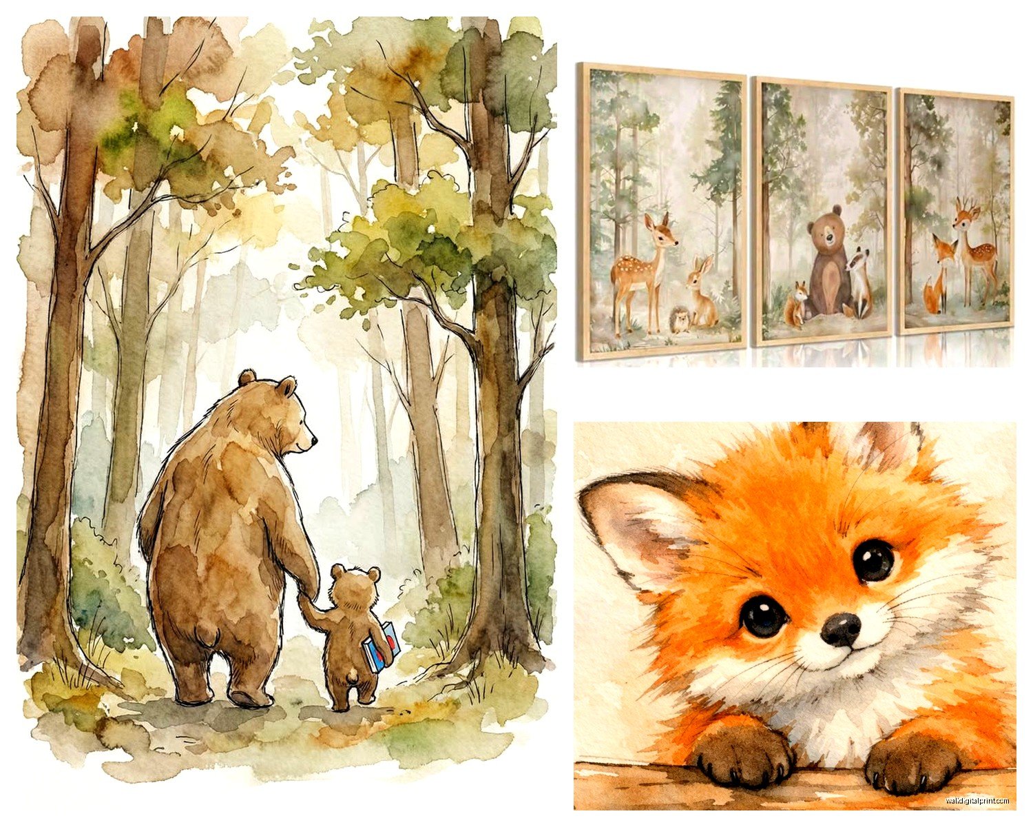
- Watercolor woodland – soft, dreamy, lots of greens and browns
- Geometric/modern woodland – clean lines, limited color palette, more Scandinavian vibes
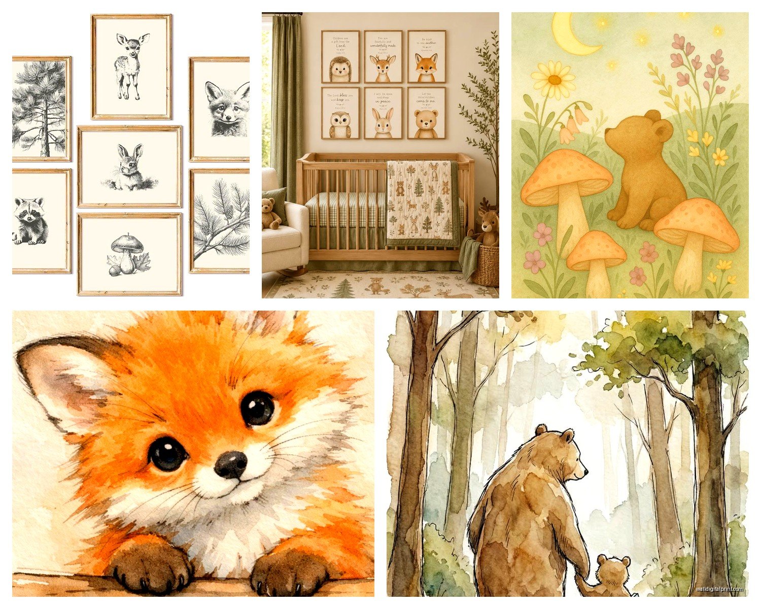
- Vintage storybook – think classic children’s book illustrations, more detailed
I’m personally obsessed with the geometric modern stuff right now because it doesn’t feel too baby-ish. Like you can keep those prints up when the kid is 5 and it still works.
Which Animals Actually Work
Not all forest animals are created equal for nursery art. Deer and foxes are the obvious ones and yeah they’re popular for a reason. They photograph well, they’re recognizable, they’re cute without being cartoonish.
But here’s what I’ve found actually works better than you’d think:
- Bears – but only if they’re illustrated in a friendly way, not realistic
- Rabbits – super versatile, work in any style
- Owls – though they’re kinda having a moment that might be passing
- Hedgehogs – unexpectedly adorable in prints
- Squirrels – underrated honestly
What doesn’t work: wolves (too intense), moose (weird proportions in art), raccoons (I don’t care what anyone says, they look like bandits and it’s creepy for a baby room).
My cat knocked over my coffee while I was writing this and it somehow didn’t hit any of the sample prints I have spread out so that’s my good luck for the day.
Color Palette Is Everything
This is where people mess up the most. They find a cute fox print in coral and teal, then a deer print in sage and mustard, then add a bear in navy and rust and suddenly it looks like a Pinterest board threw up on their wall.
Pick 3-4 colors MAX and stick to them religiously. My go-to combinations:
Sage green + cream + soft gray + tiny bit of terracotta – this is chef’s kiss, works for any gender, feels calm
Navy + white + natural wood tones + pop of gold – more modern, really crisp
Taupe + ivory + muted pink + olive green – if you want something softer but not overly feminine
Charcoal + cream + rust + forest green – darker and moodier, I did this for a client who wanted something different and it was stunning
The prints you buy should pull from these exact colors. Not similar colors. Exact. This is why buying a “set” from one artist often looks more cohesive even if it costs a bit more.
Frame Situations
Okay so frames are gonna be like 40% of your budget if you do this right. Cheap frames make expensive art look bad. I learned this during my first nursery project and had to redo everything.
IKEA frames are actually fine for this. The RIBBA series comes in good sizes and they’re simple enough that they don’t compete with the art. I use black frames for modern woodland themes and natural wood for softer traditional themes.
White frames can work but they need to be the right white – match them to your wall color or they look dingy. This seems picky but it matters when you’re staring at them while feeding a baby at 3am.
Mix frame sizes but keep the style consistent. So all black, or all wood, or all white. Don’t mix metals with wood frames either – that’s a different aesthetic entirely.
Gallery Wall Layouts That Don’t Suck
The symmetrical grid is easiest and honestly looks the most intentional. Three prints across, two down. All the same size frames. Boring but effective.
If you want something more organic, here’s my formula – one large print (16×20 or bigger) as the anchor, then build around it with smaller pieces (8×10 and 5×7). Keep the spacing between frames consistent though, like 2-3 inches apart. Measure this with painters tape before you start hammering.
There’s this technique where you trace all your frames on kraft paper, tape the paper to the wall, arrange it until it looks good, then nail through the paper. I thought this was extra until I tried it and yeah it saves so much time and wall damage.
The Single Large Print Approach
Sometimes one big statement piece is better than a whole gallery wall. Like if you’ve got a small nursery or lots of other visual stuff going on with furniture and textiles.
For a single print above a crib, go at least 24×36. Smaller looks awkward in that space. I once watched someone hang a 8×10 print above a crib and it was just… sad. Like a postage stamp.
Canvas prints work well for large single pieces because they’re lightweight and you don’t have to worry about glass breaking. Though I prefer framed prints aesthetically – they just look more finished.
Where to Actually Buy This Stuff
Etsy is the obvious answer but you gotta know how to search. Don’t just type “woodland nursery art” because you’ll get 50,000 results. Be specific: “geometric fox print,” “watercolor deer nursery,” “scandinavian forest animals.”
Look for digital downloads if you’re on a budget. You download the file, get it printed at a local print shop or online (I use Printique or Nations Photo Lab), then frame it yourself. This route costs like $60-80 total for a set of three 11×14 prints including frames.
Pre-framed prints from places like Minted or Artifact Uprising are more expensive but the quality is consistently good and you don’t have to think about it. Worth it if you hate DIY or don’t have time.
Oh and another thing – some Etsy sellers let you customize colors. This is HUGE. You can find a print you love and ask them to change the colors to match your nursery palette exactly. Most charge like $5-10 extra for this.
My Actual Favorite Shops
I probably shouldn’t play favorites but whatever, these are the shops I go back to constantly:
For modern geometric woodland stuff, there’s a few sellers who do that minimalist Scandinavian style really well. The kind with simple line drawings and limited color palettes.
For watercolor pieces, look for artists who do custom color matching – worth every penny when you’re trying to coordinate with specific bedding or curtains.
Vintage-style storybook illustrations are harder to find but when you find a good artist who does them, buy like everything because that style is specific.
What About 3D Elements
Wooden shelves with little forest animal figurines can work but don’t put them above the crib obviously. I like them on a wall opposite the crib where you can create a little scene.
Fabric pennant banners with woodland themes are cute but they collect dust like crazy and you’re gonna be wiping them down constantly. Just know that going in.
Macrame wall hangings – okay this is controversial but I think they’re getting overdone. If you love them fine, but don’t feel like you need one just because every woodland nursery on Instagram has one.
Those wooden mountain ranges that you hang on the wall? I’m obsessed. They add dimension without being fussy and they work for literally years as the kid grows.
Mixing Art Styles
You can mix illustrated prints with photography but it’s tricky. Like a photo of actual trees with illustrated animals can work if the color palettes match perfectly. I did this once with black and white forest photography and it was really striking.
Don’t mix realistic animal photos with cartoon animals though. That’s just confusing aesthetically.
You can definitely mix different artists’ work as long as you’re strict about the color palette and overall vibe. Three different fox prints from three different artists can look cohesive if they’re all in the same style category and colors.
The Practical Stuff Nobody Tells You
Hang everything BEFORE the baby comes. Seriously. You think you’ll have time after and you absolutely will not. I’ve had clients trying to hang gallery walls with a newborn and it’s chaos.
Use proper picture hanging hardware. Those command strips are fine for lightweight frames but anything over like 5 pounds needs a real nail or screw. The last thing you need is a frame falling at 2am and scaring everyone.
Keep the glass prints away from direct sunlight. Colors fade faster than you’d think, especially watercolors and lighter prints. I had a beautiful set fade to almost nothing in 8 months because they were on a south-facing wall.
wipe frames down monthly because dust accumulates and makes everything look dingy. Just a microfiber cloth, takes 2 minutes.
Budget Breakdown
If you’re doing this on a budget, here’s what I’d allocate:
Three digital download prints: $30-45
Printing at local shop: $40-60
Three frames from IKEA: $30-50
Picture hanging supplies: $15
Total: around $115-170 for a three-print setup
If you want to splurge:
Four custom prints from a good Etsy artist: $120-180
Professional framing: $200-300
Or pre-framed from Minted: $250-400 for a set
The middle ground is buying physical prints on Etsy (not digital) and framing them yourself with nicer frames from Target or West Elm.
Common Mistakes I See Constantly
Hanging things too high – the center of your art should be at eye level, which is like 57-60 inches from the floor. People always hang stuff way too high and it looks awkward.
Too many different animals – pick 2-3 animal types max. A fox, deer, bear, rabbit, owl, and squirrel all together is a zoo not a forest.
Mixing warm and cool tones – if your prints have warm browns and oranges, don’t add something with cool grays and blues. Temperature matters.
Forgetting about the rest of the room – your wall art needs to coordinate with your curtains, rug, bedding, etc. I always pick art after I know what the other textiles are gonna be.
Going too literal – you don’t need actual trees and leaves in every single print. Sometimes just a simple animal portrait on a neutral background is better.
The Growth Factor
Think about whether you’ll want to keep this art up as the kid gets older. Really illustrated baby-ish stuff might feel too young when they’re 4 or 5. The more sophisticated simple prints can literally last until they’re teenagers if you want.
I always tell clients to imagine the room in 5 years. Does this still work? Can you just swap out some elements and keep the main pieces?
Neutral woodland themes are easier to transition than really specific baby themes. You can keep forest animal art and just mature the other elements of the room as needed.
Seasonal Considerations
This is gonna sound weird but some woodland palettes feel more seasonal than others. Warm oranges and rusts feel very fall. Cool greens and blues feel more spring/summer. If you want something that works year-round, stick to more neutral earth tones.
Unless you’re into changing out art seasonally which honestly sounds exhausting to me but some people love it.
okay so I think that covers most of what you need to know without getting into like, the super specific stuff about different printing techniques and paper weights which honestly doesn’t matter that much for nursery art. just make sure it’s printed on decent quality paper and you’re good
The main thing is to commit to a cohesive vision before you start buying random cute prints. I have a folder on my phone with like 200 saved woodland print examples and I still somehow end up helping clients who bought stuff that doesn’t go together at all