Wall Art Guide, Wall Art Tutoriels
Grey and Gold Wall Art: Neutral Metallic Elegant Combo
Aug
So I’ve been obsessing over grey and gold wall art lately and honestly it’s such a forgiving combo when you’re trying to make a space look more expensive than it actually is. Like my client last month wanted her living room to feel “hotel lobby chic” but had maybe a $300 budget and I was like okay we’re doing grey and gold, no other option.
The thing about this color combo is it works because grey is basically the Switzerland of colors – it doesn’t commit to anything, which sounds bad but actually means it plays well with that warm gold metallic. And gold, when you use it right, reads as intentional luxury instead of trying too hard. When you use it wrong though… we’ll get to that.
Why This Combo Actually Works
Grey gives you this neutral backdrop that doesn’t compete. I’ve tried navy and gold, black and gold, even that trendy sage green and gold thing everyone’s doing, but grey just has this quality where the gold can be the star without the whole thing looking like a Vegas hotel room. The cool tones in grey balance out the warmth of gold metallics, and you end up with something that feels sophisticated instead of either too cold or too blingy.
My dog knocked over one of my gold-framed pieces last week and I had this moment of panic but it actually made me realize how much the grey in the artwork itself was doing the heavy lifting. Without that neutral base, the gold frame would’ve been too much on my charcoal accent wall.
Picking the Right Shade of Grey
Okay so this is where people mess up. Not all greys are created equal and I learned this the hard way. You’ve got:
- Cool greys with blue undertones – these work best with bright gold or champagne gold
- Warm greys with beige undertones (greige basically) – pair these with antique gold or brushed gold
- True neutral greys – honestly these are rare but they work with any gold tone
- Charcoal/dark greys – go with rose gold or mixed metallics so it doesn’t feel too heavy
I spent like two hours at HomeGoods once holding different grey and gold pieces up to each other under their horrible fluorescent lights trying to figure out why some combos looked amazing and others looked like they were from different decades. It’s the undertones. Always the undertones.
Testing Your Wall Color First
Before you buy anything, and I mean anything, take a photo of your wall in natural light. Then take that photo with you when you’re shopping, either on your phone or print it if you’re old school like my mom. The grey on your wall might be reading cooler or warmer than you think, and you gotta match the gold tone to that.
Types of Grey and Gold Art That Actually Look Good
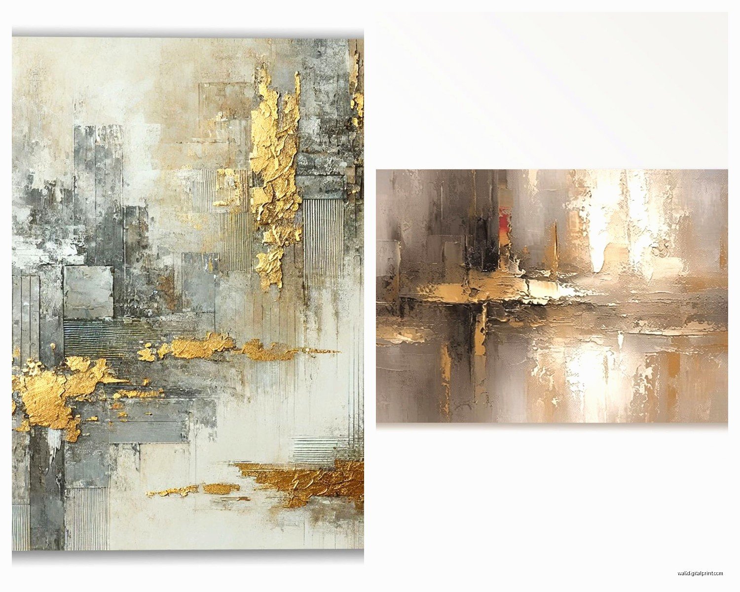
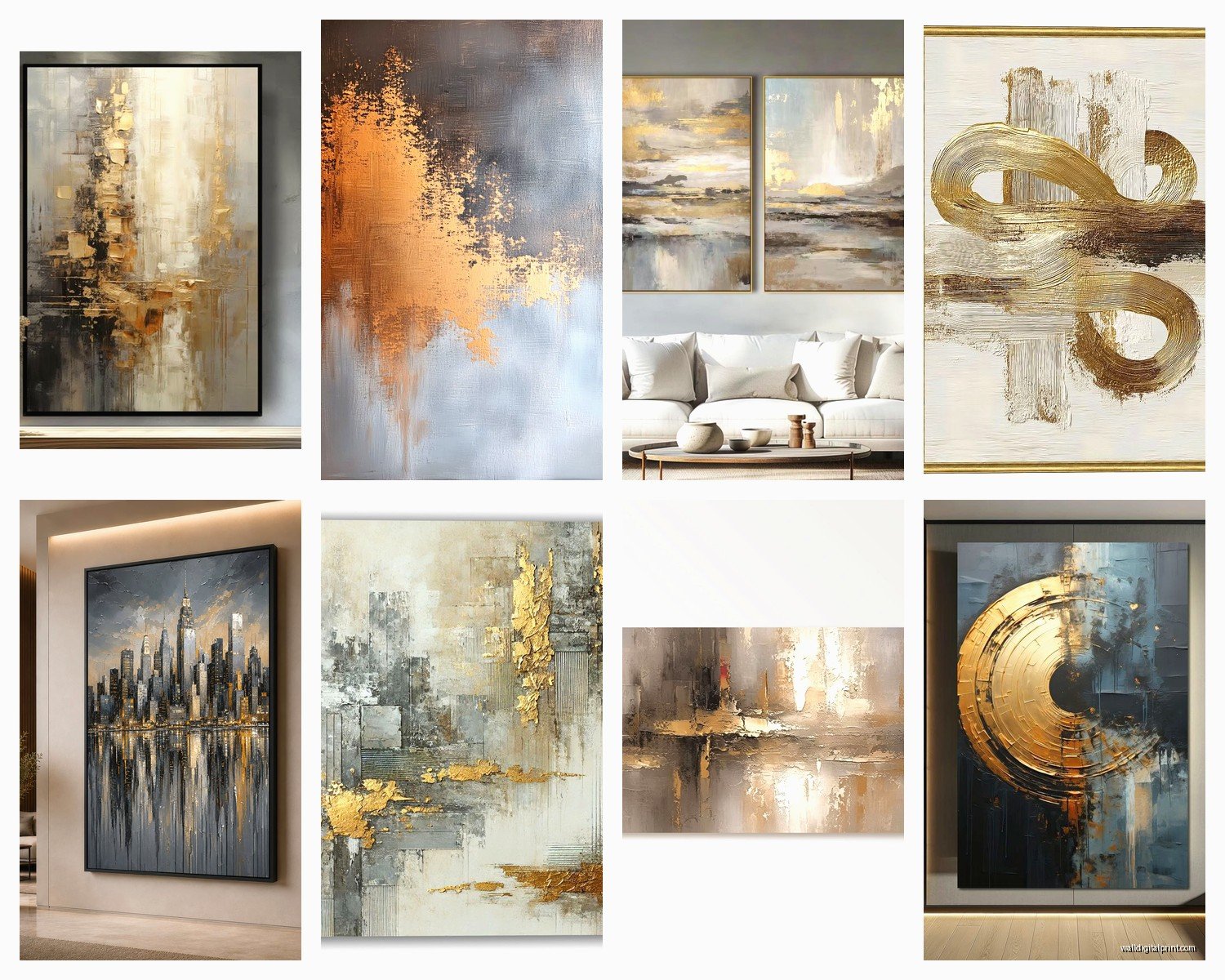
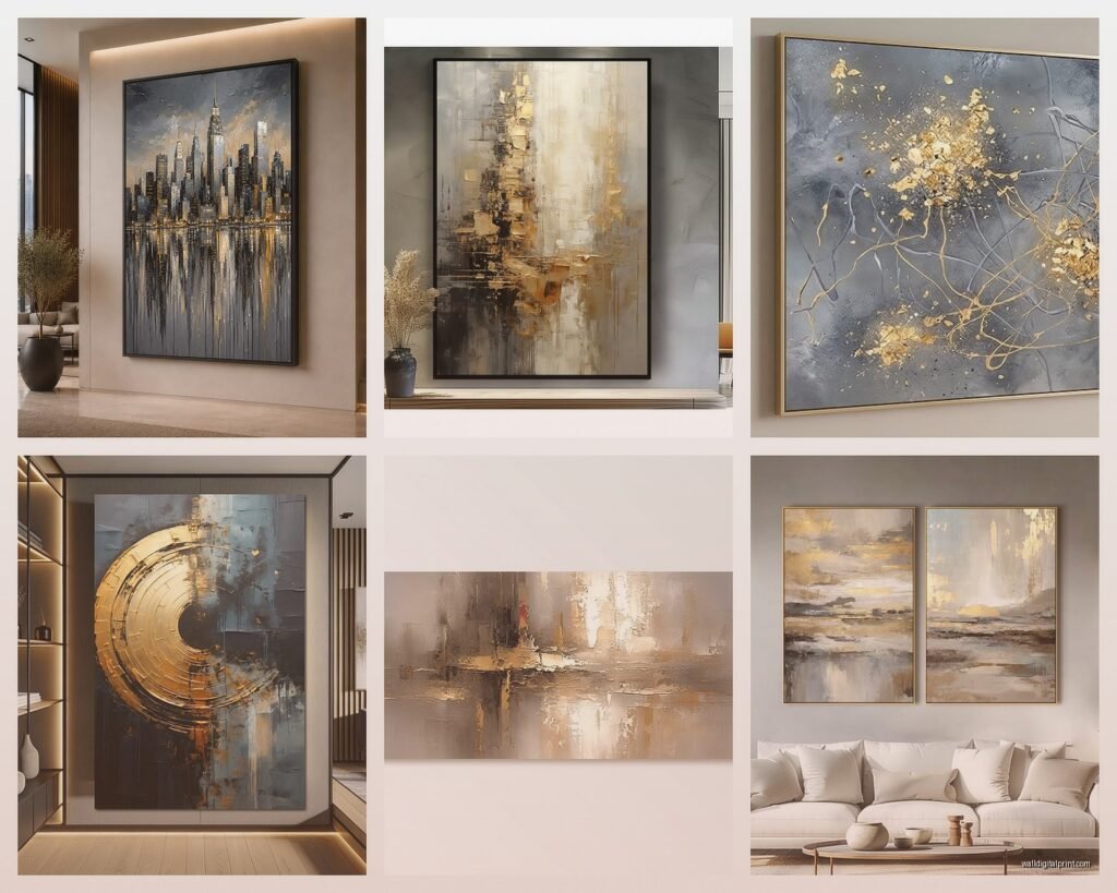
Abstract geometric stuff is probably the easiest to pull off. You want pieces with grey as the dominant color and gold as accent lines, dots, or small sections. I found this amazing set on Etsy – three panels with grey watercolor washes and gold leaf details – that my client put above her sofa and it completely transformed the room for like $180 total.
Marble prints with gold veining are having a moment and honestly they work great in bathrooms or bedrooms. Just make sure the marble reads as grey not white because white and gold is a whole different vibe.
Botanical prints are trickier but when they work they WORK. Think grey-toned leaves with gold stems or gold-dipped edges. I saw someone do eucalyptus prints with gold foil accents in their dining room and it was chef’s kiss.
Oh and another thing – typography art in grey with gold accents can look really sophisticated if you pick the right quote. Stay away from anything too “live laugh love” though. I’m talking more like single words in different grey tones with a gold underline or gold first letter.
Frame Situations You Gotta Consider
This is gonna sound weird but sometimes the frame matters more than the actual art. I’ve taken cheap prints from Target and put them in nice gold frames and people assume they’re expensive. The reverse doesn’t work as well – expensive art in cheap frames just looks sad.
Gold frame options:
- Bright shiny gold – very traditional, works in formal spaces
- Brushed or matte gold – more modern, easier to style
- Antique gold with distressing – farmhouse vibes, works with warm greys
- Rose gold – trendy but actually really pretty with cool greys
- Mixed metal frames with gold accents – safe choice if you’re nervous
I usually tell people to go with matte gold frames because they’re the most versatile. That high-shine bright gold can look amazing but it’s also unforgiving if your space isn’t dialed in.
Wait I forgot to mention – thin gold frames are more modern, thick gold frames read more traditional or maximalist. I have both in my own place because I can’t commit to one aesthetic apparently.
Size and Placement Strategy
Okay so funny story, my client bought these tiny 8×10 grey and gold prints for her huge blank wall above the couch and texted me a photo like “why does this look weird” and I had to gently explain that you need like… substantial size for a statement wall.
For above a sofa, you want your art to take up roughly two-thirds to three-quarters of the sofa width. So if you have a 90-inch sofa, you’re looking at 60 inches of art width minimum. You can do this with one large piece or a gallery wall.
Single large piece (like 40×60 or bigger): Makes a bold statement, easier to hang, modern look. Go with something that has both grey and gold in the actual image.
Diptych or triptych (two or three panels): Super popular right now, gives you that expensive gallery feel. Make sure you space them 2-4 inches apart. I use painters tape to plan this out on the wall first because math is hard.
Gallery wall: More work but you can mix frame sizes and styles. Keep the color palette tight though – just grey, gold, maybe white. I did one with seven pieces of varying sizes, all gold frames, mix of grey abstract and marble prints, and it took me three tries to get the layout right.
Height Matters Too
Center of your art should be at eye level, which is roughly 57-60 inches from the floor. But if you’re hanging above furniture, leave 6-8 inches between the furniture and the bottom of the frame. This is one of those rules I actually follow because it genuinely looks better.
Where to Actually Buy This Stuff
Real talk – you don’t need to spend a fortune. Here’s where I shop:
Etsy: Best for unique prints you can download and print yourself or have them print. Search “grey gold abstract art” or “marble gold print” and you’ll find tons. Usually $5-30 for digital downloads.
Society6 and Redbubble: Independent artists, you can get the same design as a framed print, canvas, or just the print. Prices vary wildly but sales happen constantly.
HomeGoods/TJ Maxx: Hit or miss but when you find good grey and gold pieces they’re usually under $50. I check every time I’m near one because my willpower is nonexistent.
Target: Their Project 62 line usually has some grey and gold options. Quality is fine for the price, nothing amazing but gets the job done.
Amazon: Honestly better than you’d think for framed canvas sets. Read the reviews about actual color though because product photos lie.
Local print shops: If you find digital art you love, you can get it printed on nice paper or canvas locally. Sometimes cheaper than ordering pre-framed stuff online.
DIY Options If You’re Crafty
I made my own grey and gold piece once during a slow weekend and it was actually pretty easy. Got a canvas from Michael’s, painted it in different grey tones using cheap acrylic paint, let it dry, then added gold leaf adhesive in a random pattern and pressed on gold leaf sheets. Sealed it with mod podge. Total cost maybe $35 and it looks like something from West Elm.
You can also do:
- Print grey watercolor textures from free stock photo sites, add gold washi tape in geometric patterns, frame it
- Buy cheap canvas art and add your own gold paint pen details
- Use gold foil transfer sheets on grey cardstock in patterns, frame multiple pieces as a set
- Paint abstract grey strokes on canvas, splatter with watered-down gold acrylic
The DIY route works best if you’re doing a gallery wall where not every piece needs to be perfect. Mix in a couple homemade pieces with purchased ones and it looks intentional.
Styling the Rest of the Space
Your grey and gold art isn’t gonna look right if the rest of your room is fighting it. You don’t need to redecorate everything but consider:
Throw pillows: Add at least one or two with gold accents or grey and gold patterns. This creates visual connection between your art and furniture.
Metallics elsewhere: Gold picture frames on shelves, gold lamp base, gold cabinet hardware – these little touches tie everything together. Don’t overdo it though or you’ll end up looking like King Midas threw up in your house.
Texture: Grey velvet, linen, or knit textures make the combo feel more layered and expensive. Flat grey walls with flat gold frames can fall flat (see what I did there).
I added a grey faux fur throw to my client’s space after we hung the grey and gold art and it made such a difference. Something about that texture echoed the softness in the abstract art.
Common Mistakes to Avoid
Too much gold. I’ve seen people go overboard where there’s gold everywhere and the grey art just becomes part of the chaos. The power of this combo is in the restraint – grey does the grounding, gold does the elevating, but grey should be the dominant player.
Wrong gold tone for your space. If your hardware, light fixtures, and other metals are silver or chrome, throwing in bright yellow gold art can look off. Either switch to rose gold or champagne gold for the art, or commit to mixing metals intentionally throughout the space.
Ignoring lighting. Gold looks completely different in warm vs cool light. If you have cool LED bulbs, your gold might read flat or even greenish. Warm bulbs make gold glow. I learned this when my grey and gold piece looked amazing in my bedroom (warm bulbs) but weird in my bathroom (cool bulbs).
Buying art that’s too small. We talked about this but it’s worth repeating – scale matters so much and most people buy too small.
Mixing Patterns and Styles
You can totally mix different styles of grey and gold art in the same space if you’re careful. I have abstract geometric next to a gold-framed botanical print in my hallway and it works because the color palette is consistent. The key is keeping that grey and gold thread running through everything.
If you’re doing a gallery wall, vary the styles but keep the frames consistent, or vary the frames but keep the art style consistent. Don’t vary both unless you really know what you’re doing or have a really good eye.
Adding Other Colors
Grey and gold is pretty but it can feel cold if that’s ALL you have. I usually add:
- Blush pink – softens everything, very popular combo right now
- Navy blue – adds depth, feels more masculine or traditional
- White – keeps it light and airy, more minimal
- Black – dramatic, makes the gold pop even more
- Sage green – trendy but works if you use warm greys
These can be in your art itself or in accessories around the art. My living room has grey and gold art but blush pillows and a navy rug, and it all works together.
Seasonal Switching
One thing I love about grey and gold is how well it transitions through seasons. In fall and winter it feels cozy and sophisticated with warm lighting and chunky textures. In spring and summer it feels fresh and elegant with brighter lighting and lighter fabrics.
You don’t need to change your art seasonally but you can change what’s around it – swap pillow covers, change out throws, adjust your lighting temperature – and the same grey and gold pieces will give you a different vibe.
Okay I think that covers most of what I’ve learned through trial and error with this color combo. The main thing is just to commit to it – get enough gold in there that it feels intentional but let the grey do the heavy lifting. And honestly if you start with one good piece and build from there you can’t really go wrong.