Wall Art Guide, Wall Art Tutoriels
Harry Potter Wall Art: Wizarding World Fan Decor
Jun
So I’ve been decorating Harry Potter themed spaces for like three years now and honestly the wall art situation is way more complicated than people think. My friend Rachel texted me last week asking which Marauder’s Map print to buy and I ended up sending her like forty voice messages because there’s just… a lot to unpack here.
Finding Stuff That Doesn’t Look Cheap
Okay first thing – and I cannot stress this enough – most Harry Potter wall art on Amazon looks absolutely terrible in person. The colors are weirdly saturated, the paper quality is like printer paper, and you’re gonna be disappointed. I learned this the hard way with a set of house crest prints that looked amazing online but arrived looking like someone’s home printer project from 2003.
The Etsy route is honestly where I find most of my best pieces now. Search for “Harry Potter watercolor prints” or “minimalist wizarding world art” and you’ll get stuff that actually looks sophisticated. There’s this one shop – I think it’s called MugglebornsWelcome or something similar – that does these gorgeous muted-tone potion bottle illustrations that don’t scream “teenager’s bedroom” which is what you want if you’re over like, 25.
For canvas prints, I always tell people to check the reviews with photos. Always. Because the mockup images lie constantly. If you see actual customer photos showing the canvas texture and how it looks on a real wall with real lighting, that’s your green light.
Size Actually Matters Way More Than You Think
This is gonna sound obvious but I see people mess this up constantly – buying tiny 8×10 prints for huge empty walls. My client last month did this and we had to reorder everything because it looked ridiculous, like little postage stamps floating in space.
For above a couch or bed, you want at least 24×36 inches or a gallery wall situation. Single small prints only work in tight spaces like bathrooms or hallways or above a desk. I have this rule now where I literally measure the wall space and don’t go smaller than one-third the width of the furniture below it.
Gallery Wall Layouts That Don’t Look Messy
Gallery walls are tricky with themed art because it can veer into “obsessive fan shrine” territory real fast. What I do is mix Harry Potter pieces with complementary non-fandom art. Like, a Hogwarts castle print next to a vintage book page print next to a simple moon phase illustration. It reads as “person with eclectic taste who happens to like HP” instead of “this is my entire personality.”
The template method works best – cut out paper shapes the size of your frames, tape them to the wall, rearrange until it looks right, then actually hang the frames. Saved me so many extra nail holes. My cat kept trying to attack the paper templates which was annoying but also kinda helpful because it showed me which pieces hung too low.
Frame Choices Make or Break Everything
Black frames are your safe bet. They work with literally any HP art style and don’t compete with the imagery. I buy most of mine from Michael’s when they have their 50% off sales because spending $30 per frame adds up insanely fast.
White frames can work but only if your wall color isn’t white – you need contrast. And those ornate gold frames everyone thinks they should use because “magical vibes”? No. They look costume-y unless you’re doing a very specific Victorian gothic thing and even then it’s risky.
Wood frames in lighter tones (oak, natural) are great for the more whimsical or watercolor-style prints. I used them for a nursery project with really soft Hedwig illustrations and it looked perfect, not too intense for a baby’s room.
Matting Yes or No
Matting makes everything look more expensive and professional, full stop. Even a cheap print in a frame with a white or cream mat suddenly looks curated. The standard is 2-3 inch borders around the print. You can get pre-cut mats on Amazon for like $8 which is way cheaper than custom framing.
Oh and another thing – if you’re doing a gallery wall, keep the mat color consistent across all frames. It’s that little detail that makes it look intentional instead of random.
Where to Actually Buy This Stuff
Etsy – Best for unique, artistic interpretations. Search terms that work: “Harry Potter line art,” “minimalist wizarding world,” “HP book page art,” “watercolor Hogwarts.” Prices range from $5 for digital downloads you print yourself to $50+ for original watercolors.
Society6 and Redbubble – Good for trendy styles, lots of options, but quality varies by artist. I always size up because their smaller prints can look pixelated. The framed options are overpriced though, better to buy just the print and frame it yourself.
Target and BoxLunch – Surprisingly decent for official licensed stuff that doesn’t look childish. Target had this collection last year with house crests in really nice muted colors that I used in a teen’s room. BoxLunch has more variety but it’s hit or miss.
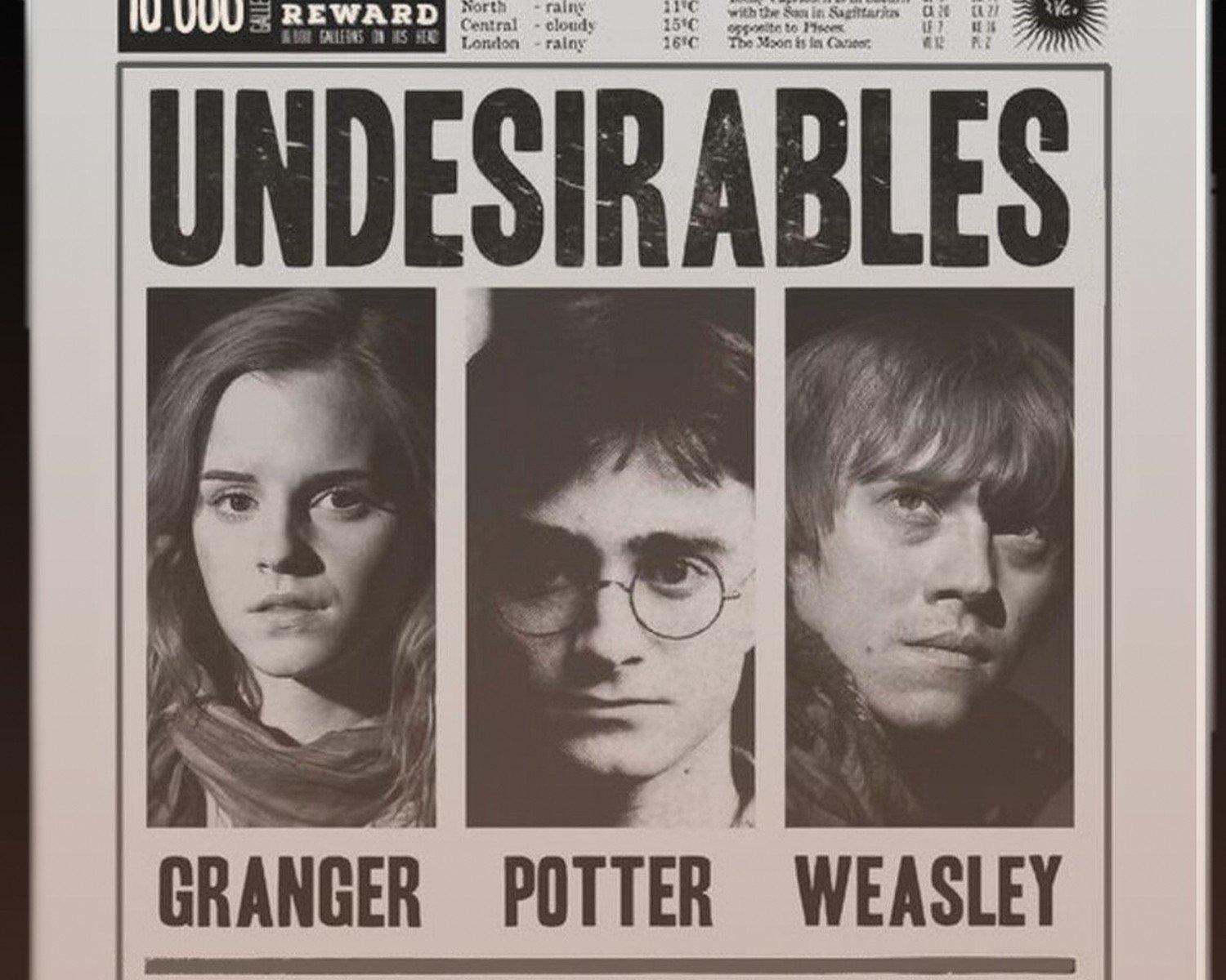
The Noble Collection – If you want official replica stuff like the actual movie posters or promotional art. Expensive but high quality. I got a client the Prisoner of Azkaban movie poster and it’s stunning, the paper quality is thick and the colors are film-accurate.
Specific Pieces I Actually Recommend
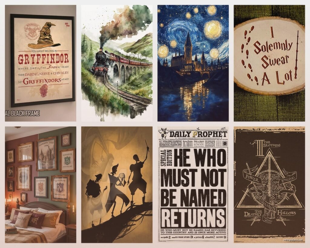
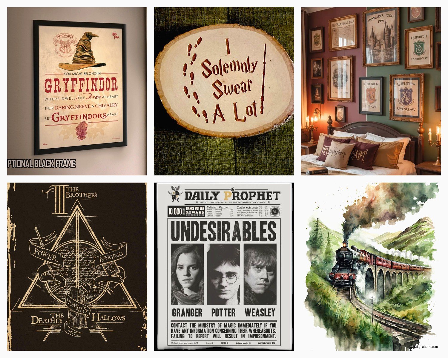
The Marauder’s Map prints – get one that’s on parchment-style paper or has that aged look. The bright white background versions look wrong. There’s a version on Etsy that comes as a massive 36×48 print and it’s perfect as a statement piece above a desk or in a reading nook.
House crest art that’s NOT the movie versions – unpopular opinion maybe but the movie crests are everywhere and kinda boring at this point. Look for artistic reinterpretations, geometric designs, watercolor versions, floral interpretations. I found these amazing art nouveau style house crests that my client framed in a set of four and they’re gorgeous.
Chapter illustration prints from the books – Mary GrandPré’s original illustrations have such a different vibe than the movies. You can find high-quality prints of these and they feel more literary, less commercial. Perfect for a home library or office.
Constellation map of the night sky from significant dates in the series – okay this is super nerdy but there are shops that will create custom star maps from specific dates like “the night Harry’s parents died” or “the Battle of Hogwarts date” and frame them with subtle HP references. Most people won’t even know it’s HP related but fans will get it.
The Spell Book Page Thing
You know those prints that look like aged spell book pages with potion recipes or spell instructions? They’re everywhere and honestly… they’re fine but overused. If you’re gonna do this, limit it to one or two pieces mixed with other styles. A whole wall of fake book pages reads as trying too hard.
What works better IMO is actual vintage book pages or dictionary pages with HP-related imagery overlaid. Like a phoenix on a dictionary page defining “rebirth” or a stag on a page about patronage. More subtle, more interesting to look at.
DIY Options That Don’t Suck
I’m not usually a DIY person but some HP wall art is actually worth making yourself. Digital downloads from Etsy are like $3-8 and you can print them at FedEx or Staples on nice cardstock for cheap. The quality is genuinely comparable to buying pre-made prints if you use good paper.
Vinyl wall decals can work in specific situations – like a Platform 9¾ decal in a hallway or stairwell, or house points hourglasses in a kids’ room. But please please please avoid the giant Hogwarts castle silhouettes or sprawling quote decals. They’re hard to apply smoothly and they scream 2012 Tumblr aesthetic.
The Photo Print Hack
This is gonna sound weird but those photo printing services like Shutterfly or Nations Photo Lab? You can upload HP artwork and get it printed on actual photo paper for way cheaper than art prints, and the quality is often better. I’ve done this with digital downloads and the colors are more vibrant, the paper is thicker. Just make sure your file resolution is high enough – at least 300 dpi.
Arranging By Room Type
Living rooms need to be subtle unless you live alone and don’t care. I usually do one statement piece – like a large Hogwarts castle landscape in muted tones – or a curated gallery wall that mixes HP with other art. The goal is “tasteful fan” not “theme park.”
Bedrooms are where you can go harder. House pride stuff works here, quotes on the walls, more obvious fan art. I did a bedroom with a whole wall of different artistic interpretations of the Deathly Hallows symbol and it looked amazing, almost geometric and modern.
Home offices – motivational quotes from the series work well here without being too on the nose. “Happiness can be found even in the darkest of times” sounds like generic inspiration unless you know. Or maps, the Marauder’s Map or wizarding world maps look professional enough for Zoom backgrounds.
Kids rooms – go colorful and fun but make sure it’s stuff that can grow with them. Avoid super cutesy baby versions of characters. The illustrated editions artwork is perfect for this, still whimsical but not babyish.
Lighting Considerations Nobody Talks About
Direct sunlight will fade your prints SO fast, especially cheaper ones. I learned this when a client’s beautiful Patronus print turned completely washed out after six months near a window. Use UV-protective glass in frames for anything in bright areas or just… don’t hang art where sun hits it directly.
Picture lights or small spotlight fixtures can make wall art look incredibly high-end. There are battery-operated ones now that you don’t need to wire, and they make such a difference for nighttime ambiance. I put one above a large Hogwarts Express print in a hallway and it completely transformed the space.
Mixing Official and Fan Art
You gotta be careful with copyright stuff if you’re buying fan art, just FYI. Most Etsy sellers are operating in a gray area. I’m not saying don’t buy it – I obviously do – but if you’re running a business or posting photos online, official licensed stuff is safer legally.
That said, fan artists often create way more interesting and diverse interpretations. There’s incredible representation art of the characters, different artistic styles, crossover pieces. The official stuff can be kinda samey and focused on the main trio.
I mix both in most projects. Official movie stills or promotional art as anchor pieces, then fan interpretations for variety and personality. It creates a more dynamic collection that feels personal.
Wait I forgot to mention – textured prints like canvas or wood-mounted prints add dimension that regular paper prints don’t. There’s something about the physicality of a thick canvas or a print mounted on distressed wood that makes it feel more like actual art than fandom merch. Worth the extra cost for your main pieces.
The metal prints are having a moment too – HP art printed directly on aluminum sheets. They’re super modern looking and the colors are insanely vibrant. Not for everyone but if you have a more contemporary space they can work really well.
Anyway, that’s like everything I’ve figured out through trial and error and client projects. The main thing is just making sure it feels like YOUR space that happens to include HP references, not a space that’s screaming HARRY POTTER at everyone who walks in, you know?