Wall Art Guide, Wall Art Tutoriels
Ocean Wall Art: Seascape Photography & Marine Decor
Jun
So I’ve been basically living and breathing ocean wall art lately because three of my clients decided simultaneously they wanted that coastal vibe, and honestly? It’s way more nuanced than just slapping up a beach photo and calling it a day.
The Size Thing Nobody Talks About
Okay so first thing – seascape photography needs to be BIGGER than you think. I learned this the hard way in my own living room. Got this gorgeous wave print, like 16×20, thought it would be perfect above my console table and it just… disappeared. Ocean scenes have so much visual depth that if they’re too small, they lose all their impact and just look like a random window or something.
For above a sofa, you’re looking at minimum 40 inches wide, ideally closer to 60. I know that sounds massive but trust me. The horizon line in seascape photos creates this natural division that your eye wants to follow, and if it’s cramped into a tiny frame, the whole composition falls apart.
My friend Sarah ignored this advice and bought like five small ocean prints thinking she’d do a gallery wall, and they just looked busy instead of serene. We ended up returning four of them and getting one large 48×36 instead and it completely transformed her space.
Print Quality Actually Matters Here
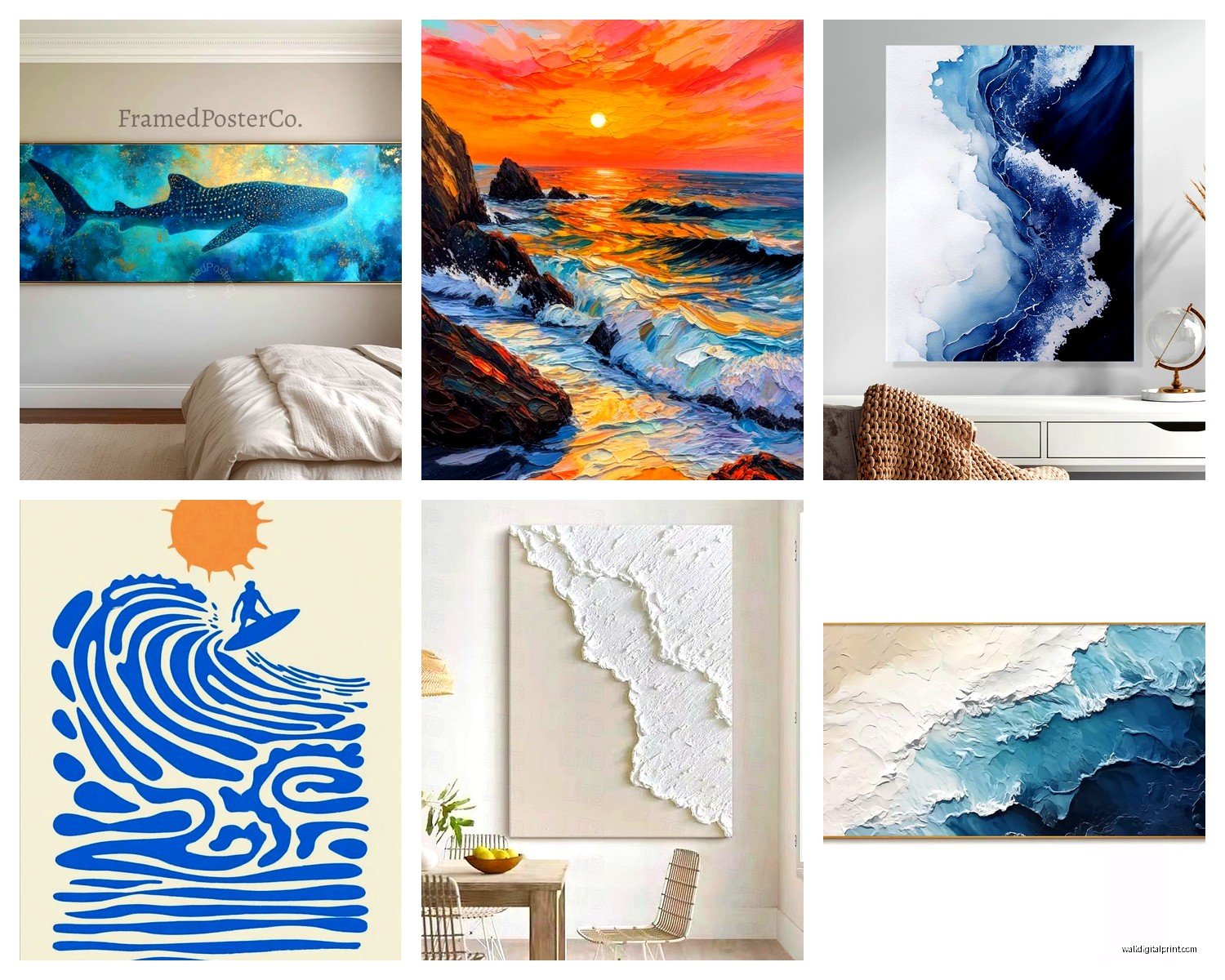
This is gonna sound snobby but you can really tell the difference between a cheap print and a quality one with ocean photography specifically. The gradients in water and sky show banding SO easily if the print quality is bad. I’ve tested prints from like everywhere – Etsy, Society6, local print shops, even Costco honestly.
Here’s what I found: acrylic prints are incredible for seascapes. The depth and luminosity they give to water is unreal. I got one from a photographer on Etsy, had it printed on acrylic through a lab they recommended, and the way light hits it throughout the day makes the water look almost alive. They’re pricey though, like $300-500 for a large piece.
Canvas is tricky because ocean photos can look muddy on canvas if the printing isn’t top tier. The texture of canvas can work against the smooth quality of water. But I’ve seen it done well – you just gotta make sure they’re using archival inks and the canvas is properly gal stretched.
Metal prints are having a moment right now and honestly they work beautifully for high-contrast ocean shots. Black and white waves on metal? Chef’s kiss. There’s this company called Printique that does really solid metal prints, my client used them for a massive storm wave photo and it’s literally the first thing everyone comments on.
What About Just Regular Framed Prints
Yeah these work fine if you get the matting right. For ocean photography I actually prefer minimal or no mat – let the image fill the frame. The exception is if you’re doing a vintage nautical print or something more illustrative, then a mat can work.
Glass matters more than you’d think. Regular glass creates glare which is super annoying with ocean art because you naturally want to hang it where there’s good light. I always spring for museum glass or at minimum anti-glare glass. It’s like an extra $50-80 but you’re not gonna spend two years trying to find the one angle where you can actually see your expensive photo without glare.
Color Palette Is Where People Mess Up
Okay so funny story – I was watching this home reno show the other night while eating leftover pizza and they put this bright turquoise tropical ocean print in a room with cool gray walls and it looked SO bad. Ocean art comes in wildly different color temperatures and you gotta match it to your space.
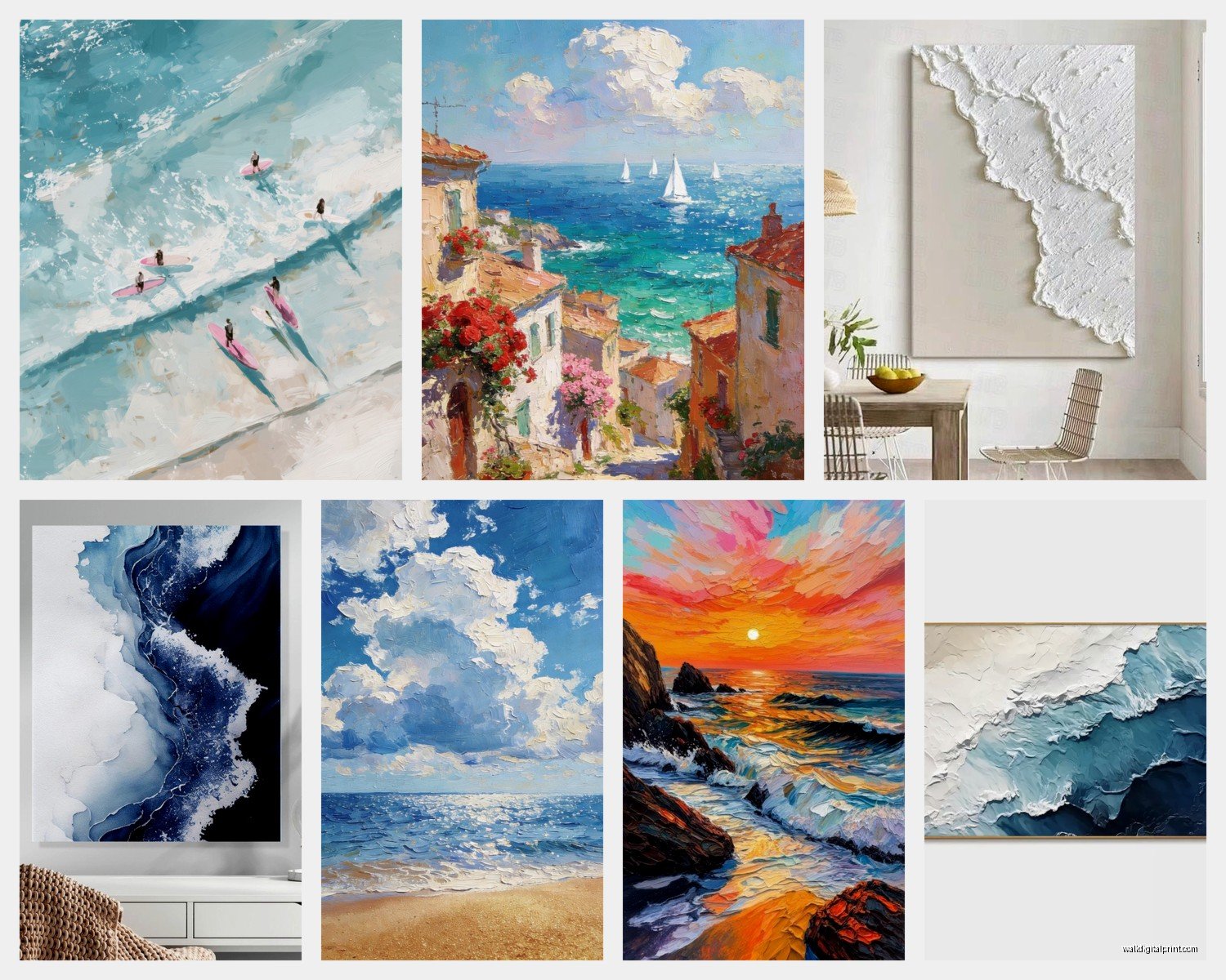
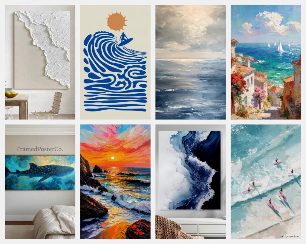
Storm seascapes and moody ocean photography: these have gray, navy, deep blue, sometimes even green tones. They work with modern spaces, industrial vibes, rooms with darker woods or metal accents.
Tropical/Caribbean ocean photos: those bright turquoise and teal colors look amazing in spaces with white or cream walls, natural wood, maybe some coastal contemporary furniture. They can look really out of place in traditional or moody spaces.
Sunset/sunrise seascapes: these have warm tones – pinks, oranges, golds. They’re actually the most versatile? I’ve used them in bedrooms mostly because they’re calming but still have visual interest.
Black and white ocean photography: this is my secret weapon honestly. Works with literally any color scheme, adds sophistication, and the drama of waves or coastlines really comes through without color distraction.
I had a client who was dead set on this bright blue tropical water print but her whole apartment was done in warm beiges and terracotta… we compromised with a sunset ocean scene that had both blue water and warm sky tones and it actually tied everything together perfectly.
Placement Tips That Actually Work
Living room: above the sofa is classic but also consider the wall opposite your windows. Ocean art benefits from natural light but you don’t want direct sun hitting it (fading is real). I hung a huge seascape on my client’s wall that faces their balcony doors and the natural light makes it glow without direct exposure.
Bedroom: honestly this is where ocean photography shines. There’s something about falling asleep looking at the ocean or waking up to it. I usually go for calmer seas in bedrooms – save the dramatic crashing waves for living spaces. Also gonna say this – horizontal orientation works better above beds than vertical. It echoes the horizon line and feels more restful.
Bathroom: YES you can put ocean art in bathrooms but you gotta be smart about it. Acrylic or metal prints only because humidity will destroy canvas and paper prints. Keep it away from direct shower spray obviously. I have a small metal print of calm turquoise water in my bathroom and guests always ask about it.
Office/workspace: this is where I like more dramatic seascapes. Something with movement and energy. One of my clients works from home and we put this incredible stormy ocean photo behind her desk – she says it helps her focus somehow? The movement in the image but the overall blue-gray palette is calming.
Mixing Ocean Art With Other Decor
Wait I forgot to mention – ocean photography doesn’t have to be your only art. Actually it probably shouldn’t be unless you’re going full coastal theme.
I like pairing seascapes with abstract art that pulls colors from the ocean photo. Like if you have a piece with deep blues and whites, add an abstract with similar tones. Creates cohesion without being matchy-matchy.
Botanical prints also weirdly work well with ocean photography? I did a client’s dining room with a large seascape and two botanical prints of coastal grasses and it felt really collected and intentional.
What DOESN’T work: mixing ocean photography with other landscape photography usually looks confused. Like don’t put a mountain scene next to an ocean scene unless you’re doing a very specific travel gallery wall thing.
The Frame Question
Thin black metal frames are your friend with contemporary ocean photography. They disappear enough to let the image shine but provide definition.
Natural wood frames work beautifully with warmer ocean tones or vintage nautical prints. I’m obsessed with this light oak frame from Framebridge right now – it’s casual enough for beach vibes but still polished.
White frames can work but be careful – they can make ocean photography look too beachy/themed unless that’s specifically what you want. There’s a difference between coastal decor and beach house decor, you know?
No frame (canvas wraps, mounted prints): these work great for modern spaces and when you want the art to feel more casual. My cat knocked over a framed print once and I was so paranoid after that I switched to mounted prints in my own place.
Marine Decor Beyond Photography
Okay so if you’re doing ocean wall art you’re probably wondering about other marine decor elements and how much is too much.
Vintage nautical charts are actually having this huge renaissance right now. They’re less literal than ocean photography so you can layer them in. I found an amazing 1940s chart of the Pacific Northwest coastline at an estate sale and had it professionally framed for a client’s study – pairs perfectly with their black and white seascape photos.
Sculptural elements: driftwood wall hangings, woven rope art, even responsibly sourced coral (make sure it’s actually sustainable). These add texture which photographs can’t provide. But like… one or two pieces max. I saw someone’s Pinterest board with driftwood, rope, shells, AND ocean photos and it was just too much.
Ship models and maritime antiques: these skew more traditional but can work in the right space. My rule is if you have modern ocean photography, skip the model ships. They’re speaking different design languages.
What About Actual Shells and Sea Objects
This is tricky territory. Shadow boxes with shells can look either really elegant or really touristy. The difference is restraint and presentation. One large statement shell (like a conch or nautilus) in a simple box frame? Beautiful. Thirty tiny shells hot glued to a board? No.
I actually love using natural objects like sea urchin shells or starfish as shelf decor rather than wall art. They add the marine element without competing with your photography.
Where To Actually Buy This Stuff
Through all my testing here’s what I’ve found:
For original photography: Etsy has amazing independent photographers. Search specifically for “fine art ocean photography” and filter by your location if you want to support local artists. I’ve bought from like six different Etsy shops and quality varies wildly so always read reviews.
For prints of famous seascapes: Society6 and Redbubble are solid for variety. Quality is decent, not amazing. Fine for secondary spaces or if budget is tight.
Local art fairs and coastal galleries: if you live anywhere near a coast, check out local photographers. The work is usually higher quality and you can often commission custom sizes. Plus you get the actual story behind the image which is cool.
High-end options: Minted has a curated selection, Artfully Walls, even Anthropologie occasionally has gorgeous ocean photography. You’re paying more but the printing and framing is usually excellent.
For vintage nautical prints and charts: eBay honestly, estate sales, antique shops. Just make sure you’re getting actual vintage and not reproduction unless you don’t care about that.
Styling Tips Nobody Tells You
Don’t center everything. I know it’s tempting but ocean photography often has the horizon line off-center (rule of thirds and all that) so centering it on your wall can actually throw off the composition. Sometimes hanging it slightly off-center feels more dynamic.
Layer with lighting. I’m obsessed with picture lights right now – those brass or black wall-mounted lights that illuminate art from above. They make ocean photography look gallery-quality and you can see all the detail in the water even at night.
Consider the room’s natural light throughout the day. I did a test in my own place where I hung the same ocean print on four different walls and it looked completely different on each one depending on how light hit it. North-facing walls gave it a cooler, moodier vibe. South-facing made the blues pop more.
oh and another thing – if you’re hanging ocean photography in a room with windows that face actual water or nature, make sure the photo’s horizon line roughly aligns with your actual horizon line if possible. It creates this cool flow between indoor and outdoor space.
Common Mistakes I Keep Seeing
Going too literal with the theme. Ocean photography + anchor decor + rope accents + blue and white stripes + “Beach Please” sign = theme park not home. Pick your lane – either sophisticated coastal with quality photography OR casual beach house vibes, but mixing them looks confused.
Wrong scale for the room. Tiny ocean print in huge room = lost. Massive ocean print in tiny room = overwhelming. Measure your wall space and actually use those online tools that show you how art will look at scale.
Ignoring your climate. This is gonna sound weird but putting bright Caribbean ocean photography in like Minnesota in January feels jarring? I mean do what you want obviously but I notice ocean art feels most natural in spaces where it relates to the actual environment somehow. Storm photography works anywhere though.
Buying without seeing print quality first. If you’re spending more than $100, try to see samples or at least detailed photos of the actual print quality. I got burned once with what looked like gorgeous photography online but arrived pixelated and muddy.
Okay I think that covers most of what I’ve learned through trial and error with ocean wall art. The main thing is don’t overthink it but also don’t just grab the first beach photo you see on Amazon – there’s a middle ground where you find pieces that actually speak to you and work in your specific space. Quality over quantity always, and when in doubt go bigger and simpler than smaller and busier.