Wall Art Guide, Wall Art Tutoriels
Iconic Wall Art: Famous Images & Cultural Symbols
Jun
So I’ve been curating wall art for clients for like fifteen years now and honestly the iconic pieces are both the easiest and trickiest to work with because everyone thinks they want that Warhol Marilyn print until it’s actually on their wall and suddenly their living room looks like a college dorm.
Let me back up. You’re probably looking at those famous images thinking they’ll instantly make your space look cultured and put-together, and yeah they can, but there’s a whole thing about doing it right. I learned this the hard way when I first started styling – hung a massive Klimt’s “The Kiss” reproduction in a client’s bedroom and they called me three days later saying they couldn’t sleep because it felt like someone was watching them. Which like, fair.
The Big Names Everyone Wants
Okay so the usual suspects are Warhol, Banksy, Basquiat, Van Gogh’s Starry Night, Mondrian’s geometric stuff, that Hokusai wave print (Great Wave off Kanagawa), and honestly anything by Frida Kahlo right now. Oh and those vintage travel posters are having a moment again which is kinda funny because they were huge in like 2015 and now they’re back.
Here’s what I actually tell people – and my dog is literally barking at nothing right now so ignore that – you gotta consider the reproduction quality first. I’ve seen SO many people buy cheap prints from random Amazon sellers and the colors are completely off. Like that Rothko color field painting you love? If the reds aren’t deep enough it just looks like someone spilled paint on canvas. Not the vibe.
Where to Actually Buy Quality Reproductions
Museum shops are your friend. The MoMA store, Tate, even smaller museum websites have licensing deals that mean the color matching is actually accurate. Yeah you’ll pay more but the difference between a $30 print and a $120 museum-quality one is massive. I compared them side by side once when my client canceled and I had a free afternoon – the cheap one looked flat and the colors were weirdly saturated in this artificial way.
Society6 and Minted are middle ground options. Not museum quality but way better than the random stuff. I’ve ordered probably fifty pieces from Society6 over the years and it’s hit or miss depending on the artist who uploaded it, so check reviews on that specific print.
Cultural Symbols That Actually Work in Modern Spaces
This is gonna sound weird but the Japanese wave print works in literally every design style except maybe ultra-minimalist Scandinavian. I’ve used it in boho spaces, modern apartments, even traditional homes. Something about the composition is just universally appealing. Get it in the right size though – too small and it looks like a postcard, too big and it overwhelms unless you’ve got serious wall space.
The Rosie the Riveter poster is another one that people love but you gotta be careful with context. In a home office? Perfect. In a kitchen? Kinda gives weird 1950s housewife vibes even though that’s literally the opposite of what it represents. I had this whole discussion with a client about it last month.
Pop Art Icons
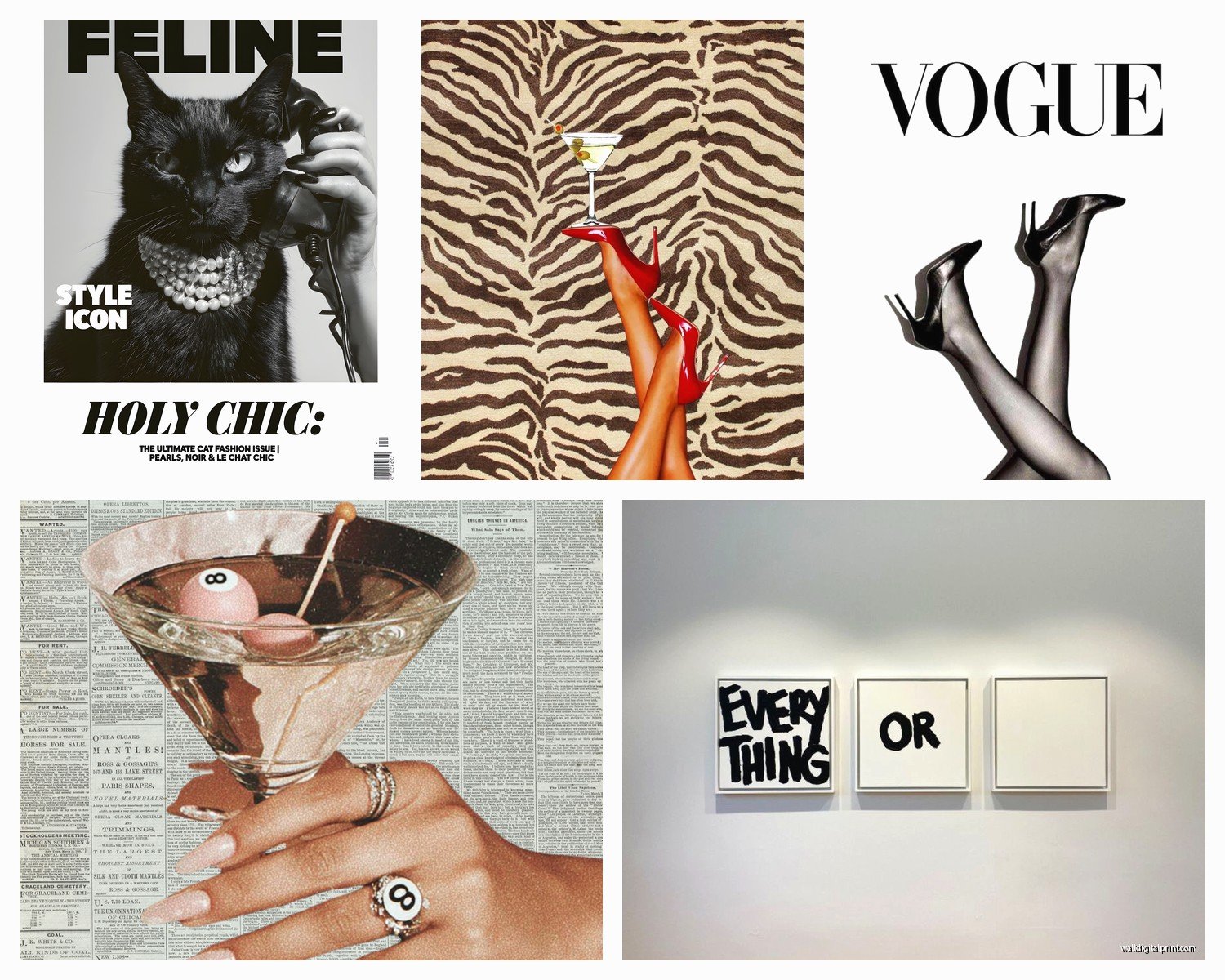
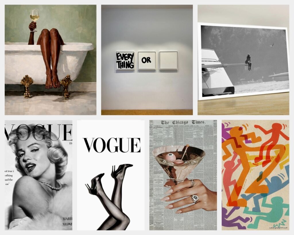
Warhol’s Campbell’s Soup cans or Marilyn prints – look these are iconic for a reason but they’re also everywhere. If you’re gonna do it, commit to the bit. One small Warhol print looks tentative. A series of four or six arranged in a grid? That’s a statement. I did this in a client’s dining room with the Campbell’s soup series and it actually worked because we went big.
The trick with pop art is matching the energy of your space. Pop art is bold and kinda commercial by nature, so it looks weird in a space that’s trying to be cozy and organic. Put it in spaces with clean lines, maybe some mid-century modern furniture, solid colors. It needs breathing room.
The Banksy Problem
Okay so everyone wants Banksy right now. Girl with Balloon, Flower Thrower, that chimp with the sign. And I get it, they’re subversive and cool and make you look like you have opinions about society or whatever. But here’s the thing – Banksy works because of context. It’s street art. It’s supposed to be unexpected and jarring.
When you put it in your carefully designed living room with your West Elm couch and your fiddle leaf fig, it loses something. Not saying don’t do it, just saying think about whether you actually connect with the piece or if you just think you should like it because it’s Banksy.
I’ve found the Banksy prints work best in more casual spaces. Game rooms, home offices, even bathrooms honestly. Somewhere with personality where the irreverence makes sense.
Getting the Size Right
This is where people mess up constantly. That famous Mondrian composition with the primary colors and black lines? Needs to be BIG. Like minimum 30×40 inches. Small geometric prints just look like graph paper from a distance. Meanwhile something detailed like Botticelli’s Birth of Venus can actually work smaller because there’s so much to look at up close.
Rule I use: stand where you’ll usually view the piece and hold your hands up to frame roughly the size you’re considering. If you have to squint to imagine detail, go bigger. Your walls can handle more than you think.
Cultural Symbols Beyond Western Art
African masks and tribal patterns are tricky territory and honestly I’m gonna say what a lot of designers won’t – if you’re not from that culture, really think about whether you’re appreciating or appropriating. I usually steer clients toward licensed reproductions from museums or purchasing from artists from those cultures directly.
That said, geometric patterns from various cultures – Moroccan tiles, Japanese geometric patterns, Aboriginal dot paintings (again, from actual Aboriginal artists) – these can be amazing. I used a series of Moroccan-inspired geometric prints in a hallway once and it completely transformed the space.
Chinese and Japanese calligraphy art is having a huge moment. If you’re gonna do this, please make sure you know what it actually says. I heard a story – might be urban legend but still – about someone who had a “beautiful symbol” that apparently translated to something like “cheap noodles.” Just… check.
The Starry Night Situation
Van Gogh’s Starry Night is probably the most reproduced painting ever and honestly it’s been done to death but I still love it? Which feels basic but whatever. The thing is, most people hang it wrong. It’s a nighttime scene with all this movement and energy, so it actually works better in bedrooms or cozy spaces than in bright, airy rooms where it feels out of place.
Also the color is crucial here. Bad reproductions make it too blue or too dark. The swirls should have this luminous quality. I always tell people to get the highest quality version they can afford because cheap Starry Night prints are genuinely depressing in how bad they look.
Photography Icons
Okay so funny story, I was watching this documentary about Ansel Adams while organizing my print catalog and realized how underused his landscape photography is in modern homes. Everyone’s doing abstract art or pop art but those black and white landscape photographs are stunning and they work in literally any space.
The Afghan Girl photograph from National Geographic, that famous Doisneau kiss in Paris, Dorothea Lange’s Migrant Mother – these are powerful images but they’re also heavy. I don’t usually recommend them for bedrooms or spaces where you’re trying to relax. Living rooms, offices, entryways? Much better.
Mixing Iconic Pieces With Original Art
Here’s something I figured out kinda accidentally – you can absolutely mix famous reproductions with original art from local artists or even your own stuff. In fact it often looks better because it feels more personal and less like you furnished your walls from a poster sale.
I did this whole gallery wall for a client where we mixed a small Matisse cutout print with three original abstracts from an artist in Brooklyn and some family photos. The Matisse actually elevated the whole thing by providing a recognizable anchor point.
The key is treating the iconic piece as one element in a larger composition, not the whole show. Unless you’re going for that one-statement-piece look, which also works but needs the right wall and the right piece.
Framing Makes or Breaks It
This is gonna sound obvious but so many people cheap out on framing and it ruins everything. That Toulouse-Lautrec Moulin Rouge poster you love? In a cheap black frame it looks like dorm decor. In a nice frame with a mat? Suddenly it’s sophisticated.
For vintage-style posters and prints, I usually go with simple frames – black, natural wood, or white depending on the wall color. For modern pieces like Warhol or Lichtenstein, you can get away with more minimal floating frames or even no frame if it’s printed on canvas.
Museum glass is worth it for pieces you really love. Cuts glare and protects from UV damage. Yeah it’s expensive but if you’re investing in a nice reproduction anyway, might as well protect it.
The Frida Kahlo Thing
Okay so Frida is everywhere right now and I have mixed feelings. Her self-portraits are incredibly powerful and personal, but they’ve also become kinda commodified? Like you can buy Frida socks and Frida tote bags and at some point it starts feeling disrespectful to the actual art.
If you’re gonna put a Frida in your space, maybe go for one of the less reproduced pieces. Not every self-portrait is created equal, and some of her still lifes and smaller works are just as interesting without being as trendy.
What About Prints of Sculptures
Nobody talks about this but photographs of famous sculptures can be amazing wall art. Michelangelo’s David, Rodin’s The Thinker, those Easter Island heads – in the right space these are conversation pieces that feel different from the usual painting reproductions.
I used a black and white photograph of a Greek statue in a client’s bathroom once and it was perfect. Classical, elegant, unexpected.
When NOT to Use Iconic Art
Real talk – sometimes the famous piece is the wrong choice. If your space already has a strong personality, adding a recognizable cultural symbol can be too much. Like if you’ve got a very specific design style going – say, modern farmhouse or industrial loft – a Warhol might clash with the whole vibe.
Also if everyone in your friend group has the same Banksy print, maybe consider something else? I dunno, there’s something about going to three different apartments and seeing the same Girl with Balloon that makes it feel less special.
Sometimes the best choice is finding an unknown artist whose work speaks to you rather than going for the name recognition. But that’s a whole other conversation.
Licensing and Legal Stuff
Quick thing – make sure what you’re buying is properly licensed. There are SO many bootleg prints out there, especially of contemporary artists like Banksy (who adds a whole other layer because of his anonymity and stance on copyright). Buying from reputable sources means the artist’s estate or the museum actually gets paid.
For stuff in public domain – basically anything where the artist died more than 70 years ago in most countries – you’ve got more freedom. That’s why you see Van Gogh and Monet everywhere. But for modern artists, licensing matters.
I try to steer clients toward legitimate sources not just for legal reasons but because the quality is genuinely better when it’s officially licensed.
Anyway I gotta run but that’s basically my brain dump on iconic wall art. The main thing is just make sure you actually like living with it, not just the idea of it, because you’re gonna see that thing every day and if it doesn’t genuinely make you happy or feel something, what’s the point?