Wall Art Guide, Wall Art Tutoriels
Skyline Wall Art: City Silhouette Architecture
Jun
So I’ve been obsessing over skyline art lately and honestly it started because I needed something for this weird wall space in my apartment that’s like, too big for a regular print but too narrow for anything substantial? Anyway, let me dump everything I’ve learned because I’ve literally bought and returned like seven pieces in the past month.
The Three Main Types You’ll Actually See
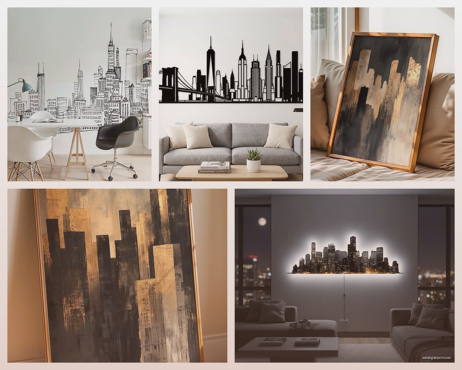
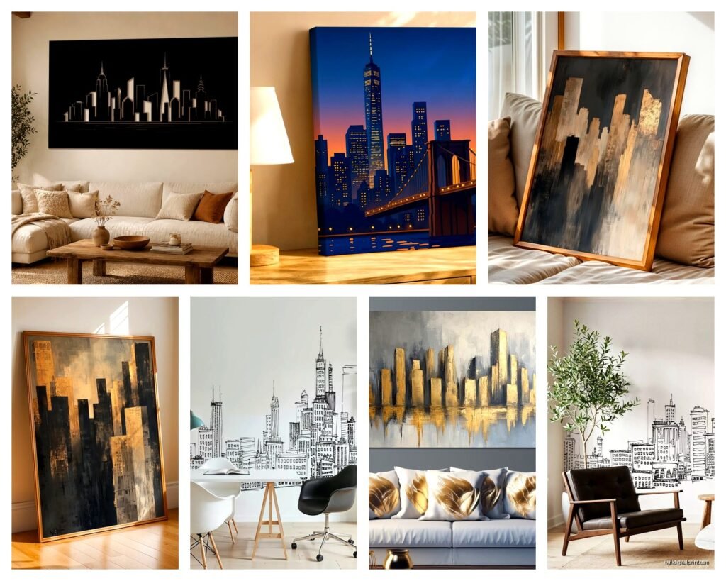
Okay so there’s basically three categories and they’re all totally different vibes. You’ve got your photographic prints which are literally just photos of city skylines, then there’s the line art/silhouette stuff that’s more minimalist and graphic, and then these metal cutout things that are having a major moment right now.
The photo prints are what most people think of first. I grabbed one from this Etsy seller of the Chicago skyline at sunset and it looked AMAZING online but when it arrived the colors were so oversaturated it looked like someone cranked the saturation slider to 100. Learned my lesson there, you gotta ask for actual photos of the print, not just the digital file preview.
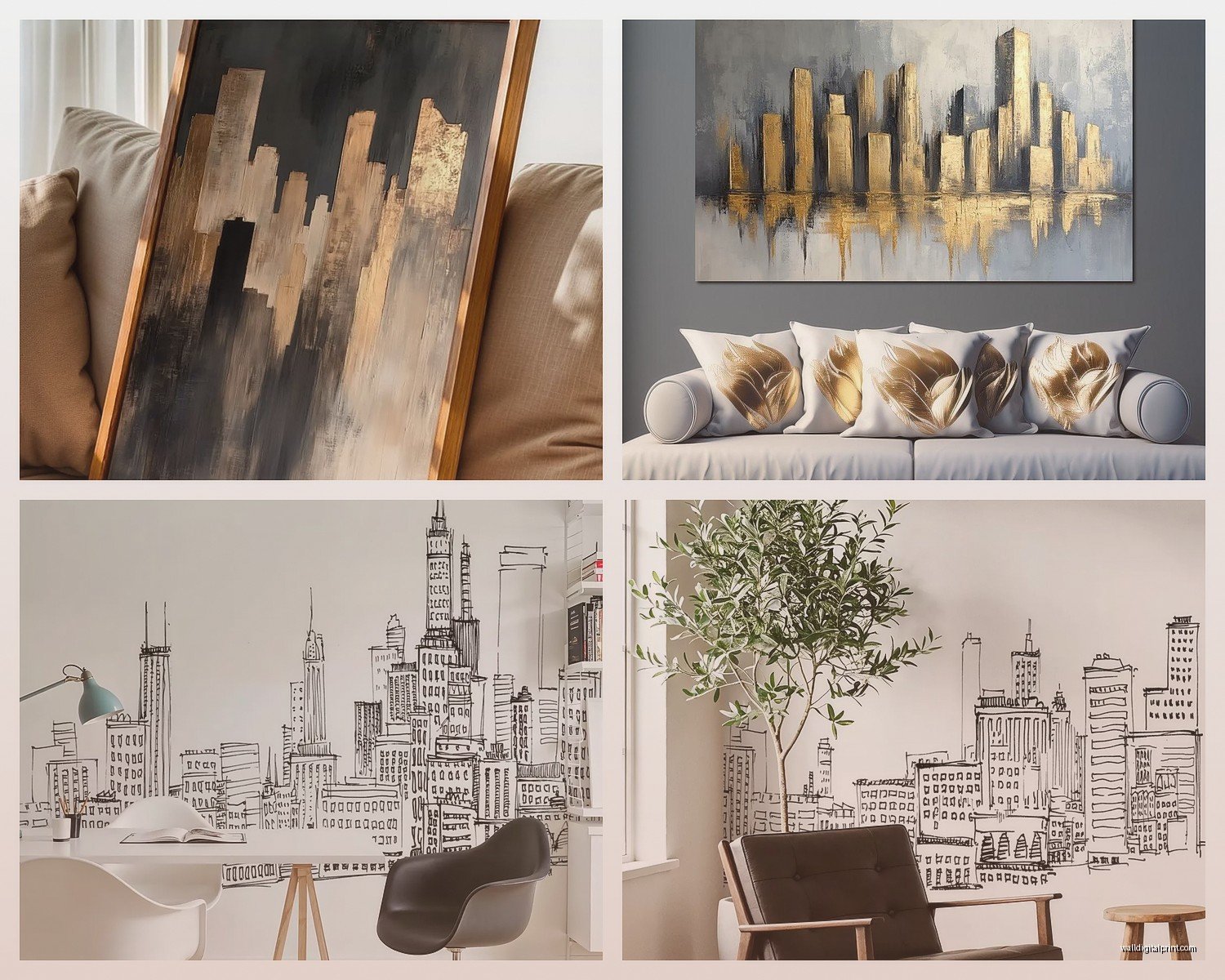
Line art though, that’s where I ended up going for my living room. It’s basically the outline of buildings in black on white or vice versa. Super clean, works with literally any decor style. I found this one of Tokyo’s skyline and it’s just… chef’s kiss. The thing about line art is it doesn’t compete with your other stuff, you know? Like if you’ve already got colorful furniture or a lot going on, the simplicity actually helps.
Size Matters Way More Than You Think
This is gonna sound obvious but I totally messed this up initially. I ordered a 16×20 print for above my couch and when it arrived it looked like a postage stamp. You need to go WAY bigger than you think. For reference, my couch is about 84 inches wide and I ended up needing a 40×30 to make it look proportional.
Here’s what actually works:
- Above a couch: at least 2/3 the width of your couch
- Narrow hallway: go tall and skinny, like 12×36 or even 10×40 if you can find it
- Bedroom above the bed: similar to couch rule, you want substantial presence
- Office/desk area: smaller works here, 16×20 to 20×24 range
I spent an embarrassing amount of time holding up newspaper taped together to the right dimensions before ordering. My cat thought it was the best game ever and destroyed my measuring attempt twice.
Metal vs Canvas vs Framed Print
So metal cutouts are really trendy right now and I get why. They’re three-dimensional which adds actual depth to your wall. I’ve got a New York skyline one that’s powder-coated black metal and it casts these cool shadows depending on the lighting. BUT they’re heavy and mounting them is honestly a pain. You’re gonna need proper anchors, not just regular nails.
Canvas is easier to hang, lighter, and usually cheaper. The texture adds something that a regular print doesn’t have. Downside is they can look kinda cheap if you go too budget-friendly. I ordered one for like $35 and you could literally see the pixels in the print when you got close. Spent $120 on a better quality one and the difference was night and day.
Framed prints are classic for a reason. You can control the frame style to match your space. I’m currently using thin black metal frames for my skyline pieces because they keep that modern minimal vibe. Wood frames can work too but they tend to make it feel more traditional, which might not be what you want with architectural art.
The Whole Lighting Thing
Wait I forgot to mention this earlier but lighting makes such a huge difference with skyline art. If you can put a picture light above it or even just position it where natural light hits during the day, it totally transforms the piece. My Tokyo line art is near a window and the way the afternoon light hits it creates this subtle shadow effect that I didn’t even plan for but looks intentional.
For metal pieces especially, consider adding a small LED strip behind them. Creates this floating effect that’s really dramatic at night. I watched someone do this on Instagram while I was supposed to be working and immediately ordered the supplies.
Which Cities Actually Work
Not all skylines are created equal for art purposes. Some cities just have more recognizable silhouettes. New York is obviously the most iconic because of the Empire State Building and the old Twin Towers in vintage prints or the new Freedom Tower. You literally cannot mistake that skyline for anywhere else.
Chicago works great because of the Willis Tower and the John Hancock building creating these distinct peaks. Same with Dubai, the Burj Khalifa is so dramatically tall it makes for really dynamic compositions.
London’s good if you want something more horizontal and sprawling. Paris is beautiful but honestly the Eiffel Tower can read as kinda cliché depending on your style. Hong Kong has an insane skyline that photographs really well, especially the Victoria Harbour views.
Here’s my hot take though: smaller cities can actually be cooler because they’re unexpected. I saw a Pittsburgh skyline piece at a friend’s place and it was such a conversation starter because the bridges make it super distinctive but most people don’t immediately recognize it.
The Color Situation
Black and white is safest and most versatile. You can put it anywhere, matches everything, timeless whatever. But don’t sleep on color options entirely.
Navy blue skylines on white backgrounds are having a moment and they add just enough color without being overwhelming. I almost went with one for my bedroom but chickened out at the last minute. Sometimes I regret it when I see them styled well on Pinterest at 11pm when I should be sleeping.
Metallic accents are another option. Gold line art on white or black looks really luxe. There’s this rose gold Miami skyline print I’ve had in my cart for like three weeks and I keep not pulling the trigger because I’m worried it’ll feel too trendy in a year.
Sunset/sunrise colors can be gorgeous if you commit to it. The key is making sure the colors actually work with your existing palette. I learned this the hard way with that Chicago print I mentioned earlier.
Where to Actually Buy This Stuff
Etsy is honestly my go-to for skyline art. You can find independent artists doing custom work, and a lot of them will do personalized versions with different color combinations or even add coordinates or dates. Just read the reviews carefully because quality varies wildly between sellers.
Society6 and Redbubble have tons of options and they’re print-on-demand so you can get the same design in different formats. I’ve ordered from both and quality has been consistently decent. Not amazing, but decent for the price.
For metal pieces, I found my best stuff on Wayfair actually. They have a surprising selection and the reviews usually include actual photos from buyers which is super helpful.
If you want something really high-end, there are galleries and artists on Saatchi Art doing original skyline work. We’re talking hundreds or thousands of dollars though. I curated a show last year that included some architectural photography and the pricing was… yeah. But if you have the budget and want investment-quality art, that’s the direction.
The Whole Gallery Wall Question
Okay so funny story, I tried to do a gallery wall with skylines from different cities and it looked completely chaotic. The key if you’re gonna do multiple pieces is keeping them really cohesive in style. All line art, all the same color scheme, all similar framing.
What actually worked better for me was mixing one large skyline piece with smaller complementary art that wasn’t skylines. Like my Tokyo print is the anchor piece and then I have some smaller abstract prints and a vintage map nearby. The skyline becomes the focal point instead of competing with other skylines.
If you really wanna do multiple cities, go for a grid arrangement with identical frames and sizing. I’ve seen this done well with like six 12×12 squares, each a different city silhouette, all in the same style. Creates a collection vibe rather than random chaos.
Mounting Tips I Wish Someone Told Me
Command strips work for lighter canvas pieces but don’t trust them with anything heavy or valuable. I had a print fall at 3am once and nearly had a heart attack.
For metal art you’re definitely gonna need wall anchors. Measure twice, drill once, all that stuff. I marked my spots with painter’s tape first and it saved me from making wonky holes.
The whole “hang it at eye level” rule is fine but also consider your furniture. If it’s above a couch, the bottom of the frame should be about 8-10 inches above the back of the couch. I hung mine too high initially and it looked like it was floating away.
Custom Options Are Worth Considering
A bunch of Etsy sellers will do custom skylines where you can pick which buildings to include or exclude, change colors, add text, whatever. I had someone create a version of my hometown’s skyline which isn’t exactly famous for its architecture but it meant something to me personally. Cost about $60 more than a standard print but felt way more special.
You can also find sellers who’ll create a skyline view from a specific address or the view from a hotel window where you got engaged or whatever. It’s sentimental without being cheesy if you do it right.
Some places even do constellation maps combined with skylines which sounds weird but I’ve seen it executed beautifully. The night sky above the city on a specific date, that kind of thing.
What Actually Makes Skyline Art Work
The thing about architectural art is it feels sophisticated without trying too hard. It’s not flowers or inspirational quotes or live laugh love nonsense. It’s structural, geometric, kind of masculine in a way that works in any space.
The best pieces have good negative space. The buildings shouldn’t fill every inch of the canvas. You want breathing room, especially with silhouette styles. That empty space is what makes the architecture pop.
Detail level matters too. Too simple and it looks like clipart. Too detailed and it gets muddy from a distance. The sweet spot is recognizable landmarks rendered cleanly with just enough detail to be interesting up close.
Honestly after testing all these different options I keep coming back to simple black line drawings on white backgrounds in thin black frames. They’re timeless, they don’t clash with anything, and they make a statement without screaming for attention. But that’s just like, my opinion after returning way too many packages this month and annoying my mail carrier.