Wall Art Guide, Wall Art Tutoriels
Pantone Wall Art: Color Swatch Designer Decor
Jun
So I’ve been absolutely obsessed with Pantone wall art lately and honestly it started because a client asked me to find “something colorful but sophisticated” which is like… the vaguest brief ever, right? But then I stumbled down this whole rabbit hole of color swatch decor and now half my studio wall is covered in different versions I’ve been testing.
Why This Actually Works When It Shouldn’t
Okay so here’s the thing about Pantone swatch art that surprised me. You’d think it would look too corporate or design-studio-y, but it doesn’t? Like, I put a set of these in my friend’s nursery (she wanted something gender-neutral but not boring) and it completely transformed the space. The key is that color swatches feel intentional without being fussy. They’re graphic enough to make a statement but not so busy that they compete with your actual furniture.
I’ve tested probably fifteen different styles at this point and the ones that work best are either really large single swatches or grouped collections that tell a color story. The medium-sized ones that try to be everything? Those usually fall flat.
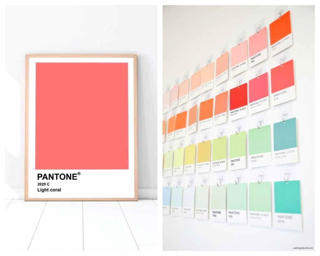
What You’re Actually Shopping For
There’s basically three categories and I wish someone had explained this to me before I wasted money on the wrong type:
- Actual licensed Pantone prints – these are official, come with the proper color codes, and cost more but the color accuracy is insane
- Pantone-inspired art – looks like the real thing, uses similar layouts, way cheaper, colors might be slightly off
- Custom swatch art – you pick your own colors and someone designs it to look like a Pantone chip
For most people honestly the inspired versions work perfectly fine. Unless you’re a designer who needs actual color references (guilty), you won’t notice the difference once it’s on the wall.
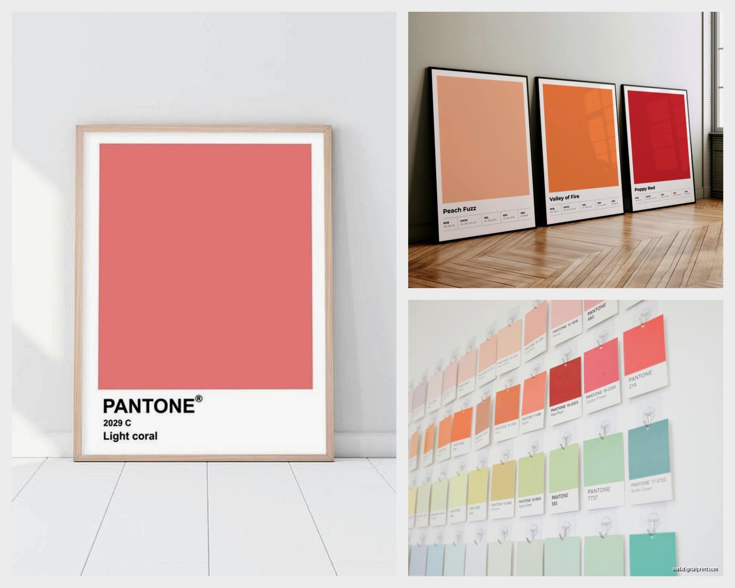
Size Matters Way More Than You Think
My biggest mistake early on was going too small. I ordered these cute 8×10 prints thinking I’d do a gallery wall and they just looked… lost? Like sad little color samples that didn’t know what they were doing there.
What actually works:
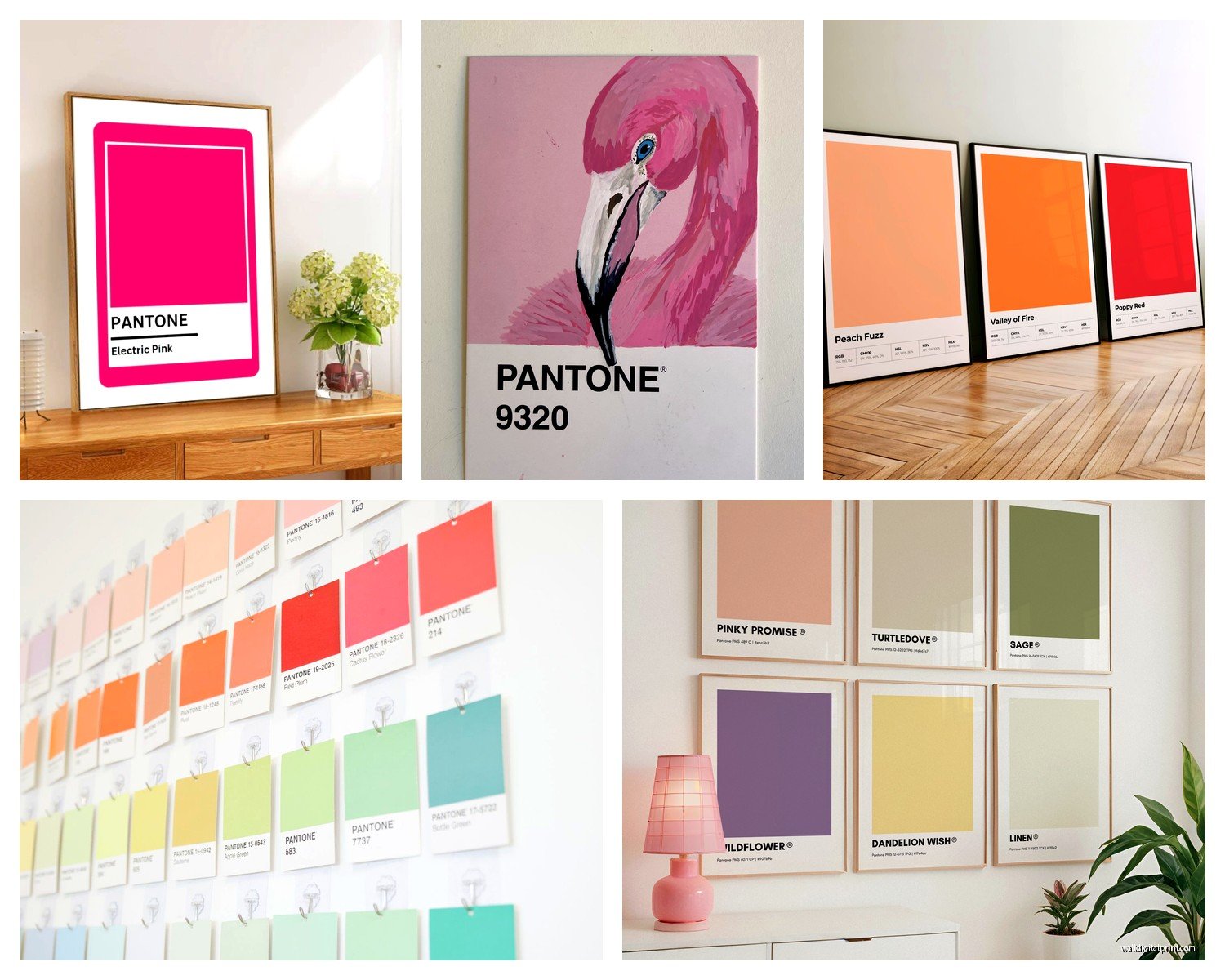
- Single large format – 24×36 or bigger, one bold color, makes a huge statement
- Triptych or diptych – three or two coordinating colors in matching frames, each piece at least 16×20
- Grid of nine – but only if each individual print is at least 12×12, otherwise it reads as cluttered
I did a client’s home office last month with a single 30×40 “Marsala” swatch (that wine color from like 2015, remember when that was everywhere?) and it anchored the entire room. One piece, maximum impact.
The Layout Thing Nobody Talks About
If you’re doing multiple swatches, they need to be either perfectly aligned or intentionally asymmetrical. That weird middle ground where they’re “sort of” lined up? Drives me crazy every time I see it. I use painter’s tape to map out the exact placement before hammering anything because I’ve definitely created extra holes in walls by eyeballing it.
Oh and another thing – the spacing between frames should be consistent. I use 2-3 inches between each piece for a cohesive look. More than 4 inches and they start reading as separate elements instead of a collection.
Color Selection Is Where People Overthink It
You don’t need to match your exact wall color or pull from your throw pillows or whatever. Actually, the pieces that work best often introduce a NEW color that wasn’t really in the room before. It gives the eye somewhere fresh to land.
My formula that’s worked pretty consistently:
- Pick one color you absolutely love – like genuinely makes you happy when you see it
- Add one neutral (not necessarily gray, could be a warm cream or soft taupe)
- Include one unexpected accent that’s slightly weird – this is what makes it interesting
I have a set in my bedroom that’s blush pink, charcoal, and this random bright coral that shouldn’t work but totally does. The coral keeps it from being too safe.
Seasonal Swapping
This is gonna sound extra but hear me out – I keep two sets of swatch prints and rotate them. Spring/summer I go brighter and cooler toned, fall/winter I switch to deeper warmer shades. Takes like ten minutes to swap them out and it completely refreshes the room. My cat knocked one off the wall last week during a switch which was… fun.
Frame Choices That Don’t Suck
The frame matters SO much with this style. I’ve learned this the hard way after trying to go cheap.
Best options I’ve actually tested:
- Simple black frames – classic, makes the colors pop, works in literally any space
- Natural wood – adds warmth, great for Scandinavian or minimalist vibes
- White frames – clean and modern but can wash out lighter colored swatches
- Metallic frames – brass or gold for glam spaces, but keep it thin profile
What doesn’t work is trying to get too decorative with the frame. Ornate molding or distressed finishes compete with the graphic simplicity of the swatch. Keep it clean.
Also get real glass or plexiglass, not just the flimsy plastic sheet that comes with cheap frames. The reflection quality affects how the colors read in different lighting.
DIY vs Buying Pre-Made
Okay so I’ve done both and here’s my honest take. If you’re crafty and have access to decent printing, DIY can work. You’ll need:
- High quality color printer or access to a print shop
- Heavy cardstock or photo paper
- Exact Pantone color codes if you want accuracy
- Design software or at least Canva skills
The problem is getting the colors to print accurately. I spent an embarrassing amount of time trying to calibrate my printer to match Pantone 2955 C (this perfect royal blue) and it kept coming out too purple. Finally gave up and ordered from a professional.
Pre-made is easier and honestly not that much more expensive when you factor in your time and materials. Etsy has tons of options, both digital downloads and physical prints. Just read reviews about color accuracy and shipping times.
The Digital Download Route
If you go digital downloads, make sure you’re getting high resolution files – at least 300 DPI. I’ve bought cheap ones that looked pixelated when printed large and that defeats the whole point of clean graphic design.
Take the file to a local print shop rather than using your home printer for anything bigger than 8×10. The color quality is just better and it’s not actually that expensive. Like $15-25 for a large format print on good paper.
Where To Actually Put These Things
I’ve installed Pantone art in basically every type of room at this point and some placements work way better than others.
Living room: Above the sofa is obvious but try behind a bar cart or console table instead. Creates a focal point without competing with the TV.
Bedroom: Over the bed works great, especially a horizontal arrangement of three swatches. Or do a vertical stack on a narrow wall next to the closet.
Home office: This is where it really shines honestly. The designer aesthetic feels appropriate and the color can be energizing. I have a bright yellow swatch above my desk that I swear makes me more productive.
Kitchen: Unexpected but amazing. A small collection near the breakfast nook or on that weird empty wall everyone has. Just keep them away from cooking surfaces where grease could be an issue.
Bathroom: Powder rooms especially. One bold swatch in a small bathroom makes it feel intentional and designed rather than just functional.
Hallways: Perfect for boring corridor walls. Line up multiple swatches in a row to draw the eye down the length of the space.
Mixing With Other Art
You can totally mix Pantone swatches with other art styles but you gotta be strategic about it. They work best with:
- Black and white photography – the color swatches add the pop of color
- Line drawings or minimalist sketches – similar graphic quality
- Abstract geometric art – plays well with the clean shapes
- Typography prints – both have that design-forward vibe
What gets weird is mixing them with traditional paintings or super detailed illustrations. The styles just clash too much.
Wait I forgot to mention – if you’re doing a gallery wall, limit yourself to 2-3 Pantone swatches max and let other pieces fill in the rest. Too many swatches and it starts looking like a paint store display.
Lighting Considerations Nobody Mentions
This is super important and I didn’t realize it until I hung a set of prints in a north-facing room with terrible natural light. The colors looked completely different than I expected – way more muted and sad.
Color swatches need good lighting to really sing. If your room is dark, either:
- Choose brighter, more saturated colors that won’t get lost
- Add picture lights or track lighting to illuminate the art
- Position them where they’ll catch natural light during the day
I installed LED picture lights on a set in my studio and it made such a difference. The colors stay true even in evening hours.
The Trendy vs Timeless Question
Look, Pantone swatch art is definitely having a moment right now, but I think it’s got staying power if you’re smart about it. The key is treating it like a design element rather than just jumping on a trend.
What makes it more timeless:
- Choosing classic colors rather than just Color of the Year picks
- Quality frames and printing that look expensive
- Thoughtful placement as part of your overall design scheme
- Avoiding super trendy color combinations (like all millennial pink everything)
I have clients who installed these three years ago and they still love them. The ones who get tired of them are usually the ones who went too matchy-matchy with their decor.
Budget Breakdown From My Experience
Since you’re probably wondering what this actually costs, here’s what I typically see:
Budget option: Digital downloads $5-15 each, cheap frames $10-20, local printing $10-20 per print. Total for three pieces: around $75-135
Mid-range: Pre-printed art from Etsy or similar $30-60 per print, decent frames $25-40. Total for three: $165-300
High-end: Licensed Pantone prints $80-150+, custom framing $100-200 per piece. Total for three: $540-1050
I usually recommend the mid-range for most people. You get good quality without going crazy on budget.
Maintenance and Longevity
These are pretty low maintenance which is nice. Keep them out of direct sunlight if you want the colors to stay true – UV light will fade any print over time. I learned this when a beautiful cobalt blue swatch in my kitchen window turned kind of washed out after a year.
Dust the frames regularly just like any art. If you used glass, clean it with regular glass cleaner. For plexiglass use a microfiber cloth without harsh chemicals because it can scratch or cloud.
The actual prints should last years if they’re decent quality. I’ve got some that are going on four years and still look fresh.
Common Mistakes I See All The Time
Too many colors in one space – pick a cohesive palette, don’t just grab every color you like
Hanging them too high – the center should be at eye level, roughly 57-60 inches from the floor
Ignoring the room’s existing color temperature – warm room needs warm-toned swatches, cool room needs cool tones
Cheap printing that looks washed out or pixelated – this completely ruins the effect
Mixing different swatch styles in one grouping – if you’re doing multiples, keep the format consistent
Okay so funny story, I once had a client who bought like twelve different Pantone prints from different sellers and wondered why they didn’t look cohesive together. Turned out they were different sizes, different design layouts, different paper stocks… it was a mess. We ended up starting over with a matching set and it looked infinitely better.
The nice thing about this whole trend is that it’s accessible and customizable. You can go super minimal with one statement piece or create an entire color story across a wall. Just keep it intentional rather than random and you’re gonna end up with something that looks way more expensive and designed than it probably was. My living room setup cost under $200 total and people always ask where I got it professionally done.