Wall Art Guide, Wall Art Tutoriels
Infinity Wall Art: Symbol & Endless Loop Designs
Jun
So I’ve been obsessing over infinity symbols in wall art lately and honestly it started because a client wanted something “meaningful but not cheesy” for their bedroom and like… that’s harder than it sounds? But infinity designs actually work really well when you get them right.
Why Infinity Symbols Don’t Have to Look Basic
Okay so the infinity symbol gets a bad rap because it’s everywhere, right? Like every motivational poster since 2010. But here’s the thing – when you treat it as an actual design element instead of just slapping the symbol on a canvas with some quote, it gets interesting. I’ve been testing different styles in my own place and at client homes for the past year and the key is honestly just avoiding anything that looks like it came from a college dorm poster section.
The endless loop thing works because your eye literally follows it around. It’s not static like a regular geometric shape. I had this piece in my living room for three months – just a simple brushed gold infinity on white – and I’d catch myself tracing it with my eyes while on work calls. My cat knocked it off the wall twice though so maybe don’t hang it where pets can reach if you have the climbing type.
Materials That Actually Matter
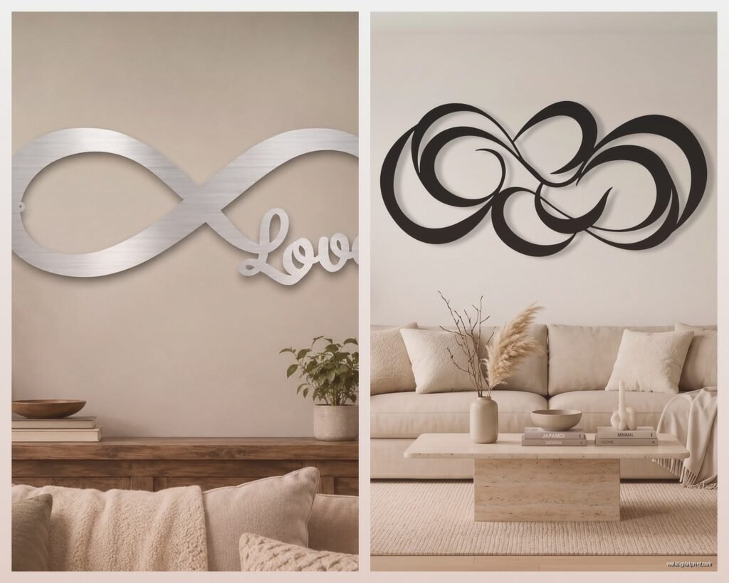
Metal infinity art is where I’d start if you want something that doesn’t read as teenage bedroom decor. The dimensional aspect changes everything. I found this brushed copper piece at a local artisan market that’s basically just the symbol cut from sheet metal, and the way it casts shadows throughout the day makes it feel way more sophisticated than flat prints.
- Metal cutouts in brass, copper, or matte black
- Wire sculptures that have actual depth
- Wooden versions with interesting grain patterns
- Textured canvas where the infinity is embossed or raised
- Minimalist line drawings that keep it subtle
The wooden ones are tricky because they can go rustic-farmhouse really fast, and unless that’s your whole vibe it’ll clash. I learned this the hard way with a reclaimed wood infinity I bought for my home office – it looked amazing in photos but in person it was giving “Live Laugh Love” energy. Returned it and got a walnut version with clean lines instead, much better.
Size and Placement Strategy
This is gonna sound weird but I actually think smaller works better for infinity symbols? Like a huge 40-inch infinity on your wall is just… a lot. It’s too literal. I’ve had better luck with pieces in the 12-24 inch range that you can layer with other art or use as an accent.
Behind the bed is obvious but kinda perfect for infinity designs because of the whole eternal love symbolism thing. Just don’t center it directly above the headboard like a hotel – offset it slightly or pair it with two smaller pieces on either side. I did this in a client’s master bedroom with a 16-inch brass infinity positioned about 8 inches to the left of center, balanced with two small abstract pieces on the right, and it looked intentional instead of matchy.
Oh and another thing – hallways are actually ideal for infinity art. The continuous loop concept mirrors the flow of the hallway itself. I hung a simple black wire infinity in my narrow hallway last month and it creates this nice rhythm as you walk past. My neighbor asked where I got it which basically never happens so I’m counting that as a win.
Color Choices That Don’t Feel Obvious
Everyone defaults to black or gold infinity symbols and yeah, those work, but I’ve been experimenting with other options. Deep navy on cream creates this subtle contrast that feels more sophisticated. Terracotta or rust tones bring warmth without being too bold. I tested a sage green infinity in my bathroom and honestly? It’s growing on me even though I was skeptical at first.
The monochromatic approach works too – like a white infinity on white where you only see it because of texture or shadow. I saw this in a gallery and it was stunning but probably too subtle for most spaces. You’d walk right past it unless the lighting was perfect.
Mixing Infinity Symbols with Other Design Elements
Wait I forgot to mention – you don’t have to use the infinity symbol alone. Some of the best pieces I’ve found incorporate it into larger compositions. There’s this one artist on Etsy (I’m blanking on the name but I can find it if you want) who does abstract paintings where the infinity is formed by negative space between color blocks. You don’t immediately see it as an infinity symbol which makes it feel less obvious.
Geometric patterns that include infinity loops work well in modern spaces. I have a print that’s basically a series of interlocking infinity shapes creating a larger pattern, and it reads more as contemporary geometric art than symbolic wall decor. Got it from an online print shop for like $40 and it’s held up well for two years now.
DIY Options If You’re Into That
Okay so funny story – I tried making my own infinity wall sculpture from wire and it was a disaster. Turns out getting a symmetrical infinity shape is harder than it looks? Mine ended up lopsided and kinda sad looking. But I’ve seen people do it successfully with:
- String art on wood boards
- Painted canvas with metallic leaf accents
- Rope or thick cord mounted on backing
- Pressed flowers arranged in the infinity shape under glass
The string art version is probably most forgiving for beginners. You just need a template printed out, nails, and embroidery thread or thin string. My friend did one for her daughter’s room in rainbow colors and it actually turned out really cute, not gonna lie.
The Continuous Loop in Abstract Form
This is where it gets interesting – you can have infinity themes without the literal symbol. Circular or flowing abstract pieces that loop back on themselves create that endless movement without being so on-the-nose. I’ve been gravitating toward these lately because they feel more mature?
Spiral designs, Möbius strips, Celtic knots – they all have that continuous quality. I hung a large black and white abstract in my dining room that has these flowing curves that circle back, and multiple people have mentioned it gives infinity vibes without me even pointing it out. It’s by some artist whose name I can never remember but I got it from a local art fair.
Avoiding the Cheesy Factor
Real talk – infinity symbols can look corny really fast. Here’s what makes them work versus what makes them look like something from a gift shop:
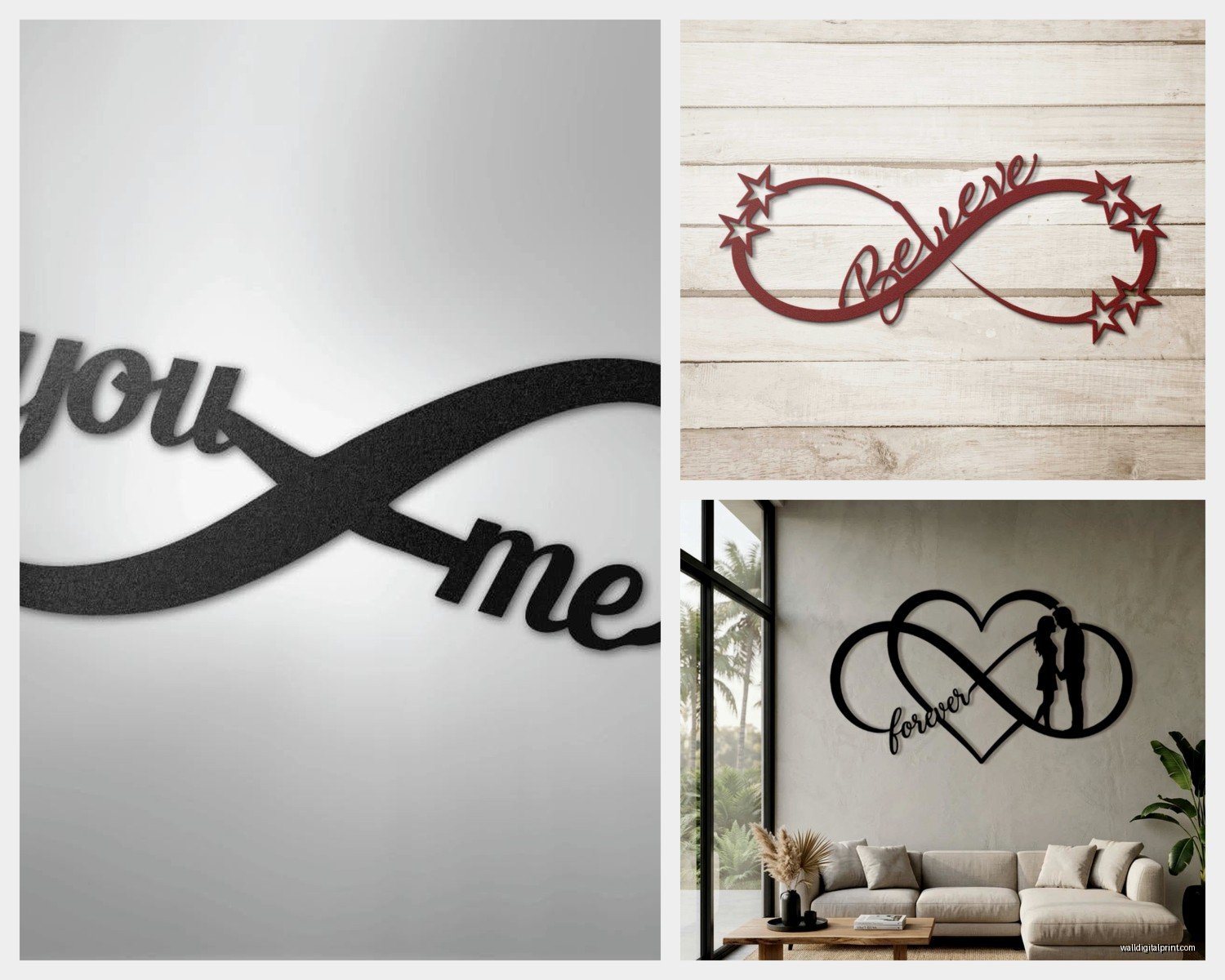
Skip anything with quotes. I don’t care how meaningful the words are, pairing infinity symbols with text almost always reads as tacky. The only exception I’ve found is if it’s in another language or uses really sophisticated typography, but even then it’s risky.
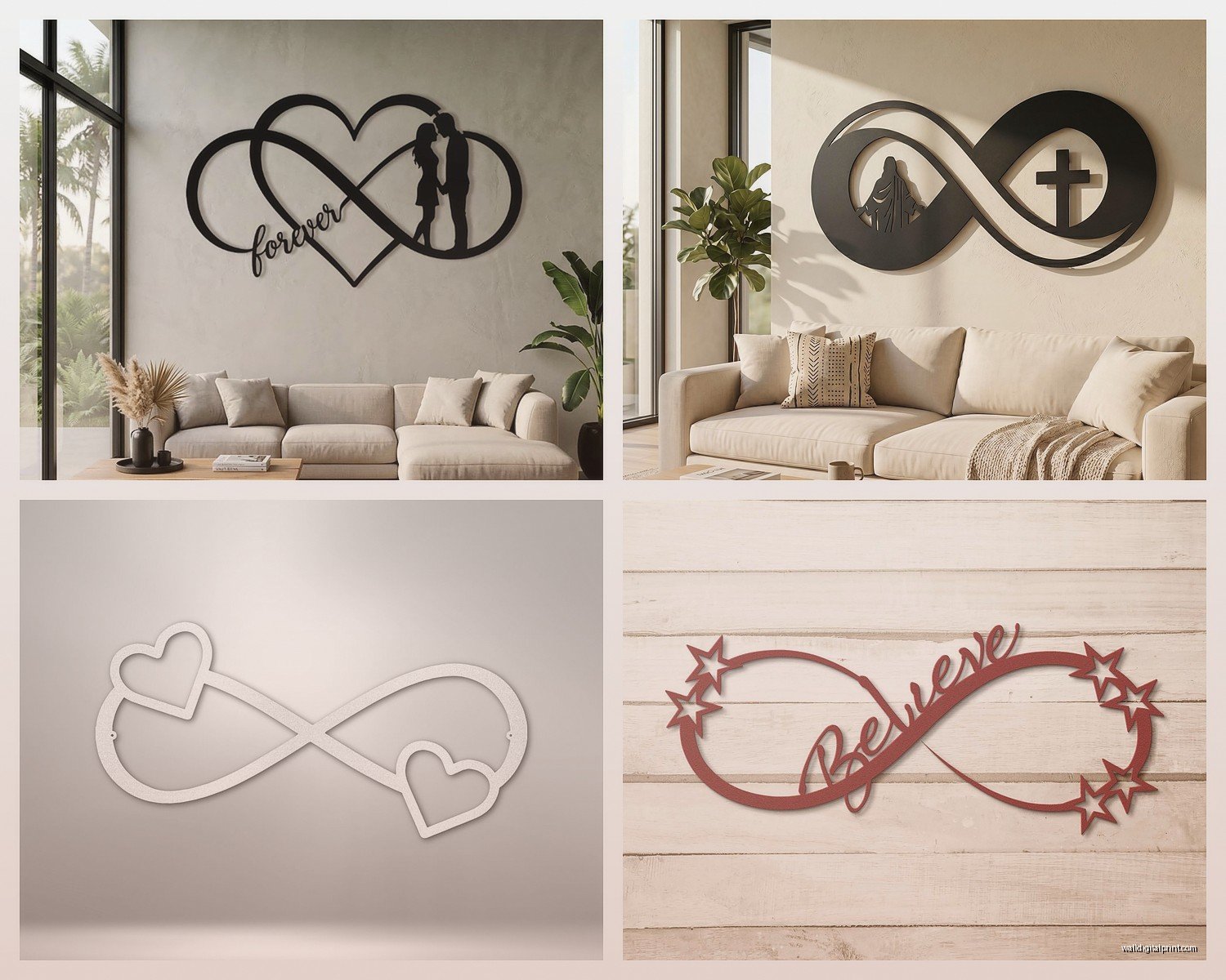
Avoid the double infinity or infinity hearts. Just… no. I had a client insist on one of these for her bedroom and I tried to talk her out of it but she was set on it, and yeah, it looked exactly as juvenile as I expected. She replaced it six months later.
The infinity with names or dates is similarly problematic unless it’s custom art from a legitimate artist who can make it feel elevated. Most of what you find online in this category is rough.
Where to Actually Buy Good Infinity Art
I’ve had the best luck with:
- Local artisan markets and craft fairs for unique metal or wood pieces
- Etsy shops that specialize in minimalist or abstract art
- Actual galleries if you want investment pieces
- West Elm and CB2 occasionally have decent modern versions
- Independent online print shops for affordable options
Amazon has options but you’re really gambling on quality. I ordered three different infinity pieces from there and two were garbage – flimsy, poor finishing, colors didn’t match photos. The third was fine but nothing special.
I’ve found some surprisingly good stuff at HomeGoods and TJ Maxx if you’re willing to dig. They get random shipments of metal wall art and I’ve scored a couple really nice infinity pieces there for under $30. You just have to check regularly because inventory changes constantly.
Styling Around Infinity Art
The rest of your wall matters obviously. I usually pair infinity pieces with other geometric or abstract art to create a cohesive gallery wall. Mixing in some organic elements like botanical prints keeps it from feeling too rigid.
Lighting makes a huge difference especially with metal pieces. I installed a picture light above my brass infinity and the way it catches the light now is completely different. If you can’t add dedicated lighting, just position it where natural light hits during the day or where a nearby lamp will catch it.
Oh and plants nearby work really well with infinity art for some reason? I have a trailing pothos on the shelf next to mine and the organic growth against the geometric symbol creates nice contrast. My cat tries to eat the plant constantly though so maybe that’s just creating extra problems.
Scale and Proportion Tips
For wall space under 3 feet wide, keep your infinity piece under 18 inches. Anything larger overwhelms the space. I made this mistake in a client’s powder room with a 24-inch piece and it dominated the tiny room in a bad way. Swapped it for a 12-inch version and suddenly the room felt balanced.
If you’re going above a console table or dresser, the infinity art should be roughly 2/3 the width of the furniture piece. Standard design rule but it really does work. I measured this out for a client’s entryway and the proportions just clicked once we got the sizing right.
Multiple small infinity pieces can work too – like three 8-inch ones arranged in a cluster. I did this in my guest bedroom with different finishes (brass, copper, and matte black) and it’s more interesting than one medium piece would’ve been.
The Symbolic Weight Question
Some people get really into the meaning of infinity symbols – eternal love, limitless possibilities, spiritual connection, whatever. That’s fine if it resonates with you but honestly I think they work just as well as pure design elements. The shape itself is aesthetically pleasing regardless of symbolism.
That said, if you ARE choosing it for the meaning, commit to quality. A cheap-looking infinity symbol kinda undermines the whole eternal/infinite concept. Invest in something well-made that’ll actually last. I have a solid brass piece that cost $120 which felt like a lot at the time but it’s still perfect three years later while cheaper pieces I bought have tarnished or bent.
The endless loop thing can represent different meanings depending on context too. I had a client who got one to represent the ongoing nature of creativity in her art studio. Another used it in a meditation space for the concept of continuous growth. You can make it mean whatever works for your space and life.
Finishes and Textures Worth Considering
Hammered metal finishes add visual interest without being too busy. I prefer these over smooth metals because they catch light differently and have more character. There’s a hammered copper infinity in my bedroom that looks almost alive with how the surface texture creates shadows.
Powder-coated metals in matte finishes feel more contemporary than shiny ones. I’ve noticed glossy infinity art tends to look cheaper even when it’s not. The matte black versions especially photograph well if you’re into that whole cohesive Instagram aesthetic thing.
Wood with visible grain brings warmth but needs to match your existing wood tones. I learned this after buying a light oak infinity for a room with dark walnut furniture and it just looked wrong. Sold it and found a darker version that actually worked with the space.
Anyway that’s most of what I’ve figured out through way too much trial and error with infinity wall art – it’s definitely not as straightforward as just buying the first symbol you see but when you get it right it’s a really versatile design element that works in most spaces.