Wall Art Guide, Wall Art Tutoriels
Palm Wall Art: Tropical Leaf & Tree Botanical Prints
Jun
So I’ve been working with palm wall art for like three years now and honestly it’s one of those things that seems super straightforward until you’re standing in your living room at 9pm holding a massive banana leaf print wondering what you’ve done with your life.
The Actually Important Size Thing Nobody Tells You
Okay so here’s what I learned the hard way – palm prints need to be bigger than you think. Like, way bigger. I had this client who ordered these cute little 8×10 palm frond prints and they just looked… sad? The whole point of tropical botanical art is that lush, oversized feeling. You want people to feel like they walked into a space, not squint at your wall.
For above a sofa, you’re looking at minimum 30 inches wide. I usually go 40-48 inches for that spot. And if you’re doing a gallery wall with multiple palm prints, each piece should be at least 16×20. Anything smaller and it reads more like clipart than actual art, which yeah I know sounds harsh but it’s true.
My golden retriever knocked over one of my 24×36 monstera prints last month and honestly the size was perfect for that entryway spot so I wasn’t even mad.
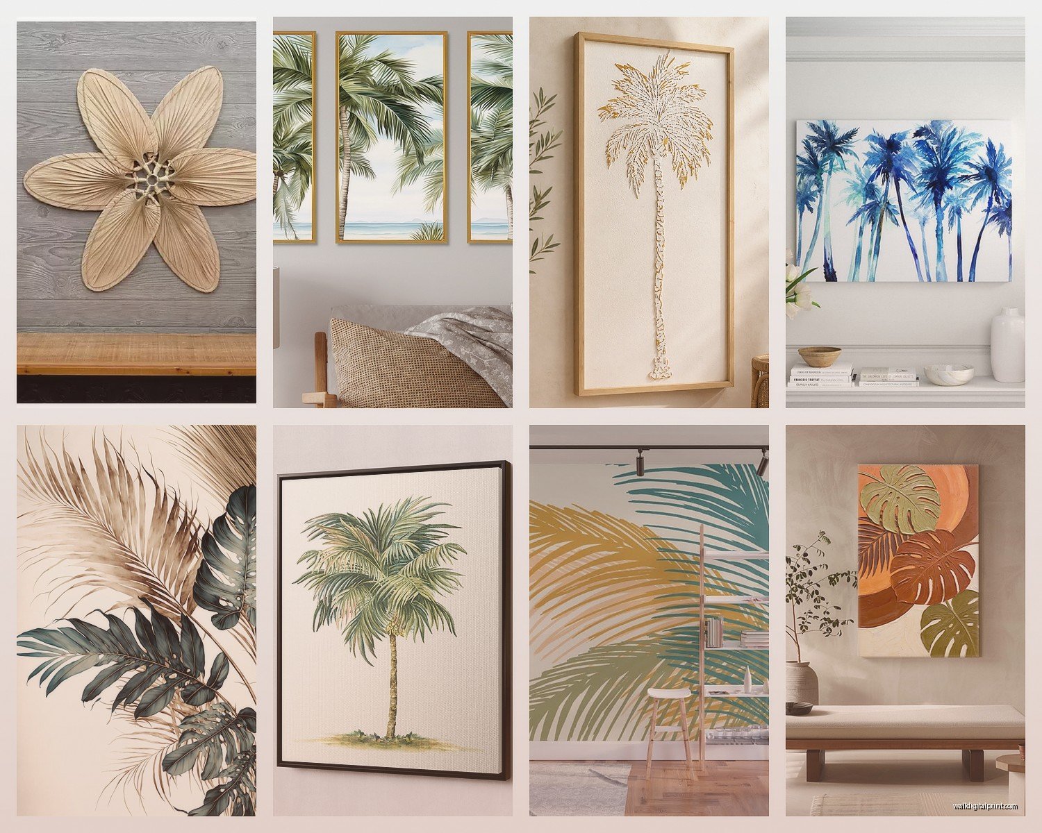
Types of Palm Art That Actually Work
There’s basically four categories that I keep coming back to, and look – some of the trendy stuff from 2019 is already looking dated so let’s focus on what holds up.
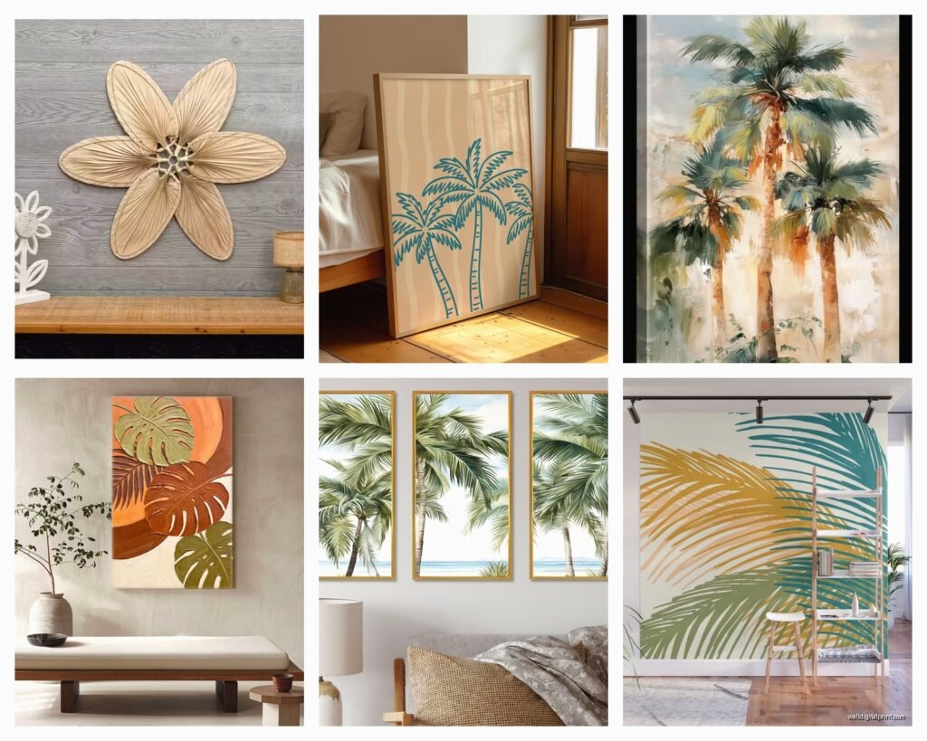
Single Leaf Portraits
These are your classic isolated palm frond or monstera leaf on a white or neutral background. They’re clean, they work in basically any space, and they don’t scream “I decorated my house in 2018.” The trick is finding ones where the leaf has actual detail and texture. You want to see the veins, the natural imperfections. Those ultra-simplified silhouette versions? Gonna age poorly.
I use these in modern spaces, Scandinavian-influenced rooms, and anywhere that needs something organic without going full jungle. They’re also great for offices because they add life without being distracting.
Vintage Botanical Illustrations
These are the detailed, scientific-looking drawings usually on aged paper backgrounds. Think old encyclopedia vibes. They’re having such a moment right now and honestly I’m here for it because they add sophistication that regular palm photos don’t. The Latin names at the bottom, the technical precision… it just elevates the whole thing.
These work amazing in traditional spaces, libraries, home offices, even bathrooms. I framed three different palm species illustrations in matching gold frames for my own bathroom and it’s probably my favorite thing I’ve done to my apartment.
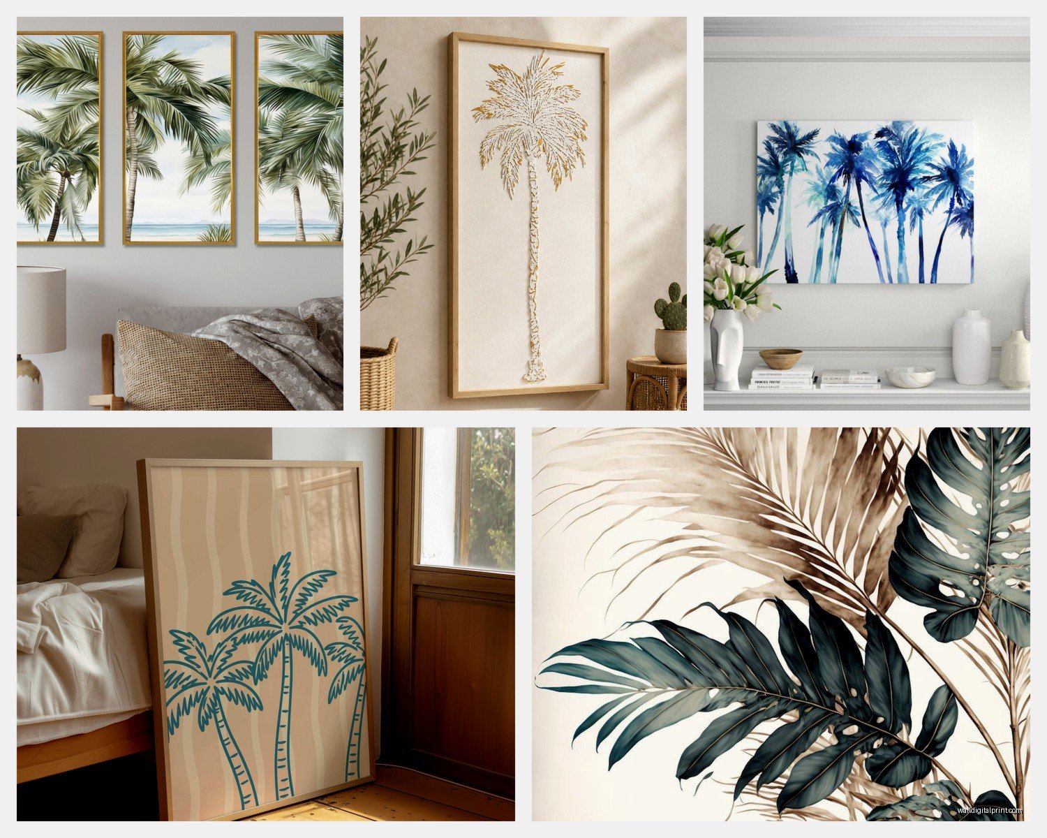
Actual Palm Tree Landscapes
Full palm trees in their natural setting – beaches, forests, whatever. These are trickier because they can easily look like hotel art if you’re not careful. The ones that work have interesting composition or lighting. Sunset palms, black and white palm groves, that kind of thing.
Best for bedrooms and spaces where you want more of a mood than a statement. Also great for beach houses obviously but like, in a less obvious way if that makes sense.
Abstract Palm Patterns
Where the leaves overlap and create patterns, usually with bold colors or high contrast. These are the most “designed” looking and they work when you want something that feels more like modern art than nature photography.
I’m honestly hit or miss with these. They’re great for contemporary spaces but you gotta be careful they don’t clash with other patterns in the room.
Color Schemes That Don’t Make Your Room Look Like a Tiki Bar
This is where people mess up constantly. They see “tropical” and immediately go full rainbow parrot mode.
The safest and most sophisticated approach is sticking with greens, whites, and blacks. Maybe some warm browns or tans. A predominantly green palm print on white background works in literally any room. I’ve used them in minimalist spaces, traditional homes, even industrial lofts.
If you want color, think about what’s already in your space. If you’ve got navy accents, look for palm prints with blue-green leaves or navy backgrounds. Blush pink in your room? There are palm prints with pink-tinged leaves or backgrounds that are actually gorgeous and not at all cheesy.
Wait I forgot to mention – black and white palm prints are like the little black dress of wall art. They work everywhere, they never look dated, and they’re easier to frame well because you don’t have to worry about color accuracy.
Framing Decisions That Actually Matter
So here’s where I probably spend too much time obsessing but whatever, it makes a difference.
For modern/contemporary spaces, I almost always do thin black frames or natural wood (light oak or maple). The thin profile keeps focus on the art. I’m talking like half inch to one inch frames max.
For traditional or eclectic spaces, you can go wider and more ornate. Gold frames with botanical prints? *Chef’s kiss*. But make sure the gold is either real gold leaf or a really good quality metallic, not that brassy cheap stuff from craft stores.
Float mounting is huge right now – where there’s space between the art and the mat, creating this shadow effect. It adds so much depth and makes even affordable prints look expensive. Totally worth the extra cost if you’re custom framing.
Oh and another thing – if you’re doing multiple palm prints together, matching frames creates cohesion even if the art styles are different. I did a whole wall with five different palm species, all different illustration styles, but unified with identical black frames and white mats. Looked intentional instead of chaotic.
The Mat Debate
Mats are not optional for palm art, sorry. The white space around the image is what makes it feel curated rather than just… stuck on the wall. I typically do 3-4 inch mats for pieces under 24×36, and 4-5 inch mats for anything larger.
All white is cleanest. Cream/ivory works if your walls aren’t bright white. I’ve done sage green mats with palm prints and it was beautiful but very specific to that room’s color scheme.
Where to Actually Put These Things
Living rooms are the obvious choice but let me tell you about some unexpected spots that work really well.
Bathrooms – humidity-loving plants as art in a humid room, it just makes sense thematically? Plus bathrooms often lack personality and a good palm print fixes that immediately. Just make sure it’s properly sealed or behind glass because steam is real.
Kitchens – especially if you’ve got a breakfast nook or dining area in there. I did a set of three vintage palm illustrations in a client’s kitchen and it completely changed the energy. Made it feel more like a bistro than just a kitchen.
Bedrooms – above the bed is standard but also consider the wall opposite your bed, the first thing you see when you wake up. Starting your day looking at something lush and green is honestly underrated.
Hallways – these dead spaces need love. A series of palm prints down a long hallway creates movement and interest.
Home offices – this is gonna sound weird but studies show looking at nature imagery reduces stress and increases focus. I have a large palm print directly in my sight line when I’m at my desk and I genuinely think it helps.
Mixing Palm Art With Other Stuff
You don’t have to commit to an all-palm wall. Actually, please don’t unless you’re specifically going for a botanical gallery situation.
Palm prints mix really well with:
- Abstract art in coordinating colors
- Black and white photography
- Other botanical prints (ferns, eucalyptus, flowers)
- Woven wall hangings or macrame
- Mirrors – this works better than you’d think
What they don’t mix well with:
- Busy patterns – if your walls already have a lot going on visually, palm prints will compete
- Other landscape art – you’ll end up with conflicting environments
- Super traditional portraiture – the vibes just clash
My client canceled last week so I spent an hour comparing different gallery wall layouts with palm prints and I’m telling you, the asymmetrical approach works better than trying to make everything perfectly aligned. A large palm print anchoring one side with smaller complementary pieces creating balance on the other side? That’s the move.
Quality Stuff to Look For
If you’re buying prints online, resolution matters hugely. You want at least 300 DPI for anything you’re printing large. Fuzzy palm leaves look terrible and cheap.
For photography prints, look for ones with good depth of field and lighting. The leaf should have dimension, not look flat.
For illustrations and vintage prints, check that the colors aren’t washed out and the details are crisp. A lot of reproductions of vintage botanicals lose quality in the scanning process.
Archival quality paper and inks matter if you’re spending good money. They won’t fade or yellow over time. I learned this the hard way when a client’s “bargain” palm print turned orange-ish after six months near a window.
The Actual Shopping Part
I source from all over depending on budget and what look we’re going for. Etsy has tons of downloadable botanical prints you can print yourself – just make sure the seller includes high res files. This is the most affordable option if you’re okay with handling printing and framing.
For ready-to-hang stuff, I’ve had good luck with Desenio, The Poster Club, and honestly sometimes Target has surprisingly good options. West Elm’s palm prints are nice but overpriced IMO.
If you want something unique, check out actual botanical artists on Instagram. A lot of them sell prints directly and the quality is usually phenomenal because it’s their actual work, not mass-produced stuff.
Vintage shops and antique stores sometimes have real botanical prints from old books. These are amazing framed and they have authenticity that reproductions don’t.
Common Mistakes I See Constantly
Hanging them too high – art should be at eye level, which is usually 57-60 inches to the center of the piece. Not to the bottom, to the CENTER. I cannot tell you how many times I’ve walked into homes where the art is basically on the ceiling.
Going too matchy-matchy – if you have three identical palm prints in identical frames, it looks more like a doctor’s office than a curated space. Mix up the species, the angles, the styles a bit.
Ignoring scale – a tiny palm print on a massive wall looks lost. A huge palm print in a tiny powder room is overwhelming. The art should be proportional to the wall space.
Forgetting about lighting – palm art needs decent lighting to look good. If it’s in a dark corner, it’ll just disappear. Add a picture light or make sure there’s adequate ambient light.
Okay so that’s basically everything I’ve learned from three years of working with palm prints and tropical botanical art. It’s really not complicated once you understand the basics, and honestly? Even if you make some mistakes, green leafy things on walls tend to look pretty good anyway. Just avoid the tiny prints and the tiki bar colors and you’ll be fine.