Wall Art Guide, Wall Art Tutoriels
Japandi Wall Art: Japanese Scandinavian Minimal Fusion
Nov
So I’ve been totally obsessed with Japandi wall art lately and honestly it’s one of those things where you think “oh this’ll be easy” and then you’re standing in your living room at midnight moving the same print two inches to the left for the fifth time.
The whole Japanese-Scandinavian fusion thing sounds fancy but really it’s just about finding that sweet spot between wabi-sabi (the Japanese appreciation for imperfection) and hygge minimalism. Which sounds simple until you actually try to buy pieces that work together without looking like you just grabbed random stuff from two different IKEA sections.
What Actually Makes Wall Art “Japandi”
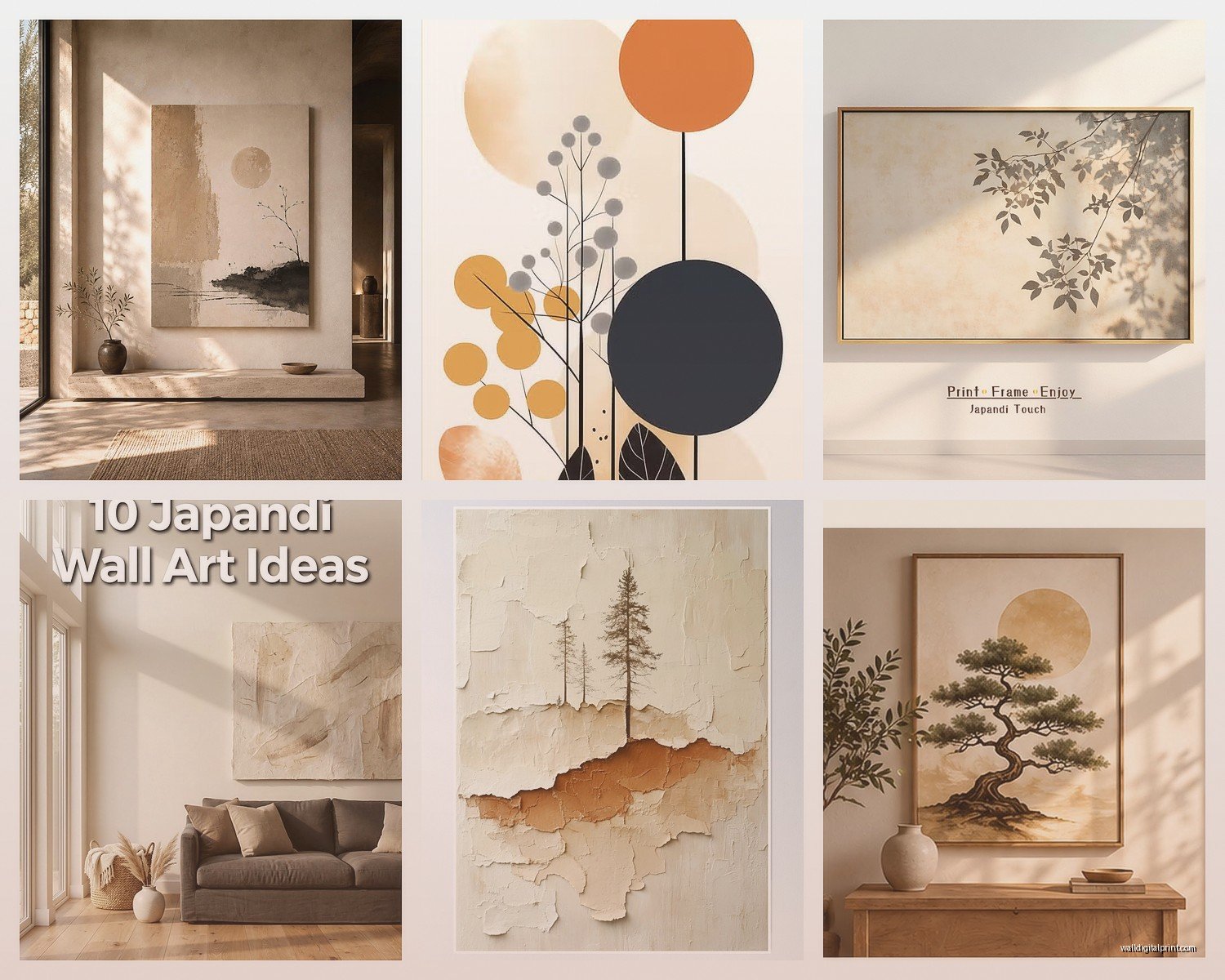
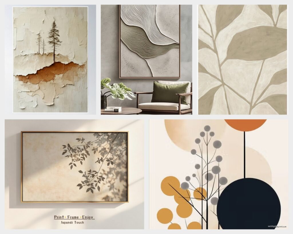
Okay so the color palette is where most people mess up. You’re looking at earthy neutrals – think warm beiges, soft greys, muted terracotta, sage green, and lots of cream and off-white. The Scandinavian side brings in those cooler greys and whites, while the Japanese influence adds warmth through natural wood tones and occasionally a deep charcoal or ink black.
I learned this the hard way when I bought this gorgeous print that I thought was perfect – beautiful minimalist mountain scene – but it had this bright white background that just felt too stark. It clashed with everything. The frame’s still sitting in my closet actually, my cat likes to sleep on the box.
The subject matter should be nature-focused or geometric but in a soft way. Not the sharp geometric patterns you see in modern art, more like organic shapes, brushstroke circles (enso circles are huge in this style), line drawings of plants, abstract landscapes, or those simple botanical prints. Oh and another thing – negative space is your best friend. If the art feels crowded or busy, it’s probably not gonna work.
Frame Choices That Won’t Ruin Everything
This is gonna sound weird but the frame matters MORE than the actual art sometimes. I’ve seen people take a mediocre print and make it look expensive with the right frame, and vice versa.
Natural wood frames in light oak, ash, or maple are the safest bet. The grain should be visible but subtle – you don’t want that super rustic barnwood look. Black frames work too, especially thin ones, but they need to be matte black not glossy. White frames can work but they need to be warm white or cream, not that stark gallery white.
I usually go for frames that are about 1-2 inches wide. Anything thicker starts feeling too traditional, anything thinner and it can look cheap unless you’re spending serious money on quality materials.
Wait I forgot to mention – you can also do frameless if you’re mounting on wood panels or using canvas prints. There’s something very Japanese about the simplicity of a canvas edge showing, but make sure the sides are finished nicely.
Mix and Match Frame Strategy
You don’t have to match everything perfectly and honestly it looks better if you don’t. I’ll do like three light wood frames and one black frame in a gallery wall, or alternate between framed prints and a couple mounted canvases. The key is keeping the COLOR palette cohesive even if the frames vary slightly.
Where to Actually Find Good Pieces
Etsy is honestly my go-to but you gotta wade through a lot of generic stuff. Search for “wabi sabi art print” or “minimalist botanical line art” or “abstract neutral landscape” rather than just “Japandi art” because that term gets slapped on everything now.
I’ve had good luck with these specific things to look for:
– Ink wash paintings or prints that mimic sumi-e style
– Single line drawings of faces or bodies (very Scandi but works if colors are warm)
– Abstract shapes in earthy tones
– Dried grass or pampas photography
– Minimalist mountain ranges or horizon lines
– Zen circle prints
Oh and secondhand stores are actually amazing for this if you’re patient. I found this vintage Japanese woodblock print at a thrift store for like twelve dollars, reframed it in light oak, and it’s literally the centerpiece of my dining room now. People always ask where I got it.
For ready-made stuff, Target’s Threshold line sometimes has decent options, and West Elm does too though they’re pricier. Project 62 at Target can be hit or miss but I’ve found a few good pieces there.
The Layout Part That Everyone Overthinks
Okay so funny story – I once spent three hours planning a gallery wall with paper templates taped to the wall, measurements, the whole thing. Then my friend came over and just eyeballed four frames in like ten minutes and it looked better than my planned version. Sometimes you gotta just go with it.
That said, here’s what actually works:
Single Statement Piece
This is the easiest and often the most impactful. One large piece (like 30×40 inches or bigger) centered above a sofa or bed. Keep it simple. The art should be pretty minimal itself since it’s taking up a lot of real estate.
Diptych or Triptych
Two or three panels that go together. Space them about 2-3 inches apart. This is very Japandi because it has that balanced asymmetry thing going on. I love doing this with abstract landscapes where each panel shows a different layer – like sky, mountains, foreground.
Grid Layout
Four or six same-sized frames in a perfect grid. Very Scandinavian in its order but you can make it Japanese by choosing art with lots of negative space. Keep the spacing consistent – usually 2-4 inches between frames works.
Asymmetrical Gallery Wall
This is the trickiest but looks amazing when done right. Mix different sizes but keep everything aligned along either horizontal or vertical lines. Don’t just randomly scatter things. I usually start with the largest piece and build around it, making sure there’s breathing room between pieces.
The height thing matters too – center of the art should be around 57-60 inches from the floor, which is standard gallery height. Unless you’re doing a gallery wall that extends higher, then just make sure the visual center is around that height.
DIY Options If You’re On a Budget
Look, not everyone wants to spend $200 on a single print, I get it. Here’s what I’ve done that actually turned out decent:
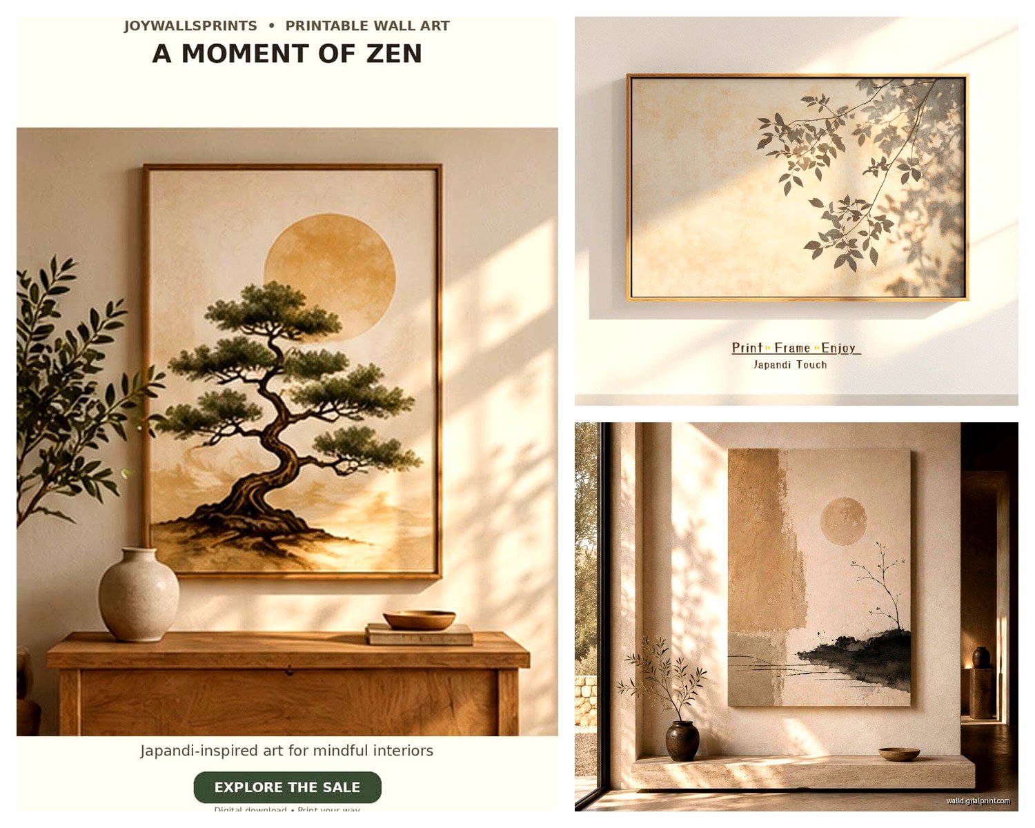
Print your own from digital downloads on Etsy. You can get high-res files for like $5-10, then print them at a local print shop or even FedEx. Use good quality paper – ask for matte cardstock or fine art paper. The difference between regular printer paper and decent paper is HUGE.
Frame pressed botanicals or dried flowers. Very wabi-sabi, very free if you collect your own. Just make sure they’re completely dry before sealing them under glass or they’ll get moldy (learned that one the hard way, yikes).
Paint your own abstract stuff. I’m serious – get some neutral acrylic paints, a canvas, and just make organic shapes or brush strokes. The imperfection is literally part of the aesthetic. My client canceled last month so I spent an hour comparing different beige paints and ended up making three canvases with just different tones of tan and grey brushstrokes. They’re hanging in my hallway and people think I bought them somewhere fancy.
The Printable Route Details
If you’re gonna print stuff yourself, get files that are at least 300 DPI for the size you want. So if you want an 18×24 print, make sure the file is actually sized for that or larger. Scaling up a small file looks blurry and cheap.
Print on matte paper, not glossy. Glossy feels too modern and slick for this aesthetic. And honestly, printing at Costco or your local camera shop is way cheaper than you’d think – usually like $15-30 for a large print depending on size.
Common Mistakes I See All the Time
Hanging things too high. I swear everyone does this. Your art is not a crown molding decoration, it should be at eye level where you can actually appreciate it.
Choosing art that’s too small for the space. That 16×20 print is gonna look like a postage stamp above your king-sized bed. You need something substantial or a grouping of pieces.
Mixing in colors that are too bright or saturated. I know that pop of coral looks cute but it’s gonna throw off the whole calm vibe. If you want color, stick to muted versions – dusty rose instead of hot pink, sage instead of kelly green, rust instead of bright orange.
Getting too matchy-matchy. Everything doesn’t need to be the exact same shade of beige or have identical frames. Some variation keeps it from looking like a hotel room.
Forgetting about texture. All prints can feel flat – consider mixing in a woven wall hanging, a ceramic piece, or some dimensional element. Very Japanese to incorporate different materials.
Lighting Makes or Breaks It
Natural light is obviously ideal but if your wall doesn’t get much, consider adding picture lights or adjusting your ambient lighting. Warm LED bulbs (2700-3000K) work way better than cool white lights for this aesthetic.
I have these wireless picture lights from Amazon that were like $25 each and they make such a difference for the pieces that are on my darker walls. Battery operated so no weird cords showing.
Styling Around Your Wall Art
The art shouldn’t exist in a vacuum. I like to echo the colors or themes in other decor nearby. If you’ve got a print with terracotta tones, maybe add a rust-colored throw pillow or a ceramic vase in that shade somewhere in the room.
Keep surfaces below the art relatively minimal though. A sculptural vase, a small plant, maybe a couple books – but don’t clutter it up. The Japandi thing is all about restraint and intentionality.
Oh and plants are basically mandatory for this vibe. A fiddle leaf fig, snake plant, or even just some eucalyptus in a simple vase ties everything together.
The whole point is creating this calm, balanced space that feels both warm and clean at the same time. It’s that intersection of Scandinavian function and Japanese mindfulness, and the wall art is usually what sets the tone for everything else in the room. Just don’t overthink it to the point where you’re paralyzed – sometimes you gotta just hang something up and live with it for a week before you know if it really works.