Wall Art Guide, Wall Art Tutoriels
Word Wall Art: Text Typography Letter Message Designs
Nov
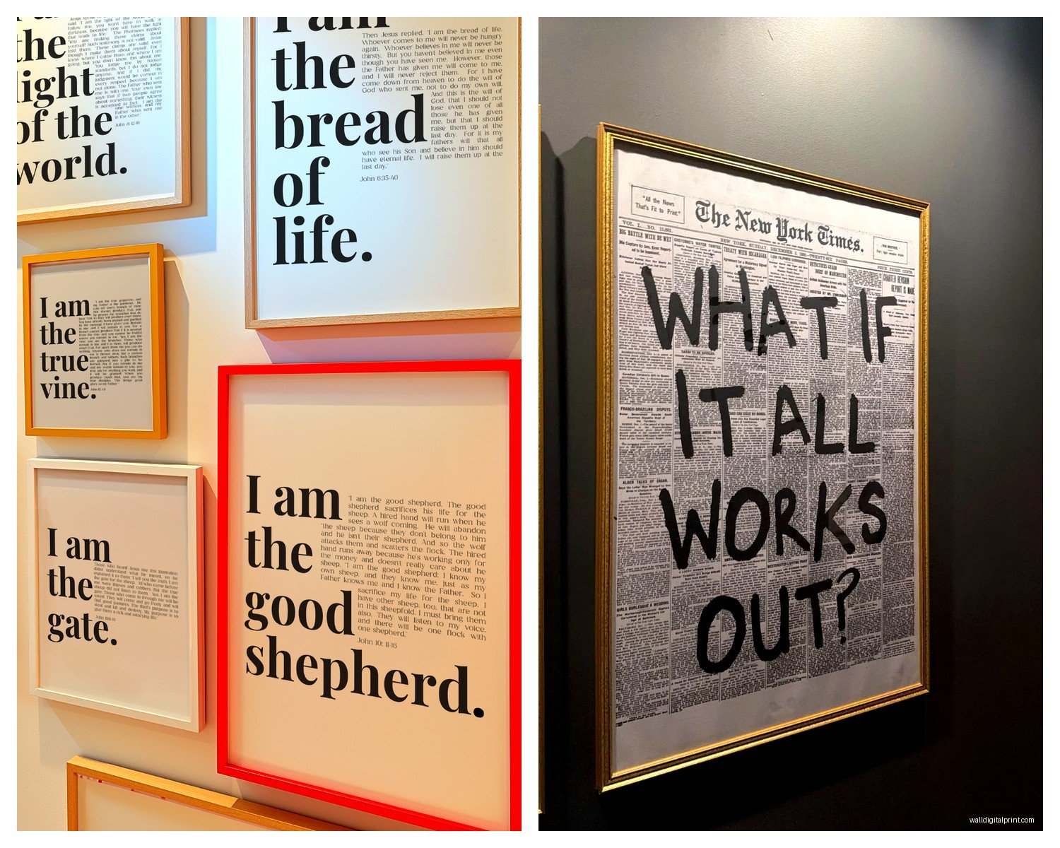
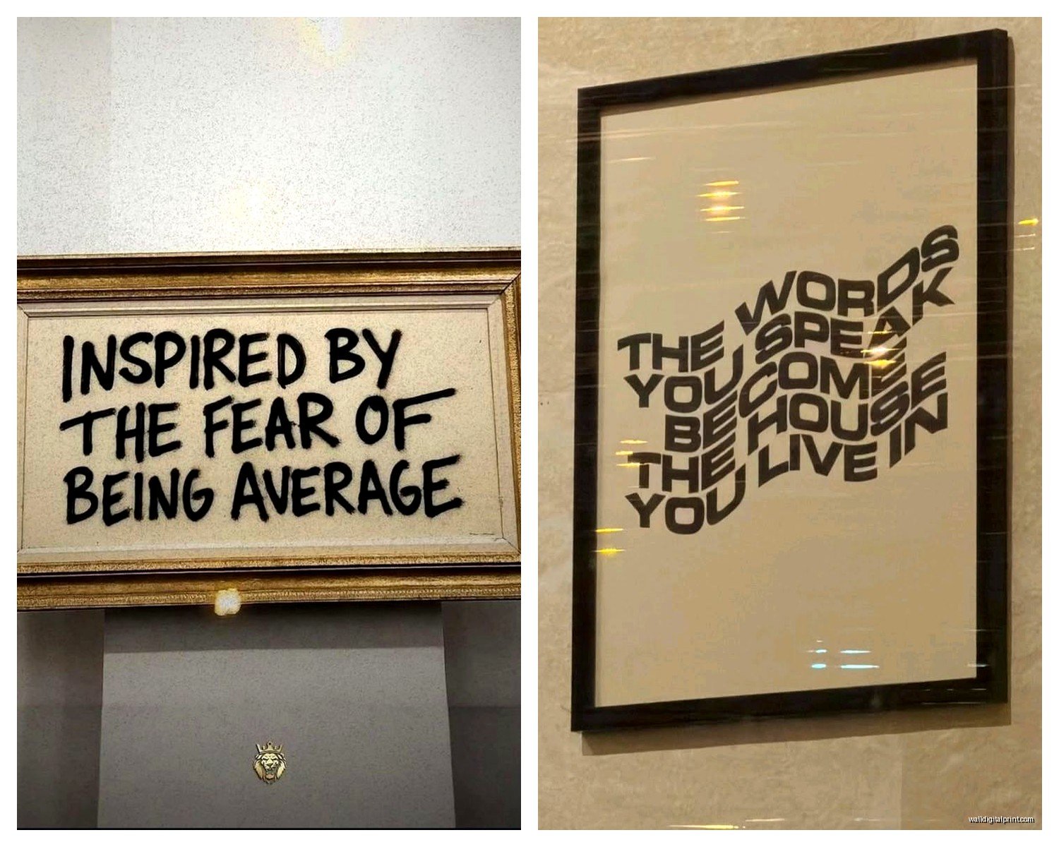
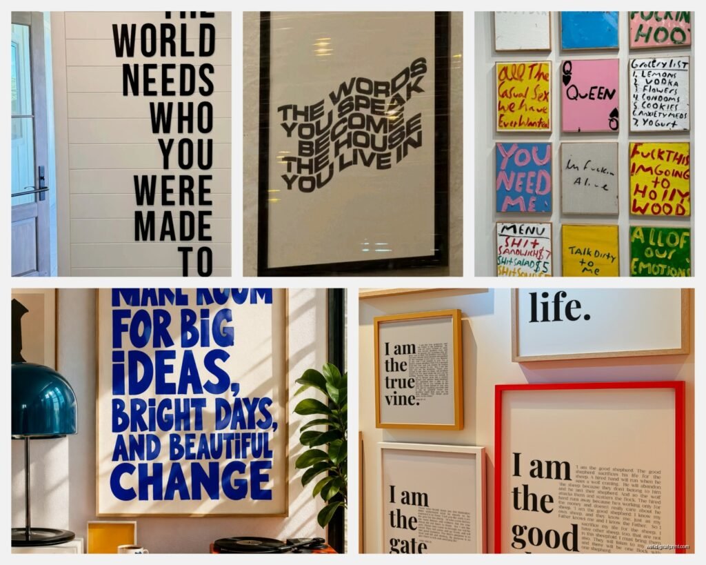
So I’ve been obsessing over word wall art lately because honestly it’s the fastest way to make a boring wall look intentional, and I feel like I’ve tested literally every type at this point…
The Different Types You’ll Actually See
Okay so there’s basically like four main categories and they’re all super different. You’ve got your vinyl decals which are those sticky letter things, then there’s actual physical letters (wood or metal usually), canvas prints with quotes, and then the fancy custom neon or LED stuff.
The vinyl decals are what I started with because they’re cheap and you can peel them off if you mess up. I put one in my office that said something about coffee and deadlines and my cat immediately tried to scratch it off the wall so… that was fun. But they work great if you’re renting or commitment-phobic about wall stuff. They run like $15-40 depending on size and you just stick them on. The tricky part is getting them straight which I’ll get to in a sec.
Physical letter art is what I’ve been doing more recently. Like those individual wooden or metal letters you mount separately. Way more dimensional and honestly looks more expensive than it is. I found these black metal ones at a home goods store for like $8 per letter and spelled out CREATE above my workspace and everyone asks where I got it custom made and I’m like… nope, Target clearance section.
Choosing What Words Actually Work
This is where people mess up the most. They either go too long (nobody wants to read a paragraph on your wall) or too generic. “Live Laugh Love” is… I mean it’s been done. A lot.
What actually works is either:
– Single impactful words (BLOOM, GATHER, BREATHE… you get it)
– Super short phrases, like 2-4 words max
– Something personal that means something specific to you
– Lyrics or book quotes that aren’t super obvious
I did “She believed she could” without the “so she did” part in a client’s home office and it felt way less cheesy? Sometimes cutting off the expected ending makes it more interesting.
Oh and another thing – think about the room’s purpose. Kitchen gets food-related words or family gathering stuff. Bedroom should be calm words. Home office needs motivation but not the cringey kind. I saw someone put “HUSTLE” in their bedroom once and I was like… no wonder you can’t sleep, Susan.
Size and Placement Because This is Where It Gets Real
So the biggest mistake is going too small. I did this in my first apartment and the word just looked lost on the wall like it was apologizing for existing.
For a standard wall (let’s say above a couch or bed), you want your word art to take up about 2/3 to 3/4 of the furniture width below it. So if your couch is 84 inches, your art should span like 55-65 inches roughly. Don’t get too mathematical about it but that’s the zone.
Height-wise, hang it so the center is at eye level, which is usually 57-60 inches from the floor. But if it’s going above furniture, you want like 6-8 inches between the furniture top and the bottom of your letters.
I’m gonna be honest, I still use painters tape to map it out first because I’ve definitely hammered holes in the wrong spot more times than I’ll admit. My landlord loves me.
The Vinyl Application Process That Nobody Tells You Right
Okay so when you get vinyl decals they come with transfer tape on top and backing paper on bottom. You’re supposed to peel the backing, apply it to the wall using the transfer tape, then peel the transfer tape off. Simple right? WRONG.
First, clean your wall with rubbing alcohol and let it dry completely. Any dust or texture and it won’t stick properly.
Then – and this is key – use a level or painter’s tape to mark your guideline. I use blue painter’s tape to make a horizontal line where I want the bottom of my letters. Some people do pencil but then you gotta erase it and it’s annoying.
Apply from the center outward, using a credit card or squeegee to smooth out bubbles as you go. Work slowly. Like slower than you think. I rushed one and had to peel it back up and it stretched weird and I had to order another one.
Wait like 15-30 minutes before you try to peel off the transfer tape. Peel it back on itself at a sharp angle, not straight up. If letters start to come up with it, press it back down and wait longer.
Physical Letter Mounting
Wood or metal letters are heavier so you need actual hardware usually. Most come with sawtooth hangers or you can add command strips if they’re lightweight.
For the individual letter thing I did, I literally laid them out on the floor first to figure out spacing. Then I measured and marked each letter’s position on the wall with pencil. Used a level across all of them to make sure they weren’t gonna look drunk.
Small finishing nails work for wooden letters if you’re allowed to put holes in walls. For metal, you might need anchors depending on weight. Command strips work for lighter stuff but check the weight limit because I’ve had letters crash down at 3am and nearly died of a heart attack.
Spacing between letters should be consistent but not too wide. I usually do like 1/4 to 1/2 inch between letters for a word. Feels connected but each letter still has definition.
Font Choices That Don’t Look Like a Pinterest Fail
If you’re doing custom or printable word art, font matters SO much.
Sans serif fonts (no little feet on the letters) look modern and clean. Think Helvetica, Futura, Montserrat. Good for minimalist spaces or contemporary vibes.
Serif fonts (with the little feet) feel more classic and traditional. Garamond, Baskerville, that kind of thing. Works in formal spaces or when you want elegant.
Script fonts are tricky because they can look really cheap really fast. If you’re going script, make sure it’s actually readable from a few feet away. Some of those super swirly ones just look like squiggles from across the room.
My general rule is stick to one font per room. Maybe two if they’re really different styles but honestly one is safer.
Colors and Contrast
Your words need to actually be readable which sounds obvious but you’d be surprised. Light walls need dark text, dark walls need light text. The amount of times I’ve seen gray text on beige walls where you can barely read it…
Black is always safe. White works on any colored wall. Metallics (gold, silver, copper) add a fancy touch but make sure they’re not too shiny or they’ll glare weird in certain light.
I did rose gold letters in my bathroom and depending on the time of day they either look amazing or completely disappear so that was a learning experience. Natural light matters a lot with metallics.
Where to Actually Buy This Stuff
Etsy is great for custom vinyl decals. You can get exactly what you want in whatever size and font. Usually $20-60 depending on complexity. Just read reviews because quality varies wildly between sellers.
Amazon has tons of pre-made options, especially physical letters. The metal and wood letter selection is huge. Prime shipping means you can have it in two days which is dangerous for impulse decorating decisions.
Target and HomeGoods for finding individual letters in person. I like being able to see the actual finish and weight before buying. Plus clearance sections are goldmines.
For the fancy LED neon stuff, there are companies like YellowPop or custom neon shops on Etsy. These run $100-300+ but they’re statement pieces. I have a client who got “Good Vibes” in pink neon for her salon and it’s literally the most photographed spot in there.
Printable word art is the budget option. Sites like Etsy sell digital downloads for like $5-10, you print them yourself at home or Staples, then frame them. The quality depends on your printer obviously but it works.
DIY Custom Word Art
If you wanna make your own, it’s actually not that hard. For painted canvas, get a canvas from the craft store (wait for the 50% off sales they have constantly), paint the background color, then use vinyl letter stickers as a mask or freehand paint your words.
I’ve done the stencil method where you print out letters, cut them out, trace onto canvas, then paint inside the lines. Takes forever but costs like $10 total.
Wood word art you can make with a scroll saw if you’re handy or have a friend with tools. Print your word in a chunky font, trace it onto wood, cut it out, sand it, stain or paint. My brother made me one that says “Coffee First” and it only looks slightly crooked.
Common Mistakes I See All The Time
Going too matchy-matchy with the room colors. Your word art can be a different color, it doesn’t have to coordinate with your throw pillows. Actually a contrasting color often works better.
Hanging multiple word pieces too close together. They compete for attention and it gets cluttered. One word art piece per wall usually, unless they’re part of a gallery wall situation.
Choosing trendy phrases that you’ll hate in six months. I did “But First Coffee” in 2015 and was over it by 2016. Go with something more timeless or at least something you actually connect with.
Not considering the viewing distance. If it’s in a hallway where you walk right past it, smaller works. If it’s across a large living room, it needs to be big enough to read from the couch.
Oh wait I forgot to mention – textured walls are the enemy of vinyl decals. If you have that orange peel texture or heavy texture, vinyl won’t stick well. Physical letters or framed prints are better options for textured walls.
Styling Around Word Art
Word art works best when it’s not the only thing on the wall. Pair it with smaller framed photos or art pieces, or put it above furniture with decor on the surface below.
I usually do word art as the focal point, then flank it with smaller pieces if needed. Or do the word art off-center in a gallery wall arrangement with photos and other art mixed in.
Plants nearby always help. I don’t know why but greenery makes word art feel less stark. Maybe it balances the geometric lines of letters with organic shapes? I’m not a scientist but it works.
Lighting matters too. If you have adjustable lighting, aim a light at your word art to create some drama. Makes it feel more intentional and gallery-like.
Maintenance and Long-Term Stuff
Vinyl can peel over time, especially in humid rooms or if it gets direct sunlight. I had a decal in my bathroom that started lifting at the edges after like a year. You can try to re-stick it with a hair dryer to warm up the adhesive but honestly it’s easier to just replace it.
Dust physical letters regularly because they collect dust like crazy, especially ornate ones with details. I just use a microfiber cloth every couple weeks.
If you ever need to remove vinyl, use a hair dryer to heat it up first. Makes it peel off way easier without taking paint with it. Then use rubbing alcohol to remove any sticky residue.
Painted wood letters can be repainted if you get sick of the color which is nice. I’ve repainted the same wooden letters three times now because I’m indecisive about my office color scheme apparently.
The investment for word wall art ranges from like $5 for a printable to $500+ for custom neon, so there’s literally options for every budget. Start cheap if you’re unsure, you can always upgrade later. I started with a $12 vinyl decal five years ago and now I’m out here mounting metal letters with power tools so it’s a slippery slope honestly.