Wall Art Guide, Wall Art Tutoriels
Large Black and White Wall Art: Oversized Monochrome
May
So I’ve been obsessing over large black and white wall art lately because honestly, my living room looked like a sad beige box until I figured this whole thing out. Let me tell you what actually works because I’ve made literally every mistake possible.
Why Size Actually Matters More Than You Think
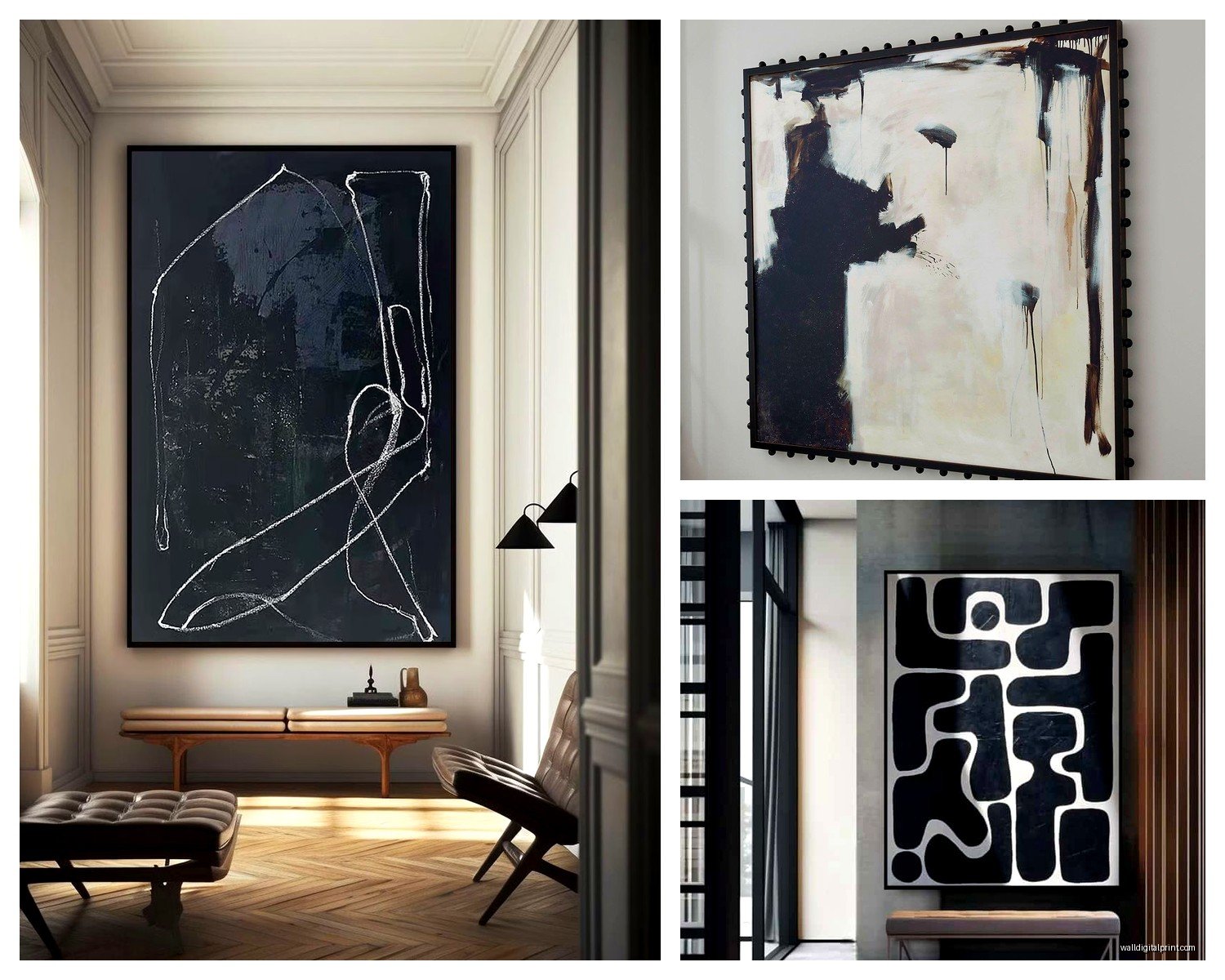
Okay so the biggest thing everyone gets wrong is going too small. Like, you need to think WAY bigger than feels comfortable at first. I’m talking at least 40×60 inches for a standard living room wall. My client last month bought this “large” piece that was 24×36 and it looked like a postage stamp above her sectional. We had to return it and go with a 60×80 instead and suddenly the whole room made sense.
The rule I use is your art should take up about 2/3 to 3/4 of your furniture width. So if you’ve got a 90-inch sofa, you’re looking at 60-67 inches of art width minimum. And honestly? I usually go bigger. Better to make a statement than have it look like an afterthought.
Multi-Panel vs Single Canvas
This is where it gets interesting. You can do one massive piece or go with a triptych situation. I’m personally obsessed with 3-panel sets right now because they give you flexibility. Like if you move or your wall dimensions change, you can adjust the spacing between panels. Plus they’re easier to hang because each piece weighs less.
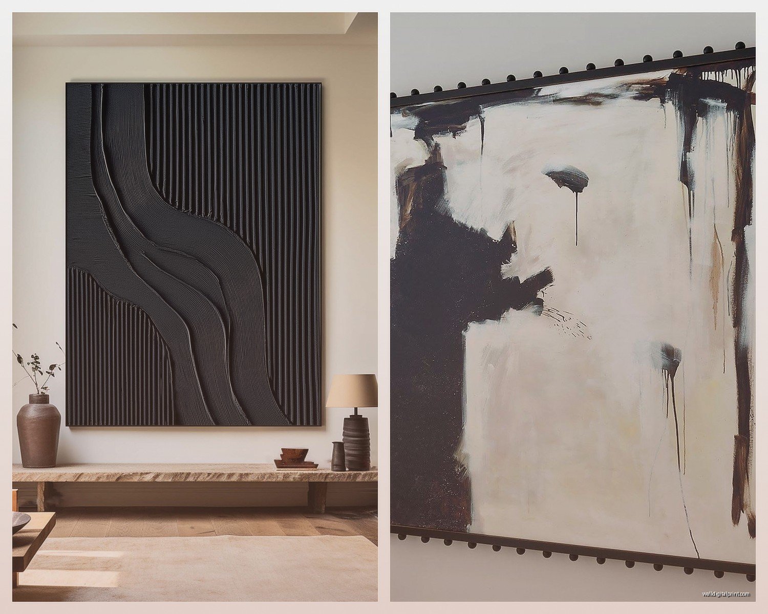
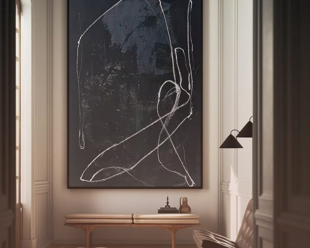
But single large pieces have this drama that’s unmatched. There’s something about one cohesive image that just commands attention. I have a single 72×48 abstract black and white piece in my hallway and people literally stop to look at it every time.
What Actually Looks Good in Black and White
Not everything translates well to monochrome and this took me forever to figure out. Here’s what actually works:
Abstract geometric patterns – these are foolproof honestly. Lines, circles, brushstrokes, that whole minimalist vibe. They work in literally any space and don’t compete with your other decor.
Architectural photography – buildings, bridges, staircases. There’s something about the structural elements that just POP in black and white. I found this amazing piece of the Brooklyn Bridge last year and it’s still my favorite.
Botanical prints – but like, the dramatic ones. Think giant monstera leaves or abstract florals. Not the cutesy watercolor flowers, more like bold graphic interpretations.
Figure studies and portraits – if you want something more classic or sophisticated. Though fair warning, faces can be polarizing so make sure everyone in your household is on board.
What doesn’t work: landscapes usually fall flat in monochrome unless they’re really high contrast. I learned this the hard way with a beach scene that just looked gray and sad.
Material Choices That Don’t Suck
Okay so you’ve got options and they’re not all created equal.
Canvas prints are the most common and honestly pretty reliable. They’re lightweight, easy to hang, and have that gallery-wrapped edge thing that looks finished without a frame. I usually go with 1.5-inch depth because anything thinner looks cheap. The texture hides minor printing imperfections too which is nice.
Framed prints give you more of a polished look but they’re heavier and more expensive. If you go this route, thin black metal frames are your friend. Thick ornate frames fight with the simplicity of black and white art… learned that one from a client who insisted on gold baroque frames and it was a disaster.
Acrylic or plexiglass is having a moment and I’m kinda here for it? The glossy finish makes blacks look SUPER rich and deep. But fingerprints show like crazy and they’re stupid expensive. Also really heavy. My cat knocked over one that was leaning against the wall and I thought it was gonna go through the floor.
Metal prints are cool if you want an industrial vibe. The aluminum gives this subtle sheen that’s interesting with high-contrast images. But they only work in certain aesthetics – modern, industrial, minimalist. They’d look weird in a traditional space.
Where to Actually Buy This Stuff
I’ve ordered from like a million places at this point. Here’s the real talk:
Etsy has tons of downloadable prints you can get printed locally at a print shop, which is actually the cheapest route if you’re on a budget. Quality varies wildly though. Read the reviews and check the seller’s resolution specs. You need at least 300 DPI for large prints or it’ll look pixelated.
Society6 and Redbubble are easy but the quality is hit or miss. I’ve gotten some great pieces and some that looked washed out. Their return policies are decent though.
For actually good quality, I usually go with Minted or Desenio. Desenio is European but ships to the US and their prices are surprisingly reasonable for the quality. Minted is more expensive but the printing is consistently excellent.
If you want something really special and have the budget, commission a local artist or photographer. I did this for my dining room and it’s the piece everyone asks about. Cost way more but it’s actually original which feels good.
Hanging This Beast Without Destroying Your Walls
Okay this is where people panic but it’s actually not that hard. Just requires some planning which I know, annoying, but trust me.
For canvas pieces, those sawtooth hangers they come with are garbage. Like genuinely terrible. Toss them and use D-rings with wire instead. Way more secure and they distribute weight better. I use braided picture wire rated for way more than the piece weighs because paranoia.
Command strips can work for lighter canvas pieces under like 20 pounds but I don’t trust them for anything expensive or irreplaceable. They’re great for renters though if your piece qualifies weight-wise.
For anything heavy, you gotta find studs or use proper anchors. Drywall anchors are your friend – specifically the toggle bolt kind that spread out behind the wall. Each one can hold like 50+ pounds.
The Actual Process
Measure from the floor up 57-60 inches to the center of where your art will be. This is standard gallery height and it actually looks right in most spaces. Don’t just eyeball it, you’ll end up with crooked art that drives you insane.
Use painter’s tape to map out the dimensions on your wall before you commit to holes. This saved me so many times. You can see if the size actually works and if the placement feels right.
Level is non-negotiable. Buy a good one, not the 99 cent thing. Or honestly just use a level app on your phone, they’re surprisingly accurate.
Oh and another thing – if you’re doing multiple pieces or a triptych, lay them out on the floor first and measure the spacing. I do 2-3 inches between panels usually. Take a photo so you remember the configuration.
Styling Around Black and White Art
This is where it gets fun because monochrome art is actually super versatile. It works as a neutral anchor that lets you do whatever you want with color in the rest of the room.
You can go full monochrome with the whole space – blacks, whites, grays, maybe some natural wood tones. Very Scandinavian and clean. This is the safest option and it’s nearly impossible to screw up.
Or you can use it as a neutral backdrop for bold color. Like I have a black and white abstract piece in my bedroom and the bedding is this deep emerald green and it’s *chef’s kiss*. The art keeps it from feeling overwhelming.
Textures become really important when you’re working with monochrome. Mix in different materials – velvet, linen, leather, metal, wood. Otherwise everything can look flat and boring.
What to Put Around It
Don’t do the matchy-matchy thing where everything is perfectly symmetrical and coordinated. That looks like a furniture store display.
I usually style a console table or credenza underneath large art with asymmetrical groupings. Maybe a table lamp on one side, some books, a small plant or sculptural object. Keep it simple though – the art should be the star.
Wall sconces on either side can look really elegant if you have the wiring for it. Black metal or brass finishes work great. Just make sure they’re proportional – tiny sconces next to massive art looks weird.
Plants actually work surprisingly well with black and white art. The organic green plays nicely against the graphic nature of monochrome. I have a fiddle leaf fig next to my living room piece and it’s a vibe.
Lighting That Makes It Look Expensive
This is gonna sound extra but proper lighting makes cheap art look expensive and expensive art look museum-quality. You don’t need special picture lights or anything (though those are cool if you’re fancy).
Track lighting or adjustable recessed lights aimed at the wall work great. You want the light hitting the art at like a 30-degree angle to avoid glare.
If you don’t have built-in lighting, those battery-operated LED picture lights from Amazon are actually decent. I was skeptical but they work fine for smaller pieces.
Natural light is tricky with art – too much direct sun will fade it over time. If your art gets direct sun for hours a day, maybe use UV-protective glass or acrylic, or just accept it might fade eventually.
Common Mistakes I See All the Time
Hanging it too high. Seriously everyone does this. Your art should relate to your furniture and the people in the room, not float up near the ceiling.
Going too matchy with the colors in the room. Like if you have gray walls, gray furniture, and gray-toned black and white art, everything disappears. You need contrast and variety in your tones.
Forgetting about scale in the actual image. A tiny figure in a massive white canvas can look intentional and artistic or it can look like a printing error. Make sure the composition works at the size you’re buying.
Choosing art you don’t actually like because it “matches” or seems safe. You’re gonna look at this thing every day. Get something that makes you feel something, even if that something is just “huh, neat.”
The Budget Reality
You can do this at literally any price point. I’ve found amazing prints on Etsy for $30 that I got printed at Costco for another $40. Framed at Target for $50. So $120 total for a 40×60 piece that looks way more expensive.
Or you can drop $2000+ on an original piece from a gallery. Both are valid. Both can look great.
Mid-range is probably $200-500 for a quality large print that’ll last and look good. That’s my sweet spot for most projects.
wait I forgot to mention – sales are your friend. Minted does 20% off constantly. Society6 has sales every other week. Sign up for emails and wait for the discount codes.
Okay so I think that covers most of it? The main thing is just commit to the size and don’t second-guess yourself. Large black and white art is one of those things that’s hard to mess up once you get the scale right. It’s classic and works with basically any style evolution your space goes through.
Also if you’re still unsure about what specific piece to get, take photos of your space and look at them while browsing. It helps you visualize way better than trying to remember what your wall looks like. I literally do this every time now even though I should know better.