Wall Art Guide, Wall Art Tutoriels
Large White Wall Art: Oversized Pure Neutral Designs
May
So I’ve been obsessing over large white wall art lately because honestly, after you sent me that photo of your living room, I immediately thought you need something big and neutral above that couch. Like, the space is begging for it.
Why White Art Actually Works When You Think It Wouldn’t
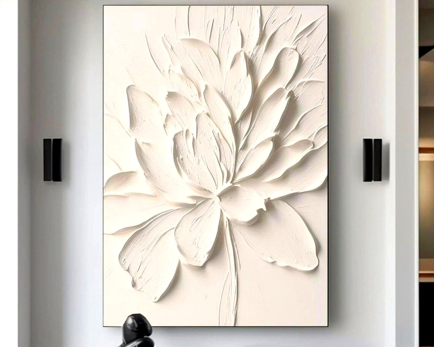
Okay so this is gonna sound weird but white on white is having this massive moment and it’s not boring like you’d think. I just finished a project last month where we did this huge 60×40 inch textured white piece in an all-white room and it completely transformed the space. The trick is texture and dimension—you need something that catches light differently throughout the day or it’ll just look like you forgot to hang actual art.
I’ve tested probably fifteen different styles at this point because my own dining room has been my guinea pig for the past year. My dog keeps judging me every time I swap pieces but whatever.
The Size Thing Nobody Tells You
Here’s what I wish someone had told me before I bought my first oversized piece: measure your wall space, then go BIGGER than you think. Like, uncomfortably big in your mind. I’m serious. Most people go too small and then the art just floats there looking lost.
For above a sofa, you want the art to be roughly two-thirds to three-quarters the width of your couch. So if you’ve got an 84-inch sofa, you’re looking at something in the 56-60 inch range minimum. But honestly? I usually push clients toward even larger because the visual impact is just… better.
I did a consultation two weeks ago where the homeowner insisted on a 36-inch piece above their sectional and I basically had to stage an intervention. We went with a 72-inch piece instead and she literally texted me three days later saying she couldn’t believe she almost went smaller.
The Actual Dimensions That Work
- Small spaces or narrow walls: 40×30 inches minimum
- Standard living rooms above sofas: 60×40 or 72×48 inches
- Large walls or high ceilings: 80×60 inches or bigger, go wild
- Dining rooms: 48×36 works but I prefer 60×40 if you have the space
The height matters too but everyone forgets about it. You want the center of your art at eye level, which is roughly 57-60 inches from the floor. Above furniture, leave 6-8 inches between the furniture top and the bottom of the frame.
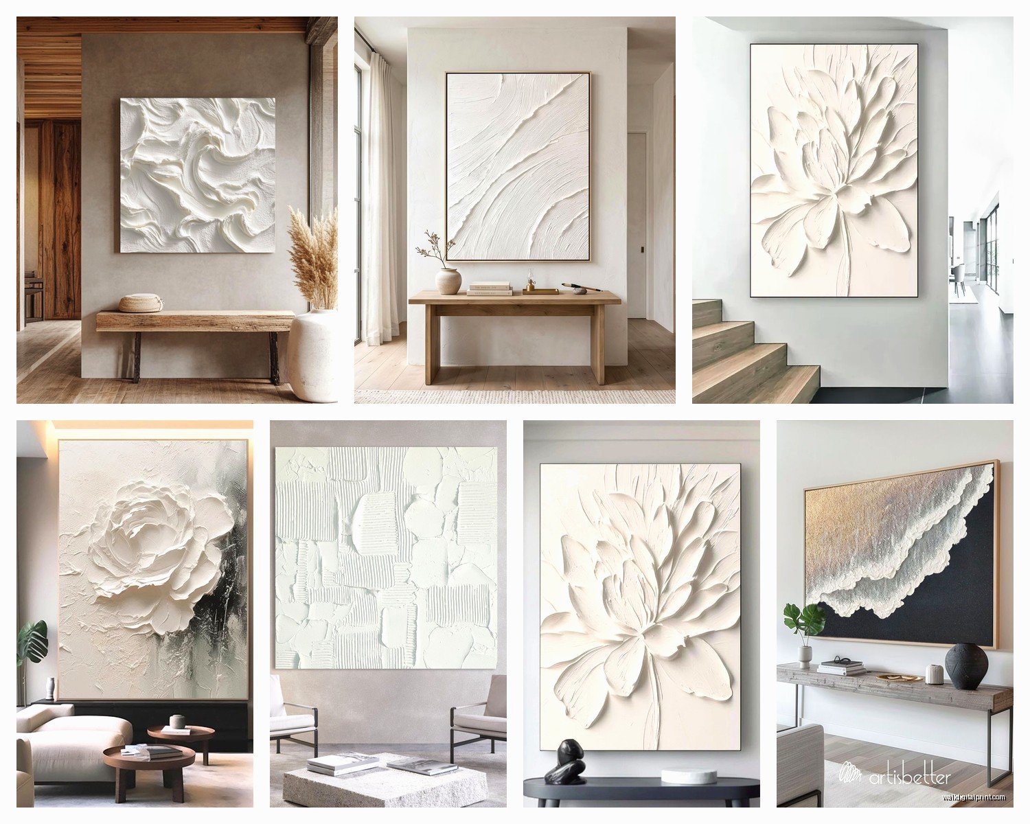
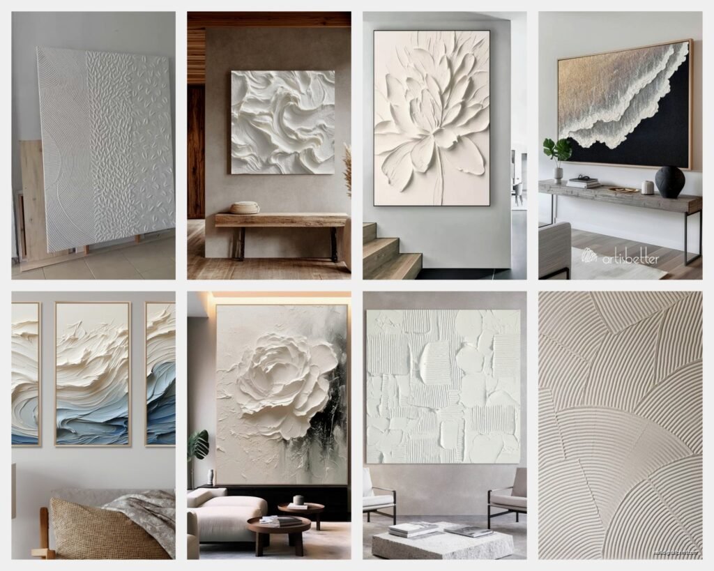
Types of White Art That Actually Look Good
Okay so I’m gonna break down what I’ve found works because there’s a lot of garbage out there masquerading as “minimalist art.”
Textured White on White
This is my favorite category hands down. Think heavy impasto, plaster-style pieces, or mixed media with actual dimension. I have this piece in my office that’s basically white paint built up in layers with some subtle cream and the lightest gray, and depending on the time of day it looks completely different.
The best ones have shadows that shift. Morning light hits it one way, afternoon another, and by evening when the lamps are on it’s like a totally different piece. That’s what you’re paying for—the interaction with light.
You can find these from local artists (check Instagram, seriously), or places like Anthropologie sometimes has decent options. Etsy is hit or miss but I’ve found some gems. Just make sure you’re looking at the actual texture in photos, not just a flat white canvas.
Line Work and Minimalist Drawings
Simple black or charcoal lines on white canvas. Very Scandinavian, very clean. These work really well if your space already has a lot going on with furniture or patterns because they don’t compete for attention.
I used one of these in a client’s bedroom last spring—just these organic flowing lines, almost like a gesture drawing—and it was perfect because her bedding had this busy floral pattern. The white art calmed everything down.
The thing with line work though is you gotta make sure it’s substantial enough. Wimpy little lines on a huge canvas just look unfinished.
Abstract White with Subtle Neutrals
This is where you get white as the dominant color but with whispers of beige, cream, taupe, maybe the palest blush or gray. Not enough color to call it colorful, but enough variation to create interest.
I’m looking at one right now in my living room that’s like 70% white, 20% cream, and 10% this greige color that picks up my sofa perfectly. Wasn’t even intentional but now I can’t imagine the room without it.
These are safer if you’re nervous about pure white because they give you more flexibility with your other decor. You can pull colors from the subtle tones in the art.
Sculptural and 3D White Pieces
Okay this is more advanced but if you really wanna make a statement, sculptural wall art is insane. I’m talking pieces that project off the wall, layered panels, geometric shapes in white.
Did one of these in a modern condo downtown and people literally stop and touch it when they visit. It’s like functional art-slash-architecture. But you need the right space—high ceilings help, and your room needs to be fairly minimal otherwise it’s too much.
Materials Matter More Than You Think
So I learned this the hard way when I bought a “canvas print” online that turned out to be basically a poster. For large white art especially, the material quality is everything because there’s nowhere to hide.
Canvas: Traditional and works well, but make sure it’s gallery-wrapped (the image continues around the edges) and stretched tight. Loose canvas looks cheap from across the room.
Wood panels: I’m obsessed with these lately. The rigidity gives a more modern feel and they don’t warp. Great for minimalist designs.
Acrylic or plexiglass: Super contemporary, reflective quality adds dimension. Can be pricey but the effect is pretty stunning.
Textured plaster or cement: Heavy, expensive, but oh my god the texture. If you’re investing in a statement piece, this is it.
Paper on board: Works for line drawings and minimalist work, less successful for large abstract pieces in my experience.
Where to Actually Buy This Stuff
Alright so I’ve bought from like a million places at this point. Here’s my honest breakdown:
Local artists and galleries: Best option if you want something unique and you can actually see it in person. Follow local artists on social media, visit studio tours, check out small galleries. You can often commission custom sizes which is huge.
Etsy: Wildly inconsistent quality but I’ve found amazing pieces here. Read reviews obsessively. Ask for additional photos. Make sure they show the edges and texture. I found this incredible textured white piece from a seller in Oregon and it’s one of my favorites.
West Elm, CB2, Article: Mid-range pricing, decent quality, safe choices. Their white abstract stuff is pretty reliable. Not gonna blow anyone’s mind but won’t disappoint either.
Anthropologie: More expensive but usually good quality. They do interesting textural pieces. Wait for sales though because their markup is real.
Minted and Artfully Walls: Good for prints and some original work. Lots of size options. Quality is generally solid.
Facebook Marketplace and estate sales: Okay weird suggestion but I’ve found AMAZING vintage white art this way. People don’t value neutral pieces as much as colorful ones so you can get steals.
The Framing Situation
Can we talk about frames because this is where people mess up constantly. For large white art, you basically have three options and each creates a totally different vibe.
No frame (floating or gallery-wrapped): Most modern option, clean lines, lets the art breathe. This is what I do probably 70% of the time. Just make sure the edges are finished nicely.
Simple white or natural wood frame: Adds a bit of polish without competing. Natural wood frames are having a moment and they warm up white art nicely. I did a white textured piece with a chunky oak frame last month and the combination was chef’s kiss.
Black frame: Creates strong contrast, more traditional gallery feel. Can be stunning but it’s a bolder choice. Works really well with line drawings.
Oh and another thing—don’t cheap out on hanging hardware for big pieces. Use proper wall anchors or hit the studs. I once had a 60-inch piece fall at 3am and nearly had a heart attack. My cat definitely had a heart attack.
Styling Around White Art
So you’ve got your huge white piece, now what? The whole point of neutral art is flexibility but you still gotta think about the overall composition.
Contrast is your friend: White art on a white wall can work but you need different textures or tones. A bright white piece on an off-white or warm white wall creates subtle depth. Or go bold with a darker wall color—white art on navy or charcoal is dramatic.
Layer with other elements: I love putting white art in a space that has plants, wood tones, and texture. The neutrality of the art lets everything else pop. Did a living room with a massive white abstract, tons of greenery, and natural fiber rugs and it just worked.
Don’t overthink the rest of the walls: One large white piece is usually enough. You don’t need a gallery wall situation on every surface. Let it be the moment.
Consider lighting: This is huge. Picture lights or track lighting can completely change how your white art looks. I installed uplighting under a textured white piece once and the shadows it created were incredible.
The Mistakes I See All the Time
Since we’re being real here, lemme tell you what doesn’t work because I’ve done most of these myself.
Going too small like I mentioned before. It’s the number one mistake. Just go bigger.
Buying flat white art with no texture or variation and expecting it to look interesting. It won’t. You need dimension or subtle color shifts or line work or SOMETHING.
Hanging it too high. Eye level means eye level, not ceiling level.
Putting it in a room with no natural light and expecting it to have impact. White art needs light to work its magic. In a dark room, consider adding lighting or maybe go with a different art choice altogether.
Not considering the undertones in your whites. Cool white art in a warm white room can look dingy. Warm white art in a cool-toned space can look yellowed. Match your undertones.
Custom vs. Ready-Made
I go back and forth on this constantly. Ready-made is obviously easier and usually cheaper, but custom means you get exactly the size and style you want.
For really specific dimensions or if you have a particular vision, custom is worth it. I worked with an artist last year on an 84×60 inch piece for a client with a massive wall in their entryway and we were able to incorporate specific textures and subtle colors that matched their space perfectly. Cost more but the result was exactly right.
Ready-made works great when you’re flexible on the exact dimensions and style. And honestly, there’s so much good stuff out there now that you can usually find something close to what you want.
Price Ranges and What to Expect
Since you’re probably wondering what this is all gonna cost…
- Budget options (prints, simple canvas): $150-400 for large sizes
- Mid-range (original art from emerging artists, quality prints): $400-1200
- Investment pieces (established artists, gallery work, heavily textured originals): $1200-5000+
I usually tell people to spend what makes sense for their budget but don’t go SO cheap that you end up with something that looks obviously cheap. Better to save up for something quality than rush into a purchase you’ll wanna replace in six months.
Maintenance and Care
White art is surprisingly low maintenance but here’s what you gotta know. Dust it gently with a microfiber cloth every few weeks. Don’t use cleaning products on textured pieces because they can damage the surface or get trapped in crevices.
Keep it out of direct harsh sunlight if it’s a print because even white can fade or yellow over time. For original paintings, this matters less but still something to consider.
If you have textured or dimensional white art, be careful not to bump it or let kids get too close with sticky hands. I learned this when my friend’s toddler decided my textured plaster piece needed “help” with a marker.
Wait I forgot to mention—some white art collects dust in the texture and you can use a soft paintbrush to gently get into crevices. Works great.
Anyway, I think that covers most of what I’ve learned through trial and error. The main thing is just to go bigger than feels comfortable and make sure there’s actual visual interest through texture or line work or subtle variation. Pure flat white on a huge canvas is only interesting if you’re going for that super specific minimalist gallery vibe, and even then it’s risky.
Let me know what you end up getting because I’m genuinely curious now. And measure your wall before you buy anything because returns on huge art pieces are a nightmare trust me.