Wall Art Guide, Wall Art Tutoriels
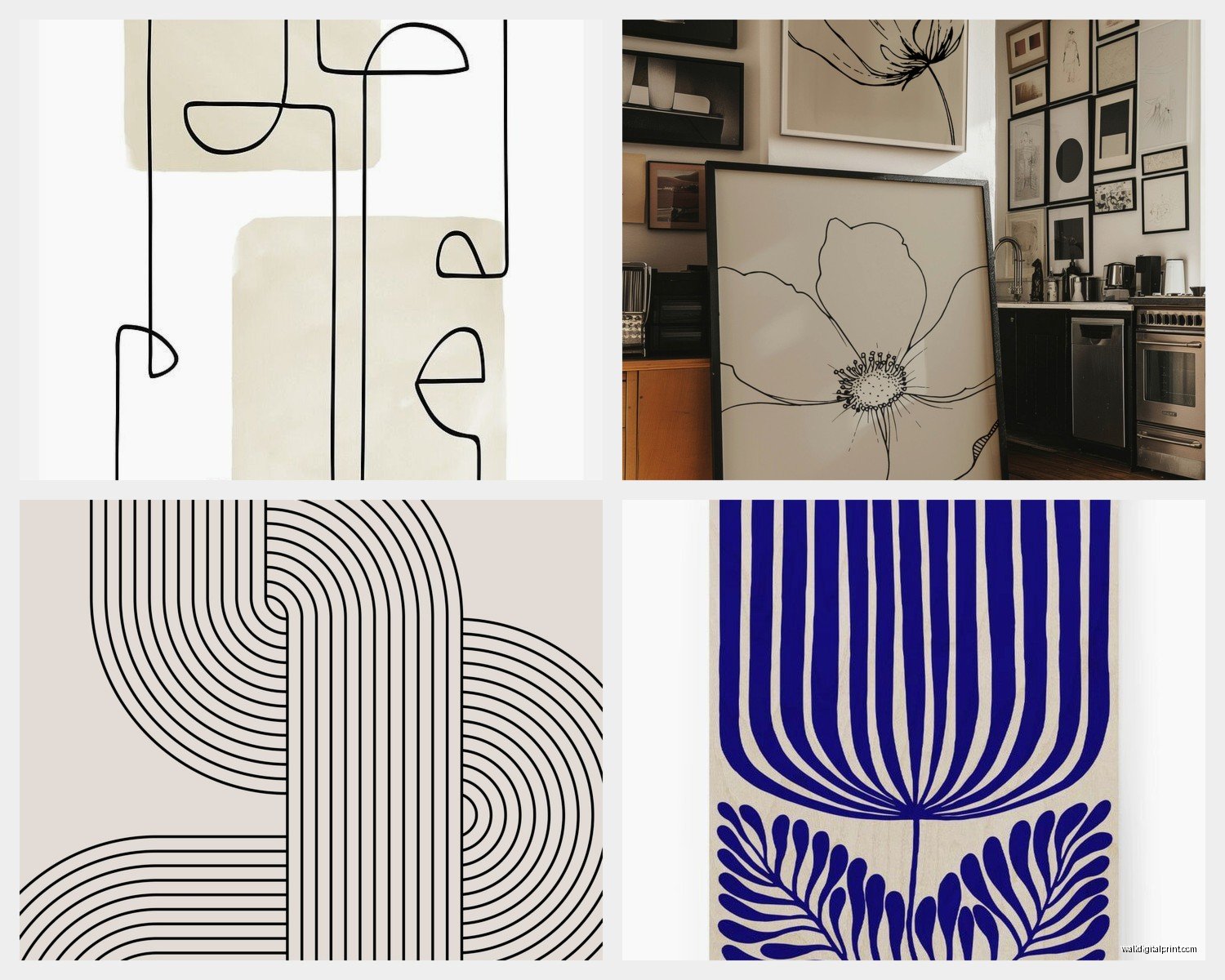
Line Wall Art: Minimalist Single-Line Drawings
May
So I’ve been completely obsessed with single-line drawings lately and honestly it started because I hung one in my bathroom and suddenly everyone who came over wanted to know where I got it. Like, my sister literally texted me a photo of my wall at 11pm asking for the link.
The thing about line art is it’s SO easy to mess up. You think oh I’ll just grab any simple drawing and call it minimalist but then it looks like… I don’t know, like you printed out a coloring book page? There’s actually a technique to making it look intentional and not just empty.
Finding the Right Line Weight
Okay so this is gonna sound super specific but the thickness of the line matters way more than you’d think. I learned this the hard way when I bought this “minimalist” face print from Etsy and the lines were so thick it looked like a cartoon. Not in a good way.
You want lines that are delicate enough to feel elegant but thick enough that they don’t disappear from across the room. I usually go for prints where the line weight is around 1-2mm when printed at standard sizes. If you’re looking at digital files before buying, zoom in and check – if the line looks chunky even when you’re zoomed out on your screen, it’s too thick.
My go-to test is holding my phone at arm’s length. If I can still see the drawing clearly and it looks refined, that’s the sweet spot. I did this while watching The Crown the other night and my dog thought I was taking photos of her, kept posing… anyway.
Single Line vs Continuous Line
There’s actually a difference here that nobody tells you about. Single-line drawings can have breaks – like the pen lifts off the paper between sections. Continuous line means the artist never lifted the pen at all, it’s one unbroken line from start to finish.
Continuous line stuff tends to look more organic and interesting because there are these little quirks where the artist had to figure out how to connect everything. But they can also look messy if not done well. Single-line with breaks gives you more control over composition.
I have both types in my apartment and honestly? The continuous line pieces get more attention. There’s something about following the path of the line that makes people stop and really look.
What Actually Works on Different Wall Colors
So everyone says black line art on white walls but let me tell you what I’ve tested across like seven different client spaces plus my own place.
White or off-white walls: Black lines are classic but consider dark navy or charcoal gray instead. It’s still minimalist but feels less stark. I found this gorgeous deep green line drawing of a woman’s back and it looks incredible against my cream walls – way more interesting than black would’ve been.
Gray walls: This is tricky. Light gray lines disappear, black can feel too harsh. I’ve had the most success with either rust/terracotta colored lines or going bold with white lines on dark gray. Yeah, white lines. Sounds backwards but it’s actually stunning.
Colored walls: Okay this is where it gets fun. I have a client with this dusty blue bedroom and we used gold metallic line drawings. Not like shiny gold, more of a matte brass situation. The key is making sure there’s enough contrast that the drawing doesn’t get lost.
Size and Placement Because This Trips Everyone Up
I see people buying these tiny 8×10 line drawings and wondering why they look insignificant on their big empty wall. Scale is everything with minimalist art – you need to go bigger than feels comfortable.
For above a bed or sofa, you want the art to take up about two-thirds to three-quarters the width of the furniture. With line art specifically, I actually push people to go even bigger because the negative space makes it feel smaller than it is.
My bedroom has a single-line nude figure that’s 30×40 inches and it’s STILL not overwhelming because there’s so much empty space in the composition. Meanwhile I’ve seen ornate landscape paintings at that size that feel too busy.
The Gallery Wall Question
Everyone asks if they should do a gallery wall of multiple line drawings or one large piece. Honestly depends on your commitment level and wall space.
Multiple small line drawings (like 5-7 pieces) can look amazing if – and this is important – they’re cohesive. Same line weight, same color, similar subject matter. I curated a set for my dining room with all botanical single-line drawings, all black on white, all similar sizes. Took me three weeks to find pieces that worked together.
One large statement piece is easier and often more impactful. Less decision fatigue, less holes in your wall if you change your mind later.
Subject Matter That Actually Looks Good
Not all subjects translate well to single-line style. Here’s what I’ve seen work consistently:
- Female figures and faces – classic for a reason, the curves work perfectly with flowing lines
- Botanical stuff but only if it’s simplified. Complicated flowers look messy in line art
- Abstract body parts – hands, backs, collarbones. Sounds weird but trust me
- Simple architectural elements like arches or doorways
- Animals but ONLY if they’re naturally curvy. Line art cats and dogs? Adorable. Line art horses? Usually awkward
What doesn’t work: landscapes (too much detail needed), anything geometric that could just be actual geometric art, portraits of men with beards (the texture gets lost), anything with text incorporated.
I bought a line drawing of mountains once and returned it because it just looked like… zigzag lines. No depth, no interest. Mountains need shading or they’re just triangles.
Digital vs Physical Prints
Okay so funny story, I used to only buy physical prints from art shops because I’m like a traditionalist or whatever. Then my client canceled last minute one day and I spent an hour comparing digital downloads on Etsy to physical prints and the quality difference is basically nonexistent if you print them right.
Digital files: Way cheaper, you can resize them, print multiple copies, change your mind without guilt. But you gotta get them printed properly. Don’t use your home printer unless it’s actually good – the lines will look pixelated or the black won’t be deep enough.
I use a local print shop that does large format printing. Costs about $15-30 depending on size. The paper quality makes such a difference. Ask for matte cardstock or fine art paper, not glossy photo paper.
Physical prints: More expensive but they arrive ready to frame. The paper is usually better quality. You’re supporting artists directly which feels good. But you’re committed to that size and you can’t easily replace it if you spill coffee on it… not that I’ve done that.
Frame or No Frame
Minimalist police will tell you simple black or white frames only. And yeah, that’s safe. But I’ve been experimenting with natural wood frames lately and they add warmth without fighting with the simplicity of the art.
The one rule I actually follow: keep the mat minimal or skip it entirely. A huge white mat around delicate line art makes it look even more sparse. I usually do either no mat or a super thin one, like half an inch.
Oh and another thing – floating frames (where the art sits in front of the glass with space around it) look incredible with line drawings. Creates this shadow effect that adds dimension.
Mixing Line Art With Other Styles
You don’t have to commit to all line art all the time. I mix mine with:
- Black and white photography – keeps the minimal vibe
- Solid color abstract pieces – adds depth without clutter
- Woven wall hangings – the texture contrast is chef’s kiss
What gets tricky is mixing line art with detailed realistic art or busy patterns. The styles compete and nothing looks intentional.
Where to Actually Buy This Stuff
I’ve bought from probably twenty different sources at this point so here’s the real tea:
Etsy: Best selection, especially digital prints. Quality varies wildly so read reviews. Some sellers are actual artists, some are reselling clip art. You can usually tell by looking at their shop – original artists have consistent style across pieces.
Society6 and similar print-on-demand sites: Good for physical prints, tons of options, but you’re paying a markup. I use these when I need something quick and don’t want to deal with printing.
Local art fairs: If you want something truly unique. I found an artist who does single-line drawings of pets and commissioned one of my dog. It’s my favorite piece in my apartment even though it cost three times what I normally spend.
Home decor stores: Places like West Elm and CB2 have line art now but it’s pricey and honestly not better quality than what you can find from independent artists online.
wait I forgot to mention – check Instagram artists. So many illustrators sell prints directly and their prices are usually better than going through platforms. Search hashtags like #lineart #singlelinedrawing #minimalistart
The Lighting Thing Nobody Talks About
Line art needs different lighting than other art. There’s no color to catch light, no texture to create shadows. If your lighting is flat, the art will look flat.
I installed picture lights above my larger line drawings and it made such a difference. The shadow from the frame creates depth and the focused light makes the lines look crisper.
For gallery walls of line art, I use adjustable track lighting so I can direct spots at different pieces. Creates visual interest and makes the white space feel intentional instead of empty.
Natural light is tricky – too much direct sun and line drawings fade fast, especially if they’re inkjet printed. I learned this when my bathroom print (the one that started this whole obsession) faded on one side after six months near a window.
Common Mistakes I’ve Made So You Don’t Have To
Hanging line art too high. With minimal art, eye level is crucial. The center of the piece should be at 57-60 inches from the floor. I hung my first one way too high and it looked like it was floating away.
Choosing super abstract line art that nobody can figure out what it is. There’s minimalist and then there’s just confusing. If you have to explain what it is to every person who sees it, it’s not working.
Mixing too many different line styles in one space. Continuous line drawings with broken line drawings with different line weights… it looks chaotic. Pick one vibe and stick with it per room.
Forgetting that line art shows every imperfection in your wall. That tiny crack you’ve been ignoring? The minimalist art draws attention to it. Ask me how I know. I spent last Saturday spackling before I could hang anything.
Not considering the negative space as part of the composition. The empty areas matter just as much as the lines. I bought a print once that was positioned weird on the paper and I couldn’t center it properly in my frame without it looking off-balance.
Quick Styling Tips
Keep furniture and decor around line art simple. The art is meant to be the focal point so don’t compete with it.
Plants work really well with line art – they add organic shapes without visual clutter. I have a trailing pothos next to my largest line drawing and the combination is perfect.
If you’re renting and can’t paint, line art is your best friend. It adds personality to white walls without requiring any permanent changes. I use command strips for everything under 20 inches.
For small spaces, line art makes rooms feel bigger because of all the negative space. My studio apartment feels way more open with line drawings than it did with my old colorful abstract pieces.
this is gonna sound weird but I sometimes change out my line art seasonally. Botanical pieces in spring, abstract figures in summer, architectural stuff in fall. They’re light and easy to swap and it keeps things feeling fresh without major redecorating.
The main thing is trust your gut on what feels right in your space. Minimalism isn’t about following rules, it’s about being intentional with what you choose to display.