Wall Art Guide, Wall Art Tutoriels
Long Narrow Horizontal Wall Art: Slim Panoramic Designs
May
So I’ve been absolutely obsessed with these long narrow horizontal pieces lately because they solve SO many weird wall problems that regular art just… doesn’t. Like, you know that space above your couch that’s too wide for one piece but too narrow for a gallery wall? Or that hallway that goes on forever and you’re like “what am I supposed to do with this?”
Why These Slim Panoramic Pieces Actually Work
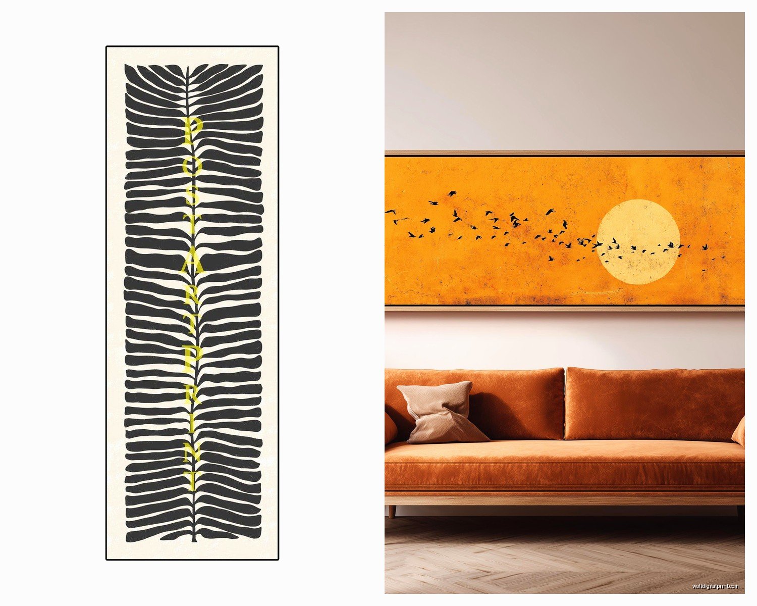
Okay so here’s the thing about panoramic art that I didn’t get until I started really using it with clients. The dimensions typically run anywhere from 48 inches wide by 12-16 inches tall, sometimes even more extreme like 60×10 or 72×12. And what happens is your eye travels horizontally across the space instead of getting stuck in one spot. It’s like… it makes the room feel wider automatically because you’re forcing the perspective outward.
I had this one apartment last month where the living room was narrow and kinda dark, and we put this 60-inch abstract landscape piece above the sofa in these muted greens and grays. The whole room immediately felt less cramped. It’s weird how that works but it really does.
Where to Actually Use These Things
Above sofas and beds is the obvious one, but you gotta get the proportions right. The art should be roughly two-thirds to three-quarters the width of your furniture. So if you’ve got a standard 84-inch sofa, you’re looking at something between 56-63 inches wide. I see people go too small all the time and it just looks… sad and floating.
For beds, especially king-sized ones, you want something substantial. Don’t be scared of a 72-inch piece. I promise it won’t overwhelm if the bed itself is 76 inches wide.
Hallways are where these really shine though. Long corridors feel intentional instead of awkward when you’ve got a panoramic piece running along one wall. I usually hang them at standard eye level which is like 57-60 inches to the center, but in hallways sometimes I go slightly lower, maybe 54 inches, because you’re walking past it and the viewing angle is different.
Above console tables or sideboards in entryways or dining rooms. Same rule applies with the two-thirds width thing. If your console is 48 inches, aim for 32-36 inch art minimum.
Oh and another thing, stairway walls. If you’ve got that long diagonal wall going up the stairs? A horizontal panoramic piece mounted to follow the angle of the stairs looks incredibly intentional. Though I’ll be honest, the hanging process is annoying because you’re dealing with angles and you need someone to hold it while you level.
Styles That Actually Look Good
Not all panoramic art is created equal and some styles just work better in this format than others.
Abstract landscapes are probably my go-to recommendation because they’re versatile. Think soft horizons, blurred color fields, minimal compositions. They read as calm without being boring. I’m really into pieces that have like three or four color blocks—a horizon line, sky, maybe some foreground texture. Brands like West Elm and CB2 have decent options in the $200-400 range.
Coastal and seascapes in panoramic format are *chef’s kiss* because oceans are literally horizontal. Beach scenes, wave photography, pier perspectives. These work amazing in bathrooms too if you’ve got a long wall above the tub. Just make sure if it’s a bathroom that you’re getting something sealed or behind glass because humidity is gonna wreck canvas eventually.
Cityscape silhouettes work if your style leans modern. Skyline shots of New York, Chicago, whatever. They’re dramatic without being too busy. Though honestly I’m kinda over the black and white skyline thing—it feels very 2015 Ikea to me now.
Botanical prints in horizontal arrangements. Like a series of pressed ferns or a single branch extending across the canvas. These feel more organic and less formal than traditional florals. Good for bedrooms or offices where you want something living but subtle.
What I actively avoid: super busy patterns or scenes with too much detail. When you stretch something across 60+ inches and it’s only 12 inches tall, busy compositions just become visual noise. You want something your eye can rest on.
Materials and Framing
Okay so this is where it gets practical. Canvas prints are the most common and they’re lightweight which matters when you’re mounting something that long. The problem is cheap canvas looks cheap—you can see the texture looks plasticky and printed-on instead of painted.
I usually steer people toward framed prints under acrylic or glass if budget allows. The frame gives it structure and the glass makes colors look richer. Walnut or oak frames in slim profiles (like 1-2 inch width) look current. Black aluminum frames work if you’re going minimalist.
Metal prints are having a moment and they actually work really well for panoramic sizes because the material itself is rigid. The colors are super saturated and they have this modern gallery feel. They’re more expensive, like $300-600 depending on size, but they last forever and you don’t need glass.
Wood prints give you texture and warmth. The image is printed directly onto planked wood so you get this rustic vibe. Perfect for farmhouse or transitional spaces. Not great for very detailed images because the wood grain interferes, but for abstracts or simple landscapes they’re gorgeous.
My dog just knocked over my coffee, hold on…
Okay back. Where was I?
The Actual Hanging Process
This is gonna sound weird but the biggest mistake people make is eyeballing it. You cannot eyeball a 60-inch piece and expect it to look level. You just can’t. I’ve tried. It always ends up crooked.
You need a level (obviously), a measuring tape, a pencil, and preferably a stud finder because these pieces aren’t super heavy but they’re long enough that you want secure mounting.
Here’s my process:
- Measure the wall width and mark the center point
- Measure the art width and figure out where the edges will land
- Mark where the hanging hardware on the back of the frame sits relative to the top edge
- Transfer those measurements to the wall
- Find studs if possible—if not, use drywall anchors rated for at least 30 pounds
- Install two hooks or nails, never just one for something this wide
For pieces over 48 inches, you really need two mounting points. One hook will cause the piece to tilt or swing and it’ll drive you insane trying to keep it straight.
If you’re hanging on picture rail wire (which I do sometimes in older homes), use two suspension points and make sure the wire is taut. Loose wire on a horizontal piece creates this sagging effect that looks sloppy.
Height Guidelines That Actually Matter
The whole “57 inches to center” rule is a starting point but not gospel. I adjust based on furniture height and ceiling height.
Above a sofa: Leave 6-8 inches between the top of the sofa back and the bottom of the frame. Less than 6 inches feels cramped, more than 10 inches feels disconnected.
Above a bed: Similar rule, 6-10 inches above the headboard. If you don’t have a headboard, treat the mattress top as your furniture line and go up from there.
In hallways with no furniture: Stick closer to the 57-60 inch center height. Walk the hallway and make sure it feels natural at eye level.
Dining rooms: If it’s above a sideboard, follow furniture spacing rules. If it’s on a blank wall, consider sight lines from the table—you don’t want it so high that people have to crane their necks.
Budget Breakdown Because You’re Probably Wondering
Under $150: You’re looking at Ikea, Target, Amazon prints. They’re fine. Seriously, they’re fine for a first apartment or rental. The quality is basic but if you pick the right image it works. Ikea’s BJÖRKSTA series has some good panoramic options.
$150-$400: This is the sweet spot for West Elm, CB2, Pottery Barn, AllModern. Better quality prints, nicer framing options, more curated designs. I buy a lot from this range for client projects because the value is solid.
$400-$800: You’re getting into custom prints, original photography, smaller artists on Etsy or Minted. The difference in quality is noticeable—better paper, archival inks, unique compositions you won’t see everywhere.
Over $800: Original art, commissioned pieces, gallery purchases. Worth it if you’re staying in the space long-term and want something truly unique. I’ve commissioned panoramic pieces from local artists and it’s always worth the investment when it’s exactly what the space needs.
Where I Actually Shop
Minted has a good filter for panoramic sizes and they work with independent artists so the selection feels less mass-produced. Their framing is decent quality too.
Etsy is hit or miss but you can find really specific stuff. Search “panoramic abstract art” or “horizontal landscape print” and filter by size. Read reviews because print quality varies wildly between sellers.
Juniper Print Shop does beautiful minimal landscape prints that work perfectly in panoramic format. More affordable than you’d think, like $180-300 for large sizes.
Society6 and Redbubble for trendy designs and lots of variety. Quality is standard but the selection is massive. Good if you know exactly what aesthetic you want.
I found this amazing photographer on Instagram last year who does custom panoramic beach prints and I’ve used her for like three projects now. It’s worth following artists directly because they often do custom sizing.
Common Problems and How to Fix Them
The piece looks too small: You went too narrow. This happens all the time. Don’t be scared of scale. Go bigger than you think you need. That 48-inch piece you’re considering? You probably need the 60-inch.
It feels disconnected from the furniture: You hung it too high. Bring it down so there’s clear visual connection between the art and the furniture below it. That 6-8 inch gap is crucial.
The room still feels boring: The art itself might be too neutral or the colors aren’t pulling from anything else in the space. Panoramic art should echo at least one or two colors from your room palette—pillows, rug, whatever. If everything is beige and you add beige art, nothing changes.
It looks crooked but it’s level: This is usually a furniture problem. If your sofa or the floor itself is slightly unlevel, the art will look wrong even when it’s technically straight. Sometimes you have to hang it slightly off-level to make it *look* level. Trust your eye over the tool in these cases.
oh and another thing, if you’ve got textured walls, hanging can be tricky because the frame won’t sit flush. You might need to add small bumpers or spacers on the bottom corners to tilt the top closer to the wall. Otherwise you get shadows and gaps that look weird.
Styling Around Panoramic Art
You don’t need a ton of accessories when the art is this substantial. That’s actually the point—it’s a statement on its own.
Maybe add one or two simple objects on the console below. Like a small plant and a decorative bowl. Or a single sculptural object. Don’t crowd it.
If you’re doing sconces or wall lights, mount them lower and to the sides, not right next to the frame. You want the art to be the focus, not compete with lighting.
For gallery walls, panoramic pieces can be the anchor at the bottom with smaller pieces stacked above, but honestly I think panoramic art works best solo. It’s designed to command space by itself.
I’m watching this true crime thing right now and it’s very distracting but anyway…
Specific Room Scenarios
Small living room: One 48-60 inch panoramic piece above the sofa, keep everything else minimal. This creates a focal point without cluttering.
Master bedroom: Go big, like 72 inches if your bed is king-sized. Choose something calming—abstract horizon, soft seascape, muted botanical. You’re waking up to this every day so pick something that feels restful not energizing.
Long narrow kitchen: If you’ve got wall space, a panoramic food photography print or abstract in your kitchen colors can tie the space together. I did a client kitchen with a 48-inch abstract in blues and whites that echoed the backsplash and it looked so intentional.
Home office: Horizontal art behind your desk or on the wall you face. Choose something that helps you focus—I like minimal abstracts or black and white photography. Avoid anything too busy or colorful if you’re on video calls because it’s distracting to viewers.
Bathroom: If you’ve got a long wall above the tub or a big vanity, a 36-48 inch coastal or abstract piece works beautifully. Just make sure it’s properly sealed against moisture.
You gotta think about the function of each room and what feeling you want. Bedrooms need calm, living spaces can handle more drama, offices need focus.
Okay I think that covers most of what I’ve learned from actually using these in real spaces. The main thing is don’t overthink it but also don’t go too small. Scale is everything with panoramic art. It should feel substantial and intentional, not like you’re trying to fill space with whatever fit.