Wall Art Guide, Wall Art Tutoriels
Long Narrow Wall Art: Slim Horizontal Vertical Pieces
Sep
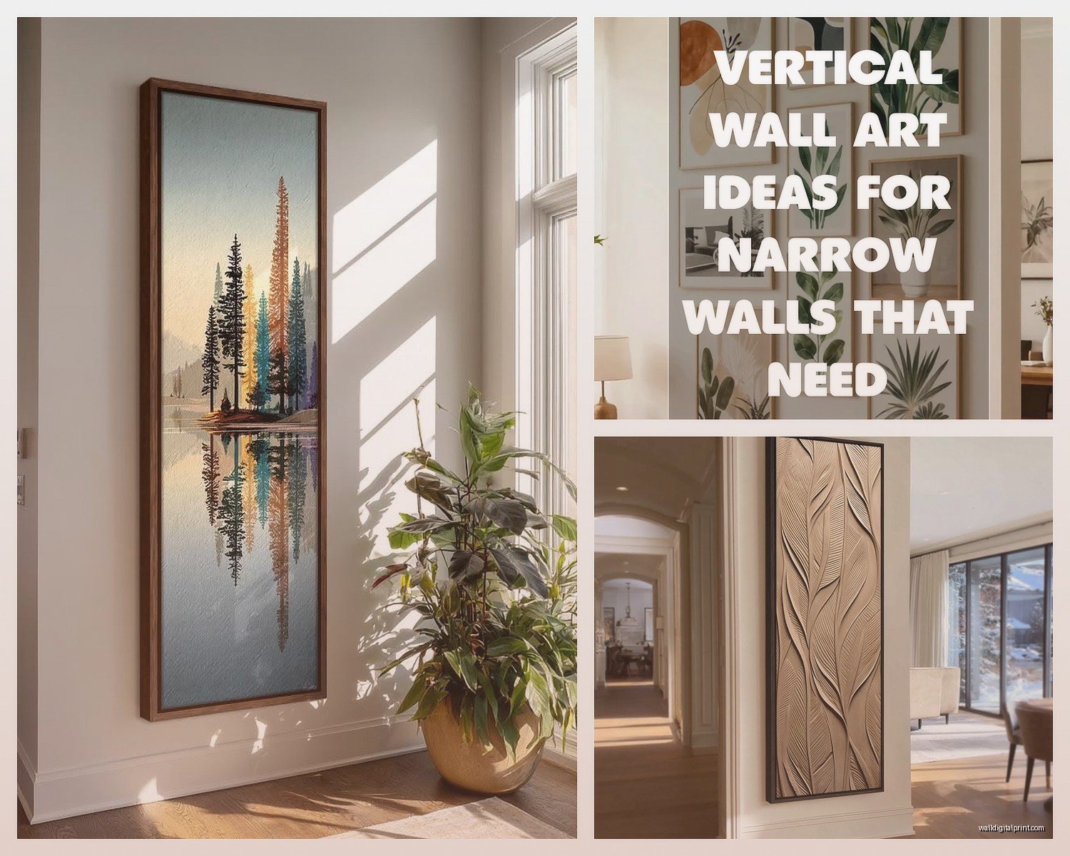
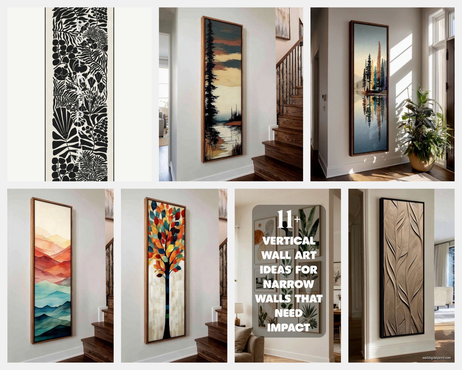
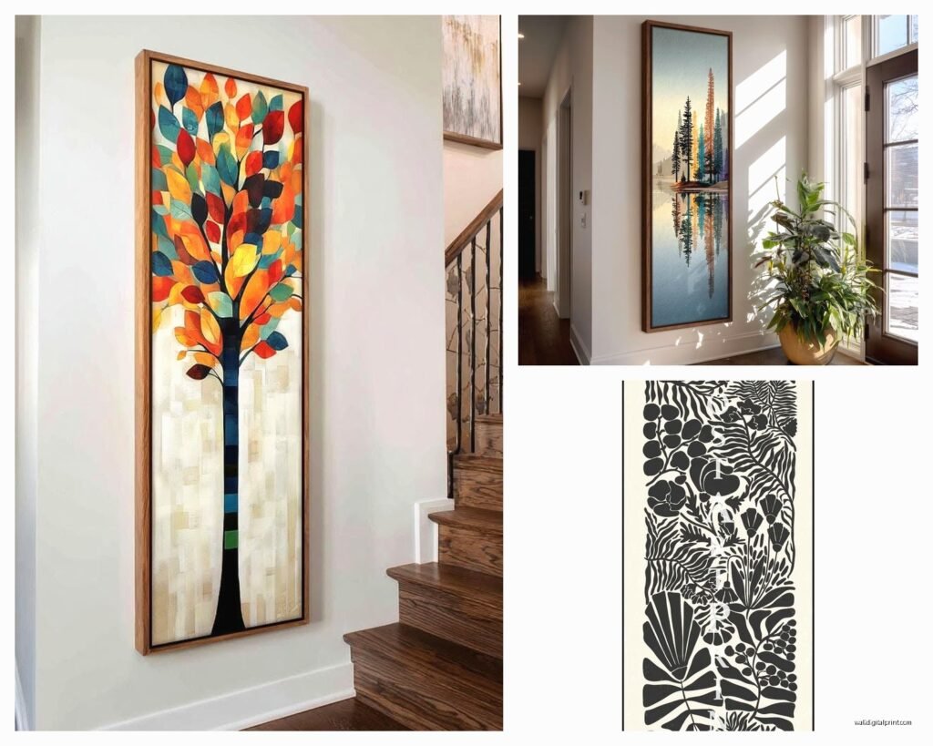
So I’ve been totally obsessed with long narrow wall art lately because honestly it’s like the secret weapon nobody talks about when you’re trying to fill those weird awkward spaces. You know those spots I mean, right? Like that strip above your couch that’s too narrow for a big square piece, or that hallway that just feels like a bowling alley.
First thing you gotta figure out is whether you need horizontal or vertical pieces because they do completely different things to a space. Horizontal ones make walls feel wider, which is perfect for above furniture or in rooms that feel too tall and narrow. I just used a 60-inch horizontal piece in my own dining room above this vintage credenza and it totally grounded the whole wall. Vertical pieces though, they’re your friend when you have low ceilings or want to draw the eye up, makes the room feel taller than it actually is.
Measuring is Not Optional Even Though It’s Annoying
Okay so funny story, I once ordered this gorgeous 48-inch piece for a client without measuring the actual wall space first because I was running late to meet my sister and just eyeballed it. It was too long by like 6 inches and we had to return it which was a whole nightmare. So yeah, measure your wall space with an actual tape measure, not your arms spread out or whatever.
For horizontal pieces above furniture, the general rule I follow is the art should be about two-thirds to three-quarters the width of the furniture below it. So if your sofa is 84 inches wide, you’re looking at something between 56 and 63 inches. But honestly I’ve broken this rule plenty of times when the piece is just perfect.
Vertical pieces are trickier because you gotta think about ceiling height. I usually leave at least 8-10 inches between the top of the art and the ceiling, otherwise it looks like it’s trying to escape through the roof.
Where These Skinny Pieces Actually Work Best
- Above sofas and console tables, this is like their natural habitat
- Narrow hallways where anything else would overwhelm
- Between windows when you have those awkward gaps
- Flanking doorways or fireplaces
- Staircases, especially going up at an angle
- Above beds as an alternative to the standard big square headboard art
- In bathrooms above the tub or a long vanity
The bathroom thing is underrated by the way. I put a slim horizontal ocean photograph above my tub last year and every time I take a bath I’m like yeah this was the right choice.
What Kind of Art Actually Works in This Format
Not everything translates well to long narrow dimensions. Panoramic landscapes are the obvious choice and they’re popular for a reason, like coastal scenes, mountain ranges, city skylines. But I’ve found some less obvious options that look incredible:
Abstract pieces with horizontal or vertical movement work really well. There’s this artist I follow on Instagram who does these flowing resin pieces in long formats and they’re just stunning. The movement of the resin follows the length of the piece naturally.
Typography and quotes can work if you’re into that, though I’m personally kind of over the whole “live laugh love” thing. But a single meaningful word or short phrase in interesting typography, that can be really striking in a horizontal format.
Botanical prints, especially things like bamboo or tall grasses for vertical pieces, or a series of leaves or branches horizontally. My cat knocked over one of these once and shattered the glass everywhere which was fun to clean up at midnight.
Multiple Panels vs Single Pieces
Oh and another thing, you can go with a single long piece or multiple panels arranged together. The multi-panel thing (diptychs or triptychs) gives you more flexibility because you can space them exactly how you want. I did three 12×36 vertical panels in my hallway with about 3 inches between each and it created this really cool rhythm as you walk down the hall.
The spacing between panels is important though. Too close and they look cramped, too far and they don’t read as one piece. I usually do 2-4 inches between panels depending on the size. For bigger panels, more space. For smaller, less.
Framing Considerations That Actually Matter
Thin frames work better for long narrow pieces usually. A chunky frame on an already slim piece can look disproportionate. I learned this the hard way with a 10×40 print that I put in a 3-inch wide ornate frame and it just looked… wrong. Like the frame was eating the art.
Floating frames are really nice for this format because they add depth without bulk. Canvas wraps are another good option, especially for more casual spaces, and you don’t have to deal with framing at all which saves money and hassle.
If you’re doing metal prints or acrylic, those can look super modern and sleek in narrow formats. I’m working with a client right now who’s doing a 12×60 metal print of a forest scene for her office and the depth of the metal material makes it feel substantial even though it’s so slim.
Actually Hanging These Without Losing Your Mind
Hanging long pieces is where people mess up most often. The center of the artwork should generally be at eye level, which is usually around 57-60 inches from the floor. But when you’re hanging above furniture, different rules apply.
Above a sofa or console, leave 6-8 inches between the top of the furniture and bottom of the frame. I sometimes go as low as 4 inches if the piece is really large and the ceiling is low, but that’s pushing it.
For horizontal pieces, definitely use two hanging points instead of one, otherwise the thing will tilt and drive you crazy. I use two D-rings on the back positioned about a third of the way in from each edge. Then two nails or hooks on the wall, use a level to make sure they’re even before you hang anything.
Vertical pieces over 36 inches tall, same thing, I use two hanging points stacked vertically for stability.
Wait I forgot to mention, if you’re hanging on drywall and the piece is heavy, use proper wall anchors. Those little plastic things from the hardware store are not gonna cut it for anything over like 10 pounds. I use toggle bolts for anything substantial, or if you can hit a stud that’s even better.
DIY Options That Don’t Look Cheap
If you’re on a budget or just like making stuff, there are some good DIY options. I’ve made several long narrow pieces myself when I couldn’t find exactly what I wanted.
You can get canvas prints made from your own photos pretty cheaply now. I did a 16×48 panorama of this beach sunset from a vacation for like 35 bucks. The quality was actually pretty decent. Just make sure your original photo has enough resolution, otherwise it’ll look pixelated when stretched that large.
Fabric wall hangings are another option. Get a long narrow piece of interesting fabric, wrap it around a thin board or stretcher bars, staple the back. I did this with some gorgeous Japanese fabric I found and it’s been hanging in my bedroom for three years now.
Wood art is having a moment too. You can create patterns with thin wood strips, stain them different colors, arrange them horizontally or vertically. It’s time-consuming but the results can be really unique.
Thrift Store and Vintage Finds
This is gonna sound weird but some of my favorite long narrow pieces have come from thrift stores. People donate the strangest stuff. I found an original vintage ski poster that’s like 12×40 for eight dollars last month. It needed a new frame but still, total score.
Estate sales are good too, especially for mid-century pieces. Those old panoramic photographs from the 60s and 70s, the colors are usually amazing in that faded vintage way.
Color and Style Matching
Okay so for colors, I generally try to pull at least one color from the room into the art, but it doesn’t have to match perfectly. Actually perfect matching can look too staged. I like when there’s a color echo, like if you have navy pillows, maybe there’s some blue tones in the art but it’s not the exact same navy.
Black and white photography or prints work literally anywhere which is why they’re so popular. They’re the safe choice. Nothing wrong with safe if it works for your space. I have a black and white birch tree vertical piece in my entryway and it’s been there for five years because it just works.
For style, try to match the vibe of your room. Modern minimalist room needs clean simple art, not a busy baroque landscape. Traditional room can handle more ornate pieces. Though mixing styles intentionally can be cool too, like a modern abstract in a traditional room as a conversation piece.
Common Mistakes I See All The Time
Hanging art too high is probably the number one thing. People think it needs to be way up near the ceiling for some reason. It ends up looking disconnected from the room and you strain your neck looking at it.
Going too small is another one. People get nervous about overwhelming a space so they go too small and it looks timid. A long narrow wall can actually handle a pretty substantial piece as long as the proportions work.
Not considering the viewing distance matters too. If you’re putting art in a long hallway where you’ll mostly see it from far away, you need bolder simpler imagery. Detailed intricate stuff gets lost from a distance.
Ignoring lighting is a mistake. Art needs proper lighting to look its best. I added picture lights above two horizontal pieces in my living room and it completely transformed them. You can also use track lighting or strategically placed lamps.
My Current Favorite Sources
I’ve been ordering a lot from online print shops lately because the selection is just better than what I can find locally. Society6 and Minted both have good options for custom sizes. Etsy has tons of downloadable prints you can have printed at your own size, which gives you total control over dimensions.
For original art, I follow a bunch of artists on Instagram and several will do custom sizes if you ask. It costs more obviously but you get something unique. I just commissioned a 14×50 abstract piece for above my client’s fireplace and the artist was super easy to work with.
Local art fairs and markets are worth checking too. I found this woman who does watercolor botanicals and she had several long narrow originals that were way cheaper than I expected. Plus you’re supporting local artists which feels good.
Quick Tips for Specific Rooms
Living room: Go bigger than you think you need, rooms with lots of furniture can handle substantial art
Bedroom: Keep it calming, this isn’t the place for super energetic busy pieces usually
Kitchen: Food art is obvious but can be cliché, consider herbs, abstract pieces in colors that complement your backsplash, or vintage advertising
Bathroom: Make sure it’s properly sealed or framed if you’re hanging near the shower, moisture will destroy regular paper prints
Home office: Motivating but not distracting, I like landscapes or abstract pieces that your eye can wander to when you need a mental break
The whole process of finding the right long narrow piece is honestly kinda fun once you get into it. It’s like a puzzle figuring out what will work in that specific space. And when you finally get it hung and step back and it’s just right, that’s a good feeling. Way better than staring at a blank wall or that generic art you bought in a panic at HomeGoods because you had people coming over.
Just take your time with it, measure twice, and don’t be afraid to return stuff if it doesn’t work. I’ve returned probably 30% of the art I’ve ordered over the years and that’s just part of the process.