Wall Art Guide, Wall Art Tutoriels
MCM Wall Art: Mid-Century Modern Retro Design Style
Oct
So I’ve been obsessing over MCM wall art lately because my living room looked like a sad beige box and I needed something to fix it without spending like, mortgage money. Mid-century modern stuff is everywhere right now but honestly most people get it wrong and their walls end up looking like a bad Pinterest board from 2015.
What Actually Counts as MCM Wall Art
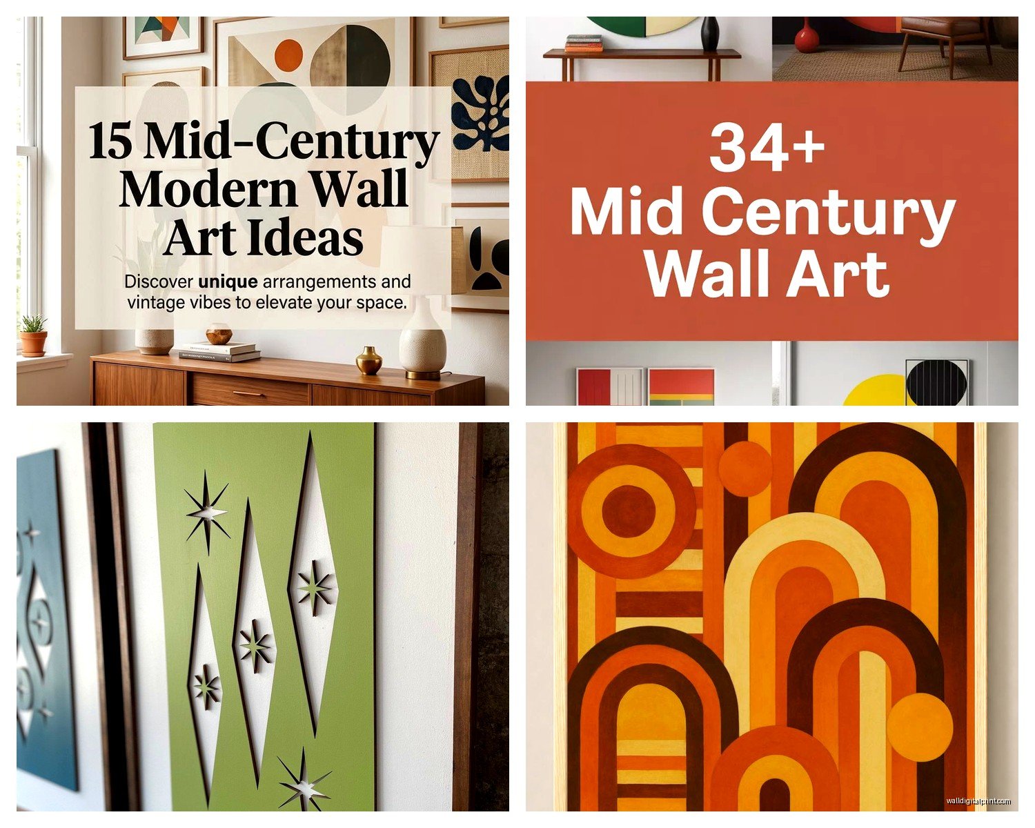
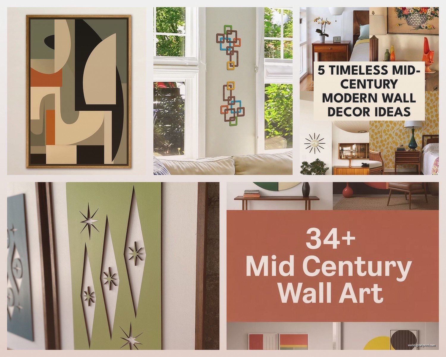
Okay so first thing – mid-century modern is basically 1940s to late 1960s design aesthetic. Think clean lines, geometric shapes, those starburst clocks your grandma probably had. The wall art from this era is super specific and you can’t just slap any retro poster up there and call it MCM.
Real MCM art usually features:
- Abstract geometric patterns – circles, triangles, asymmetrical shapes
- Muted color palettes with pops of mustard yellow, burnt orange, teal
- Atomic age motifs (those boomerang shapes everyone uses)
- Minimalist line drawings
- Nature-inspired abstract forms
- Typography art with that specific 60s font vibe
I spent like three weeks researching this when I was helping a client redo their den and honestly the rabbit hole goes deep. You’ve got your Charley Harper prints, your Alexander Girard textiles that people frame, vintage travel posters with that specific aesthetic.
Where to Actually Find This Stuff
So here’s where it gets tricky because authentic vintage MCM art costs like… a lot. I saw an original Charley Harper print going for $800 and nearly choked on my coffee. But you’ve got options.
The Affordable Route
Etsy is gonna be your best friend here but you gotta search smart. Don’t just type “mid-century modern art” because you’ll get 50,000 results and most of them are garbage. Try searching for:
- “MCM geometric print”
- “Atomic age poster”
- “Retro abstract art”
- “1960s style print”
I found this seller who does digital downloads of MCM-style designs for like $6 and you can print them at Staples or whatever. The quality is surprisingly good if you print on decent paper stock. Just make sure you’re getting at least 300 DPI resolution or it’s gonna look pixelated and cheap.
Society6 and Redbubble have tons of MCM-inspired stuff too. The nice thing is they’ll print and frame it for you, though the framing options are kinda basic. I ordered three prints from Society6 last month and two were perfect, one came with a weird color shift that made everything look too pink, so that’s a gamble.
The Vintage Hunt
If you wanna go authentic, estate sales are where it’s at. I dragged my friend Sarah to like six estate sales one weekend and we found some amazing stuff – a set of three teak-framed prints for $40 total. The frames alone were worth more than that.
Thrift stores can be hit or miss. You’re mostly gonna find mass-produced stuff from the 80s trying to look retro, but occasionally you’ll score. I found a legitimate 1960s textured abstract piece at Goodwill for $12 and almost screamed in the middle of the store.
Online vintage shops on Etsy mark stuff up like crazy but sometimes it’s worth it. Just really examine those photos – zoom in, check for damage, ask about dimensions because people are terrible at measuring things accurately.
Framing Without Going Broke
Oh and another thing – framing is where people blow their entire budget and then wonder why their $10 print cost $150 total. Custom framing is insane expensive. I learned this the hard way.
IKEA frames are actually perfect for MCM style if you stick to their simple designs. The RIBBA frames in black or white work great. Their SILVERHÖJDEN frames have that thin profile that looks super modern. Just avoid anything ornate or too traditional because it’ll clash with the aesthetic.
Target’s Threshold brand has some good options too. I use their gallery frames all the time – they’re like $20-30 and look way more expensive than they are.
For odd-sized vintage pieces, check out Frame It Easy online. You input custom dimensions and they’re cheaper than going to a local frame shop. Takes like two weeks to arrive but the quality is solid.
The DIY Framing Thing
This is gonna sound weird but I’ve started making my own frames for smaller pieces using wood trim from Home Depot and corner clamps. It’s not that hard if you have a miter saw or can get the store to cut angles for you. Way cheaper and you can stain the wood to match your existing furniture. My cat knocked one off the wall last week and it survived so they’re pretty sturdy.
Creating a Gallery Wall That Doesn’t Look Chaotic
So gallery walls are huge right now but most people just throw stuff up randomly and it looks messy. MCM style needs more intention than that.
Here’s what actually works – pick a unifying element. Could be:
- All the same frame color (black works best for MCM)
- Consistent color palette across all pieces
- Similar subject matter (all geometric, all abstract, all nature-inspired)
- Matching frame sizes in a grid pattern
I always do the paper template thing first. Trace your frames on kraft paper, tape them to the wall with painter’s tape, move stuff around until it looks right. Takes forever but saves you from putting 47 holes in your wall.
For spacing, 2-3 inches between frames is the sweet spot. Closer than that looks cramped, farther looks disconnected. I use a ruler and level for this because my eye is terrible at judging distances – everything ends up crooked if I eyeball it.
Color Combinations That Don’t Fight Each Other
Okay so color is where people really mess up MCM wall art. The palette is super specific and if you go too bright or too modern it stops reading as mid-century.
Classic MCM colors:
- Mustard yellow (not bright lemon, the dusty yellow)
- Burnt orange and rust tones
- Avocado and olive greens
- Teal and turquoise
- Chocolate brown
- Warm wood tones
- Black and white as neutrals
You want mostly neutrals with those accent colors popping through. I did a gallery wall last year that was mostly black and white geometric prints with one mustard yellow abstract piece and one teal botanical print. Looked amazing and didn’t overwhelm the space.
Avoid: Hot pink, lime green, purple (unless it’s a really muted mauve), anything neon or too saturated. Those didn’t exist in the MCM palette the way we use them now.
Mixing Authentic and Reproduction Pieces
Wait I forgot to mention – you can totally mix real vintage stuff with modern reproductions. Nobody’s gonna come inspect your walls with a magnifying glass. I do this all the time.
The trick is matching the quality level. If you’ve got one really nice vintage framed piece, don’t put a cheap printed poster next to it because the difference will be obvious. But a good quality modern print in a nice frame next to authentic vintage? Totally works.
I have this one wall in my office that’s half vintage finds and half stuff I designed myself in Illustrator using period-appropriate elements. My friend who’s a total MCM purist couldn’t even tell which was which until I pointed it out.
Scale and Proportion Stuff
This matters more than people think. MCM design is all about balance and proportion. A tiny 5×7 print on a huge empty wall looks sad and lost. You want your art to take up appropriate visual weight for the space.
General rule I use – your art or gallery wall should take up about 2/3 to 3/4 the width of your furniture piece. So if you’ve got a 6-foot credenza, your wall art above it should be roughly 4-5 feet wide total. Can be one big piece or a grouping.
For height, hang stuff so the center is at eye level, which is usually 57-60 inches from the floor. I cheat this a bit depending on ceiling height and furniture but it’s a good starting point.
Subject Matter That Actually Fits
Not everything retro is MCM, right? Like, 1950s diner aesthetics and sock hop stuff isn’t mid-century modern even though it’s the same era. MCM is more sophisticated and design-forward.
What works:
- Abstract geometric compositions
- Stylized botanical prints (think Charley Harper birds or simplified leaf patterns)
- Architectural drawings and blueprints
- Atomic age and space race imagery
- Maps and vintage travel posters with clean design
- Typography and word art with period fonts
- Minimalist figure drawings
What doesn’t work:
- Shabby chic or farmhouse stuff
- Overly ornate or detailed illustrations
- Modern photography (unless it’s black and white architectural)
- Beach and coastal themes (wrong vibe)
- Inspirational quotes in modern fonts
I made the mistake once of putting a really pretty watercolor botanical print in a MCM space and it just looked wrong. Too soft and romantic. Swapped it for a graphic line-art version of a similar plant and suddenly it worked.
DIY Projects That Don’t Require Art Skills
So if you’re broke or just can’t find what you want, making your own MCM wall art is easier than you’d think. I’m not even artistic and I’ve made stuff that looks legit.
Geometric tape painting: Get a canvas, paint it a base color (white, cream, or gray), use painter’s tape to create geometric shapes, paint those shapes in MCM colors, remove tape. Done. I made three of these while watching that new show on Netflix and they turned out surprisingly good.
Starburst wall sculpture: Wooden dowels, a circular base, gold spray paint. Basically you’re making those sunburst clocks but without the clock part. I’ve seen people charge $200 for these on Etsy and the materials cost like $15.
Framed fabric: Buy MCM-patterned fabric (Spoonflower has tons), stretch it over a canvas or in a frame, done. I did this with vintage barkcloth I found at an estate sale and it’s one of my favorite pieces.
Cork board geometric art: Those cork tiles from the hardware store, cut them into shapes, arrange on a backing board, spray paint. Adds texture and dimension which is very MCM.
Digital Design Route
If you know even basic Canva or Illustrator, you can make your own prints. I taught myself enough Illustrator to make simple geometric designs and honestly it’s not that hard. There are tons of MCM-style shape libraries and color palettes available free online.
Just keep it simple – circles, triangles, lines, maybe some texture overlays. Export at high resolution and print. I probably have 20 designs I’ve made sitting in a folder that I rotate through when I get bored of what’s on my walls.
Common Mistakes Everyone Makes
Okay so here’s what I see constantly that drives me nuts:
Mixing too many styles. Your MCM wall art shouldn’t be next to farmhouse signs and boho macrame. Pick a lane.
Going too matchy-matchy. Everything doesn’t need to be the exact same color or theme. You want cohesion but not uniformity.
Hanging stuff too high. I swear every house I go into has art practically on the ceiling. Bring it down to eye level.
Buying prints that are too small. Bigger is almost always better. A bunch of tiny scattered prints looks cluttered unless you’re doing a very intentional grid.
Cheap printing on cheap paper. If you’re doing reproduction prints, invest in decent printing. The difference between drugstore printing and proper photo lab printing is huge.
Ignoring lighting. MCM art looks best with good lighting – either natural light or warm ambient lighting. Those cool LED bulbs make everything look washed out.
Maintaining and Protecting Your Art
UV protection glass or acrylic is worth it if you’re spending real money on pieces or if they’re in direct sunlight. I learned this when a print I paid $80 for faded to almost nothing in like six months because it was across from a west-facing window.
Dust your frames regularly. Sounds obvious but dust buildup makes everything look dingy and old in a bad way.
For actual vintage pieces, sometimes less is more with cleaning. Don’t use harsh chemicals on old paper or fabric. Dry dusting is usually enough.
If you’ve got valuable vintage stuff, consider getting it professionally appraised and documented. I helped a client who found out her “cheap thrift store prints” were actually worth like $3,000 because they were original lithographs from a known artist.
Budget Breakdown Reality Check
Since you’re probably wondering what this actually costs, here’s what I typically spend:
Budget approach: $50-150 total for a whole wall. Digital prints from Etsy ($5-10 each), IKEA frames ($10-20 each), maybe one nicer piece as a focal point ($30-50).
Mid-range approach: $200-500. Mix of Society6 framed prints ($50-100 each), some vintage finds ($20-80), better quality frames ($30-60).
Investment approach: $500+. Original vintage pieces, custom framing, maybe one or two authentic designer prints. This is where you go if you’re really serious about it.
I usually recommend the mid-range approach because it gives you enough quality that things look intentional but you’re not gonna cry if you decide to change stuff up in a few years.
Honestly the biggest thing is just starting and not overthinking it. I changed my gallery wall like four times before I was happy with it and that’s totally normal. You’re not gonna get it perfect immediately and that’s fine – MCM design is supposed to be livable and functional, not precious museum pieces you can’t touch.
My office wall right now has eight pieces and I’m already planning to swap two of them out because I found better options at an estate sale last weekend. It’s an ongoing thing, not a one-and-done project.