Wall Art Guide, Wall Art Tutoriels
Navy and Pink Wall Art: Deep Blue Blush Preppy Combo
Oct
So I’ve been obsessing over this navy and pink combination lately and honestly it started because a client asked for something “preppy but not boring” and I kinda fell down a rabbit hole. Like, I thought it would be simple but then I spent three hours comparing art prints while my dog kept trying to sit on my laptop.
The thing about navy and pink wall art is you gotta figure out your ratio first. I see so many people trying to do a perfect 50/50 split and it just looks… I dunno, like a kid’s room? Which is fine if that’s what you want, but for that sophisticated preppy vibe you’re probably going for, you need one color to dominate.
I usually go 70% navy, 30% pink. Or flip it if you want something softer. But don’t do equal amounts unless you’re specifically going for that bold statement wall situation.
Finding Pieces That Actually Work Together
Okay so here’s where people mess up. They’ll buy a navy abstract print from one seller, a pink floral from another, and then wonder why it looks like a Pinterest fail when they hang everything up. The secret is having some kind of connecting thread.
I’ve found a few approaches that actually work:
Same art style, different subjects. Like, all line drawings but one’s navy strokes on white, another is pink strokes on cream, maybe throw in one that has both colors. This is probably the easiest method if you’re just starting out.
Matching frames. Cannot stress this enough. I once tried mixing gold and black frames thinking it would look eclectic and it just looked messy. Stick with one frame color for the whole gallery wall. White frames work if your walls are bright white, but natural wood or even navy frames can tie everything together better.
Similar tones of your colors. Here’s where it gets tricky… there’s like a million shades of pink. Dusty rose, blush, hot pink, salmon, mauve. For preppy vibes, you want that softer blush or dusty rose situation. Not the bright fuchsia. And your navy should be a true navy, not teal-ish or purple-navy.
Where I Actually Buy This Stuff
I’m gonna be real with you, I’ve wasted so much money on prints that looked great online and arrived looking washed out or pixelated.
Minted has really good quality and their navy tends to be consistent. I got this set of botanical prints in navy and blush last month and the paper quality is chef’s kiss. A bit pricey though, like $40-80 per print depending on size.
Etsy is hit or miss. You gotta read reviews carefully and look at customer photos, not just the seller’s mockups. I found this amazing shop that does custom nautical coordinates in navy with pink accents and it’s held up really well. But I also once ordered what looked like a sophisticated abstract and it arrived looking like someone’s first Procreate attempt.
Society6 is good for affordable options, especially if you’re doing a big gallery wall and need like 6-8 pieces. Quality isn’t quite as nice as Minted but it’s respectable for the price point.
Oh and another thing, if you’re crafty at all, you can buy navy cardstock and pink watercolor paper and make your own simple geometric pieces. Sounds basic but I did this for my own office and people always ask where I bought them.
Size and Layout Planning
This is gonna sound weird but I literally cut out paper templates before hanging anything. Every. Single. Time. I learned this the hard way after putting 20 nail holes in a client’s wall trying to get spacing right.
For a gallery wall with this color combo, I like mixing sizes but keeping them in the same “family” of proportions. So like, 16×20, 11×14, 8×10. All vertical or all horizontal works better than mixing orientations for this preppy look.
If you’re doing a single statement piece above a sofa or bed, you need something substantial. At least 30×40 or bigger. I see too many people hang like a 16×20 above a king bed and it just looks lost. You want the art to be about 2/3 the width of the furniture it’s above.
Wait I forgot to mention, the height matters too. Center of the art should be around 57-60 inches from the floor. This is standard gallery height and it actually does make a difference. When people hang stuff too high it feels disconnected from the space.
My Go-To Layout Formulas
- The Symmetrical Grid: 6 or 9 pieces, all same size, perfect squares or rectangles. Alternate navy-heavy and pink-heavy pieces. Super preppy, very organized. Works great in offices or above a console table.
- The Salon Style: Different sizes clustered together, tightest spacing is about 2-3 inches between frames. This one’s trickier but looks really collected and sophisticated. Start with your largest piece slightly off-center and build around it.
- The Linear Five: Five pieces in a straight horizontal line, varying sizes but tops aligned. Mix in maybe 3 navy, 2 pink, or vice versa. Really clean, works in modern spaces.
- The Statement Plus: One large piece with two smaller flanking pieces. Like a 24×36 in the middle with two 8x10s on either side. Keep the big one mostly navy with pink accents, smaller ones can be more pink-dominant.
Styling Beyond Just Hanging Stuff
Okay so you’ve got your art, you’ve hung it, but something still feels off. The art doesn’t exist in a vacuum, you gotta style around it.
I always add in some physical objects that pull the colors through. Navy throw pillows on your sofa if the art is above it. A pink vase on the console table below your gallery wall. Even books with navy spines stacked on a coffee table can tie things together.
Lighting is huge and people forget about this. If your room has warm yellow lighting, those navy and pink tones are gonna look muddy. You want cooler LED bulbs, around 3000-4000K. Makes the colors pop way better.
And honestly, sometimes you need to paint. I had a client with beige walls who wanted this color scheme and it just didn’t work until we painted the walls a soft white. Navy and pink need a clean backdrop. Beige, cream, or warm whites make everything look dingy. Bright white or very pale gray are your friends here.
Patterns and Textures That Work
Not everything needs to be solid colors. Actually, all solid colors can look flat and boring.
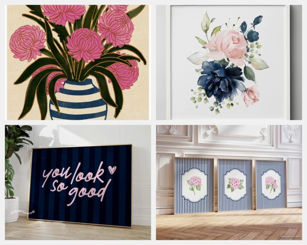
Stripes are obviously preppy. Navy and white stripes with pink accents, or pink and white stripes with navy accents. You can mix a striped piece with solid pieces and it adds visual interest without being chaotic.
Florals in these colors are tricky. You want stylized or abstract florals, not like… realistic rose garden situations. Think more botanical line drawings or watercolor abstracts that hint at floral shapes.
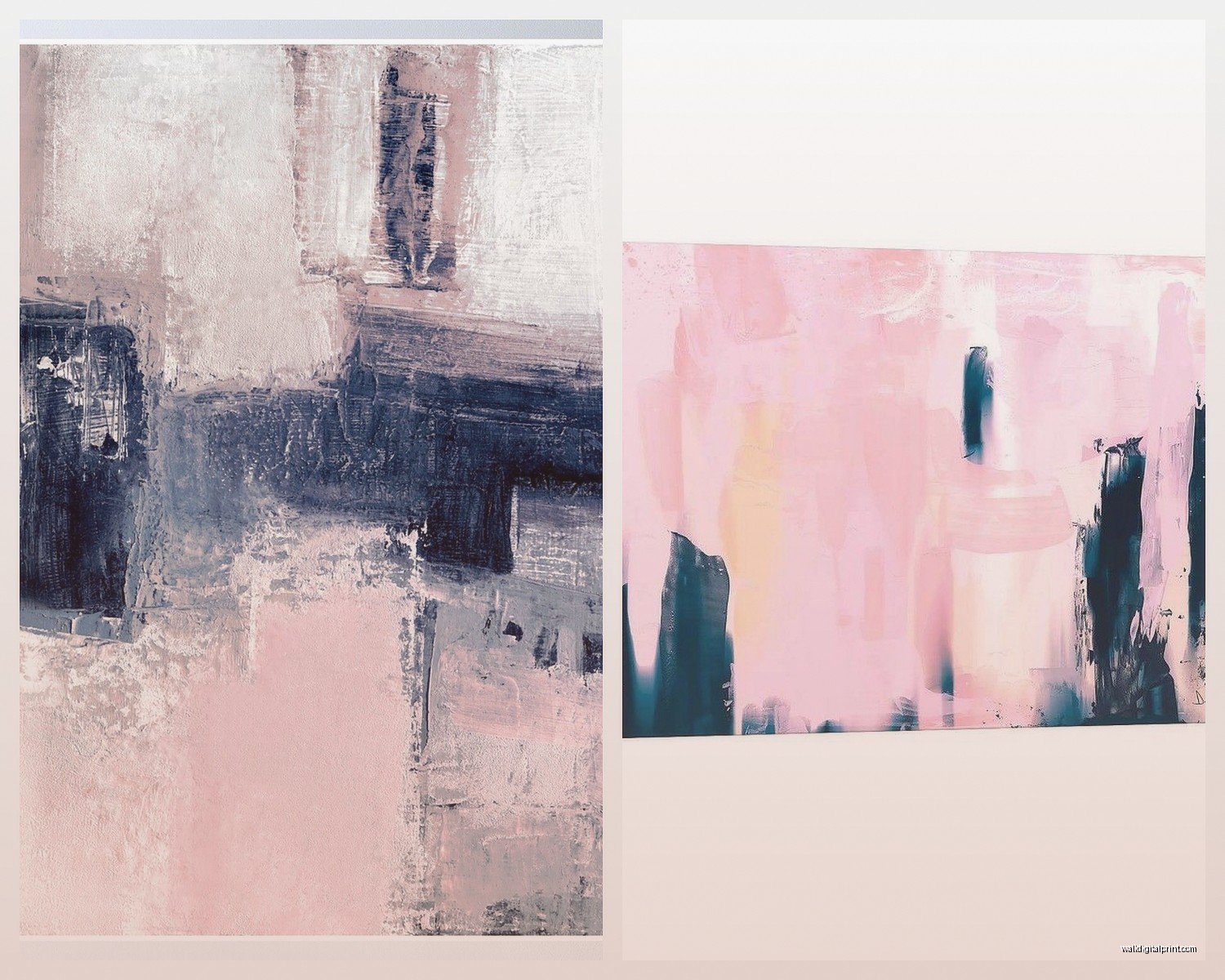
Geometric patterns work really well. Think hexagons, triangles, or even just color blocks. There’s this one print I use a lot that’s just overlapping circles in navy and blush and it’s simple but really elegant.
Nautical themes can work if you don’t go overboard. Like, one piece with an anchor or sailboat is fine. Five pieces all screaming “I LOVE BOATS” is too much. Unless you actually love boats that much, then go for it I guess.
Textures to Mix In
Don’t make everything flat art prints. Add dimension with:
- Woven wall hangings in navy and pink (macrame is having a moment)
- Framed fabric pieces – I’ve used vintage scarves in these colors and they look expensive
- 3D elements like shadow boxes or floating shelves styled with navy and pink objects
- Textured canvases, not just paper prints
Common Mistakes I See All the Time
Too matchy-matchy. If every piece is the exact same shade of navy and the exact same shade of pink, it looks manufactured and sterile. You want slight variations in tone.
Forgetting about scale. One tiny print on a huge wall just looks sad. If you’ve only got one piece and a big wall, either get a bigger piece or add more pieces.
Wrong undertones. This is subtle but important. If your pink has peachy undertones and your navy has purple undertones, they’re gonna fight each other visually. Try to keep undertones consistent – either both cool or both warm.
Hanging things too high. I mentioned this but seriously, so many people do this. Your art should feel connected to your space, not floating near the ceiling.
Not considering the room’s purpose. A bedroom can handle softer, more pink-dominant art. A home office probably wants more navy to feel professional. Living room can go either way depending on your vibe.
Budget-Friendly Options
Look, not everyone can drop $500 on a gallery wall. I get it.
Printable art on Etsy is like $5-10 per design. You download it, print it at a local print shop or even at home if you have a decent printer, frame it yourself. Frames from Target or IKEA are fine for this. The RIBBA frames from IKEA are actually pretty nice for the price.
Thrift store frames can be spray painted. I’ve taken ugly gold frames, spray painted them navy, and used them for pink-dominant art. Looks intentional and costs like $3 per frame plus paint.
DIY abstract art is easier than you think. Get a canvas, tape off some geometric shapes, paint sections in navy and pink, remove tape. Boom, art. I did this while watching The Bear last week and made three pieces in an evening.
Frame fabric or wrapping paper. Sounds cheap but if you find nice patterns, it actually works. I framed some navy and pink gift wrap once and people thought it was expensive wallpaper art.
Mixing in Other Colors
You don’t have to be strictly navy and pink. Actually, it usually looks better with some supporting colors.
White or cream is essential. Gives your eyes a place to rest and keeps things from feeling too saturated.
Gold accents are super preppy. Gold frames, or art with gold foil details, or just gold objects styled with your wall art.
Green works surprisingly well. Like, emerald green or sage green with navy and pink is chef’s kiss. I did a whole living room with this palette and it was probably my favorite project last year.
Gray can work as a neutral bridge between navy and pink. Charcoal gray especially.
Seasonal Switching
Okay this might be extra but I have some clients who swap out art seasonally. Keep your navy pieces year-round but switch the pink pieces for different vibes.
Summer: bright blush and coral tones, maybe some beach-inspired pieces
Fall: dustier rose and mauve, bring in some texture
Winter: keep it cool-toned, maybe add silver accents
Spring: softer pastels, floral elements
You don’t have to do this but it’s an option if you get bored easily like I do.
What to Actually Avoid
Anything too literal or cutesy unless that’s your vibe. Like wall decals that say “Live Laugh Love” in pink and navy. Just… no.
Overly trendy pieces that’ll look dated in two years. That super specific millennial pink and navy combo that was everywhere in 2018? Already looks dated. Stick with more classic shades.
Too many fonts. If you’re doing text-based art, keep it to one or two font styles max. Otherwise it looks like a ransom note.
Photos in these colors unless they’re really well done. Like, you can’t just slap a navy filter on your vacation photos and call it art. If you’re gonna do photography, get actual prints from photographers who work in this color palette.
Anyway, I think that covers most of it. The main thing is to just commit to a vision and not second-guess yourself into buying random pieces that don’t work together. Start with 2-3 pieces you really love and build from there rather than trying to fill a whole wall at once.