Wall Art Guide, Wall Art Tutoriels
Nice Wall Art for Living Room: Quality Main Space Decor
Sep
So I’ve been spending way too much time thinking about living room wall art lately, mostly because I had three clients in a row completely blank on what to do with their main walls and honestly? It’s trickier than people think.
Size Actually Matters More Than You’d Think
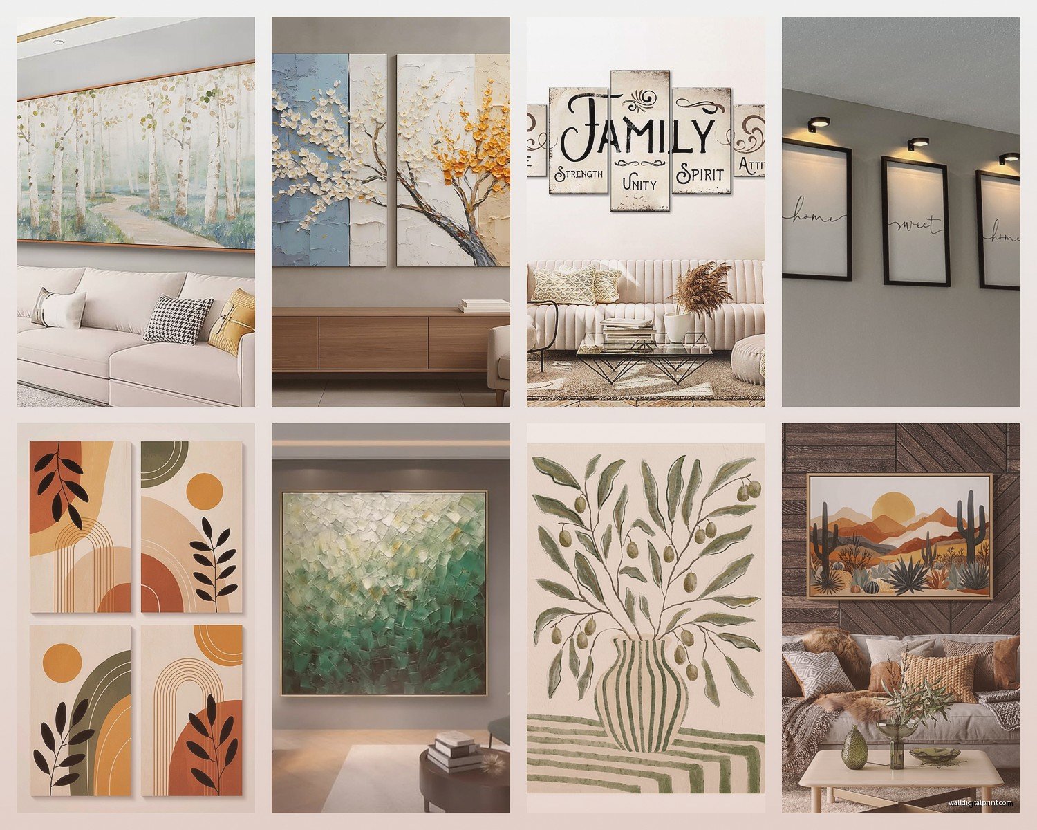
Okay so first thing – everyone buys art that’s too small. Like, every single time. You walk into a room and there’s this tiny 16×20 print floating above a massive sofa and it just looks… sad? The rule I tell everyone is your art should take up about two-thirds to three-quarters of your furniture width. So if you’ve got an 8-foot sofa, you’re looking at something around 60 inches wide, give or take.
But here’s where it gets interesting – you can do this with one large piece OR a gallery wall. I’m personally obsessed with gallery walls right now because you can build them over time and they feel more collected, less “I bought everything at HomeGoods in one trip” which, no shade, I’ve definitely done.
For a single large piece, I’ve been recommending 40×60 minimum for standard living rooms. Anything smaller and it disappears. I had a client ignore this advice (they always do at first) and bought a 24×36 for above their sectional and then texted me a photo like “why does this look wrong” and I was like… I told you but okay let’s fix it.
What Actually Looks Good Quality-Wise
Canvas prints are fine but they’re everywhere now. If you want something that feels more elevated, look for giclée prints on fine art paper with actual framing. The difference is noticeable – the texture, the way light hits it, everything.
I’ve been using this one supplier lately that does museum-quality prints and the color depth is just different. They’re pricier, like $200-400 for a large print versus $80 for a canvas, but it actually looks like art you’d see in a gallery. My dog knocked over a lamp last week and I had to move some pieces around and honestly just handling the better quality stuff reminded me why it matters.
Oh and another thing – if you’re going with canvas, make sure it’s at least 1.5 inches deep. Those thin gallery wraps look cheap. The thicker edge just reads as more substantial and you don’t necessarily need to frame it which saves money.
Color Coordination Without Being Matchy-Matchy
This is gonna sound weird but I tell people to ignore their wall color when picking art at first. Pick art you actually like, THEN figure out if it works. Because here’s the thing – you can change throw pillows and blankets way easier than you can find art that speaks to you but also perfectly matches your beige walls.
That said, some loose guidelines: pull 2-3 colors from your art into your accessories. Not all of them, just a few. I did this in my own living room with a really colorful abstract piece – pulled the burnt orange into pillows, the deep blue into a throw, left the rest alone. Works perfectly.
Neutral art is safer but it can read as boring. I’m seeing a lot of beige and cream abstract stuff right now and it’s pretty but like… does it spark anything? Sometimes no. If your whole room is neutral, that’s actually when you want colorful art to create a focal point.
Where to Actually Buy Decent Stuff
Okay so I’ve tested a bunch of sources:
Etsy – surprisingly good for original work and prints from actual artists. Search for “large abstract art” or “modern landscape print” or whatever your vibe is. The quality varies wildly so read reviews. I’ve gotten amazing pieces for $150-300 and also received one that looked like it was printed at a FedEx, so.
Minted – consistently good quality, nice framing options, but you’re paying for it. Expect $300-600 for large framed pieces. They do sales though, wait for 20% off.
Saatchi Art – if you want actual original paintings and have the budget ($500+), this is where I go. You’re buying directly from artists which feels good, and the curation is solid.
Article and West Elm – their art selection is actually pretty good now? Not just furniture. Mid-range pricing, modern aesthetic, ships fast. I furnished a whole living room from Article last month and grabbed two pieces of their wall art and it tied everything together nicely.
Wait I forgot to mention – avoid Amazon for art unless you’re doing something really basic for a rental. The quality is just not there most of the time, and the colors never look like the photos.
Gallery Wall Strategy That Won’t Make You Crazy
I’ve installed probably fifty gallery walls at this point and here’s what actually works:
Start with templates on the floor. Trace your frames on kraft paper, tape them to the wall with painter’s tape, step back and look for like a week. Move things around. This saves so many nail holes.
Mix frame sizes but keep a consistent element – all black frames, all wood frames, all white mats, something. Otherwise it looks chaotic. I learned this the hard way in my first apartment where I mixed black and gold and wood and it was just… a lot.
The center of your gallery should be at eye level, which is roughly 57-60 inches from the floor. People hang things too high constantly. Art should feel connected to your furniture, not floating near the ceiling.
Spacing rules:
- 2-3 inches between frames in a gallery wall
- 6-8 inches above furniture
- If it’s not above furniture, the center should be around 60 inches up
My cat knocked a frame off mid-install once and I realized I’d hung it too high anyway so… maybe listen to your pets? Just kidding, use a level.
Styles That Work in Most Living Rooms
Abstract art is the most forgiving because it doesn’t compete with your other stuff. Large brushstrokes, interesting colors, adds movement without being literal. I use this probably 60% of the time.
Black and white photography – timeless, sophisticated, works in modern or traditional spaces. Landscapes, architecture, even portraits if they’re artistic enough. Go big with these, like 40×60 or larger.
Line drawings – having a moment right now and I’m here for it. Simple, elegant, works especially well in minimalist spaces. A large line drawing of a figure or face can be really striking.
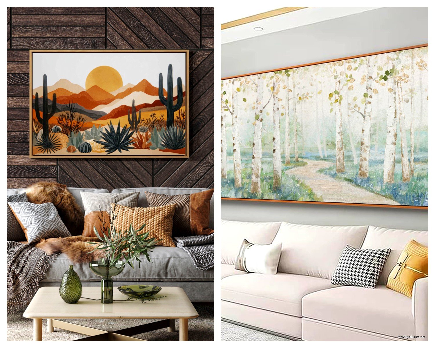
Landscape paintings or prints – if your space feels cold or sterile, landscapes warm it up. I’m not talking Thomas Kinkade stuff (no judgment if that’s your thing), more like moody seascapes or abstract landscapes with interesting color palettes.
Botanical prints – classic for a reason. Large-scale botanicals feel fresh without being too trendy. Go for vintage-style or really modern geometric ones, the middle ground can feel dated.
What I’m Avoiding Right Now
Those word art pieces that say like “gather” or “blessed” – they had their moment, it’s passed. If you love them that’s totally fine but they date a space.
Overly matchy-matchy sets from the same collection. You know the ones – three canvas prints, same color scheme, clearly designed to be sold together. They scream “I didn’t put any thought into this.”
Super trendy stuff unless you’re committed to changing it out. That weird 70s mushroom art that’s everywhere right now? Gonna look dated in three years, I’m calling it.
Framing Makes or Breaks Everything
This is where people try to save money and it shows. A $50 print in a $200 frame looks better than a $200 print in a $50 frame, I promise you.
If custom framing is too expensive (it usually is – I just got quoted $380 to frame one piece and nearly fell over), try:
Framebridge – online custom framing that’s way cheaper than local frame shops. Upload a photo, pick your style, they frame and ship it. Quality is solid.
Michael’s with a coupon – their custom framing is actually decent and they always have 50% off coupons. Just don’t go on weekends, the wait is horrible.
IKEA frames – if you find a print that fits their standard sizes (they have pretty large ones now), their frames are shockingly good for the price. The RIBBA series especially.
Large frames get expensive fast so sometimes it makes sense to buy unframed prints and invest in one really good frame. I rotate art in my entryway this way – same frame, different prints seasonally.
Lighting Your Art Properly
Okay so funny story – I installed this gorgeous abstract piece for a client, stood back to admire it, and realized their lighting made it completely disappear. Lighting matters SO much.
Picture lights are the gold standard but they require wiring or battery packs. Worth it for really special pieces. I like the LED ones that are adjustable.
Track lighting or adjustable can lights work if you already have them. Just make sure they’re aimed at the art, not creating glare.
If you can’t add lighting, at least make sure there’s ambient light in that area. A floor lamp nearby helps. Art in a dark corner is wasted art.
Some Random But Important Things
Hang art before you think you’re ready. Living with blank walls while you “wait for the perfect piece” means you’re just living with blank walls. Start with something, you can always change it.
Don’t hang valuable or sentimental art in direct sunlight. UV damage is real and permanent. I learned this with a vintage print that faded in like six months, it was devastating.
If you’re renting and can’t put holes in walls, command strips work for lightweight pieces (under 15 pounds usually). Picture rails are also genius – install once, hang anything.
Scale up more than you think. Seriously, bigger is almost always better. I’ve never had someone say “this art is too large” but I’ve had dozens say “I should’ve gone bigger.”
Mix mediums – don’t feel like everything has to be the same. A painting next to a photograph next to a textile piece can look really collected and interesting.
My Current Living Room Setup
Since you’re asking what actually works – I have a 6-foot wide abstract painting above my sofa (ochre, navy, cream), two smaller black and white photographs on the adjacent wall, and a large vintage botanical print in the corner. Nothing matches exactly but the colors all work together. Took me probably six months to collect everything and I’m still tempted to switch out the botanical print sometimes but that’s just how it goes.
The trick is living with things for a bit. Your first instinct isn’t always right. I’ve returned probably 30% of the art I’ve bought over the years because it looked different at home than in my head.
Oh and invest in a good laser level and those wall anchors that can hold actual weight. The tools matter just as much as the art itself. Nothing worse than something crashing down at 2am because you used a cheap nail.