Wall Art Guide, Wall Art Tutoriels
Simple Wall Art for Living Room: Minimalist Main Space Designs
Sep
So I’ve been thinking about this a lot lately because my neighbor literally texted me at midnight asking how to make her living room walls less… boring? without spending a fortune or making it look like a dorm room, and honestly the minimalist approach is where it’s at for living rooms.
Why Simple Actually Works Better
Here’s the thing about living room wall art that nobody tells you—less genuinely is more, and I know that sounds like something from a Pinterest quote board but hear me out. Your living room already has furniture, probably a TV, maybe plants, people moving around. Adding too much wall stuff just makes everyone’s eyes tired. I tested this in my own space by putting up like seven pieces and then slowly removing them over two weeks, and the sweet spot was three pieces max for a standard living room.
The key is that each piece needs to actually matter instead of just filling space. My cat knocked over my coffee while I was rearranging things last month and it made me realize I wasn’t even looking at half the art anymore because there was just too much competing for attention.
What Actually Counts as Minimalist Wall Art
Okay so minimalist doesn’t mean boring white canvas with one black line, though that can work if you’re into it. It means:
- Simple compositions that don’t have a million things happening
- Usually neutral or limited color palettes
- Clean lines and shapes
- Negative space that lets your eyes rest
- Nothing that screams for attention
I’ve curated shows where people bring in “minimalist” pieces that are actually super busy abstract expressionism and like, that’s fine, but it won’t give you the calm vibe you want in a main living space.
The Three Approaches That Actually Work
Single Large Statement Piece
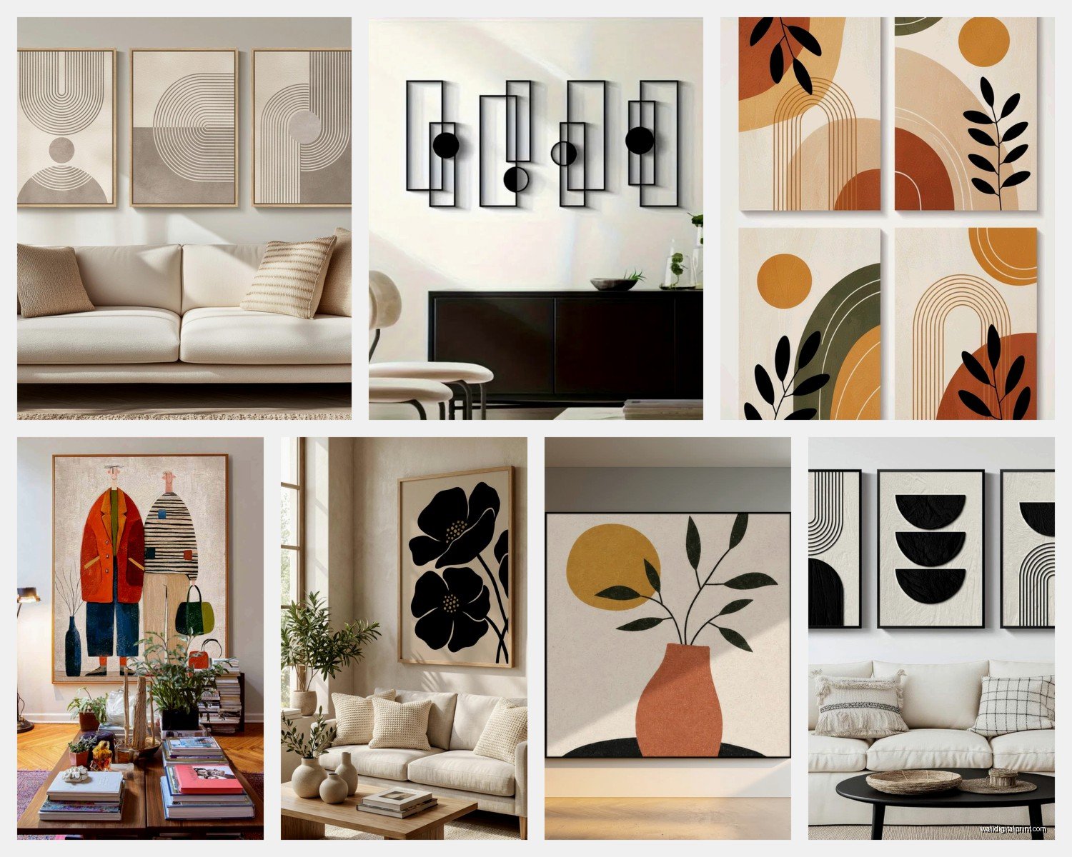
This is honestly the easiest and my go-to recommendation for people who get overwhelmed. One big piece above the sofa or on the main wall. Size-wise you want something that’s about two-thirds to three-quarters the width of your sofa if it’s going above seating.
I usually tell people to go for abstract photography, line drawings, or geometric prints. There’s this one print I keep recommending—it’s basically just a beige arch shape on cream background—and it works in literally every living room I’ve put it in. Cost like $60 framed.
The mistake people make is going too small. A tiny piece above a big sofa looks lost and sad. If you’re gonna do one piece, commit to the size. I’m talking 40×60 inches minimum for a standard sofa.
The Diptych or Triptych Setup
Two or three matching or coordinating pieces hung in a row. This gives you more visual interest than one piece but keeps things structured and calm.
What works:
- Three identical frames with simple line drawings
- Two large matching abstract prints
- Three botanical prints in the same frame style
Spacing matters here—I use 2-4 inches between frames depending on frame size. Closer spacing makes it feel more like one unit, wider spacing gives each piece room to breathe. I tested this extensively when my client canceled last spring and I spent an entire afternoon just moving two prints back and forth on my own wall at different distances.
Oh and another thing, make sure the center of your arrangement is at eye level, which is usually around 57-60 inches from the floor. I see so many living rooms where the art is randomly floating near the ceiling and it’s just awkward.
The Leaning Approach
This is gonna sound weird but some of my favorite minimalist setups don’t involve hanging anything. Large frames or canvases leaning against the wall on a console table or sideboard. It’s casual, easy to change, and you don’t put holes in your walls.
Works best with:
- Pieces that are substantial enough not to look temporary
- Simple frames—black, wood, or white
- Larger sizes, like 24×36 minimum
I have three black-framed line drawings leaning on my credenza right now and people always ask about them. They’re literally just figure sketches I printed from an online shop for $15 each.
Where to Actually Get This Stuff
Real talk about sourcing because this is where people get stuck.
Printable art from Etsy is clutch if you’re on a budget. You pay like $5-15, download the file, get it printed at a local print shop or online, frame it yourself. I’ve done this probably fifty times for clients. The quality is totally fine for living room art where you’re not examining it up close.
Frame it at Michael’s or Hobby Lobby when they have 50% off sales which is basically always. Or IKEA frames if you want to keep it really simple—their RIBBA and SILVERHÖJDEN lines are perfect for minimalist stuff.
For original pieces or higher quality prints, I actually like Minted and Artfully Walls. They’re pricier but the quality is noticeable and they have tons of minimalist options. Wait I forgot to mention—Society6 is hit or miss but they have sales constantly and some really good geometric and abstract stuff.
If you want actual original art without spending thousands, check local art fairs or student shows. I got this amazing minimalist landscape from a grad student show for $200 and it’s the piece I get asked about most.
Color Palette Strategy
This is where people mess up minimalist wall art. They pick pieces they like individually but together it’s chaos.
Pick one of these approaches:
Monochrome: Black and white only. Easiest to get right, works with literally any living room colors. My fail-safe recommendation.
Neutral Plus One: Beiges, tans, creams, grays, then maybe one muted accent color that pulls from your room. Like if you have blue pillows, a print with subtle blue elements.
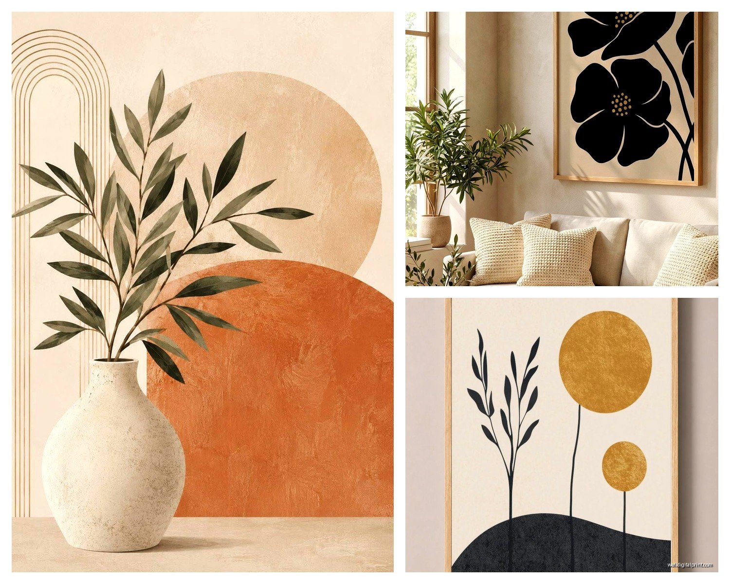
Earth Tones: Terracotta, sage, warm browns, cream. Super popular right now and genuinely looks good. Works especially well if your living room has wood furniture or warm metals.
I tested the earth tone thing in my own space after watching too much Selling Sunset (don’t judge) and yeah, it creates this really calm cohesive vibe.
The rule is basically don’t introduce colors through your wall art that aren’t already somewhere in your room. The art should feel like it belongs, not like it’s screaming “look at me I’m different.”
What About Black and White Photography
Okay so black and white photography is like the ultimate minimalist wall art but it can go wrong. Avoid:
- Super obvious stuff like the Eiffel Tower or a random lighthouse
- Overly dramatic landscapes that belong in a corporate office
- Anything too personal or specific unless it’s actually your photo
What works:
- Architectural details
- Abstract compositions
- Minimalist nature shots
- Simple portraits or figure studies
I have this one black and white print of just a doorway and shadow and it’s been in three different living rooms I’ve styled and works every time. Cost $45.
The Technical Stuff Nobody Explains
Hanging height: center of art at 57-60 inches from floor. Use a level, seriously. Eyeballing it never works as well as you think.
For gallery walls or multiple pieces, map it out on the floor first. I use painter’s tape on the wall to mark where frames will go before making any holes. Sounds tedious but saves so much frustration.
Hardware matters—use proper wall anchors if you’re not hitting studs. Those little plastic things that come with frames are garbage for anything over 5 pounds.
Lighting can make or break minimalist art. If your living room has good natural light, position art where it won’t get glare. If you’re relying on artificial light, consider picture lights or adjustable track lighting. I installed simple LED picture lights above two prints in my living room and the difference is honestly dramatic.
Actual Piece Recommendations
Things I recommend constantly:
Line art drawings: Female figures, faces, plant stems, abstract lines. Simple, elegant, works everywhere. Black on white or sepia tones.
Geometric prints: Circles, arches, rectangles in muted colors. Very on trend but also kinda timeless if you stick to neutral colors.
Minimalist landscapes: Think horizon lines, simple mountain silhouettes, abstract fields of color. Not realistic photography but interpretive.
Botanical prints: Single stems or leaves, lots of white space. The vintage scientific illustration style works great.
Typography: Only if it’s really well designed and the words actually mean something to you. Most typography art is cheesy but when it’s good it’s good.
Common Mistakes I See All The Time
Going too small. Seriously this is the number one thing. People are afraid to go big and end up with little pieces that look lost.
Matching everything too perfectly. Even in minimalist design you want some variation—different sizes, slight texture differences, etc.
Forgetting about the frame. The frame is like half the impact with minimalist art. Clean simple frames in black, natural wood, or white. No ornate gold stuff unless your whole room is glam which contradicts the minimalist thing anyway.
Hanging things too high. I see this constantly. Your art should relate to your furniture, not float up near the ceiling.
Oh and buying art before you know where it’s going. Figure out your wall situation first—measurements, what furniture is there, lighting—then shop for art. Not the other way around.
The Reality of Budget
You can absolutely do this cheap. Three printable downloads ($30), printing at Costco or a local shop ($60), IKEA frames ($45). That’s a full living room gallery wall for $135.
Mid-range would be buying prints from Minted or similar during sales, decent framing, maybe $300-500 for a full living room setup.
High-end is original art or limited edition prints with custom framing, you’re looking at $800+ per piece easily.
I’ve done all three and honestly? The cheap version done well looks just as good in most living rooms. The difference matters more if you’re into collecting art or want investment pieces.
Making It Feel Cohesive
This is the part that makes minimalist wall art actually work instead of looking random. Everything should feel like it belongs together even if the pieces aren’t matching.
Use consistent framing—all black frames, all wood frames, all white frames. Mixing frame colors in minimalist spaces usually looks messy.
Stick to your color palette like I mentioned before. If you chose earth tones, everything should pull from that family.
Consider the style—abstract geometric shapes don’t really mix with realistic botanical illustrations. Pick a lane.
The spacing and layout should follow some logic. Centered arrangements, symmetrical groupings, consistent spacing between pieces.
When to Break the Rules
Sometimes one colorful piece in an otherwise neutral setup is perfect. Sometimes mixing styles works if you’re intentional about it. Sometimes going smaller than recommended is actually the right choice for a specific wall.
I have this one client who insisted on a tiny 8×10 print on a huge wall and I was like “that’s gonna look weird” but she put it on a narrow wall section between windows and it actually worked because the architecture framed it.
The minimalist approach is about being thoughtful, not following rigid rules. If something feels right in your space and creates the calm vibe you want, it’s probably fine.
Anyway that’s basically everything I tell people when they ask about this. Start simple, pay attention to scale, stick to a cohesive palette, and don’t overthink it. Your living room wall art should fade into the background in a good way—present but not demanding attention, adding to the vibe without dominating it.