Wall Art Guide, Wall Art Tutoriels
Teal Wall Art for Bedroom: Turquoise Blue Sleep Space Decor
Sep
So I’ve been basically living and breathing teal wall art for bedrooms lately because three different clients asked about it in the same week and then my sister wanted to redo her sleep space, and honestly? It’s one of those things that sounds simple until you actually start shopping and realize there are like eight million shades of teal and they all photograph differently online.
Figure Out Your Actual Teal First
Okay this is gonna sound annoying but you need to figure out if you want true teal (that blue-green mix), more turquoise (leaning blue), or that deeper peacock situation. I made this mistake with a client’s bedroom last month where we ordered three “teal” pieces and they arrived looking like they belonged in three different rooms. One was basically aqua, one was navy with green undertones, and only one was actual teal.
What I do now is pull up paint swatches on my phone. Benjamin Moore’s Peacock Blue, Sherwin Williams’ Reflecting Pool, and Behr’s Teal Zeal are good reference points. Screenshot those and keep them open when you’re shopping online. It sounds extra but I promise it saves you from that sad moment when the package arrives and the color is completely wrong.
Size Things Properly Because Everyone Gets This Wrong
The biggest mistake I see is people buying art that’s way too small. Like, if you have a queen bed, you need something that’s at least 40 inches wide if it’s going above your headboard. I learned this the hard way in my own bedroom where I hung this gorgeous teal abstract piece that was 24 inches and it just looked… sad and floaty.
Here’s my rough formula:
- Above the bed: two-thirds to three-quarters the width of your headboard
- Side walls: depends on the wall space but generally 24-36 inches for medium walls
- Gallery walls: plan the whole thing to be at least 48 inches wide
I actually measured every bedroom I’ve worked on for the past year and these ratios just work. Don’t go smaller thinking it’ll look “delicate” because it won’t, it’ll just look like you didn’t commit.
Materials Matter Way More Than You’d Think
Canvas prints are fine but they photograph really saturated online and then arrive kinda muted. I’ve noticed this especially with teal because it’s such a specific color. The cheaper canvas prints from Amazon or those print-on-demand sites tend to skew either too green or wash out the blue completely.
What’s actually worked better for me:
- Framed prints with actual glass or acrylic facing – the colors stay more true
- Metal prints if you want something modern and the teal stays really vibrant
- Textured canvas but only from places that use high-quality printing
Oh and another thing, those trendy acrylic prints? They look incredible with teal because the glossiness makes the color pop, but they show every fingerprint and my cat knocked one off the wall once and it shattered into a million pieces so maybe not if you have pets or kids who like to touch stuff.
Mixing Teal With Other Colors Without It Looking Chaotic
This is where people get stressed but honestly it’s not that complicated. Teal plays really well with:
Neutrals: White, cream, gray, beige. This is the safe route and it works. I did a bedroom last spring with teal abstract art, cream bedding, and gray walls and it was chef’s kiss. Clean, calm, not boring.
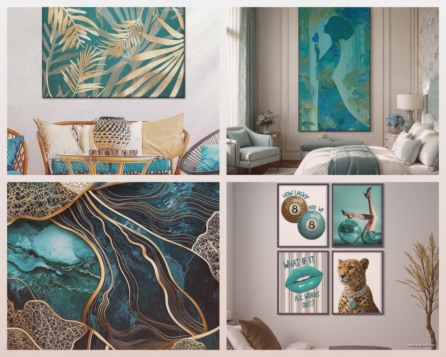
Warm metallics: Gold and brass look amazing with teal. Like, surprisingly good. I found these teal and gold leaf prints on Etsy from a shop called… wait I gotta find it… okay I can’t remember but search “teal gold abstract bedroom art” and you’ll see what I mean. The gold warms up the coolness of the teal.
Blush pink: I know this sounds weird but teal and dusty pink together create this sophisticated vibe. It’s not girly if you do it right. Keep the pink muted and let the teal be the dominant color.
Navy or deeper blues: Monochromatic but with depth. This works if your bedroom already has blue tones and you want cohesion.
What doesn’t work – and I learned this the hard way – is mixing teal with bright orange or red unless you’re specifically going for that bold maximalist look, which is cool but probably not what you want in a sleep space.
Types of Teal Art That Actually Help You Sleep
So there’s this whole thing about how the art in your bedroom affects your sleep and I was skeptical until I started paying attention. Busy, chaotic patterns genuinely make spaces feel more energetic, which is great for a living room but not ideal when you’re trying to wind down.
For bedrooms, I gravitate toward:
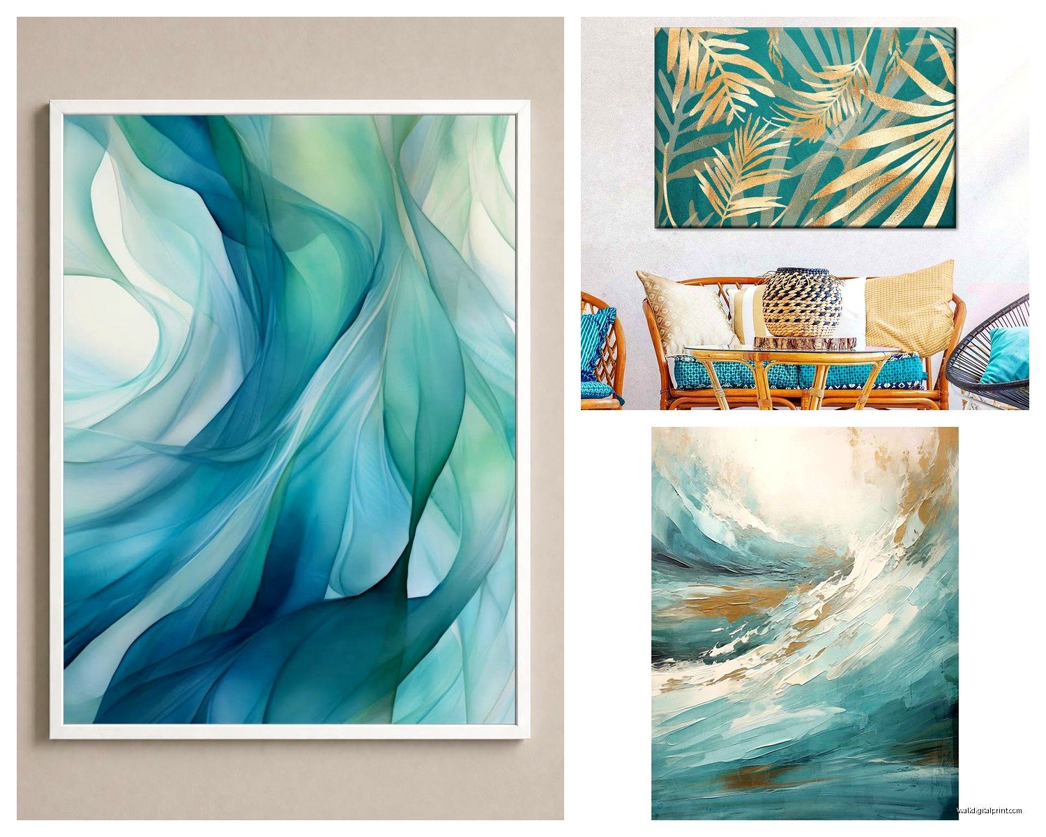
Abstract ocean or water themes: Waves, flowing shapes, anything that mimics water movement. There’s something about teal in these forms that feels naturally calming. I have this one piece in my bedroom that’s basically just teal watercolor washes and it’s so simple but I never get tired of it.
Geometric but soft: Not harsh lines, more like gentle geometric shapes. Circles, organic rectangles, that kind of thing. The structure is calming but not cold.
Botanical prints in teal tones: Leaves, palm fronds, abstract florals. These bring in that nature element without being too literal. I found a set of three teal botanical prints at Target last year for like $30 total and they still look good in my guest room.
Minimalist line art: Single-line drawings in teal on white backgrounds. Super modern, very calming, doesn’t compete with anything else in the room.
What I avoid for bedrooms is anything too detailed or busy. Like those intricate mandala designs or super detailed cityscapes – save those for other rooms.
Where to Actually Buy This Stuff
Okay so after buying probably too much wall art for various projects, here’s where I actually shop:
Etsy: Best for unique prints and you can often get custom sizing. Search for “teal abstract bedroom print” or “turquoise minimalist art” and filter by your country to avoid crazy shipping times. I’ve had good luck with digital downloads that I then get printed at a local print shop, which sounds complicated but it’s cheaper and you control the quality.
Society6 and Redbubble: Good for finding independent artists, lots of teal options. The quality is hit or miss though. I order sample prints first if I’m doing a client project. Their framing options are decent but marked up.
West Elm and CB2: More expensive but the quality is consistent. They usually have a few teal pieces in rotation. Wait for sales because their stuff goes on sale constantly.
Minted: Higher end, really good quality printing. Their limited edition art in teal tones is beautiful but you’re paying for it. Good if it’s a focal point piece.
HomeGoods/TJ Maxx: This is gonna sound random but I find great teal art here sometimes. It’s totally hit or miss and you can’t shop online for specific pieces, but if you see something you like, grab it because it won’t be there next week.
Amazon: Mixed bag. Read reviews carefully and check if reviewers posted photos because the product photos lie. A lot. I’ve had decent luck with the Rivet and Stone & Beam brands for affordable framed prints.
The Gallery Wall Situation
Everyone wants to do a gallery wall until they actually start planning one. If you’re doing teal as part of a gallery wall, here’s what’s worked for me:
Don’t make everything teal. Use teal as the accent color in maybe 40-50% of the pieces max. Mix in black and white photos, neutrals, maybe one piece with a complementary color like that dusty pink I mentioned.
Stick to either all frames or all frameless, not both. I’ve tried mixing and it looks messy. If you’re using frames, keep them the same color – black, white, or natural wood all work with teal.
Layout the whole thing on the floor first. Take a photo. Live with that photo for a day. I know it sounds excessive but I’ve redone so many gallery walls because I didn’t do this step and then hated the arrangement once it was on the wall.
Use proper hanging strips or nails. Those command strips work for lighter pieces but anything over 5 pounds needs a real nail. My downstairs neighbor was not happy when a gallery wall piece fell at 2am last year so yeah, don’t skip this.
Lighting Makes or Breaks Teal Art
This is something nobody talks about enough. Teal looks completely different in warm light versus cool light. If your bedroom has warm-toned bulbs (the yellowy ones), teal will look more green. Cool-toned bulbs (the blue-white ones) make teal look more blue.
For bedrooms, I usually recommend warm white bulbs (around 2700-3000K) because they’re better for sleep, but this means your teal art will lean slightly warmer and greener. That’s fine if you know to expect it. Just don’t order art under cool office lighting and then wonder why it looks different at home.
Picture lights are worth it if you have one major teal piece above your bed. Those small LED picture lights make the colors pop without being too bright for a bedroom. I installed one on a dimmer for a client and she can adjust it based on mood.
Quick Fixes If Your Teal Art Isn’t Working
Sometimes you get the art home and it just… doesn’t work. Before you return it:
Try moving it to a different wall. Natural light changes everything and that piece might work better on a perpendicular wall.
Add a mat or different frame. I’ve saved so many pieces by just rematting them. A white mat can tone down teal that’s too intense, a navy mat can deepen it.
Adjust your bedding or throw pillows to pull in the teal. Sometimes the art is fine but it needs support from other elements in the room. I keep a couple teal throw pillows specifically for this purpose.
Layer it with other art. One teal piece alone might feel stark, but add a neutral piece next to it and suddenly it’s a curated moment.
If it’s too bright, hang it across from a window instead of next to one. Direct sunlight makes teal really intense.
The Thing About Trendy Versus Timeless
Look, teal is having a moment right now but it’s also been popular in various forms for decades so I don’t think it’s gonna suddenly look dated. That said, how you use it matters.
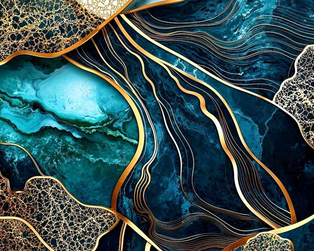
Super trendy right now: Those teal agate slice prints, teal and gold marble patterns, “be still” or other word art in teal. These might feel dated in five years.
More timeless: Abstract teal art, teal botanical prints, ocean-inspired pieces, geometric designs. These have been around forever in different forms.
I try to steer clients toward the timeless stuff for bedrooms since you look at it every day and bedroom makeovers are expensive. Save the trendy pieces for smaller spaces or cheaper frames you can swap out easily.
Wait I forgot to mention – if you’re renting, those 3M picture hanging strips are your best friend. They hold up to 16 pounds for the heavy-duty ones and don’t damage walls. I’ve used them in every apartment I’ve lived in and they work great with framed teal prints.
Also one last thing, if you’re not sure about committing to teal art, start with one piece. See how you feel about it for a few weeks. I have clients who think they want a whole teal moment and then realize they actually just wanted one accent piece, or vice versa. There’s no rule that says you have to decide everything at once.