Wall Art Guide, Wall Art Tutoriels
Northern Lights Wall Art: Aurora Borealis Sky Photography
Jul
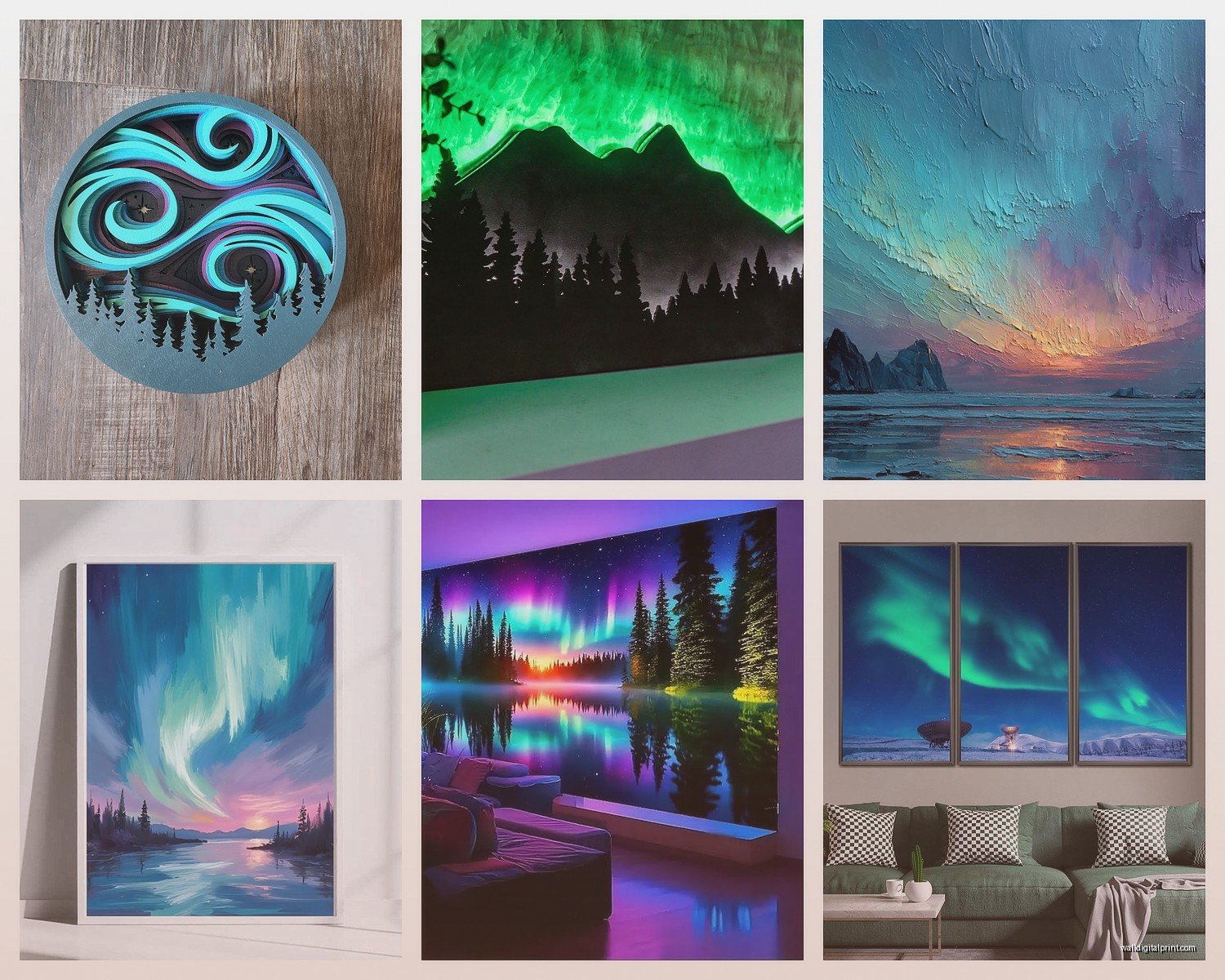
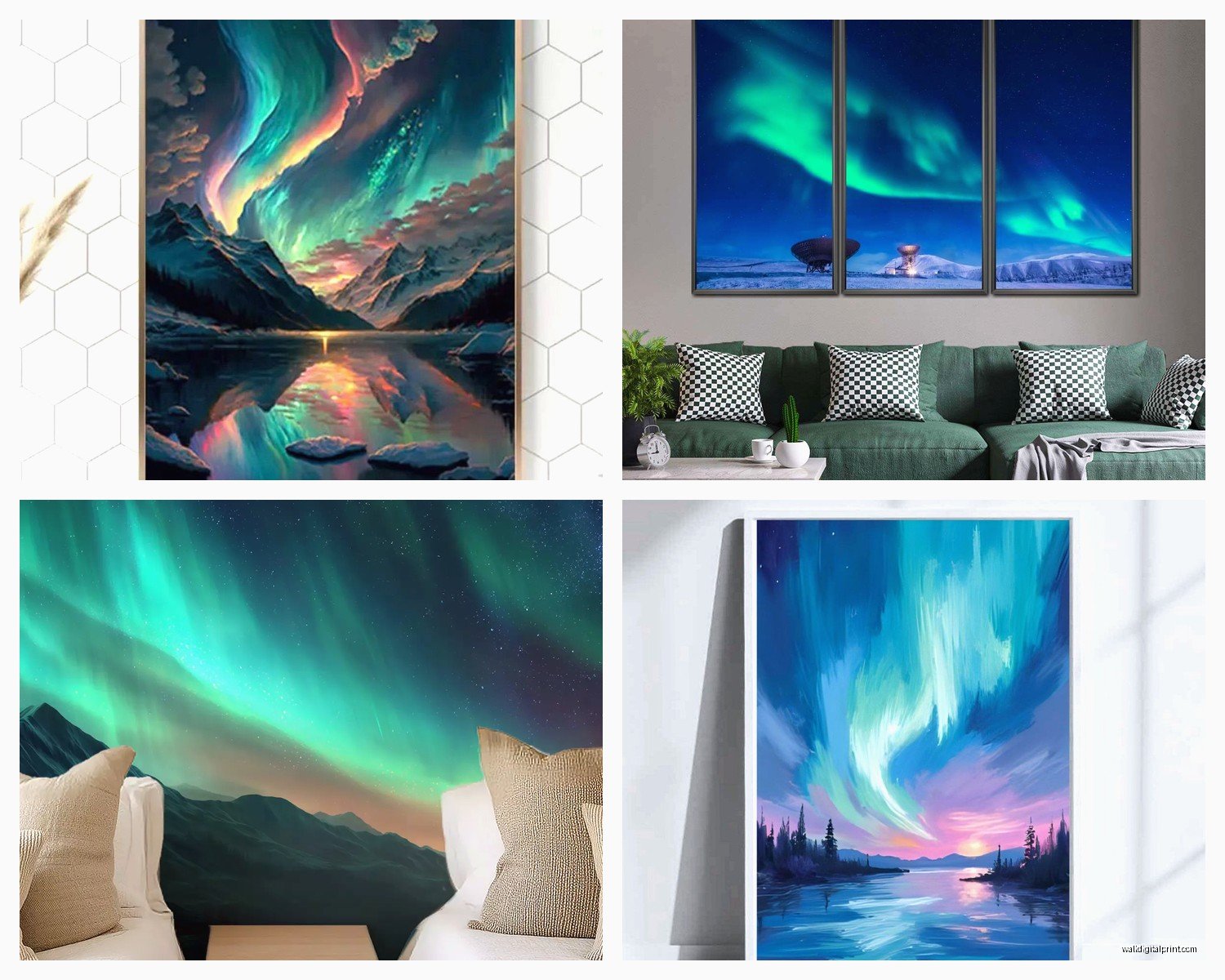
So I’ve been totally obsessed with aurora borealis photography for wall art lately and honestly it started because a client wanted to redo their entire living room around this one northern lights print they bought in Iceland. Like, they came back from vacation and just HAD to have it as the focal point and I was like okay, let’s make this work.
First thing you gotta know is that not all northern lights prints are created equal. The quality difference is insane. I spent like three weeks testing different prints from various sources and the color saturation alone will make or break the whole vibe. Some of them look washed out and sad, like someone just slapped a filter on a phone photo. Others are so oversaturated they look fake, which… I mean some people are into that but it doesn’t feel authentic to me.
Finding the Right Colors for Your Space
The traditional green aurora is what everyone thinks of first but honestly those teal and purple ones are where it’s at if you want something that works with modern interiors. I have this one piece in my own bedroom that’s mostly deep purple with hints of pink and it pairs so well with gray walls. My cat literally sits and stares at it sometimes which is weird but also kinda validating?
When you’re picking colors think about what’s already in your room. If you’ve got a lot of warm woods and earth tones, go for the greener aurora shots with maybe some yellow undertones. For cooler spaces with whites, grays, blues – the purple and magenta auroras are gonna pop without clashing. I made the mistake once of putting a super green intense aurora print in a room with terracotta accents and it just… didn’t work. Looked like Christmas threw up everywhere.
The Color Combinations That Actually Work
- Green aurora with navy or charcoal gray walls
- Purple/pink aurora with light gray or white spaces
- Multi-colored (green, purple, pink) with neutral beige or greige
- Teal aurora with warm wood tones and cream
- Blue-green aurora with coastal vibes, whites and sandy colors
Print Quality and What to Actually Look For
Okay so this is gonna sound super technical but stay with me. You want prints that are at least 300 DPI if you’re going big. I learned this the hard way when I ordered a 40×60 inch print at like 150 DPI and you could see the pixelation from across the room. Total disaster. Had to reorder and eat the cost.
Canvas prints are popular but honestly I’m more into metal prints for aurora photography. The way the light reflects off metal gives it this ethereal quality that actually mimics what the northern lights look like in person. I visited Norway two years ago (my partner dragged me on this freezing trip but it was worth it) and seeing the real aurora, it has this luminous quality that metal prints capture better than canvas or paper.
Print Material Options Ranked
- Metal prints – best for vibrant colors and modern spaces
- Acrylic prints – super glossy, works for contemporary designs
- Fine art paper – traditional, works in classic interiors
- Canvas – popular but can look flat with aurora photos
- Framed prints under glass – good middle ground
Wait I forgot to mention – if you go with canvas make sure it’s gallery wrapped so the image continues around the edges. Nothing looks cheaper than white canvas edges on a dramatic aurora photo.
Size and Placement Strategy
This is where people mess up the most. They either go too small and the impact is lost, or too big for their wall and it overwhelms everything. The northern lights are inherently dramatic so you need enough size to capture that feeling but not so much that it dominates in a bad way.
For a standard living room wall (like 10-12 feet wide), I usually recommend a 40×60 or 36×48 inch print as a solo piece. If you’re doing a gallery wall situation, don’t. Just don’t. Aurora photos need to stand alone to have impact. I tried doing a gallery wall with smaller aurora prints once and it just looked busy and confused.
Above a sofa, you want the print to be about two-thirds to three-quarters the width of the sofa. So if you’ve got a 90-inch couch, aim for a 60-inch wide print minimum. I’ve seen people put tiny 24×36 prints above massive sectionals and it looks like an afterthought.
Best Placement Spots
- Above the sofa or main seating area in living rooms
- Master bedroom above the bed – creates a dreamy atmosphere
- Home office behind your desk for Zoom backgrounds (works surprisingly well)
- Dining room focal wall
- Stairway landing where you have a big empty wall
Oh and another thing – lighting matters SO much with these prints. You need to light them properly or they lose all their magic. I use picture lights or track lighting aimed at the print. Natural light can work but avoid direct sunlight because it’ll fade the colors over time.
Where to Actually Buy Quality Prints
I’ve tested probably 15 different sources at this point. Some photography marketplaces have amazing aurora shots from actual photographers who traveled to see them. The quality is usually better than generic stock photo sites because these people know what they’re doing with camera settings and composition.
Look for photographers who specialize in landscape or astrophotography. Their aurora shots will have better composition – like they’ll include interesting foreground elements like mountains, trees, or reflections in water. Just a sky full of lights can look cool but it lacks depth. The best prints I’ve found have layers – foreground, aurora, stars, all working together.
Etsy has some good options but you really gotta dig through and check reviews. I found this one seller from Finland who does custom sizes and the quality was phenomenal. But I also ordered from someone else who sent me what was clearly a screenshot of an image downloaded from somewhere else. You can tell by checking the seller’s other work – if they have aurora photos from like 8 different countries, they probably didn’t take them all themselves.
Composition Elements to Look For
This is probably the most important part honestly. A mediocre aurora photo will always look mediocre no matter how big you print it or how nice your frame is. You want photos with strong composition.
Foreground Interest: Mountains, trees, cabins, lakes, anything that grounds the image and gives it context. My favorite print has a tiny red cabin in the corner and it makes the whole thing feel more intimate and real.
Reflection: If the aurora is reflected in water, that’s automatic visual interest. Doubles the impact. I have one over a client’s fireplace where the aurora reflects in a perfectly still lake and people always comment on it.
Stars: A good aurora photo should also show stars. If the sky is just aurora and black, something’s off with the exposure. The best shots have layers of stars behind the aurora which adds depth.
Color Variation: Look for photos where the aurora has movement and multiple colors. A single stripe of green across the sky is less interesting than swirls and waves of different hues.
Styling Around Aurora Prints
Okay so you’ve got your print, now what? The rest of your room needs to support it without competing. I learned this while binging that design show on Netflix and eating way too much popcorn but the principle holds up.
Keep your walls neutral. White, light gray, charcoal, navy – these all work. Don’t put an aurora print on a teal wall or anything that’s gonna fight with the colors in the photo. I see this mistake constantly and it’s painful.
Your furniture should be grounding. Dark woods, leather, neutral fabrics. The aurora provides all the color drama you need. If you add colorful furniture on top of a vibrant aurora print, it’s visual chaos. I did a whole living room once with a purple aurora print, charcoal sectional, light gray walls, and natural wood accents. Chef’s kiss.
Complementary Decor Elements
- Metallic accents in silver or copper to echo the luminous quality
- Natural textures like wool throws, sheepskin, wood
- Minimal other art – let the aurora be the star
- Plants for organic contrast against the cosmic theme
- Black or dark frames to contain the brightness
For throw pillows, pull accent colors from the aurora print but keep them subtle. If your aurora has purple tones, maybe one deep purple velvet pillow. Don’t go overboard or it gets matchy-matchy which feels dated.
The Technical Stuff About Framing
If you’re getting a paper or canvas print, framing decisions matter. For aurora photography I almost always recommend frameless mounting or minimal black frames. Ornate frames fight with the subject matter – the aurora is already dramatic and ethereal, you don’t need rococo gold frames adding to it.
Float mounting under acrylic is really cool for these. The print appears to float between two pieces of acrylic and it has this modern, gallery feel. More expensive but the effect is worth it for a statement piece.
Black aluminum frames with white matting is another option I use a lot. The white mat gives the aurora room to breathe and the black frame contains it. Standard but effective. Just make sure the mat is actually white-white, not cream, because cream can make the colors look off.
Common Mistakes I See Constantly
Putting aurora prints in rooms with too much going on. These need space to shine. If you’ve got patterned wallpaper, busy gallery walls, lots of colorful furniture – an aurora print will get lost or add to the chaos.
Hanging them too high. Standard rule is center of the print at eye level which is usually 57-60 inches from the floor. But people hang them way up near the ceiling for some reason and then you’re craning your neck to see them.
Choosing photos with blown-out highlights. Some aurora photos have areas that are pure white with no detail because of overexposure. These look amateur. You want photos where you can see color gradation and detail throughout.
Not considering the room’s purpose. A super vibrant, energetic aurora photo might not be ideal for a bedroom where you want calm. Save those for living spaces. For bedrooms, look for softer, more subtle aurora shots with deeper blues and purples.
oh and one more thing – if you’re ordering online, check the return policy because colors can look totally different in person than on your screen. I ordered what looked like a soft teal aurora online and it arrived as bright turquoise. Thankfully could return it but learn from my mistake and make sure you have that option.
Making It Work in Different Design Styles
Modern minimalist spaces are probably the easiest. Clean lines, neutral palette, then BAM – dramatic aurora print as the focal point. It’s literally the only pop of color you need.
Scandinavian design is a natural fit because hello, that’s where the northern lights actually are. Pair with light woods, whites, cozy textiles, maybe some black accents. Very hygge but without being cliché about it.
Industrial spaces work surprisingly well. The cosmic nature of aurora photography contrasts nicely with raw materials like concrete, metal, exposed brick. I did a loft space once with a massive aurora print against exposed brick and it was *chef’s kiss*.
Coastal is trickier but doable if you pick aurora photos with blue-green tones and maybe water reflections. Skip the purple/pink ones for coastal vibes.
Traditional or classic interiors are the hardest. Aurora photography is inherently modern and dramatic so it can clash with traditional furniture and architecture. If you’re set on it, go smaller scale and frame it very traditionally with substantial matting and classic frame molding. Or just… pick a different art subject for those spaces honestly.
The key with any style is letting the aurora print be the statement. Everything else should be supporting cast, not competing for attention. I’ve seen too many rooms where someone tried to make the aurora print AND three other things the focal point and it just doesn’t work. Pick your star and build around it.
Anyway that’s basically everything I’ve learned from way too many hours researching and testing aurora prints. My partner thinks I’m obsessed but whatever, at least our walls look amazing now.