Wall Art Guide, Wall Art Tutoriels
Nursery Decor Wall Art: Baby Room Sweet Infant Designs
Sep
So I’ve been styling nurseries for the past few years and honestly the wall art thing is where most people totally overthink it or like, go way too minimal and then panic three months later when the room feels empty.
Start With Your Actual Wall Space Not Pinterest
Okay so first thing – measure your walls. I know that sounds obvious but I cannot tell you how many clients send me inspo pics of these massive gallery walls and then their nursery is like 10×10 feet. You’re gonna want to figure out what you’re actually working with before you fall in love with a seven-piece collection that needs 12 feet of linear space.
The rule I use is roughly 60-75% of your wall width for above the crib or changing table. So if you’ve got a 4-foot wide space, you’re looking at art that’s around 30-36 inches wide total. Could be one piece, could be three smaller ones arranged together, whatever works.
The Crib Wall Dilemma
Here’s where everyone gets confused – what actually goes above the crib. Some people say nothing for safety reasons, some people go full maximalist. My take after doing like 40+ nurseries? Keep it lightweight and secured properly. I use:
- Command strips for anything under 3 pounds
- Proper anchors into studs for heavier frames
- Nothing with glass if you can avoid it – acrylic fronts or just canvas
- Keep it at least 6 inches above where the crib mattress sits at its highest position
And honestly? A lot of babies don’t even use cribs right away, they’re in bassinets for months, so you have time to figure this out. Don’t stress if you haven’t installed everything before the baby comes home.
Theme vs No Theme (Spoiler: You Don’t Need One)
This is gonna sound weird but the best nurseries I’ve styled don’t really have a “theme” in the traditional sense. Like forget the whole coordinated jungle set with matching everything. What works better is picking a color palette and a general vibe.
I did one last month where the mom was dead set on this safari theme with lions and elephants and we ended up going with abstract shapes in terracotta and sage green instead, with like ONE subtle animal print, and it looked so much more sophisticated. The kid’s not gonna care if everything matches – they literally can’t see colors properly for the first few months anyway.
Color Palettes That Actually Work
These are the combinations I keep coming back to because they photograph well but also don’t make you wanna repaint in a year:
- Sage green + cream + natural wood tones
- Terracotta + navy + white
- Dusty pink + gray + gold accents
- Mustard yellow + charcoal + cream
- Soft blue + tan + white
The trick is picking three colors max and then your wall art should hit at least two of them. I usually do neutral walls (white, cream, light gray) and then bring color in through the art and textiles.
Where to Actually Buy This Stuff
Okay so I’ve tested a ridiculous amount of sources for this. My dog literally tripped over a stack of canvas prints last week because I had them everywhere comparing quality.
Etsy – This is where I get probably 60% of nursery art now. You want to search for “printable nursery art” or “digital download nursery prints” and then you can print them yourself at like FedEx Office or Costco Photo Center for way cheaper than buying pre-made. I’ve had good luck with shops that show actual room mockups not just the flat art file.
The quality thing with printables – you gotta make sure you’re getting high resolution files. Look for 300 DPI minimum and files that are at least 3000×4000 pixels if you’re printing anything bigger than 8×10.
Minted – More expensive but their art prints are actually really nice quality and they do custom colors on some designs. I used them for a client who needed everything in very specific Pantone colors to match her bedding and they nailed it.
Target – Honestly their Pillowfort line has some surprisingly cute prints and they’re already framed which saves you time. The frames are lightweight which is perfect for nursery safety. Just avoid anything too trendy because you’ll be sick of it.
Society6 – Good for finding independent artists and they have tons of size options. Quality is decent, not amazing, but the variety makes up for it.
Frame Situation Because That Matters More Than You Think
So I learned this the hard way – cheap frames make expensive art look cheap, but expensive frames make even printable art look custom. It’s weird how much difference it makes.
IKEA frames – The RIBBA and FISKBO lines are my go-to. They’re like $5-15 depending on size, they’re lightweight, and they come in white and black which goes with everything. I literally have 20 of them in my storage unit right now.
The LIMHALL frames are also really nice if you want a wood look without spending $50 per frame. They’ve got this light wood finish that works with the whole Scandinavian minimal thing everyone’s doing.
Framebridge – If you have one or two special pieces (like maybe a custom name print or something sentimental), splurge on custom framing here. It’s not cheap but it’s way less than going to a physical frame shop and the quality is legit.
Gallery Wall Layout Without Losing Your Mind
Oh and another thing – if you’re doing a gallery wall, do NOT just start hammering nails and hoping for the best. I’ve seen some disasters.
What actually works: trace your frames on kraft paper or newspaper, tape the paper to the wall with painter’s tape, arrange it until it looks right, then nail through the paper where the hangers should go. Remove paper, hang frames. Takes an extra 20 minutes but saves you from 47 unnecessary holes in your wall.
For spacing, I do 2-3 inches between frames. Closer than that looks crowded, further apart looks disconnected.
Actual Art Styles That Work for Babies
Okay so there’s research about high contrast being good for newborn vision development – they can see black and white patterns better than anything else at first. But also you have to live with this room, so.
What I do: mix it up. Have a couple high-contrast pieces (black and white geometric prints, bold stripes, whatever) and then add in softer colored pieces for visual interest as they get older.
Abstract shapes – Arches, circles, lines, organic blobs. This stuff is trendy right now but it’s also not SO specific that it’ll look dated in three years. Maybe in ten years but whatever.
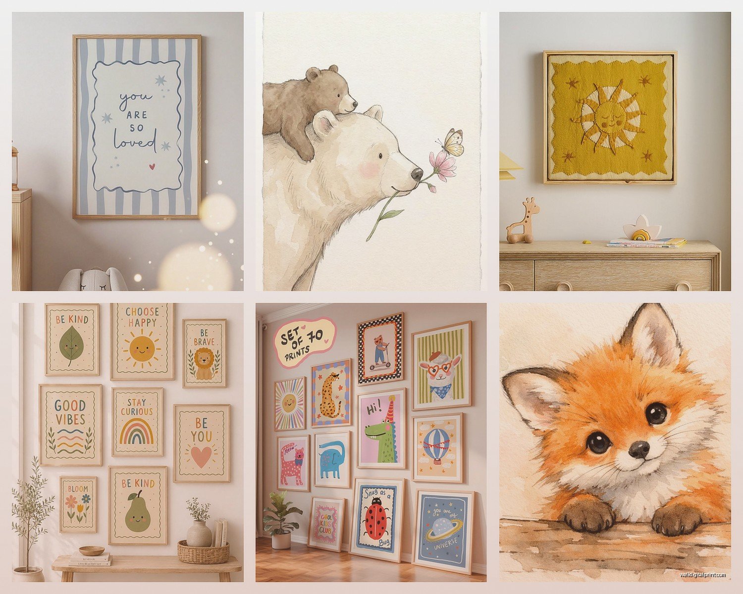
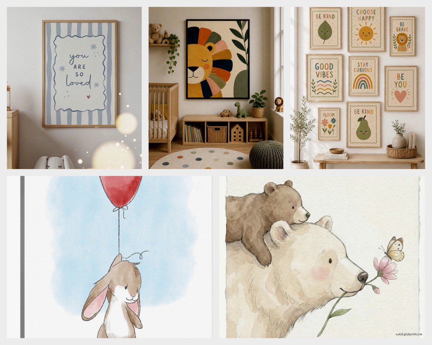
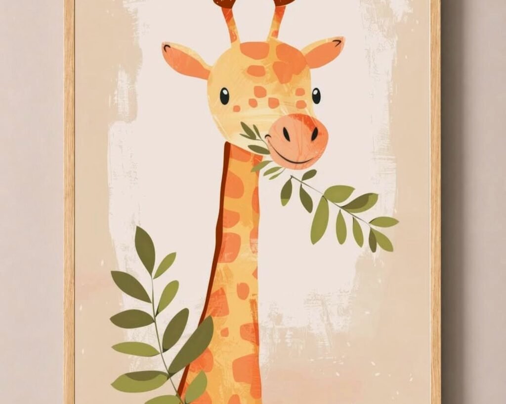
Simple animals – Not like cartoon characters necessarily but minimalist animal illustrations. A simple line drawing of a elephant or bunny or whatever. Stays cute without being babyish.
Nature prints – Leaves, mountains, sun and moon, clouds. These work well because they’re educational-ish (you can talk about them with your kid later) but also just pretty.
Typography – Name prints, alphabet prints, simple quotes. I try to avoid anything too cutesy like “Dream Big Little One” because it doesn’t age well. Better to do their name or initials or even just single letters in nice fonts.
The Sizes Thing Nobody Explains Clearly
Standard print sizes make your life easier because frames are cheaper and more available. These are what I stick to:
- 5×7 – Good for small gallery walls or shelves
- 8×10 – The workhorse size, fits everywhere
- 11×14 – Nice medium size, good for solo pieces
- 16×20 – Statement size for above cribs
- 18×24 – Large format, needs substantial wall space
For above a standard crib (about 52 inches wide), I usually do either one 16×20 or 18×24 centered, OR three 8x10s in a row, OR a mix of 11×14 in the middle with 8x10s on sides.
Wait I forgot to mention – if you’re doing an odd number of pieces, center the middle one on the wall. If you’re doing even numbers, center the gap between the two middle pieces. This is like basic design stuff but it makes a huge difference in how professional it looks.
Shelf Ledges Are Your Friend
This is gonna sound weird but I actually prefer picture ledges to hung frames sometimes. The IKEA MOSSLANDA ledges (they’re like $10 each) let you swap art easily and you can layer pieces and add little decorative objects too.
Plus you can change things out as your kid grows without making new holes in the wall. Start with cute baby-appropriate stuff and then swap in different art when they’re three and suddenly obsessed with dinosaurs or whatever.
I mount them about 5-6 feet high so they’re visible but not in the kid’s reach. You can do a couple ledges stacked with different lengths for visual interest.
DIY Options If You’re Crafty (Or Broke)
Look, nursery stuff is expensive and if you’re trying to save money, wall art is where you can actually do that pretty easily.
Fabric in embroidery hoops – Buy pretty fabric, stretch it in wooden embroidery hoops from the craft store, trim the excess, hang it. Takes maybe 10 minutes per piece and looks surprisingly good. I did this for a client’s boho nursery with different patterns in the same color family.
Printables you design yourself – Canva has tons of templates. You can make custom name prints, alphabet prints, whatever. Print at home if you have a decent printer or upload to a print shop.
Paint swatches – Okay this sounds crazy but I’ve done whole gallery walls with just paint swatch cards from the hardware store arranged in ombre patterns or geometric designs. Costs like $3 total and looks intentional if you frame them properly.
Your own photos – Print family photos or nature photos you’ve taken in black and white. Way more personal than generic art and actually free if you already have the photos.
What Not to Do (Learned From Mistakes)
Don’t buy everything at once. I see people drop $500 on a complete wall art set and then when the furniture arrives or the paint goes up, nothing matches. Get your big pieces sorted first (crib, dresser, rocker) and THEN figure out art.
Don’t go too literal with the theme. A little suggestion of a theme is better than having like 15 elephant prints everywhere. One or two nods to whatever concept you like and then fill in with more neutral pieces.
Don’t forget about scale. One tiny 5×7 print centered above a crib looks lost and sad. You need pieces substantial enough to hold the space or multiple pieces grouped together.
Don’t use command strips on textured walls – learned this one the hard way when three frames fell at 2am and scared my cat half to death. If you have textured walls you gotta use actual nails or hooks.
Transition Planning
Think about this now even though it seems far away – at some point this nursery becomes a toddler room and then a kid room. The art you choose now doesn’t have to last forever but it helps if it can evolve.
I always include at least a few pieces that could work in a 5-year-old’s room too. Abstract stuff, nature prints, simple geometric patterns – these age up better than super baby-specific designs.
You can always swap out the more obviously baby-ish pieces when they get older and keep the foundation. This is why I don’t love those sets that are like “ABC with baby animals” for every single piece – there’s no flexibility.
The Practical Stuff About Installation
Get a stud finder. They’re like $15 and worth it if you’re hanging anything heavier than a pound or two. Studs are typically 16 inches apart so once you find one you can measure to find the others.
For drywall without studs, use proper anchors. The plastic ones that expand are fine for lightweight frames, but for anything substantial get the metal toggle bolts.
Level everything. I use a laser level now because I got tired of things being slightly off and not noticing until after I’d already made the holes. You can use a regular bubble level or even a level app on your phone if you’re careful.
Start higher than you think. Art should be at eye level generally, which is around 57-60 inches to the center of the piece. Above furniture it should be 6-8 inches above the furniture top. I see people hang things way too high all the time and it looks disconnected from the room.
The whole nursery wall art thing doesn’t have to be complicated – just start with your space, pick a simple color palette, mix a few different types of art, and make sure everything’s secured properly. You can always add more later or swap things out, nothing’s permanent.