Wall Art Guide, Wall Art Tutoriels
Wall Art for Large Living Room Wall: Big Space Focal Point
Sep
So I just dealt with this exact situation last month and honestly, large living room walls are both the best and most intimidating thing to decorate. Like, you have all this potential but also it’s SO easy to make it look weird or too small or just… off.
First thing – and I cannot stress this enough – measure your wall. I know it sounds obvious but I had a client who eyeballed it and bought this “large” piece that was maybe 40 inches wide on a 15-foot wall and it looked like a postage stamp. You want your art or gallery wall to take up roughly 60-75% of your wall width. So if you’ve got a 12-foot wall, you’re looking at something around 7-9 feet wide total. Height-wise, aim for about two-thirds to three-quarters of the distance from your furniture to the ceiling.
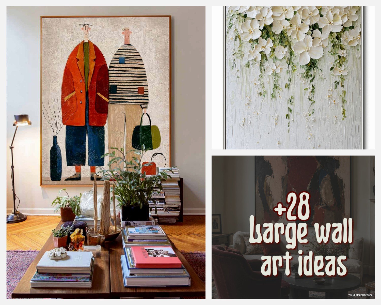
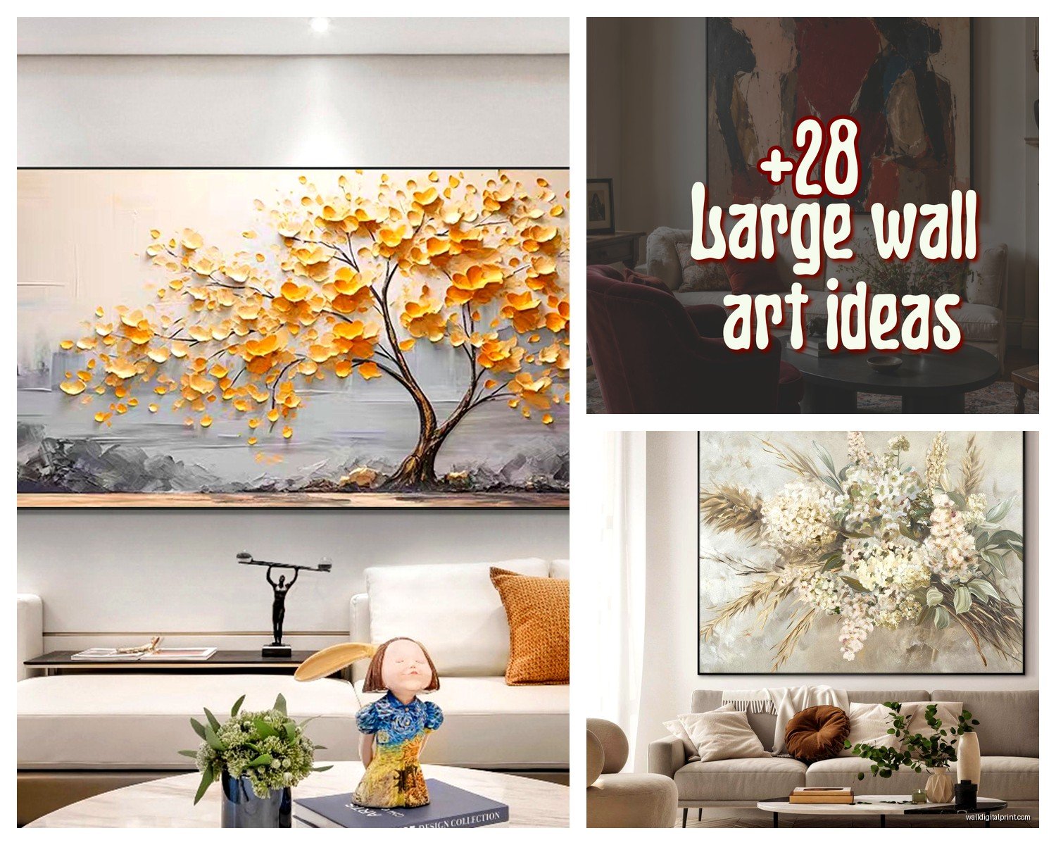
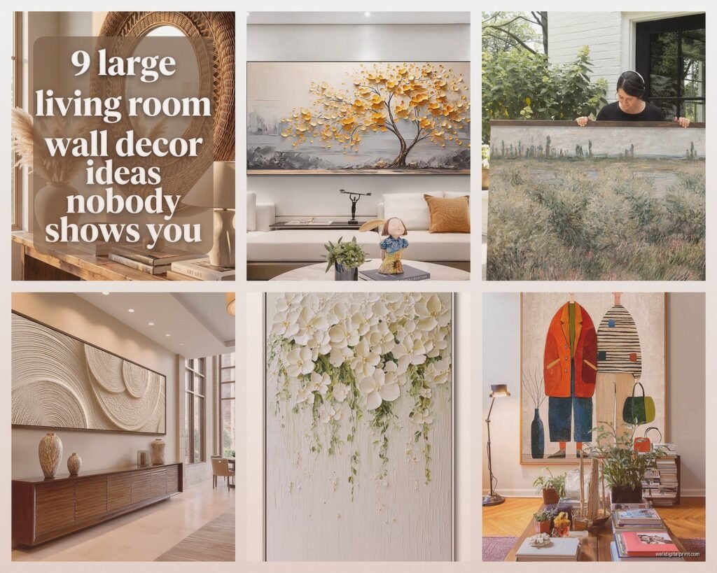
Okay so your main options here are basically: one massive statement piece, a gallery wall, a large-scale diptych or triptych, or layered art with shelving. Each has totally different vibes.
The single statement piece is what I usually recommend if you want maximum impact with minimum effort. I’m talking like 60×40 inches minimum, but honestly bigger is often better. Abstract art works really well for this because it fills space without being too literal or demanding. My favorite sources are actually Etsy for affordable large prints – you can get custom sizes printed on canvas for like $200-400 which is WAY cheaper than you’d think. Just search “extra large abstract art” and filter by size.
Oh and another thing, if you’re going the single piece route, don’t center it on the wall if you have furniture below. Center it on the furniture grouping instead. So like if your sofa is 8 feet wide but your wall is 14 feet, center the art over the sofa, not the wall. This was something I got wrong for YEARS before someone pointed it out to me.
Gallery walls are where things get tricky but also really fun. I’ve done probably 30 of these at this point and here’s what actually works: lay everything out on the floor first. Like, I know everyone says this but DO IT. Take a photo from above. Live with it for a day. My dog walked through my last layout and knocked everything around and honestly it looked better after, so sometimes chaos works?
For a large wall, you want at least 15-20 pieces to make it feel full without weird gaps. Mix sizes but keep roughly 2-3 inches between frames. I use painter’s tape to map it on the wall before hammering anything – trace each frame’s outline. Sounds tedious but it’s saved me so many times.
Frame consistency matters more than you think. Either go all matching frames (black, white, or natural wood are easiest) OR go completely eclectic with vintage frames, but don’t try to do like… three frame styles. It looks indecisive. I learned this the hard way in my own living room and had to start over.
Wait I forgot to mention – for gallery walls, your center point should be at eye level, which is usually around 57-60 inches from the floor. But this is more of a guideline because if you have vaulted ceilings or weird proportions, sometimes you gotta adjust.
Triptychs are having a moment right now and honestly they’re perfect for large walls because they give you that big impact but broken into manageable pieces. You can find them already coordinated which takes the guesswork out. Just make sure you hang them with consistent spacing between panels – usually 2-4 inches depending on the size. I hung one set 6 inches apart once and it looked like three separate pieces that accidentally ended up near each other, so don’t do that.
This is gonna sound weird but one of my favorite solutions is actually using floating shelves with layered art. You get two or three long shelves (like 6-8 feet each) and stack art on them, leaning against the wall. This works especially well if you like changing things up because you can swap pieces seasonally without putting new holes in your wall. Plus you can add small plants or objects between the art which breaks things up nicely.
For the shelves approach, I usually do one shelf at eye level and one higher, or three shelves evenly spaced. Lean larger pieces in back and layer smaller ones in front. The key is varying the heights and overlapping them slightly so it doesn’t look too rigid.
Okay so funny story, I was watching The Great British Bake Off last week while pricing out art options and got completely distracted, but it made me think about how picking wall art is kind of like that technical challenge where they have to make something impressive but also cohesive? Anyway, pricing…
You can go SO many different routes budget-wise. Like, if money’s not an issue, original art from local galleries will run you $2000-10,000+ for large pieces but you get something unique. Mid-range is getting large canvas prints or framed prints from places like Minted, Desenio, or Juniper Print Shop – usually $300-800 for big pieces. Budget friendly is honestly just printing your own stuff at places like Costco or downloading printable art from Etsy and taking it to a print shop, then getting frames from IKEA. I’ve done this for clients and if you choose good art files, nobody can tell it cost $150 total.
One thing I’m really into right now is oversized photography. Black and white landscapes or architectural photos look incredibly sophisticated when they’re huge. You can find high-res images and print them on canvas or in a simple black frame. There’s this one site, Unsplash, that has free high-resolution photos you can download and print – just make sure you get the licensing right for large prints.
Color coordination… okay so this matters but not as much as people think? Your art doesn’t need to match your throw pillows exactly. Actually that usually looks too matchy. I go for art that has maybe one or two colors that echo what’s in the room, but the art should also bring in some new tones to keep things interesting. If your room is all neutrals, this is your chance to add that pop of deep blue or terracotta or whatever without committing to a whole new sofa.
Also consider the mood you want. Abstract and modern art feels contemporary and energetic. Landscapes and nature photography feel calming. Black and white photography is classic and sophisticated. Botanical prints feel fresh and organic. Vintage maps or architectural drawings feel collected and intellectual. I’m personally obsessed with abstract expressionism style stuff right now – those big gestural brushstrokes just make a space feel more dynamic.
Lighting is something people forget about but it makes SUCH a difference. If you’re investing in a large piece, get a picture light or some directional spotlights to highlight it at night. Totally transforms how it looks and makes your living room feel more intentional. You can get decent picture lights on Amazon for like $40-80.
Oh and another thing, if you’re renting or don’t wanna deal with hanging something super heavy, there are these new Command Picture Hanging Strips that work up to like 16 pounds. I was skeptical but tested them and they actually hold. For anything heavier, you gotta find studs or use heavy-duty wall anchors. My favorite are the toggle bolt anchors – they’re annoying to install but they’re not going anywhere once they’re in.
Textural elements can be really cool for large walls too. I did one living room where we hung a massive woven wall hanging – like 6 feet wide – and it added so much warmth and dimension. Macramé, woven textiles, even a vintage rug hung on the wall can work if your style leans boho or eclectic. Just make sure it’s properly secured because textiles can be deceptively heavy.
Mixed media is another direction that works well. Combining a large mirror with art pieces around it, or doing art plus wall sconces, or art with floating shelves and objects. This approach makes the whole wall more dynamic and functional.
For placement height, the general rule is center of the art at 57-60 inches from the floor, but honestly with large walls and furniture, I usually go a bit higher. If you have a sofa below, leave 6-10 inches between the sofa back and the bottom of the frame. More than 12 inches starts to look disconnected, less than 6 inches feels cramped.
Scale mistakes are the biggest thing I see. People get art that’s too small because they’re nervous about going big, but on a large wall, you gotta commit. It’s better to go slightly too large than too small. A piece that’s too small just emphasizes how much empty wall you have.
One more thing – you don’t have to fill the ENTIRE wall. Sometimes leaving some breathing room, especially if you have high ceilings, actually looks more sophisticated than cramming art all the way up. The art should anchor the space without overwhelming it.
If you’re stuck between options, take photos of your wall and use an app like Mockup to visualize different pieces before buying. Or honestly just tape up paper in the size you’re considering and live with it for a few days. You’ll know pretty quickly if the scale feels right.
And if you end up hating what you choose, it’s really not the end of the world. I’ve changed my own living room wall art three times in two years because my taste evolved. That’s the nice thing about art – it’s not permanent like paint or flooring. You can always switch it out.