Wall Art Guide, Wall Art Tutoriels
Wall Art Pictures for Living Room: Photo Main Space Decor
Sep
So I was literally reorganizing my own living room last month and realized I’ve been doing this whole wall art thing wrong for years, and honestly it’s kinda embarrassing considering what I do for a living but whatever, we’re all learning right?
The Size Thing Nobody Talks About Correctly
Okay so first thing – everyone says “go big or go home” with wall art and that’s like… partially true? But here’s what actually matters. Your art should take up about two-thirds to three-quarters of the furniture width below it. I learned this the hard way after hanging this gorgeous abstract piece above my client’s sofa and it looked like a postage stamp. We had to order something completely different.
For reference, if you’ve got a standard 84-inch sofa, you’re looking at art that’s roughly 56-63 inches wide. That can be one large piece or a gallery wall situation. The gallery wall is honestly more forgiving if you mess up the measurements because you can always add another piece to balance it out.
Single Large Piece vs Gallery Wall
Here’s where people get stuck and honestly both work but for different reasons. A single large canvas is easier – like genuinely so much easier. You find the center point, hang it about 6-8 inches above your sofa, and you’re done. I did this in my own space with this massive black and white photography print and it took maybe 20 minutes including the time I spent looking for the level that my cat had knocked under the bookshelf.
Gallery walls though… they’re having a moment and they DO look amazing but you gotta commit. I usually lay everything out on the floor first, take a photo from above, and then recreate it on the wall. Use painter’s tape to mark where each piece goes. Sounds tedious but I’ve redone too many gallery walls because I eyeballed it and ended up with weird gaps.
What Actually Works in Living Rooms
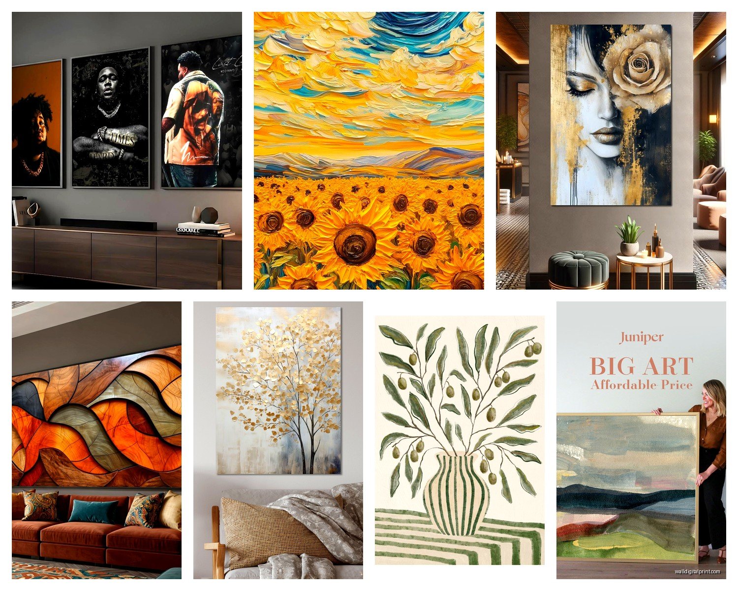
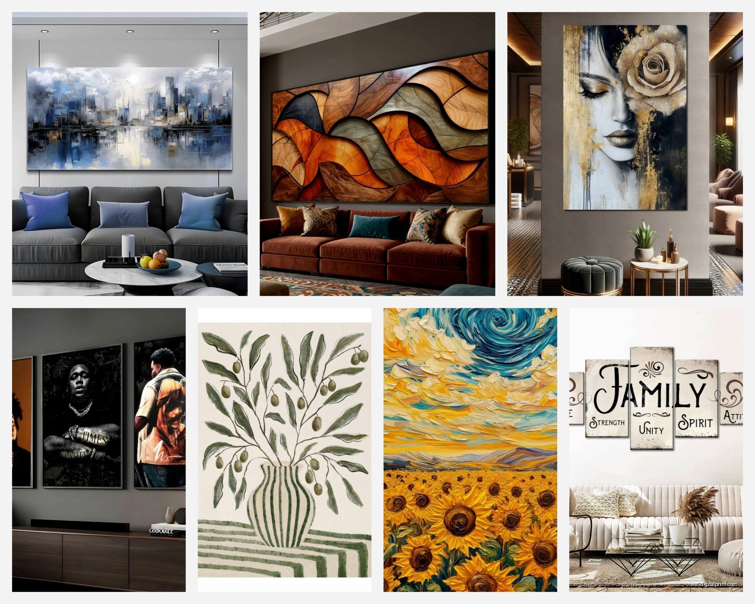
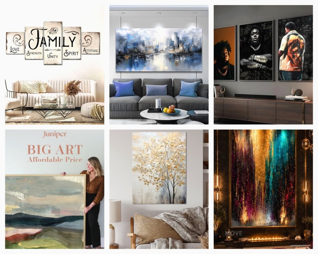
Abstract art is the safe choice and there’s nothing wrong with safe. Neutral abstracts with maybe a pop of color that pulls from your throw pillows or rug – that’s the formula that works like 80% of the time. I’ve used this approach in probably thirty living rooms at this point.
But here’s what I’ve been gravitating toward lately – large scale photography. Not like family photos necessarily, though if you go that route make sure they’re professionally shot and properly sized. I’m talking about landscape photography, architectural shots, or even abstract macro photography. There’s something about a really crisp, well-composed photograph printed large that feels both sophisticated and personal.
The Color Coordination Trap
Don’t obsess over matching colors exactly. I see this all the time where someone has a teal sofa so they’re desperately searching for art with the exact same shade of teal and it ends up looking too matchy-matchy. Instead, pull complementary colors or even contrasting ones.
My living room has warm terracotta tones in the textiles but the art above the sofa is this cool-toned coastal scene with grays and blues. It shouldn’t work on paper but the contrast actually makes both elements stand out more. The rule I follow now is that the art should have at least ONE color that appears somewhere else in the room, but it doesn’t have to be the dominant color.
Framing Makes or Breaks Everything
Oh and another thing – the frame matters SO much more than people think. I used to cheap out on frames and then wonder why expensive art looked meh on the wall. Now I budget almost as much for framing as I do for the actual art piece.
For modern spaces, go with simple frames – black, white, natural wood, or brass/gold. The frame shouldn’t compete with the art. For traditional rooms you can get away with more ornate frames but even then, I usually lean simpler than you’d expect.
Float mounting is having a moment too. That’s where the art appears to float within the frame with a small gap around it. It’s more expensive but looks really high-end, especially with photography or watercolors.
Canvas vs Framed Prints
Canvas prints are easier to hang because they’re lighter and you don’t have to worry about glass breaking. But honestly they can look cheap if you’re not careful. If you go canvas, make sure it’s gallery-wrapped (where the image continues around the sides) and mounted on thick stretcher bars – at least 1.5 inches deep.
Framed prints under glass look more polished in my opinion, especially for photography. But they’re heavier and you need proper wall anchors. I once had a framed piece fall at 3am and my dog lost his mind, so yeah, use the right hardware.
Where to Actually Buy This Stuff
Wait I forgot to mention where to source art because that’s probably what you’re actually wondering. Etsy is honestly my go-to for unique pieces that don’t cost a fortune. You can find independent artists selling digital downloads that you can print yourself at a local print shop. I did this for a client’s living room – bought three digital files for like $40 total, printed them at Costco on their large format printer for another $60, and framed them in Ikea frames. Total cost under $200 and it looked like we spent thousands.
Society6 and Minted are good for more curated options. The quality is consistent which matters if you’re ordering online. I’ve had good experiences with their framing services too, though it gets pricey.
For original art or higher-end prints, I browse local galleries and art fairs. You’re gonna pay more but you get something nobody else has. Plus you can actually see the texture and colors in person before buying.
The Digital Download Route
This is gonna sound weird but I’ve become obsessed with buying digital art files and printing them myself. The quality control is entirely on you which is both good and bad. You need to understand print resolution – look for files that are at least 300 DPI at the size you want to print.
I usually go to a local print shop rather than doing it at home because home printers rarely do large formats justice. Ask for premium paper – not the basic stuff. The difference in how colors render is pretty significant.
Hanging Height and Placement
Okay so the standard rule is center the art at 57-60 inches from the floor, which is supposedly average eye level. But in living rooms where people are mostly seated, I actually go a bit lower. If the art is above a sofa, that 6-8 inches above the furniture rule I mentioned earlier usually puts you in the right spot anyway.
For gallery walls, I treat the entire collection as one piece and find the center point of the whole arrangement. Then position that center at 57-60 inches. This means some pieces will be lower and some higher but the overall visual weight is balanced.
The Three-Piece Triptych Setup
This is my current favorite formula – three same-sized pieces hung in a row with equal spacing between them. Space them about 2-4 inches apart. It’s clean, it’s modern, and it fills a lot of wall space without the complexity of a full gallery wall.
I just did this in a client’s living room with three 24×36 inch botanical prints and it transformed the whole space. The trick is keeping them perfectly level – I used a laser level because I was tired of the whole “eyeball it and hope for the best” method.
Lighting Your Wall Art
This is where most people stop thinking about it but proper lighting makes mediocre art look amazing. Picture lights are the traditional choice – those little brass or black fixtures that mount above the frame. They work great for traditional spaces.
For modern rooms I actually prefer track lighting or adjustable spotlights that can highlight the art without visible fixtures on the wall itself. You can use LED puck lights on the ceiling pointed at the art.
Natural light is obviously ideal but watch out for direct sunlight because it’ll fade your art over time. I learned this when a client’s beautiful watercolor got completely washed out after two years in a sun-drenched living room. Now I always mention UV-protective glass for anything in direct light paths.
Common Mistakes I See Constantly
Hanging everything too high is probably the number one issue. People treat walls like they’re hanging art in a museum and everything ends up floating near the ceiling. Bring it down.
Another thing – buying art as an afterthought. I get it, art is expensive and it’s tempting to do everything else first and then figure out the walls. But the art actually influences your color scheme and overall vibe, so at least have an idea of what style you’re going for before you finalize everything else.
Oh and buying art that’s too small because you’re nervous about commitment. Go bigger than feels comfortable. I promise it’ll look better. I’ve never had a client say their art was too large but I’ve definitely had people realize their “safe” choice looks insignificant on the wall.
The Rental Situation
If you’re renting and can’t put holes in the walls, command strips actually work for lighter pieces – under 15 pounds or so. I’ve used them in my own rental situations and they hold fine. Just make sure you follow the instructions exactly about the weight limits and surface prep.
For heavier pieces, there are these systems with rails that you can mount near the ceiling and then hang art from cables. Looks kinda gallery-like which isn’t everyone’s style but it’s functional and you only make a few small holes at the top.
Mixing Different Art Styles
You can totally mix photography with paintings with prints as long as there’s some cohesive element. Usually that’s either a consistent color palette or similar framing. I mixed black and white photography with colorful abstract pieces in my own space by using the same simple black frames for everything. The frames create unity even though the art styles are different.
What doesn’t work – and I’ve tried – is mixing super traditional oil paintings with ultra-modern geometric prints. Unless you’re going for an eclectic maximalist vibe, which is cool but requires a lot of confidence to pull off.
Budget Real Talk
You don’t need to spend thousands. Seriously. Some of my favorite living room art installations cost under $300 total. The key is being strategic – print your own when possible, use simple but quality frames, and focus on one statement wall rather than trying to fill every wall surface.
That said, if you have the budget for original art or limited edition prints, they do bring something special to a space. There’s a texture and presence to original work that prints can’t quite replicate. But it’s not necessary for a beautiful room.
I usually tell people to allocate about 10-15% of their living room budget to wall art. So if you’re spending $3000 on furniture and decor, put aside $300-450 for art. That’ll get you something substantial without breaking the bank.
The installation tools you actually need are pretty basic – a level, a tape measure, picture hanging hooks appropriate for your wall type, and a stud finder if you’re hanging anything heavy. Maybe $50 total if you don’t own any of this already.