Wall Art Guide, Wall Art Tutoriels
Poetry Wall Art: Verse & Literary Quote Typography
Jul
So I’ve been down this poetry wall art rabbit hole for like three months now because my dining room looked so bland and I thought, why not make it actually say something interesting instead of just hanging another generic landscape print, you know?
Finding the Right Poems and Quotes
Okay first thing – don’t just grab the first “live laugh love” equivalent you see. I made that mistake with a client’s office and we ended up with this super cliché Rumi quote that literally everyone has. Start with poets or authors you actually connect with. I keep a notes app list on my phone whenever I read something that hits different, and honestly that’s where my best wall art ideas come from.
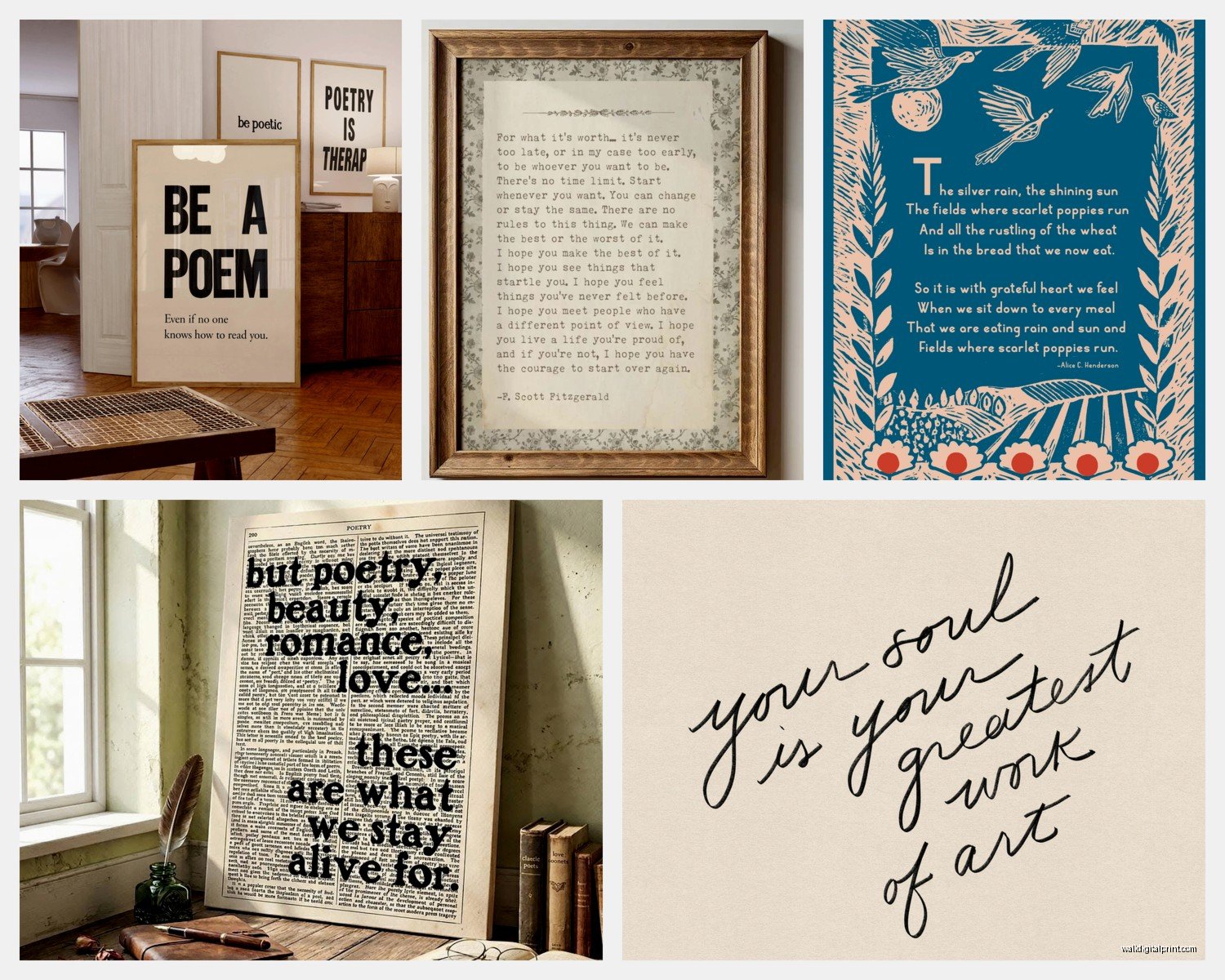
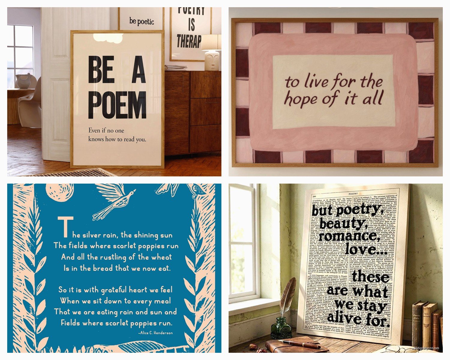
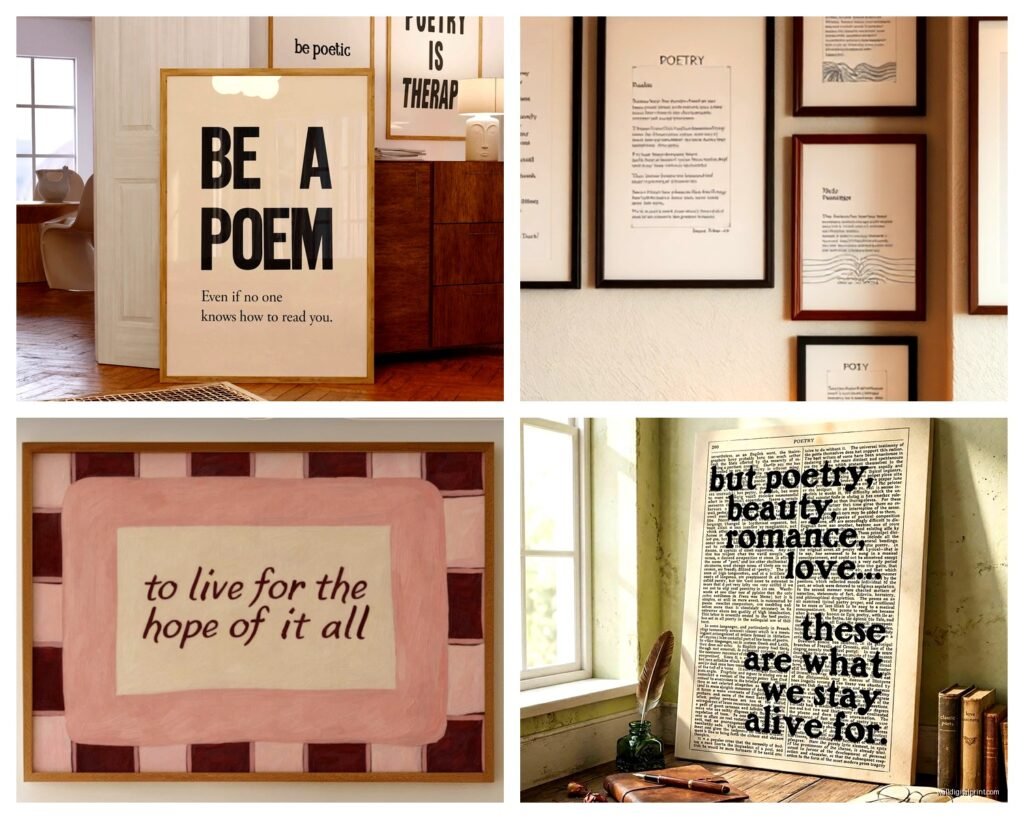
The length matters way more than you’d think. Like, I tried putting an entire Emily Dickinson poem on my bedroom wall and it was just… too much text. Your eye doesn’t know where to land. Sweet spot is usually 1-4 lines max for a single piece. If you’re obsessed with a longer poem, break it into a series of smaller frames.
Public Domain vs. Copyright Stuff
This is gonna sound boring but – most classic poetry is public domain which means you can print it however you want. Anything before like 1928 is usually safe. Modern stuff though? You technically need permission. I learned this the hard way when I wanted to use a Mary Oliver quote for a client and had to actually contact the publisher. They said no btw. So I went with Yeats instead and it looked better anyway.
Typography Choices That Actually Work
Here’s where people mess up constantly. They pick these super decorative script fonts because they think poetry needs to look “poetic” and then you literally can’t read it from more than two feet away.
I’ve tested this extensively because my cat knocked over coffee on three different mockups last month and I had to keep reprinting. Serif fonts work beautifully for classic poetry – think Garamond, Baskerville, Caslon. They have that literary feel without being pretentious. For modern poetry or contemporary quotes, clean sans-serifs like Futura or Helvetica actually let the words breathe.
Script fonts – okay look, I use them sometimes but ONLY for short quotes, like 3-5 words max. And never that super curly wedding invitation style unless you want your wall art to look like a Pinterest fail from 2014.
Size and Spacing
The kerning and leading (space between letters and lines) is weirdly crucial. Too tight and it feels claustrophobic, too loose and the poem falls apart visually. When I’m designing these in Canva or whatever, I usually go with 1.3-1.5 line spacing for poetry. Regular quotes can go tighter at like 1.2.
Font size depends on your wall space but as a general rule – if you’re printing 16×20 or larger, your main text should be at least 48pt. I made an 11×14 print with 24pt text once and you had to squint to read it. Total waste.
Color Schemes That Don’t Look Cheesy
Black text on white is classic for a reason. It’s readable, it’s elegant, it never looks dated. But if that feels too stark for your space, here’s what actually works:
Charcoal gray (#333333 or similar) on cream or off-white backgrounds. Softer than pure black/white but still totally legible. I use this combo probably 60% of the time now.
For colorful walls, reverse it – white or cream text on deep colors. Navy blue backgrounds with white text looks insanely good with poetry, especially nautical or nature themed verses. I did a Langston Hughes piece like this for a client’s study and they literally cried when they saw it installed.
Oh and another thing – if you’re doing multiple pieces in a series, stick to 2-3 colors max across all of them. I see people try to do rainbow poetry collections and it just reads as chaotic.
Frame Choices and Hanging Methods
This part I’ve experimented with A LOT. Simple frames almost always win. Those ornate gold baroque frames with poetry? It’s too much competing visual information. Your eye doesn’t know whether to read the words or look at the frame details.
I’m obsessed with thin black frames (like 0.5-1 inch width) for poetry prints. They create a boundary without overwhelming the typography. Natural wood frames work great too, especially light oak or maple for a warmer vibe.
Mat or no mat though – that’s actually important. For shorter quotes, a mat creates nice breathing room and makes the piece feel more substantial. Standard is like 3-4 inches on each side. But for longer poems or pieces where the text itself is large, skip the mat. It’s unnecessary.
Gallery Wall Arrangements
If you’re doing multiple poetry pieces together, odd numbers look better (3, 5, 7 pieces). Don’t ask me why, it’s just a design thing that actually works. And mix up your sizes – all matching frames in a perfect grid can feel too rigid for poetry which is supposed to have rhythm and flow.
I usually do a salon-style hang where the center of the grouping is at eye level (about 57-60 inches from the floor) and then arrange everything around that focal point. Lay it out on the floor first, take a photo, adjust until it feels balanced.
Wait I forgot to mention – command strips are honestly fine for lightweight frames under like 8 pounds. I know everyone says use proper picture hangers but I’ve had poetry prints up with command strips for two years with zero issues. Just make sure your wall is clean before applying.
Where to Actually Get These Made
Okay so you’ve got options. DIY printing at home works if you have a decent printer and you’re doing 8×10 or smaller. Use cardstock not regular paper – at least 80lb weight. Regular paper looks cheap and flimsy.
For larger sizes, I use Printful or Printique most often. Printique’s quality is slightly better but Printful is faster. Both have good paper options – I usually go with matte finish because glossy can create glare issues depending on your lighting.
Etsy is hit or miss. Some sellers do gorgeous custom typography work, others are just reselling the same generic designs. Look at their reviews specifically about print quality and shipping protection. I’ve received bent prints in flimsy envelopes too many times.
The DIY Digital Route
If you wanna design your own, Canva is honestly good enough for this. They have tons of font options and templates to start from. I also use Adobe Illustrator but that’s probably overkill unless you’re doing this professionally.
Key thing – always export at 300 DPI minimum. 150 DPI looks fine on screen but prints fuzzy. And use RGB color mode if you’re printing at home, CMYK if you’re sending to a professional printer (they’ll usually convert it anyway but starting with CMYK gives you more color accuracy).
Matching Poetry to Your Room’s Vibe
This matters more than people realize. Don’t just pick your favorite poem and stick it anywhere. I love Sylvia Plath but her darker stuff doesn’t exactly work in a sunny breakfast nook, you know?
Living rooms and common areas – go for contemplative but not depressing. Mary Oliver nature poetry, Pablo Neruda love poems, Rumi’s stuff about connection. These feel universal and welcoming.
Bedrooms can be more personal and intimate. Elizabeth Barrett Browning, e.e. cummings, Sappho fragments. I have a Neruda quote in my bedroom that’s in Spanish actually, which adds this private layer since not everyone who visits can read it.
Home offices need motivational without being corporate cringe. Invictus by Henley, Still I Rise by Angelou, or honestly just single powerful lines from longer works. “I am the master of my fate” hits different above a desk than “teamwork makes the dream work” or whatever.
Kitchens and Dining Areas
This is where you can get playful. Food-related poetry exists and it’s delightful – Pablo Neruda wrote odes to tomatoes and onions. Or go with quotes about gathering and fellowship. I did a series of haikus about tea in my kitchen and guests always comment on them.
Bathrooms – okay this is gonna sound weird but poetry in bathrooms can actually be really nice? Short, meditative pieces. Basho haikus work perfectly. Just make sure it’s properly sealed if you have a steamy shower situation.
Avoiding Common Mistakes
Don’t center-align everything. Poetry often has intentional line breaks and structure. Left-aligned usually respects the poet’s formatting better. I see so many prints where someone centered an e.e. cummings poem and it completely destroys his whole visual style.
Watch out for widows and orphans – that’s when a single word sits alone on a line. Adjust your frame size or font size to avoid this. It looks unfinished.
And please, please check your spelling and punctuation against the original text. I once printed an entire series for a client before noticing we’d written “your” instead of “you’re” in a Yeats quote. Had to reprint everything. So embarrassing.
Lighting Considerations
Poetry prints need good lighting to be readable but not so much that there’s glare. If you’re hanging near a window, consider the angle of natural light throughout the day. I learned this when my Frost poem was completely washed out by afternoon sun.
Picture lights are kinda extra but they do make typography pop at night. Or just make sure your room’s ambient lighting is sufficient. Nobody wants to squint at wall art.
When to Go Custom vs. Premade
Premade prints from places like Society6 or Minted are fine if you find something you genuinely love. They’re usually $20-60 depending on size. The limitation is you’re stuck with someone else’s design choices.
Custom work costs more ($50-200+ depending on the designer) but you get exactly what you want – your favorite poem, your color scheme, your sizing. I go custom for clients always, but for my own house I mix both.
There’s also a middle option where you buy a digital file on Etsy ($5-15) and then print it yourself wherever. This gives you flexibility with sizing and you can reprint if you move or redecorate.
Honestly the best poetry wall art is stuff that makes you pause and actually read it occasionally, even after it’s been up for months. If it becomes invisible wallpaper, it’s not doing its job. That’s how I judge whether a piece is working.