Wall Art Guide, Wall Art Tutoriels
Purple Wall Art for Bedroom: Violet Lavender Sleep Space
Apr
So I’ve been obsessing over purple wall art for bedrooms lately because honestly, getting that violet-lavender vibe right is trickier than you’d think. Like, you want calming sleep vibes but not “I’m living inside a grape” energy, you know?
Canvas vs Print vs Original Pieces
Okay so first thing—canvas prints are gonna be your most budget-friendly option and they actually look pretty decent. I grabbed a 24×36 inch lavender abstract from Society6 last month for like $89 and the quality surprised me. The canvas texture hides those pixelation issues you sometimes get with cheaper prints. But here’s the thing… they can look flat in person if the artwork doesn’t have enough depth or contrast.
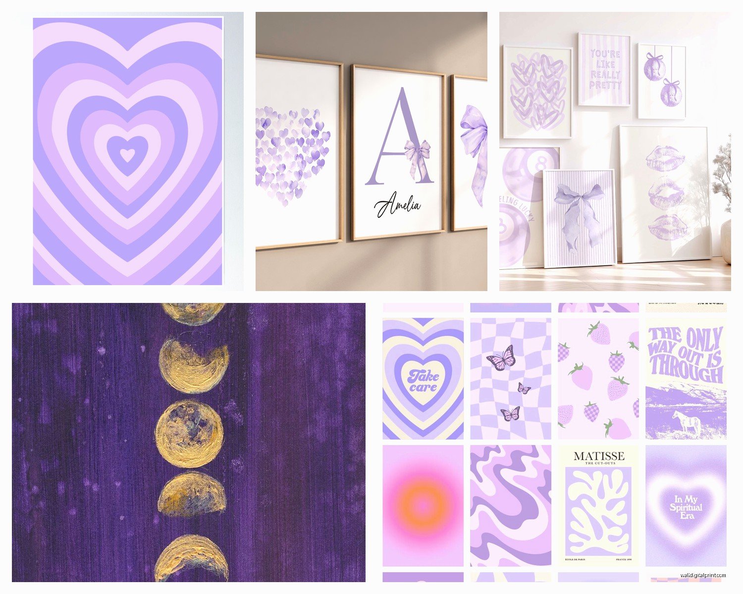
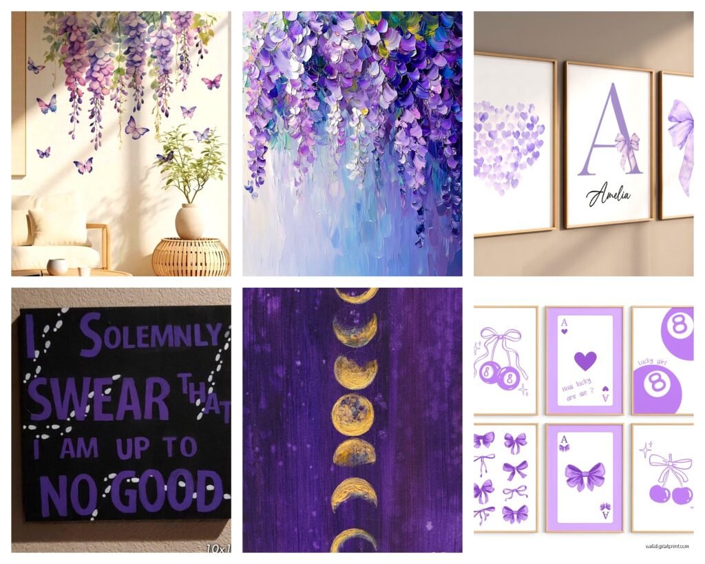
Framed prints are where I’ve been leaning more recently. You get that polished gallery look and honestly? IKEA’s RIBBA frames in white or black work perfectly with purple art. I’m talking like $15-30 per frame depending on size. The key is getting museum-quality paper prints—look for ones that say “giclée” or “archival quality.” Minted and Artfully Walls have good options in the $120-200 range.
Original paintings though… if you can swing it, there’s something about actual brushstrokes that photographs just don’t capture. I found this artist on Etsy (username was something like VioletHuesStudio) who does custom 16×20 lavender field paintings for around $300. My cat knocked over my coffee while I was browsing her shop at like 2am which is how I ended up buying two instead of one, but whatever.
Purple Shades That Actually Work for Sleep
Not all purples are created equal for bedrooms and this is where people mess up constantly. Those bright royal purples or magenta-leaning shades? Too stimulating. Your brain reads them as energizing.
What you want:
- Dusty lavender with gray undertones
- Soft violet that’s almost periwinkle
- Muted plum that leans toward mauve
- Lilac with white mixed in
I did this whole thing where I ordered like 8 different purple prints from different shops and hung them all up to compare. The ones that felt most calming had at least 30-40% white or cream in the composition. Pure saturated purple just hits different and not in a good way for sleep spaces.
Oh and another thing—warm purples (the ones with red undertones) vs cool purples (blue undertones) create completely different moods. Cool purples feel more serene and spacious. Warm purples can feel cozy but also kinda heavy? For bedrooms I’m team cool purple all the way.
Size and Placement Strategy
This is gonna sound weird but I actually measured the wall-to-art ratio in hotel rooms because they always seem to get it right. The formula that kept coming up: your art should take up about 60-75% of the wall width it’s centered on.
So like, if you’ve got a queen bed that’s 60 inches wide, you want your art piece (or gallery wall) to span roughly 36-45 inches. Going smaller makes it look like it’s floating awkwardly. Going bigger can overwhelm the space, which… actually works sometimes if that’s the vibe you’re going for, but it’s riskier.
Height matters too. The center of your artwork should be at eye level, which is typically 57-60 inches from the floor. But here’s where I deviate from that rule—above a bed, I go slightly lower, around 6-8 inches above the headboard. If you follow the standard eye-level rule above furniture, it ends up feeling disconnected.
Gallery Wall Configuration
I’m currently setting up a gallery wall for a client and we’re using five pieces in different sizes. Started with the largest piece (24×36) as the anchor, then built around it with smaller 11×14 and 8×10 prints.
The trick is laying everything out on the floor first. Take a photo, look at it, walk away, come back. I use painter’s tape to map it on the wall before committing to nail holes. Saved my walls so many times doing this.
For purple art specifically, I like mixing different shades—pair a pale lavender landscape with a deeper violet abstract, throw in maybe one piece that’s mostly cream with purple accents. That variety keeps it from feeling too matchy-matchy.
Material Combinations That Elevate the Look
Wait I forgot to mention—mixing materials makes such a difference. All canvas looks student-apartment-ish, but canvas + framed prints + maybe one textile piece? That’s the move.
I found these woven lavender fiber art pieces on Anthropologie that are basically textured wall hangings. Around $180 but they add this dimensional element that flat prints can’t. The texture catches light differently throughout the day which is actually pretty cool for a space you spend a lot of time in.
Metal prints are another option I’ve been experimenting with. There’s this company called Displate that does these magnetic metal posters and they have some gorgeous purple botanical prints. The metallic sheen gives them an almost ethereal quality. They’re like $45-60 each and they just stick to the wall with a magnetic mount—no holes needed. My landlord loves me for discovering these.
Acrylic vs Glass
If you’re going the framed route, you gotta decide between regular glass and acrylic. Regular glass is cheaper and doesn’t yellow over time, but it’s heavier and reflective. Acrylic (plexiglass) is lighter, less reflective, but can scratch easier and yellows after like 10-15 years.
For bedrooms I usually go with acrylic because the reduced glare matters more when you’ve got lamps and natural light hitting it at different times. Museum glass is the premium option—zero glare, UV protection, but you’re paying 3-4x more. Only worth it for really special pieces in my opinion.
Where to Actually Buy This Stuff
Okay so I’ve probably spent an embarrassing amount of time comparing shops. Here’s my honest breakdown:
Etsy is hit or miss. You can find incredible original work and custom pieces, but quality varies wildly. Always read reviews and ask sellers about their paper quality and inks. I’ve gotten some stunning lavender watercolors here for $80-150. Also some garbage that looked nothing like the photos.
Minted has consistently good quality and they do sales pretty often. Their limited edition artist series is worth checking. I grabbed a violet botanical print during a 20% off sale for like $140 framed.
Society6 is great for trendy abstract stuff. Quality is decent, not amazing, but totally acceptable for the price point. Their purple marble and agate designs are really popular right now.
Saatchi Art if you want to invest in original work. Prices start around $200 and go up to… a lot. But you’re supporting actual artists and getting one-of-a-kind pieces.
Desenio is this Scandinavian poster company that has beautiful minimalist purple designs. Super affordable—like $20-50 per print. They don’t come framed though so factor that in.
The Lighting Situation Nobody Talks About
Your lighting is gonna completely change how your purple art looks and I learned this the hard way. I had this gorgeous lavender abstract that looked perfect in the store under their bright white lights. Got it home, hung it up, and under my warm-toned bedroom lamps it looked… brown? Almost muddy.
Cool-toned LED bulbs (4000-5000K) make purples pop and stay true to color. Warm bulbs (2700-3000K) can muddy them or shift them toward pink or brown. I switched all my bedroom bulbs to 4000K “neutral white” and it made a huge difference.
If you’re gonna do picture lights, go with battery-operated LED strips. There’s a brand called LUXSWAY on Amazon for like $25 that I’ve used multiple times. Just stick them behind or above the frame. Creates this subtle glow that makes the colors more vibrant at night.
Mixing Purple Art with Other Colors
So you probably don’t want an all-purple bedroom unless you’re really committed to that aesthetic. The art should work with your existing palette.
Purple pairs really well with:
- Gray walls (literally made for each other)
- White or cream for that airy feeling
- Sage green for a nature-inspired vibe
- Blush pink if you want something softer
- Navy blue for a moody sophisticated look
- Gold accents for a luxe touch
I just finished a bedroom where the walls were Benjamin Moore’s “Classic Gray” and we did three lavender prints in gold frames. Added sage green throw pillows and a cream duvet. The purple art became this perfect focal point without overwhelming everything.
What doesn’t work as well—purple art with orange or bright yellow walls. Too much competing energy. Red walls also clash unless you’re going for a very specific dramatic look.
The Frame Color Dilemma
Black frames make purple art feel more grounded and modern. White frames keep it light and airy. Natural wood frames add warmth but can sometimes clash depending on the wood tone.
My go-to lately has been white frames with a thin gold inner mat. Sounds fancy but it’s not expensive—you can get these custom matted on Framebridge for around $150-200 including the print. The gold just elevates it slightly without being too extra.
Oh and funny story, I ordered walnut frames once for a deep plum print thinking it would look sophisticated and rich, but the warm wood tones actually made the purple look kinda dull? Switched to black frames and it completely transformed the piece.
DIY Options That Don’t Look DIY
If you’re crafty or just broke (no judgment, I’ve been there), you can create decent purple art yourself. I did this during the whole pandemic situation when I was bored watching The Crown for the third time.
Watercolor abstracts are surprisingly forgiving. Get some decent watercolor paper (Canson XL is like $15), purple and white watercolors, and just… play around. The key is letting colors bleed into each other naturally. Frame it in a simple IKEA frame and honestly? People think you bought it from a gallery.
Pressed flower art is another option. Collect lavender (obviously), press it between book pages for two weeks, then arrange it on a cream background under glass. Very cottagecore but in a sophisticated way if you keep it minimal.
I also did this thing where I bought cheap canvas boards from Michael’s (like $3 each) and just painted them in gradient purples. Three canvases going from pale lavender to deep violet, hung horizontally. Total cost maybe $20 including paint. Looks way more expensive than it was.
Avoiding the Common Mistakes
Okay so things I’ve seen go wrong repeatedly:
Don’t buy art based only on the online thumbnail. Colors always look different in person. Most good shops have return policies—use them. I’ve returned probably 30% of the art I’ve ordered online.
Don’t hang everything too high. I see this constantly. People follow the “57 inches to center” rule without considering the furniture below and it ends up in this weird floating situation.
Don’t mix too many different purple shades unless you really know what you’re doing. Stick to 2-3 shades max. Otherwise it looks chaotic instead of curated.
Don’t forget about the rest of the room. Your purple art should complement your bedding, curtains, and furniture, not fight with them. I’ve walked into bedrooms where there’s purple art, purple walls, purple bedding, and it’s just… a lot. Too much of anything gets overwhelming.
Seasonal Switching
This might sound extra but I actually swap out some bedroom art seasonally. Keep lighter lavenders up in spring and summer, switch to deeper violets and plums in fall and winter. You don’t have to change everything—even just switching one statement piece changes the whole vibe.
I have like a rotating collection now. Store the off-season pieces in those flat under-bed storage boxes. Makes the bedroom feel fresh without redecorating entirely.
The Maintenance Thing
Purple art fades faster than other colors if you’ve got direct sunlight hitting it. UV-protective glass helps but isn’t foolproof. I learned this when a gorgeous lavender print I had near a window faded to basically pink after a year.
Dust your art regularly with a microfiber cloth. Sounds obvious but dust buildup is real and it dulls everything. For canvas, you can use a soft brush attachment on your vacuum on the lowest setting.
If you’ve got acrylic or glass, clean it with glass cleaner but spray the cloth, not the glass directly. You don’t want liquid seeping behind the frame and damaging the print.
That’s pretty much everything I’ve figured out through trial and error and probably too much money spent on purple art over the past few years. The main thing is just making sure the shades work for sleep and the sizing is proportional to your space—get those two things right and you’re like 80% there.