Wall Art Guide, Wall Art Tutoriels
Romantic Wall Art for Master Bedroom: Couples & Love Themes
Apr
So I’ve been living and breathing romantic wall art for bedrooms lately because like three couples asked me about it this month, and honestly? It’s way more complicated than just slapping up some hearts and calling it a day.
The Canvas vs Print Situation Nobody Talks About
Okay first thing – you’re gonna see “canvas prints” everywhere and they sound fancy but here’s what I learned after ordering like six different ones for a client project. Gallery-wrapped canvas (where the image wraps around the edges) looks SO much better than the flat mounted ones. The flat ones need frames and then you’re spending another $100 easy. I got this gorgeous abstract couple silhouette from iCanvas and the gallery wrap was totally worth the extra $30 because you can hang it immediately and it doesn’t look unfinished.
But here’s the thing – if your bedroom gets a lot of direct sunlight, canvas fades faster than framed prints behind glass. My own bedroom faces east and I made this mistake with a really beautiful watercolor print of intertwined figures that I paid way too much for. Faded to this weird peachy color within like 18 months.
For sun-heavy rooms, go with framed prints under UV-protective glass or acrylic. Yeah it’s pricier but you’re not replacing it in two years.
Size Actually Matters More Than You Think
This is where everyone messes up including me initially. That piece that looks PERFECT online at 24×36? It’s gonna look like a postage stamp over a king bed. I have this whole formula now that I wish someone had told me:
- Over the bed: aim for 2/3 to 3/4 the width of your headboard
- If no headboard: go AT LEAST 48 inches wide, honestly bigger is better
- Multiple pieces: the combined width should still hit that 2/3 rule
I did a couple’s bedroom last month and we went with three 20×30 pieces in a row instead of one large one, and the combined 60-inch width looked actually proportional over their 72-inch headboard. One big piece would’ve been easier to hang though, not gonna lie.
The Romance Spectrum Thing
Okay so “romantic” means completely different things to different people and this is where you gotta actually think about it. I’ve got clients who want the obvious stuff – couples embracing, heart shapes, “love” typography. Then I’ve got others who are like “we want romantic but make it sophisticated” and that’s a whole different vibe.
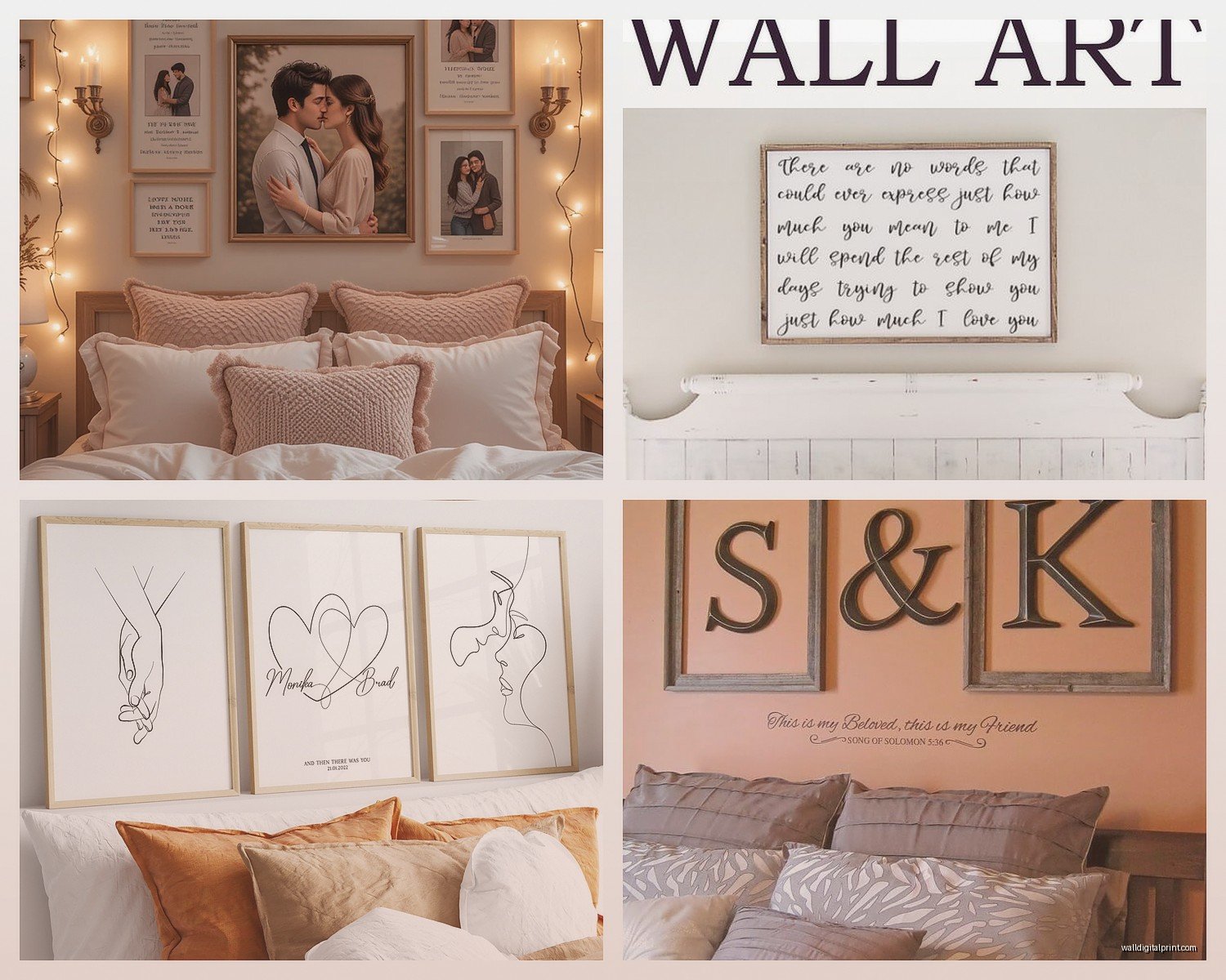
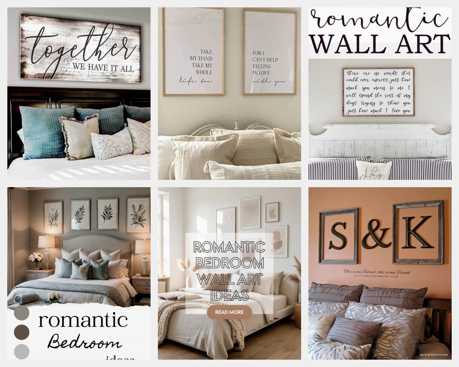
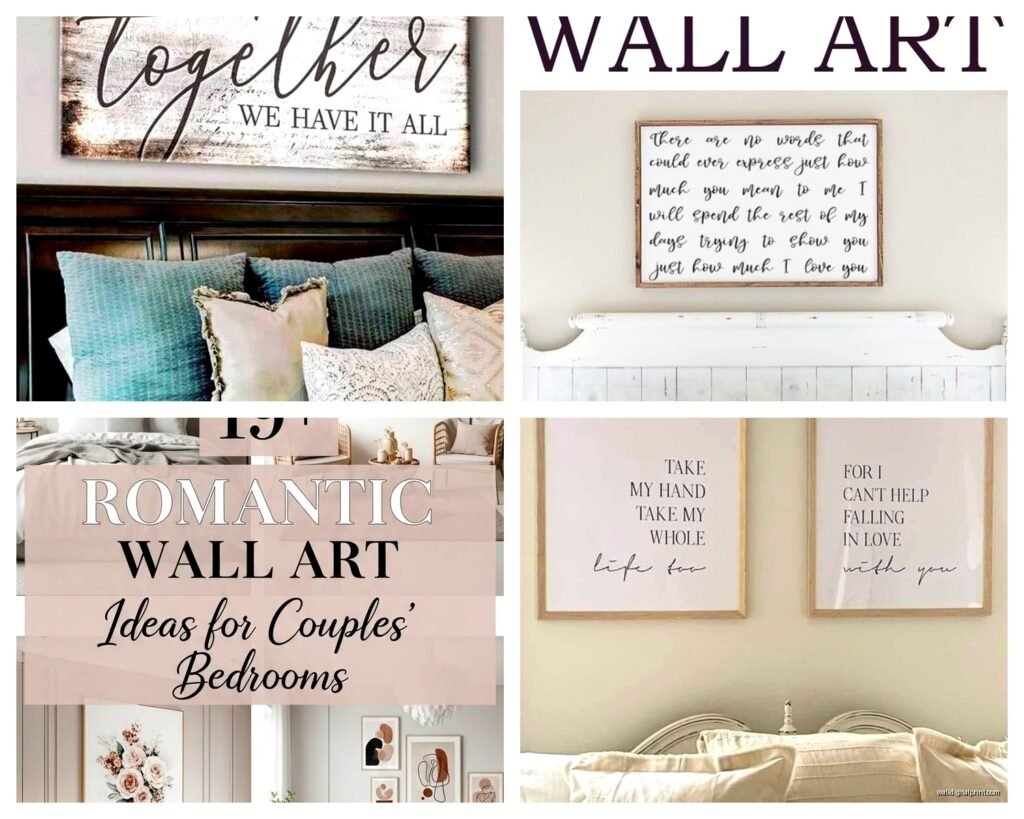
Obvious Romance (which is totally fine if that’s your thing):
You’re looking at figure art showing couples, kiss silhouettes, intertwined hands, literal hearts. Etsy is honestly amazing for this stuff. There’s this seller called LovelyPosters who does really beautiful minimalist line drawings of couples that don’t feel cheesy. I used their “Intimate Moment” print for a client and it’s just simple black lines on cream paper but it reads as romantic without being too much.
Subtle Romance (what I usually steer people toward):
Abstract art in warm tones, botanical prints of flowers that symbolize love (peonies, roses but done artistically), landscapes that feel intimate somehow. I’m obsessed with these blush and terracotta abstract pieces right now – they create a romantic FEELING without being literal about it.
Wait I forgot to mention – there’s also this middle ground of vintage-style romantic art. Like old book pages with love poems, vintage Paris prints, antique botanical illustrations. West Elm has some good ones if you don’t wanna dig through Etsy for hours.
Color Coordination Without Making It Boring
Your wall art doesn’t have to match your bedding exactly but it shouldn’t fight with it either. I see this ALL the time – someone has cool-toned gray and blue bedding and then gets this super warm terracotta romantic print and it just looks off.
Here’s what actually works: Pull one or two colors from your existing bedroom and make sure they appear SOMEWHERE in your art. Not as the dominant color necessarily, but present.
My bedroom is mostly sage green and cream, so I chose this abstract piece that’s primarily blush and gold but has these sage undertones in the shadows. Ties everything together without being matchy-matchy which always feels dated.
The Metallics Question
Okay so gold leaf art and rose gold prints are super popular for romantic themes right now. They photograph beautifully but here’s the reality – they need the right lighting or they just look muddy. If you have good natural light or nice bedroom lamps that create ambient lighting, go for it. If your bedroom lighting is just that one overhead fixture? The metallic effect gets lost and you’ve paid extra for nothing.
I learned this the hard way with a gorgeous gold foil kiss print that looks STUNNING in my living room near the window but looked completely flat in my friend’s bedroom with terrible lighting. She ended up returning it.
Materials I’ve Actually Tested
Acrylic Prints: These are having a moment and I get why. The colors are SO vibrant and they have this modern glossy look. Got one from Shutterfly with a photo of my clients from their wedding printed as this artistic high-contrast thing. Looks expensive, was like $120. Downside is they’re heavy and you need good wall anchors. Also fingerprints show up if you touch them so maybe don’t if you have kids.
Metal Prints: Tried these thinking they’d be too industrial for a romantic vibe but actually? The right image on brushed aluminum looks really cool and modern-romantic. There’s this artist on Minted who does watercolor couple silhouettes and seeing them on metal gives this unexpected edge. Not for everyone though.
Wood Prints: The grain shows through and creates this rustic-romantic thing. Perfect if your bedroom has any farmhouse or organic modern elements. I used a wood print of a quote about love for a client and the wood texture made it feel warm instead of basic.
Traditional Paper Prints: Still the most affordable and honestly if you frame them well, they look just as good as anything else. Society6 and Minted have really good quality printing. Just make sure you’re getting actual archival quality paper if you’re spending more than like $50.
The Gallery Wall Approach
Okay so funny story – I was watching The Great British Baking Show while planning this couple’s bedroom gallery wall and I literally started thinking about it like a baking layout. You need variety but cohesion, you know?
For a romantic bedroom gallery wall:
- Mix sizes but keep a consistent color palette (3-4 colors max)
- Combine different types of romantic imagery – maybe one couple silhouette, one floral, one quote, one abstract
- Keep frames consistent OR go all different but in the same color family
- Odd numbers look better (3, 5, 7 pieces)
I did a 5-piece gallery wall last month with: vintage Paris print, line drawing of a couple, blush abstract, pressed botanical print, and a small love poem print. All in black frames, all matted in white. Looked cohesive but not boring.
Template layouts help SO much. I literally make paper templates and tape them to the wall before hammering anything. Saved me from so many holes in the wrong places.
Where to Actually Buy This Stuff
Real talk about where I source romantic wall art:
Etsy: Best for unique digital downloads you can print yourself or custom work. The search can be overwhelming but filtering by “best selling” in your style helps. I’ve found the most unique couple portrait line drawings here.
Minted: Higher quality, more expensive, but their romantic abstract art is really beautiful. Good sales though – wait for 20% off which happens monthly.
Society6: Great for supporting independent artists and the quality is consistent. Their romantic category is huge. Prices are mid-range.
iCanvas: If you want museum-quality reproductions of famous romantic paintings. I got a beautiful Klimt reproduction here for a client who wanted classic romance.
Desenio: European company, more minimalist romantic aesthetic. Their couple photography prints are really tasteful.
Framebridge: Not for buying art but for framing what you already have. Expensive but worth it if you have something special like engagement photos you want to turn into romantic wall art.
The Custom Route
If you want something totally unique, commissioning art is actually not as expensive as you’d think. I’ve used Fiverr artists to create custom couple silhouettes from photos for like $50-75. Then you just get it printed at a local print shop or online.
There’s also this thing where you can turn your own photos into artistic prints – like you upload a photo and they convert it to look like a watercolor painting or line drawing. Printique does this and the results are hit or miss but when they hit, they’re really special and personal.
Stuff That Looks Good in Theory But Doesn’t Work
Okay lemme save you some mistakes:
Neon signs: Everyone wants those romantic neon signs right now but they’re SO bright for a bedroom. Like you cannot sleep with that on and turning it off every night gets old. If you must, get one with a dimmer.
Tapestries: They wrinkle weird and unless you spend serious money, they look college-dorm-ish. I’ve tried to make them work for romantic bedrooms and they just don’t have the same impact as proper art.
Vinyl wall decals: Quotes and designs you stick directly on the wall. They peel, they leave residue, they look cheap up close. Just get a proper print with that quote instead.
Too much red: Red is romantic in theory but it’s actually kinda aggressive in large amounts in a bedroom. Blush, terracotta, burgundy – much better choices.
Hanging It Without Losing Your Mind
This isn’t exciting but it matters – use the right hardware. My cat knocked over a leaning frame once and it was a whole thing with broken glass everywhere.
For anything over 20 pounds, use wall anchors not just nails. For multiple pieces, a laser level is worth buying or borrowing. Those little hanging strips work great for lightweight frames but read the weight limits because I’ve had pieces crash down at 3am which is terrifying.
The standard height is 57-60 inches to the center of the artwork but over a bed, you want the bottom of the frame about 8-10 inches above your headboard. Trust me on this spacing.
Mixing Personal Photos With Art
Some couples wanna include their own photos in the romantic wall art situation and that can work but you gotta be intentional about it. Don’t just frame a regular snapshot – get it printed in black and white or with an artistic filter, frame it really well, and integrate it with other art pieces.
I did this thing where we took the couple’s engagement photo, had it printed in sepia tone on textured paper, put it in a really beautiful gold frame, and hung it as part of a gallery wall with other romantic art. Looked intentional instead of just like a framed photo.
Oh and another thing – if you’re using personal photos, size them similarly to your other art pieces. A tiny 5×7 photo next to a 24×36 print looks weird and afterthought-y.
Just make sure whatever you choose actually makes you both happy when you look at it because you’re seeing it every single day and if one person loves it and the other just tolerates it, that’s gonna get old fast.