Wall Art Guide, Wall Art Tutoriels
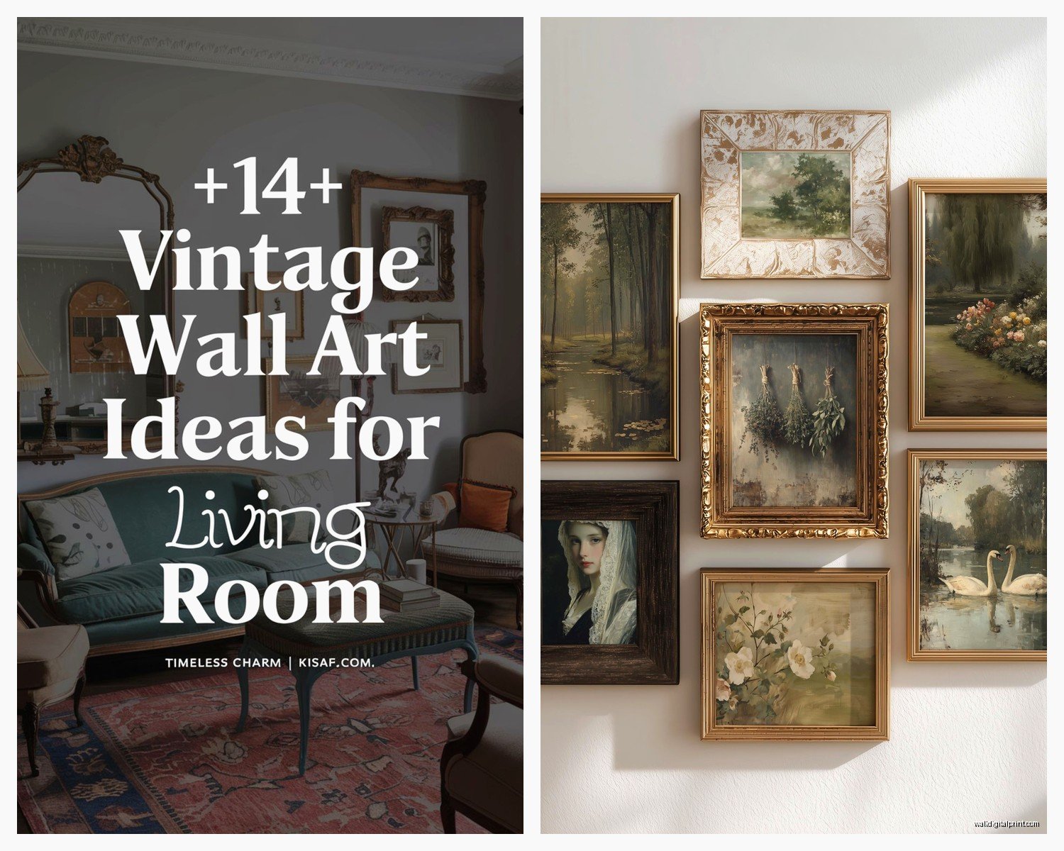
Vintage Wall Art for Living Room: Antique & Retro Designs
Apr
So I’ve been down this vintage wall art rabbit hole for like three years now and honestly it started because my cousin wanted “that Instagram vintage look” but had no idea what she was actually asking for, and now I literally can’t stop collecting this stuff.
First thing – vintage wall art basically breaks down into a few categories and knowing which one you want saves SO much time. You’ve got actual antiques (pre-1920s usually), mid-century stuff (1940s-1960s), retro revival pieces (70s-80s), and then reproductions which… look, sometimes reproductions are totally fine and I’ll die on that hill.
What Actually Counts as Vintage vs Just Old
Okay so this trips people up constantly. Real vintage is generally 20+ years old, antique is 100+ years. But here’s the thing – the market is flooded with “vintage-style” pieces that are brand new. Not always bad! I have this gorgeous reproduction of a 1950s botanical print in my hallway and it cost me like $40 instead of $400. The paper’s different though, you can tell when you’re up close. Modern prints have this too-perfect quality, the colors are almost TOO saturated.
When you’re looking at actual vintage pieces, check the backing. Old frames have different hardware – you’ll see these twisted wire hangers or really thin sawtooth brackets. The wood backing gets this brownish patina and sometimes there’s old newspaper or cardboard. I found a piece once that had a 1963 newspaper clipping as backing and that’s when I knew it was legit.
Materials You’ll Actually Encounter
Lithographs and Prints
These are probably what you’ll find most often at estate sales and antique shops. Original lithographs from like the 1920s-1950s have this specific texture if you look close – tiny dots that aren’t quite like modern printing. The paper yellows in a specific way around the edges, not uniform but kinda blotchy.
I picked up a set of French botanical lithographs last year and my dog literally knocked one off the wall (still mad about it) but it taught me that old paper is FRAGILE. Like you sneeze near it wrong and it tears. Get them professionally framed with acid-free materials or they’ll deteriorate faster.
Oil Paintings
Real vintage oil paintings are heavier than you think. The canvas has this almost rough texture on the back, and you can usually see the wooden stretcher bars. Paint cracks in specific patterns as it ages – it’s called cracklature or crazing. If someone’s trying to sell you a “vintage oil painting” and the surface is perfectly smooth… yeah, no.
Price-wise these vary wildly. I’ve seen small vintage landscapes go for $50 at thrift stores and similar pieces at galleries for $800. The signature matters but honestly unless it’s a known artist, you’re buying it because you like it not as an investment.
Needlework and Embroidery
Oh and another thing – vintage needlework is having this huge moment right now. Framed embroidery from the 1940s-1960s, especially floral designs or those kitschy sayings. The fabric backing usually shows age, might be discolored or have tiny holes.
The thread colors fade unevenly which is actually part of the charm? Like the reds go first, then blues stay vibrant. I have this embroidered peacock from probably the 50s and the blue-green is still gorgeous but all the pink has gone to this dusty rose.
Advertising Prints and Posters
Vintage advertising stuff is probably the easiest to find and authenticate. Old Coca-Cola ads, travel posters, product advertisements. The printing techniques changed over decades so a 1930s poster looks different from a 1960s one just in how the ink sits on the paper.
Real vintage posters have this thin, almost fragile paper quality. Modern reproductions are usually on thicker stock. Also check for original fold lines – a lot of vintage posters were folded for distribution and those creases don’t lie.
Where to Actually Find This Stuff
Estate sales are goldmines but you gotta get there early. Like annoyingly early. I’m talking show up 30 minutes before it opens early. The good stuff goes in the first hour, always.
Antique malls are more picked-over but sometimes you find gems because the booth owner doesn’t know what they have. I found an original 1940s Audubon print for $35 once because it was in a beat-up frame and they thought it was just a poster.
Online is tricky – eBay, Etsy, Chairish. You can’t touch the piece so you’re relying on photos. I always message sellers and ask for close-ups of the signature, the back of the frame, any damage. If they won’t provide detailed photos, move on.
Thrift stores are hit or miss. Mostly miss honestly, but when you hit… it’s worth the twenty times you walked out empty-handed. I check the art section every time I’m near a Goodwill, takes five minutes.
What to Look For in Your Living Room Specifically
Okay so living room wall art needs to hold up to more scrutiny than like, hallway art. People actually look at it, you’re sitting across from it while watching TV (currently binging that new true crime thing, can’t stop), so it needs to work.
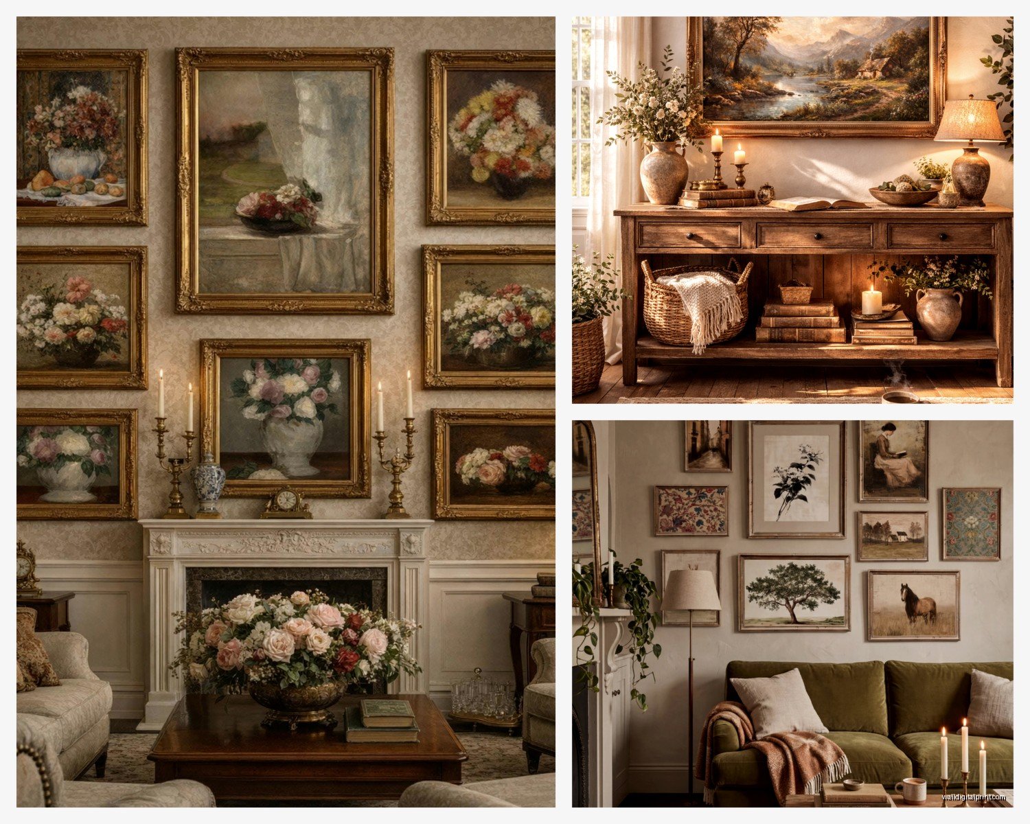
Size matters way more than people think. A tiny 8×10 vintage print on a big wall looks lost and sad. You want pieces that are at least 16×20 for standard living rooms, bigger if you have high ceilings. Or do a gallery wall of smaller pieces – mix vintage frames in different styles, different eras even. That collected-over-time look is actually super forgiving.
Color palette coordination – this is gonna sound weird but I actually bring paint swatches when I’m hunting for vintage art. Your living room has a color story already happening, and vintage pieces need to either complement or deliberately contrast.
I have mostly warm neutrals in my space so I look for vintage pieces with cream backgrounds, warm browns, muted greens. But then I have this one vibrant 1960s abstract that’s all orange and teal and it works BECAUSE it’s the only pop of color. If I had five pieces competing like that it’d be chaos.
Specific Styles That Work
Mid-century botanical prints are probably the safest bet. They go with almost everything, they’re not too fussy, and there’s tons of them out there so prices stay reasonable. Look for ones with simple wooden frames or get them reframed.
Vintage landscapes, especially European scenes or American national parks from the 1940s-1960s. These have this romantic quality without being too precious. The color palettes aged really well too – lots of sage greens and dusty blues.
Abstract art from the 1960s-1970s is everywhere right now and honestly some of it is stunning. The geometric stuff especially. Just watch out because this is also what gets reproduced most often. Original vintage abstracts usually have some texture to the paint or print.
Architectural drawings and maps – vintage city maps, building blueprints, botanical diagrams. These read as sophisticated without trying too hard. Frame them simply and let the graphic quality do the work.
The Frame Situation
Wait I forgot to mention – the frame is like 50% of whether a vintage piece works in a modern living room. Original vintage frames are cool if they’re in good shape, but a lot of them are beat up or have that ornate gold thing happening that can look dated in the wrong way.
I probably reframe half of what I buy. Simple wood frames in oak or walnut, black metal frames, even white frames for really traditional pieces. It updates them just enough. Michaels has sales constantly, or check Facebook Marketplace for people selling frames.
If you’re keeping original frames, at least clean them properly. Wipe down the glass with glass cleaner (not on the art itself obviously), use wood polish on wooden frames, and tighten any loose corners. A clean, well-maintained vintage frame looks intentional. A dusty one with cobwebs looks like you grabbed it from grandma’s attic and gave up.
Hanging and Placement Strategy
Eye level is like 57-60 inches from the floor to the center of the artwork. This is the museum standard and it actually works in homes too. I see so many people hang art way too high and then wonder why their room feels off.
Over the sofa – your art should be about 2/3 the width of the sofa. So if you have a 90-inch sofa, you want your art or gallery wall to be around 60 inches wide. Doesn’t have to be exact but it should feel proportional.
Gallery walls with vintage pieces are really forgiving because the mismatch is part of the aesthetic. I usually do an odd number of pieces, lay them out on the floor first (seriously, do this, take a photo), then hang them. Keep spacing consistent – about 2-3 inches between frames.
Lighting Makes or Breaks It
Vintage art needs good lighting or it just looks dark and muddy. If you have pieces with glass, watch out for glare from windows or overhead lights. I use picture lights on my most important pieces – the battery-operated LED ones from Amazon work great and you don’t need an electrician.
Natural light is beautiful but it also fades vintage pieces faster. Don’t hang valuable prints in direct sunlight. I learned this the hard way with a 1920s fashion illustration that lost like half its color in two years because it was across from a south-facing window.
Price Expectations and Negotiating
Small vintage prints: $15-75 usually
Medium lithographs or paintings: $50-200
Large statement pieces: $150-500+
Rare or artist-signed pieces: sky’s the limit honestly
Always negotiate at antique malls and estate sales. I usually offer 20% less than the asking price and we meet in the middle. Cash helps – people are more willing to deal when they don’t have to pay credit card fees.
Check for damage before you buy because that’s your negotiating leverage. Frame damage, foxing (those brown spots on old paper), tears, fading – point it out and ask for a discount. Sometimes they’ll go down significantly if there’s obvious issues.
Caring for Vintage Pieces
Don’t hang them in bathrooms or kitchens where humidity fluctuates. Vintage paper and canvas hate moisture changes.
Dust frames regularly but never touch the art surface itself. Use a soft brush or microfiber cloth on frames only.
If you see mold or active deterioration, take it to a professional conservator. Don’t try to DIY fix valuable pieces. I tried to clean a vintage watercolor once with a damp cloth and basically destroyed it, so yeah, learn from my mistakes.
Keep them away from heating vents and air conditioning units. Temperature changes aren’t great for old materials.
Mixing Vintage with Modern
This is where people get nervous but honestly it’s easier than you think. Vintage art actually grounds modern spaces and makes them feel less sterile.
In my living room I have a very modern gray sectional, contemporary coffee table, but the walls are all vintage art – 1940s botanicals, a mid-century abstract, some antique architectural drawings. The contrast works because the art provides warmth and history that the furniture doesn’t have.
Or go the opposite way – vintage furniture with one or two really bold modern art pieces and fill in with vintage. There’s no rules really, just make sure you have enough of each element that it looks intentional rather than confused.
The key is confidence honestly. If you love a piece and it makes you happy when you look at it, it probably works. I’ve seen people follow all the “rules” and their spaces still feel bland, and I’ve seen people break every rule and create something amazing.
Just start with one piece you really love and build from there. Don’t try to do a whole gallery wall in one shopping trip because you’ll compromise and buy stuff you don’t actually love just to fill space.