Wall Art Guide, Wall Art Tutoriels
Sexy Bedroom Wall Art: Romantic & Sensual Master Suite Decor
Jun
So I’ve been getting this question SO much lately and honestly it’s my favorite kind of project because there’s this fine line between sexy and tacky that’s actually not that hard to nail once you know what you’re doing.
The Vibe You’re Actually Going For
Okay first thing – when people say “sexy bedroom art” they usually mean one of three things and you gotta figure out which camp you’re in. There’s the overtly sensual stuff (like actual nude photography or explicit art), the subtly romantic vibe (think abstract pieces that just feel intimate somehow), or the moody atmospheric route where it’s more about creating tension through color and composition.
I did a client’s master suite last month and she kept saying “sexy but sophisticated” which like… what does that even mean right? But after showing her a bunch of options we figured out she wanted art that made the room feel private and intimate without being obvious about it. That’s actually the sweet spot for most people.
Abstract Sensuality Works Better Than You’d Think
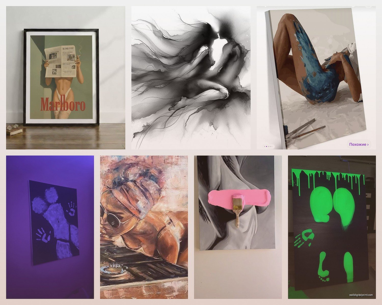
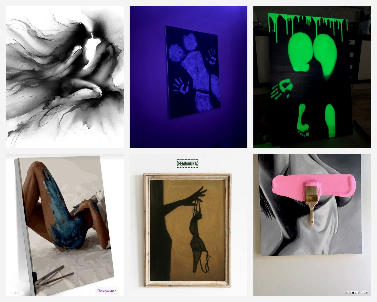
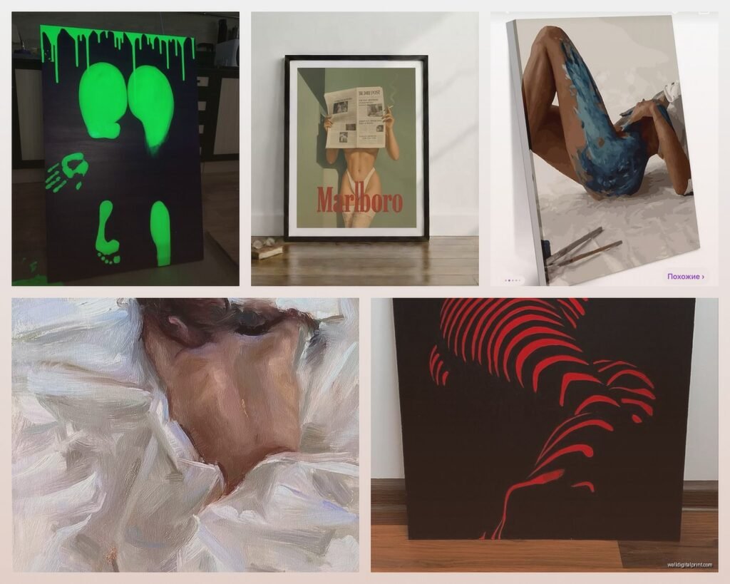
Here’s what I’ve learned after doing this for way too many bedrooms – abstract art in the right colors does more heavy lifting than actual figurative work. I’m talking deep burgundies, blush pinks, charcoal blacks, those murky teals that look almost black in low light. When you get a large canvas with sweeping gestural marks or fluid forms, your brain reads it as sensual even if it’s technically just paint on canvas.
There’s this artist on Etsy (god I wish I could remember the shop name, I have it bookmarked on my other laptop) who does these massive pour paintings in burgundy and gold and they’re like $300-400 for a 40×60 which is actually reasonable. The gold catches lamplight in this way that makes the whole room feel warmer and more intimate after dark.
Positioning and Scale Because Size Really Matters Here
Okay so this is gonna sound weird but the biggest mistake I see is people hanging sexy art too high or too small. You want this art at eye level when you’re lying in bed or… you know, otherwise occupied. Not at standard gallery height.
For over the bed – go LARGE. I mean it. A 48×36 minimum, but honestly 60×40 or bigger if your wall can handle it. Small art over a bed looks timid and timid is the opposite of what we’re doing here.
I had this couple who bought these beautiful charcoal figure drawings, really tasteful stuff, but they got them in 16×20 frames and hung all four in a grid. It looked like a doctor’s office. We swapped them out for one large-scale photograph (black and white, very shadowy, you could barely make out it was a figure) and the whole energy shifted.
Gallery Walls Can Work But Different Rules
If you’re doing a gallery wall situation, keep it to one side of the room, not over the bed. I like these on the wall opposite the bed or on a side wall where you’ve got a reading chair or whatever. The key is keeping the color palette really tight – like all black frames with black and white art, or all warm metallics with sepia-toned pieces.
Mix your subject matter but keep the mood consistent. So like, one abstract, one landscape that happens to be moody as hell, one subtle figurative piece, maybe some poetry or text art if you’re into that. But they all gotta whisper the same vibe.
What Actually Reads as Romantic vs What Reads as Cheesy
Oh and another thing – there’s certain imagery that just doesn’t work unless you’re really committed to a specific aesthetic. Like roses? Roses are hard. They can go full romance novel cover real quick. If you’re gonna do florals (which CAN be sexy, don’t get me wrong), go for something more unexpected. I love using photographs of peonies right as they’re starting to fall apart, all those petals going soft and droopy. Or orchids, which have this whole sensual thing naturally.
Lips and eyes as art – this is tricky territory. A really well-done close-up photograph of lips can be stunning, but it’s gotta be almost abstract in its closeness. Like you’re focusing on texture and shadow more than “oh that’s a mouth.” Same with eyes. The second it looks like a fashion ad, you’ve lost the intimacy.
Figure Studies and Nude Art That Actually Works
Okay so if you want actual figurative work or nudes, here’s what I tell everyone: black and white photography is your safest bet for keeping it classy. There’s something about removing color that makes it more about form and light and less about… anatomy? That sounds weird but you know what I mean.
I love using boudoir-style photography that’s heavily shadowed. The kind where you see the curve of a back or a shoulder but lots of negative space and darkness. It’s suggestive without being explicit. There’s a photographer – god I’m blanking on the name, she’s based in Portland I think – who does these incredible intimate portraits that are just… they’re more about vulnerability and connection than sexuality but they READ as deeply sensual anyway.
For drawn or painted figures, I actually prefer line drawings over realistic rendering. A simple continuous line drawing of two figures embracing or a single figure in a contemplative pose – that can be incredibly evocative without hitting you over the head with it.
Color Psychology Matters More Than Subject Sometimes
Wait I forgot to mention this earlier but it’s actually super important – the colors in your art are gonna affect the mood more than almost anything else. Cool blues and grays? That’s calm and serene, which is nice but not exactly passionate.
For romantic and sensual, you want:
- Deep burgundies and wine colors (classic romance vibes)
- Blush and dusty rose (softer romance, very intimate feeling)
- Charcoal and black with warm undertones (moody, mysterious, definitely sexy)
- Burnt orange and terracotta (earthy sensuality, very warm)
- Deep teals and emeralds (luxurious, jewel-toned richness)
- Gold and copper metallics (warmth, that candlelight effect)
I did a bedroom last year where we used this massive abstract canvas that was mostly deep plum and charcoal with these veins of copper running through it. The clients said it completely changed how the room felt at night – much more intimate and romantic than the beach scene they’d had before (which like, beaches are great but not exactly bedroom energy unless you’re into that).
Lighting Your Art Makes All the Difference
This is gonna sound extra but proper lighting on your bedroom art is what separates “we hung some stuff on the wall” from “this is a intentionally designed intimate space.” You don’t need anything fancy – just some picture lights or even those battery-operated LED puck lights if you don’t wanna deal with wiring.
Warm bulbs only. I’m talking 2700K or lower. That cool white light will kill any romantic vibe instantly. The art should glow softly, not be spotlit like you’re in a museum.
My own bedroom (which is a disaster right now because I’m in the middle of switching out the bedding but whatever) has two small picture lights on the large piece over my bed and honestly they’re on more than the overhead light. It creates this really focused pool of warmth that makes the whole room feel cozier.
Dimmable Everything
Oh and put everything on dimmers if you can. The art lighting, bedside lamps, all of it. Being able to adjust the brightness completely changes the mood. Sometimes you want enough light to read, sometimes you want barely enough to see the art. Flexibility is key.
Where to Actually Buy This Stuff
Okay so real talk about sourcing because this matters. Etsy is honestly my go-to for affordable original art and prints. You can find incredible work from independent artists, and a lot of them do custom sizing which is clutch when you need something specific.
For photography, I really like Minted and Artfully Walls (though Artfully Walls can get pricey). They have good curation and you can preview stuff in room settings which helps a lot.
If you’ve got more budget, local galleries are amazing because you can see the work in person before committing. The texture and how light hits a painting – you can’t really tell from a screen, you know? I always tell clients to go look at art in person if they’re spending over $500 on a piece.
Framebridge or Simply Framed for custom framing. Yeah it’s more expensive than Michael’s but the quality difference is huge and it matters when you’re trying to create a sophisticated vibe.
DIY Options That Don’t Look DIY
If you’re crafty or just want to save money, you can absolutely make your own abstract art. Get a large canvas from Blick (wait for a sale, they’re always having sales), some acrylic paints in your color palette, and just go for it. Seriously. Some of the best “sexy” art is just gestural, intuitive mark-making.
I had a client who was skeptical but she spent like $60 on supplies and made three canvases over a weekend. We hung them as a horizontal triptych over her bed and they looked intentional and expensive. The key is confidence – commit to your marks, use a limited color palette, and go bigger rather than smaller with your canvas size.
What to Avoid Unless You’re Really Sure
Okay rapid fire things that usually don’t work:
- Inspirational quotes about love (just no, it’s too on-the-nose)
- Heart shapes unless they’re super abstract or unexpected
- Cartoon or overly playful art (wrong vibe for romantic/sensual)
- Anything that reminds you of your parents’ house (this is personal but important)
- Multiple pieces that don’t relate to each other at all (looks chaotic not curated)
- Movie posters even if it’s your favorite romantic movie (sorry)
- Art that’s too busy or bright – you want to be able to relax in this space
The Personal Photo Debate
People always ask about hanging personal photos in the bedroom. Like engagement photos or couple shots. My take: if they’re done artistically and you’re gonna frame them really nicely, sure. But keep them off the wall opposite the bed where you’re staring at them constantly. Side wall or dresser top works better.
Actually my favorite thing is having personal intimate photos (like boudoir shots or really beautiful couple photography) in a beautiful album on the nightstand rather than on the wall. More private that way, which feels right for that kind of imagery.
Mixing Art Styles Without It Looking Weird
You can totally mix photography with paintings, abstracts with figurative work, whatever. The trick is finding the common thread. Usually that’s color palette or mood or both.
I’ve got a client with a black and white photograph of a foggy forest (super atmospheric and moody), a burgundy abstract, and a subtle figure drawing all in the same room. Sounds random but they all have this quiet, intimate feeling and the color story works – mostly neutrals and blacks with that pop of deep red.
Think about the overall emotional tone you want. Everything you choose should support that tone even if the styles are different.
Seasonal Swapping If You’re Into That
This is definitely extra but some people like to rotate their art seasonally. Lighter, softer pieces for summer (think blush tones, more negative space), deeper moodier stuff for fall and winter. I don’t usually recommend this because good art isn’t cheap and storing stuff is annoying, but if you’re someone who gets bored easily it’s an option.
Easier version: have your main large piece stay consistent but swap out smaller accent pieces on side walls or shelves.
The Shelf Alternative
Oh wait – if you’re commitment-phobic about hanging stuff, picture ledges or shelves are perfect. You can lean art against the wall and swap things out whenever. I actually love this look, feels more casual and collected over time rather than “we decorated in one weekend.”
Get a floating shelf in black or wood tone, put it at about 5 feet height, lean some framed pieces on it. You can layer them, add a candle or small plant, whatever. It’s a vibe and it’s flexible.
Making It Feel Cohesive With Your Bedding and Everything
Your art should talk to your textiles basically. If you’ve got cool-toned gray bedding, warm burgundy art is gonna feel off. Doesn’t mean everything has to match exactly but they should exist in the same color family or at least not fight each other.
I usually start with the art actually, then build the bedding and accessories around it. Art is harder to change than throwing a different duvet cover on your bed.
Right now I’m watching this show about art forgers (it’s actually fascinating) and it’s making me think about how we perceive value in art but that’s a whole other thing…
Anyway, the main thing is your bedroom art should make you feel something when you look at it. If it’s just decoration, it’s not doing its job. Sexy romantic art should make the space feel more intimate, more yours, more intentional about pleasure and rest and connection. Start there and you honestly can’t go too wrong.