Wall Art Guide, Wall Art Tutoriels
Strawberry Wall Art: Fruit Kitchen & Cottage Decor
Jun
So I just finished hanging like fifteen different strawberry prints in a client’s kitchen last month and honestly I’m still finding the tiny picture hangers in my bag, but here’s what actually works.
Where Strawberry Art Actually Makes Sense
Okay so obviously kitchens are the default choice but hear me out on this. The cottage aesthetic thing is real and strawberries work in way more places than you’d think. I’ve done a breakfast nook where we went full strawberry gallery wall and it didn’t look childish at all because we kept the frames really simple. Just black wood frames, nothing ornate.
Bathrooms though. This is gonna sound weird but powder rooms with strawberry art? It’s giving English countryside cottage and people lose their minds over it. I did one with vintage strawberry botanical prints and the homeowner told me every single guest asks where she got them.
Living rooms are trickier. You gotta be careful it doesn’t read too cutesy. What works is mixing strawberry art with other fruit or keeping it to one statement piece instead of multiples. I learned this the hard way when a client wanted strawberries everywhere and her living room ended up looking like a Strawberry Shortcake explosion.
The Styles That Don’t Look Cheap
Vintage botanical prints are your best friend here. Like the ones that look like they came from an old gardening encyclopedia. Those have this legitimacy to them that prevents the whole thing from skewing too precious. I source a lot of mine from Etsy shops that scan actual antique books, and you can get digital downloads for like twelve bucks then print them at FedEx or whatever.
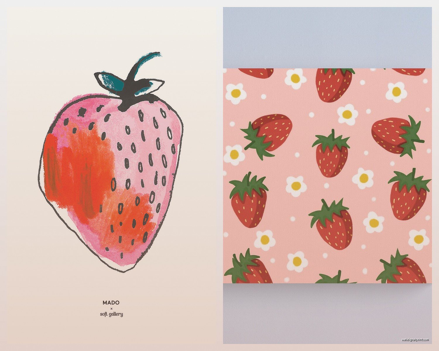
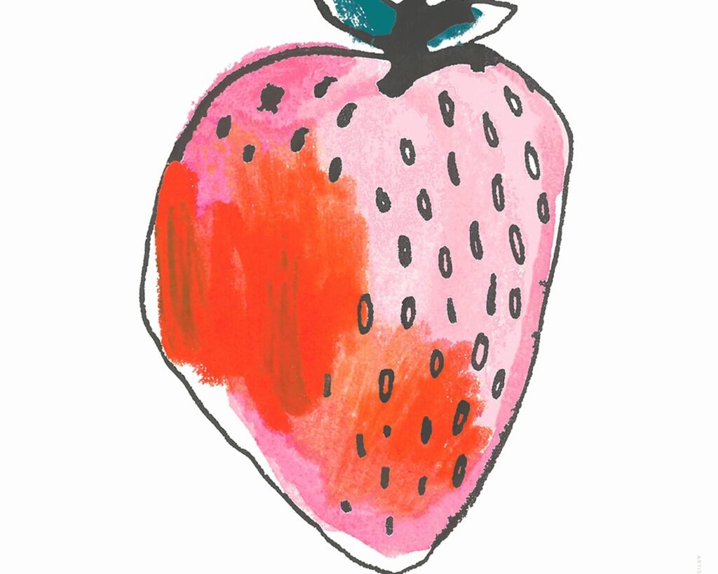
Watercolor strawberries work if they’re not too bright. The really saturated red ones feel very elementary school cafeteria to me. Look for muted reds, maybe with some cream or sage green in the composition. There’s this one artist on Etsy, I think her shop is something like WillowAndGrace or GraceAndWillow, anyway she does these gorgeous dusty rose strawberries that photograph insanely well.
Line art is having a moment. Simple black line drawings of strawberry plants with the little flowers and leaves. Super minimalist, works in modern farmhouse or even contemporary spaces. I just used three of these in a row above a breakfast bar and they looked way more expensive than they were.
Oh and another thing, the realistic oil painting style strawberries. If you find a good one, it can be stunning. But they’re harder to track down and usually more expensive. I got lucky at a estate sale once and found this incredible strawberry still life for forty dollars, my dog was with me and almost knocked over a lamp while I was paying for it.
What to Avoid
Those mass-produced canvas prints from HomeGoods with the word STRAWBERRIES in script font. Just no. They’re everywhere and they make your space look like you decorated in one trip to a chain store.
Anything too glossy or with that weird texture overlay. You know what I’m talking about, that fake brushstroke texture they add to regular prints to make them seem like paintings. It fools no one.
Super cartoonish strawberries unless you’re doing a kids’ space. Even then I’d probably skip them.
Sizing and Placement Strategy
This is where people mess up constantly. They buy art that’s way too small for the wall. Your strawberry print should be at least two-thirds the width of the furniture below it if you’re hanging it above something. So like if your kitchen table is 48 inches wide, you want art that’s at least 32 inches across. That can be one large piece or a grouping.
For gallery walls, I usually go with a mix of sizes but keep them all in the same color family frame-wise. Did a whole thing last spring with five different strawberry prints, sizes ranging from 5×7 to 11×14, all in white frames. Looked cohesive but not boring.
Height matters too. The center of your art should be at eye level, which is usually around 57-60 inches from the floor. But in kitchens where you’re often standing and moving around, you can go a bit higher. I usually do 60-63 inches in kitchen spaces.
Wait I forgot to mention, if you’re hanging above a backsplash or tile, make sure you’re drilling into studs or using the right anchors. I once had a client whose strawberry print crashed down at 2am because she used those sticky strips on a textured wall. Learned that lesson for her.
Mixing Strawberry Art With Other Stuff
Don’t make it a strawberry shrine. Mix in other elements. I like pairing strawberry prints with:
- Lemon or citrus art for that fruit bowl vibe
- Herb botanical prints like basil or thyme
- Neutral landscapes or farm scenes
- Vintage kitchen tool illustrations
- Simple text prints with recipes or food quotes
The key is keeping a consistent style even if the subjects vary. So if you’re doing vintage botanical strawberries, your other pieces should also be vintage botanicals. Don’t throw in a modern abstract lemon, it’ll look confused.
Color palette needs to tie together too. Strawberry art usually brings red, green, maybe cream or white. Pull those colors through in your other pieces. I did a kitchen where we had strawberry prints, a sage green herb print, and a cream-colored vintage French menu print. Everything talked to each other.
Frame Choices That Work
Natural wood frames in light oak or pine give you that cottage feel without being too rustic. They work especially well with vintage botanical prints.
Black frames make everything look more sophisticated and gallery-like. Good for modern farmhouse or if you wanna keep things from getting too sweet.
White frames are classic cottage. They brighten everything up and work great in spaces with white cabinets or trim. Just make sure they’re actual wood, not plastic. The plastic ones photograph terribly and you can always tell.
I’m not huge on metallic frames with strawberry art unless you’re going really contemporary. Gold can work if it’s brushed gold and the print itself is more artistic, but it’s a risk.
DIY vs Buying Ready-Made
Okay so funny story, I spent three hours one night comparing print shops because my client canceled and I had nothing to do. Here’s what I figured out.
Etsy digital downloads are the most cost-effective if you’re gonna print yourself. You can get a high-res file for ten to twenty bucks, print it at Staples or FedEx for another ten to fifteen depending on size, then frame it yourself. Total cost maybe forty to sixty dollars for something that looks custom.
But you gotta make sure the resolution is good enough. Look for at least 300 DPI and check the dimensions work for standard frame sizes. Nothing worse than getting a weird size that requires custom matting.
Ready-made framed prints from places like Etsy or small shops usually run sixty to one-fifty depending on size. More expensive but zero hassle. Sometimes worth it if you hate dealing with framing.
Society6 and Redbubble have strawberry art but it’s hit or miss quality-wise. I’ve ordered from both and gotten stuff that looked great and stuff that was weirdly pixelated. Read reviews carefully.
Actual original art is gonna be pricier, obviously. But if you find a local artist who does strawberry paintings or drawings, you’re supporting someone’s work and getting something unique. I’ve commissioned a few pieces for clients and it’s always special.
Printing Options
If you’re going the DIY route, here’s what works. Regular photo prints on matte paper look good for most vintage botanicals. Go to your local print shop, they’ll know what paper stock works best.
Canvas prints can be nice but they’re harder to frame traditionally. Better for gallery-wrapped edges if you’re doing that look.
Fine art paper gives you the most high-end result but it’s more expensive. Worth it for a statement piece, maybe not for a whole gallery wall.
Making It Feel Cottage Without Looking Like a Theme Restaurant
This is the balance everyone struggles with. You want that cozy cottage vibe but not like you’re living in a strawberry-themed cafe.
Keep your color scheme restrained. If your strawberry art brings in red, don’t also have red curtains and red dish towels and red everything. Let the art be the pop of color and keep everything else more neutral.
Mix in natural textures. Wood cutting boards, linen tea towels, ceramic dishes. These ground the sweetness of the strawberry motif.
Don’t put strawberry art in every room. Pick your spots. Kitchen and maybe dining area, done. You don’t need it in the bedroom and living room too.
Use actual strawberries sparingly in your decor. Like maybe a bowl of fresh ones on the counter when they’re in season, but don’t get strawberry-shaped salt shakers and strawberry dish towels and strawberry everything. The art is enough.
Lighting Considerations
This actually matters more than people think. If your strawberry art is in a spot that gets direct sunlight, the colors will fade. I’ve seen it happen in like six months with cheaper prints. Either frame with UV-protective glass or hang somewhere that doesn’t get blasted with afternoon sun.
Picture lights can make your art look really fancy but they’re not always necessary. In kitchens with good overhead lighting, you usually don’t need them. But in a dining room or breakfast nook where you want more ambiance, a small picture light can make your strawberry print look like a million bucks.
Natural light is your friend for photographing your space after you hang everything. I always tell clients to take pics in morning light for the best look. But again, not direct sun hitting the art.
Budget Breakdown
Since everyone always asks, here’s what you’re realistically looking at.
Budget option: Etsy digital download plus FedEx printing plus IKEA frame. Maybe forty to sixty dollars total per piece.
Mid-range: Ready-made framed print from a small shop or artist. Seventy to one-fifty per piece.
Splurge: Original artwork or high-end framed prints with custom matting. Two hundred plus per piece.
For a full kitchen gallery wall of like five pieces, I usually tell clients to budget three hundred to five hundred if they want it to look good. You can do it cheaper with all DIY, or spend way more on originals, but that’s the sweet spot where it looks intentional and quality.
Seasonal Rotation Thing
Some people like to rotate their art seasonally and strawberries are perfect for spring through summer. I have one client who swaps her strawberry prints for apple and pumpkin stuff in fall, then winter greenery stuff in December. It’s extra but she loves it and it keeps her space feeling fresh.
If you’re gonna do this, make sure all your frames are the same size so swapping is easy. And store your off-season art properly, wrapped in paper or bubble wrap so it doesn’t get damaged.
Personally I think strawberry art works year-round if it’s the right style. Those vintage botanical ones especially feel timeless to me, not specifically summery.
What Actually Happens After You Hang It
Real talk, you’re probably gonna want to adjust things after you hang them the first time. I almost never get placement right immediately. Step back, look from different angles, move stuff around. It’s normal.
Take pictures with your phone to see how it looks in 2D. Sometimes what looks good in person photographs weird and vice versa.
Give it a few days before deciding if you like it. I’ve had pieces I wasn’t sure about that grew on me, and pieces I loved initially that started annoying me after a week.
And if it doesn’t work, just change it. Art isn’t permanent. I’ve rehung the same pieces like four times in my own kitchen trying to get the vibe right.
The whole point is creating a space that makes you happy when you’re making coffee in the morning or whatever. If your strawberry art does that, you nailed it. If it doesn’t, try something different. There’s no like official rules for this stuff, just what feels right in your space.