Wall Art Guide, Wall Art Tutoriels
Simpsons Wall Art: Cartoon Pop Culture Decor
Jun
So I’ve been obsessing over Simpsons wall art lately because honestly, it’s having this whole moment right now and I keep seeing it done really wrong in people’s homes. Like, someone will slap a giant Homer poster in their living room and wonder why it looks like a dorm room, you know?
The Actually Good Stuff vs The Cheap Prints
Okay so first thing—not all Simpsons art is created equal. I learned this the hard way when I ordered what I thought was gonna be this amazing vintage-style print from a random Etsy seller and it showed up looking like someone printed it at Staples on copy paper. The colors were all wrong, totally washed out.
What you actually want to look for are either officially licensed pieces or really high-quality fan art on proper paper stock. Canvas prints work great for Simpsons stuff because the texture hides some of the bold line work and makes it feel less…cartoon-y? If that makes sense. I usually go with at least 300gsm paper weight if you’re doing framed prints.
Where Each Style Actually Works
The minimalist line art versions—you know, like just the outline of Homer’s head or Bart’s spiky hair—those are surprisingly sophisticated and work in basically any room. I put one in a client’s home office last month and her husband didn’t even realize it was Simpsons stuff at first, just thought it was abstract art. Which is kinda the point.
The full-color classic scenes are trickier. They need context or they overwhelm everything. I’ve found they work best in:
- Game rooms or entertainment spaces where pop culture stuff makes sense
- Home bars—actually the couch gag scenes look amazing behind a bar cart
- Kids’ rooms but only if the kid is old enough to appreciate the show, otherwise just get them actual kid art
- Hallways or transitional spaces where you want personality but not like, main-room commitment
The Size Thing Nobody Talks About
This is gonna sound weird but the scale of Simpsons art matters way more than with other pop culture stuff. Because the animation style is so bold and the colors are so saturated, you can’t just treat it like a photograph.
For living rooms, I usually max out at 24×36 inches unless you’re doing a gallery wall situation. Anything bigger and it starts dominating the whole vibe. But then in a dedicated fun space—like a basement or media room—you can go massive. I did a 48×72 inch Moe’s Tavern print for someone’s bar area and it was perfect.
Oh and another thing, the three-piece split canvas sets? They’re everywhere on Amazon and Wayfair. They can work but you gotta hang them with barely any gap between panels—like less than an inch. Otherwise it looks choppy and weird with the animation style.
Mixing It With Your Actual Decor
So here’s where people usually panic. They think Simpsons art means their whole room has to be this pop culture explosion. Not true at all.
I’ve successfully mixed Simpsons pieces into pretty traditional spaces by treating them as the accent, not the foundation. Like, you’ve got your neutral sofa, your normal coffee table, your regular lamps—and then one framed Simpsons print that’s in colors that already exist in your room.
For example, if you’ve got navy and yellow accents in your space, a print featuring Marge’s dress and her hair actually pulls those colors through. Sounds crazy but it works. The yellow of her dress, the blue of her hair—it’s like built-in color coordination.
Framing Makes or Breaks It
Okay this is huge. The frame choice determines whether your Simpsons art looks intentional or accidental.
Black frames are safe and work probably 80% of the time. They give it that gallery feel and make even bright cartoon art feel more curated. I buy most of mine from Frame It Easy because their black metal frames are thin enough to not compete with the bold imagery.
White frames can work but they’re risky—they only look good if your walls are also white and you’re going for that super clean Scandinavian vibe. Which like, can you even do Scandinavian with Simpsons art? I’ve tried and it’s harder than you’d think.
Wood frames in light oak or walnut are actually my secret weapon. They warm up the cartoon style and make it feel more mid-century modern. There’s this print of the family on their orange couch that I framed in light oak and put in someone’s MCM living room and it just…worked. Looked like it belonged there.
The Gallery Wall Approach
Wait I forgot to mention—if you’re nervous about committing to one big piece, a gallery wall is your friend. But you gotta mix the Simpsons stuff with other things or it becomes a shrine.
What I usually do:
- Pick 2-3 Simpsons prints max
- Add some geometric or abstract art in coordinating colors
- Throw in a plant print or two if it’s for a living space
- Include at least one text-based piece, could be a quote or whatever
- Make sure frame styles are consistent even if the art isn’t
The Simpsons pieces become part of the story instead of the whole story. I did this in my own hallway actually—mixed a minimalist Bart print with some vintage travel posters and abstract shapes. People don’t even clock it as themed, just eclectic.
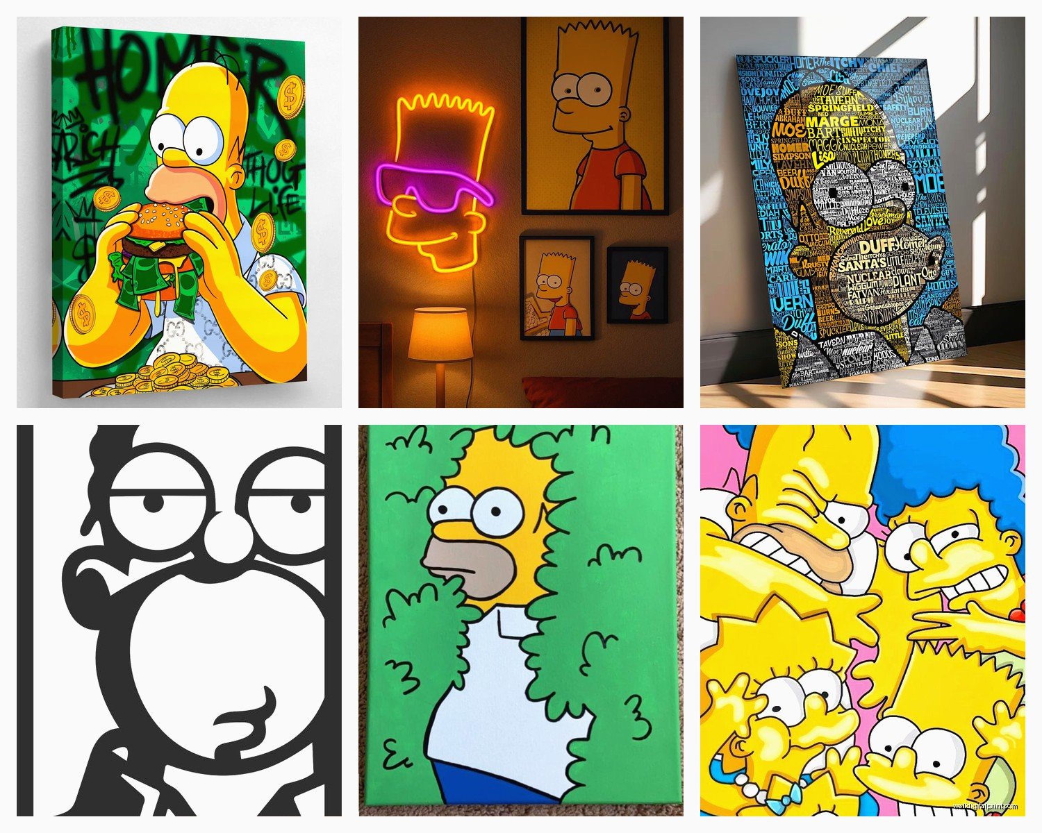
Specific Prints That Are Actually Versatile
There are certain images that just work better in real homes. The family silhouette on the couch watching TV? Super versatile, reads almost nostalgic. The opening sequence with them all running to the couch has this energy that works in active spaces like kitchens or playrooms.
Character portraits can be hit or miss. Solo Homer stuff often reads too silly unless you’re really leaning into the fun vibe. But Marge portraits—especially ones that play up her hair as this graphic element—those can actually look sophisticated. Same with Lisa playing saxophone, that’s got this artistic quality that isn’t just cartoon for cartoon’s sake.
The Springfield skyline stuff is having a moment. You can find prints that look like vintage travel posters of Springfield and they’re awesome for home offices or entryways. Not too character-heavy, just the silhouettes of the power plant and buildings.
What Doesn’t Work (Trust Me)
Okay so funny story, I once tried to convince a client that a massive print of Homer strangling Bart would be funny in their family room. It was not funny. Their kids were like…concerned. So yeah, anything too violent or adult-themed from the show doesn’t translate well to actual living spaces. Save that for your personal office if you really love it.
Also those text-heavy prints with quotes? They need to be actually good quotes that stand alone. “D’oh!” on a canvas is not enough content to be interesting. But something like “Trying is the first step towards failure” with minimal graphics—that can work as motivational-but-ironic art.
Room-by-Room Breakdown Because I’m Gonna Organize This Better
Living Room: Stick with one statement piece or a curated gallery wall. Keep it framed properly, nothing poster-tacky. The minimalist line art versions or vintage-style prints work best here. Colors should coordinate with your existing palette—this isn’t the place to introduce brand new color schemes.
Home Office: This is where you can have more fun. Character-focused pieces work great, especially if they’re related to your profession somehow. I’ve got a client who’s a nuclear engineer with a Mr. Burns power plant print and it’s perfect. Motivational quote prints work here too, especially the ironic ones.
Kitchen/Dining: Food-themed Simpsons art is a thing and it’s actually kinda brilliant. Prints featuring donuts, Krusty Burger, the kitchen scenes—they fit the space naturally. I found this series on Etsy that’s styled like vintage food advertisements but with Simpsons food and they’re chef’s kiss.
Kids’ Rooms: Okay so only if your kids actually watch the show, and maybe go with the less cynical imagery. The family scenes, the playful moments, the colorful stuff. Canvas prints are good here because they’re more durable than framed glass if you’ve got young kids.
Basement/Game Room/Bar: Go wild. This is the space for your massive Moe’s Tavern print, your neon-style signs, your full-color character posters. Multiple pieces work here. Theme it out if you want.
Bedroom: Probably skip it unless you’re really committed to the bit. Bedrooms should be calming and even the most minimalist Simpsons art has this energy to it that doesn’t really support sleep vibes.
Actually Shopping For This Stuff
So where do you actually buy it without getting scammed or receiving garbage quality?
Etsy is a mixed bag—read reviews carefully and look for sellers who show actual photos of the printed product, not just digital mockups. I’ve had good luck with shops that specialize in vintage-style prints because they understand paper quality and color accuracy.
Society6 and Redbubble have officially licensed stuff sometimes and their quality is pretty consistent. The canvas prints from Society6 are actually decent, better than I expected. Their framing options are meh though, I usually order unframed and frame separately.
Amazon is risky but there are some okay options if you filter by Prime and read the photo reviews. Stay away from anything that ships from overseas with a 3-week delivery time, it’s gonna be terrible quality.
For official licensed stuff, check the Fox shop or places like Hot Topic and BoxLunch. They occasionally have really nice art prints that aren’t just character posters.
The DIY Route
If you’re crafty, you can actually make your own pretty easily. Get high-res images—there are legal sources for promotional art—and have them printed at a professional print shop. I use a local place that does 300dpi on heavy cardstock and the quality is better than most online options. Then frame it yourself.
Just don’t like, screenshot episodes and try to print those. They’ll look pixelated and terrible and you’ll be sad.
Making It Look Intentional Not Accidental
The difference between “I decorated my space thoughtfully” and “I bought some stuff I liked randomly” comes down to a few things with pop culture art.
Repetition of colors throughout the room. If your Simpsons print has yellow and blue, echo those colors in throw pillows, a vase, a blanket. Suddenly it’s a cohesive design choice.
Proper lighting. Don’t just slap it on a wall in a dark corner. If it’s worth hanging, it’s worth lighting. Even just positioning it where natural light hits or adding a picture light makes it look curated.
Scale consistency. If you’re doing multiple pieces, they should relate to each other in size. Not all the same, but intentionally varied—like large, medium, small in a grouping. Not just random sizes scattered around.
My dog just knocked over my coffee which is perfect timing because I gotta wrap this up anyway.
The Real Talk About Resale and Longevity
Look, Simpsons has been on for like 35 years so it’s not going anywhere. But trends in how people display pop culture stuff do change. Right now we’re in this phase where nostalgic 90s stuff is peak cool. That might shift.
If you’re renting or planning to move, keep it simple with easily removable pieces. Command strips work for lighter frames but invest in proper picture hanging for anything substantial.
And honestly if you’re worried about what future buyers will think of your home, just plan to remove it before listing. But also like, live in your space for you, not for hypothetical future people.