Wall Art Guide, Wall Art Tutoriels
Sports Wall Art: Athletic Team Game Trophy Decor
Oct
So I’ve been obsessing over sports wall art lately because honestly, it’s one of those things that can either look absolutely amazing or like you just grabbed a poster from a college dorm clearance sale, and the difference is all in how you approach it.
Starting With What You Actually Have Space For
Okay so first thing – measure your wall space before you do ANYTHING else. I cannot tell you how many times I’ve seen people buy these massive canvas prints thinking they’ll look epic, and then it completely overwhelms the room. I did this in my own office with a vintage basketball print that was like 60×40 inches and my husband just stood there like “where exactly did you think that was gonna go” and he was right, it was ridiculous.
For sports stuff specifically, you gotta think about the viewing distance. Like if it’s going in a hallway where people walk close to it, you want something with clean lines and not too much busy detail. But if it’s across from a couch in a game room or man cave situation, you can go bigger and more detailed because people will actually sit and look at it.
The Types That Actually Work
There’s basically a few categories that I’ve tested out with clients and in my own spaces:
Framed Jersey or Memorabilia
This is classic but you need to do it right. The shadow box frames are your friend here – don’t just thumbtack a jersey to the wall like it’s 1997. I use these UV-protective acrylic frames because regular glass can make the colors fade like crazy over time. Found that out the hard way with a signed baseball my brother gave me that turned into this sad faded thing after two years in direct sunlight.
The key is matting. You want at least a 3-inch mat border, sometimes 4 inches if it’s a smaller item. And go with team colors for the mat but keep it subtle – like a deep navy for a Yankees jersey, not that bright screaming blue that looks cheap.
Canvas Prints and Metal Prints
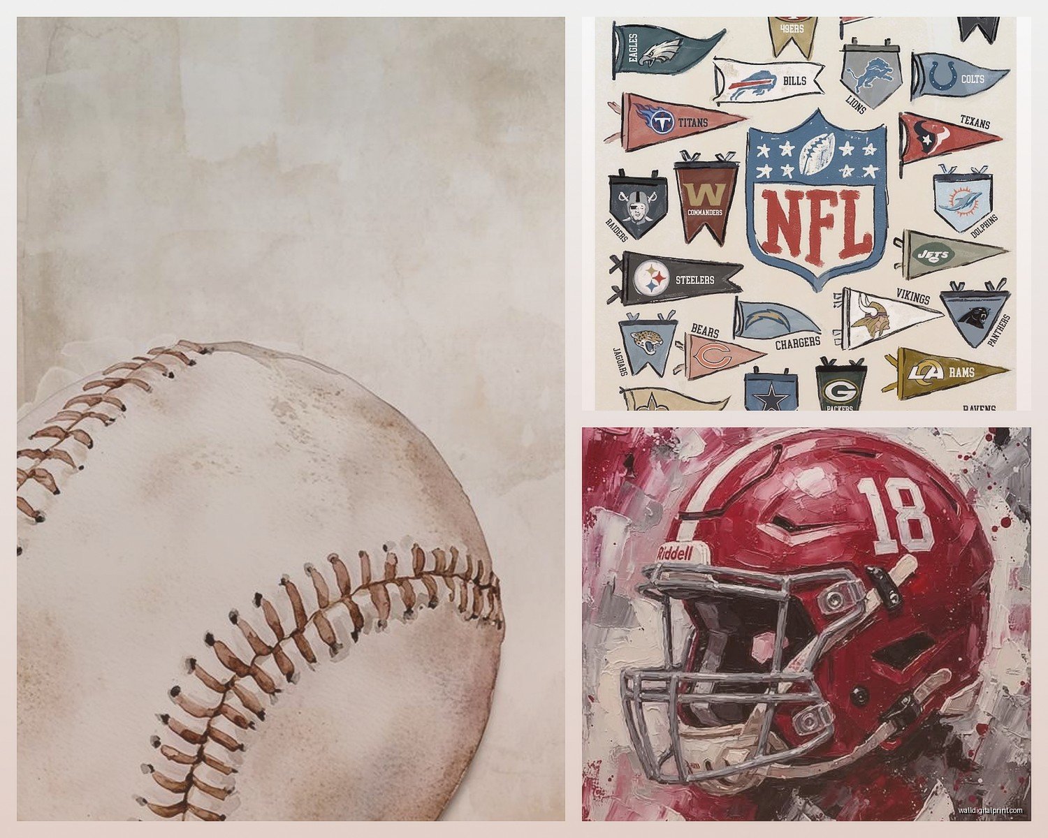
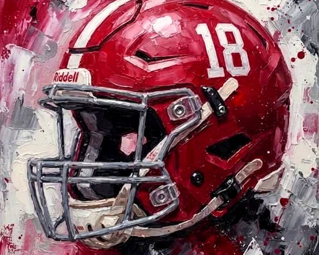
Canvas is everywhere now and honestly some of it looks terrible because people go too photographic with it. Sports images work better when they’re slightly stylized – think high contrast black and white, or those cool graphic poster styles from the 60s and 70s.
Metal prints though… okay this is gonna sound weird but I’m obsessed with them for sports stuff. They have this depth and the colors pop in a way that canvas just doesn’t. I got one of a vintage hockey scene for a client’s basement bar and it literally looks like it’s glowing. The aluminum backing makes it super durable too which matters if you’re hanging it near a pool table where things might get rowdy.
Trophy Shelves and Display Cases
If you’ve got actual trophies or game balls or whatever, floating shelves are your best bet. But NOT those cheap hollow ones from the big box stores – they sag after like six months. I learned this when my nephew’s baseball trophies created this depressing curved shelf situation.
Get solid wood shelves, at least 2 inches thick. Walnut or oak stained dark looks way more sophisticated than that blonde wood everyone defaults to. And here’s the thing nobody tells you – arrange trophies in odd numbers. Three trophies looks intentional, four looks like you just lined them up. It’s a weird design rule but it works.
Creating an Actual Gallery Wall
Oh and another thing – if you’re doing multiple pieces, the gallery wall approach can look incredible but you gotta plan it out on the floor first. I use painter’s tape to map it on the wall before hammering anything, because I’ve definitely created Swiss cheese walls by winging it.
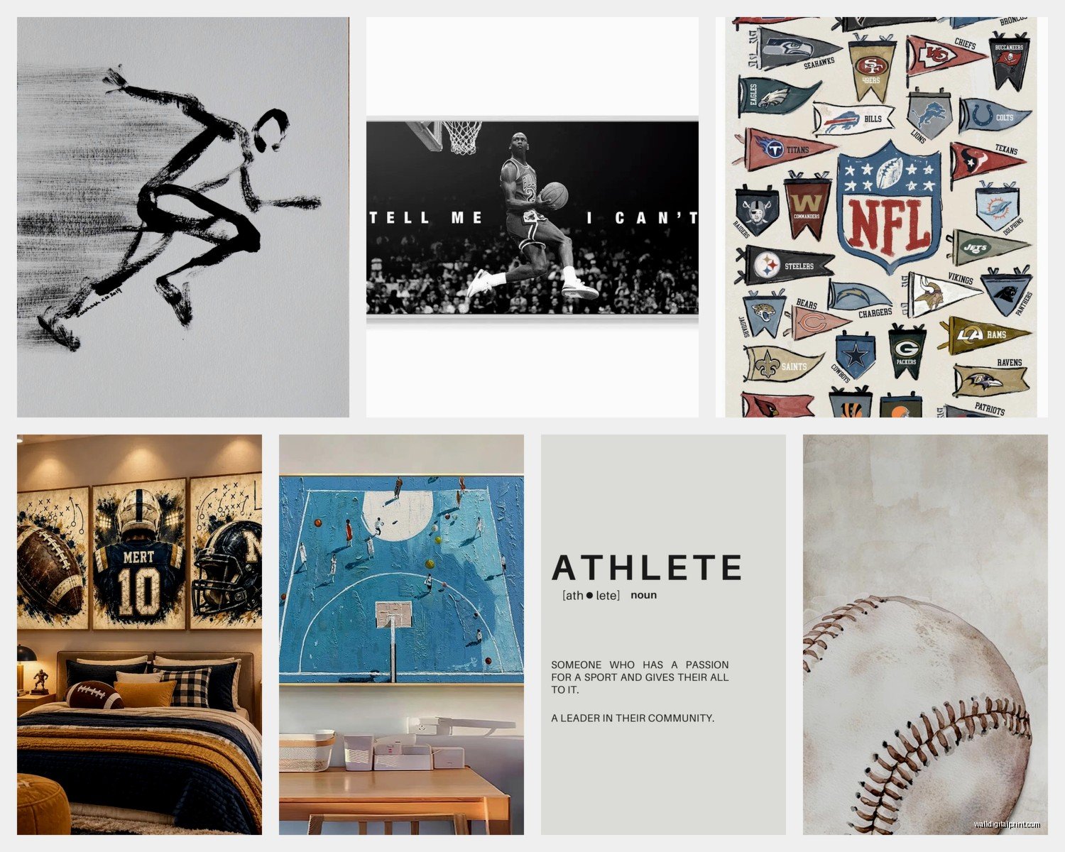
For sports galleries, I mix sizes but keep a consistent element. Maybe all black frames with different sized prints. Or all the same sport but different eras. I did a football-themed wall for a client that had vintage leather helmet photos mixed with modern action shots, all in matching black frames with white mats, and it looked so much better than if we’d just done all modern stuff.
The spacing matters too – keep it between 2 to 4 inches between frames. Less than that looks cramped, more looks disconnected.
The Layout Trick That Works Every Time
Start with your largest piece and put it slightly off-center, then build around it. People think the big piece should be dead center but that actually looks boring and symmetrical in a corporate waiting room kind of way. Put it about a third of the way across your wall space and let smaller pieces balance it out.
Where to Actually Find Good Sports Art
Etsy is honestly my go-to for vintage sports prints. There’s sellers who specialize in restored vintage posters from like the 1920s-1960s and they’re so much more interesting than the generic stuff at HomeGoods. I found this amazing series of boxing match posters from the 1940s that had incredible typography.
For modern stuff, Society6 has some good options if you search specifically – don’t just browse their main page. Search for things like “abstract basketball” or “minimalist football” and you’ll find artists doing really cool interpretive stuff.
And okay, this might sound random but estate sales and antiques shops are goldmines for authentic sports memorabilia that you can frame yourself. I got a collection of 1950s baseball cards for like $30 at an estate sale and framed them in a grid – way better than buying reproduction prints.
Custom Options
If you’ve got photos from your own playing days or your kids’ teams, there’s this site called CanvasPop that I’ve used and the quality is actually good. Not amazing, but good for personal photos. The trick is to edit your photos first – increase the contrast, maybe convert to black and white, because straight-up regular photos on canvas can look flat.
Installation Without Destroying Your Walls
Command strips are not gonna cut it for anything over like 5 pounds, I don’t care what the package says. I’ve had too many 2am texts from clients whose canvas fell off the wall mid-dinner party.
For heavier pieces, use proper wall anchors. The toggle bolt ones that expand behind the drywall. And find the studs when you can – there’s this stud finder app on my phone that actually works pretty well, though my cat went crazy when I was using it last week, I think the sound frequency bothered her.
Picture hanging wire is better than sawtooth hangers for anything larger than 16×20. It distributes the weight better and you can adjust the tilt easier.
Lighting Makes or Breaks It
Wait I forgot to mention lighting because this is actually huge. Sports art needs good lighting or it just sits there looking sad. If you’ve got overhead lighting, that’s fine but not great. What really makes sports art pop is picture lights or track lighting aimed at the pieces.
I installed these battery-operated LED picture lights on a client’s sports gallery and they were skeptical but then saw it lit up and completely changed their mind. No wiring needed, just stick them on and they last like a year on batteries.
For trophy cases, internal LED strips are the move. The ones with the remote control so you can adjust brightness. Home Depot has them in the lighting section and they’re super easy to install.
The Glare Problem
Non-glare glass or acrylic is worth the extra money for framed pieces, especially if there’s any window in the room. Regular glass creates this annoying reflection situation where you can’t actually see the image depending on where you’re standing. Museum glass is even better but it’s expensive – like double or triple the cost. I only recommend it for really valuable signed stuff.
Color Coordination Without Being Matchy-Matchy
Your sports art doesn’t need to match your team colors exactly throughout the room – that can actually look too theme-park-ish. What works better is pulling one or two accent colors from the art and echoing them in small doses around the room.
Like if you’ve got a Chicago Bulls themed piece with red and black, maybe add a red throw pillow or a black lamp, but don’t paint the whole room red and black. That’s overkill.
I did a room last year where we had Green Bay Packers art and instead of going green and gold everywhere, we kept the walls neutral gray and just had the green and gold in the art and a couple small accessories. Looked way more sophisticated.
Mixing Sports With Other Art
This is controversial but sports art doesn’t have to live in isolation. I’ve mixed vintage baseball prints with landscape photography in a den and it worked because we kept the frames consistent and the color palette cohesive.
The trick is treating the sports pieces as art, not as merchandise. If you frame them well and curate thoughtfully, they can hang next to other artwork without looking out of place.
Maintenance Stuff Nobody Thinks About
Dust your frames and canvases regularly with a microfiber cloth. Sounds obvious but sports rooms often get neglected because they’re casual spaces. Dust buildup makes everything look dingy.
For trophies, compressed air is your friend for getting into all those little crevices. I do this like twice a year and it makes such a difference.
And if you’ve got signed memorabilia, keep it away from direct sunlight and humidity. Basements seem like the obvious place for sports stuff but if your basement gets damp, you’re asking for trouble. Autographs will fade and paper will yellow.
Budget-Friendly Approaches That Don’t Look Cheap
Okay so if you’re working with limited budget – been there – here’s what actually works. Print your own posters from high-res images you can find online (for personal use, not selling obviously) and get them printed at a local print shop. Way cheaper than buying pre-made prints and you can customize the size.
Then get frames from thrift stores and spray paint them all the same color. I’ve done this in matte black and it looks legit expensive when they’re all matching.
Another option is using clipboards as frames – sounds weird but for a more industrial casual look, large clipboards with vintage sports pages or photos actually look cool in the right space. Saw this in a sports bar and recreated it for a teen’s bedroom.
Scale and Proportion Rules
Your art should take up roughly two-thirds to three-quarters of the wall space you’re filling. Too small and it looks like an afterthought floating on the wall. I see this all the time where someone has this huge empty wall and puts one tiny 16×20 frame in the middle and it just looks lost.
If you’ve only got smaller pieces, group them together to create more visual weight. Five small frames grouped together has way more impact than five small frames scattered around.
For above furniture like a couch or credenza, the art should be about two-thirds the width of the furniture piece below it. This is just a guideline but it creates good visual balance.
Oh and hang art at eye level – which is generally 57-60 inches from the floor to the center of the piece. Not the top, the center. This is the standard museum height and there’s a reason for it.
The sports wall art thing is really about treating athletic stuff with the same respect you’d give any other art form, using quality materials and thoughtful placement, and not being afraid to mix it with your regular decor instead of segregating it to one “sports room” unless that’s genuinely what you want.