Wall Art Guide, Wall Art Tutoriels
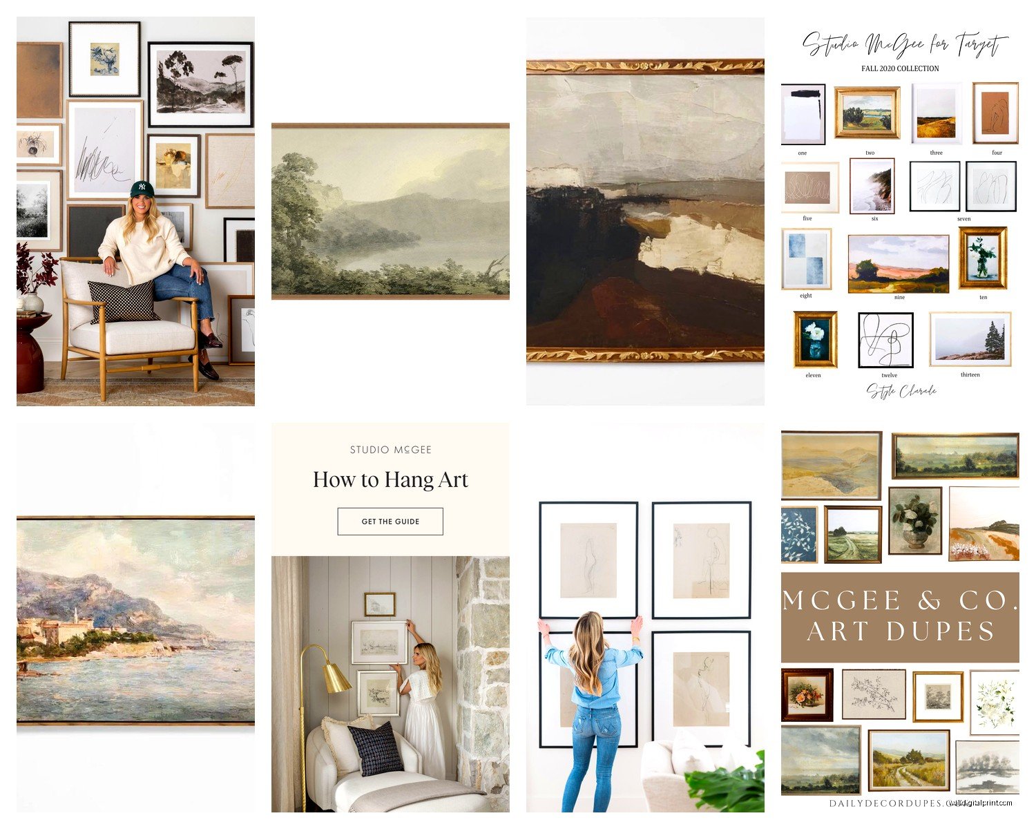
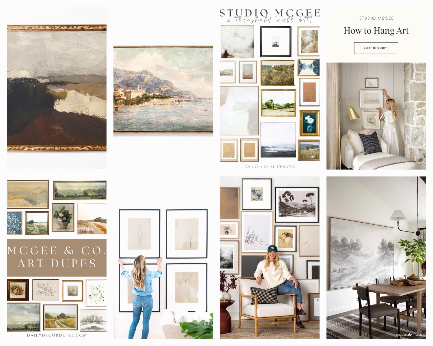
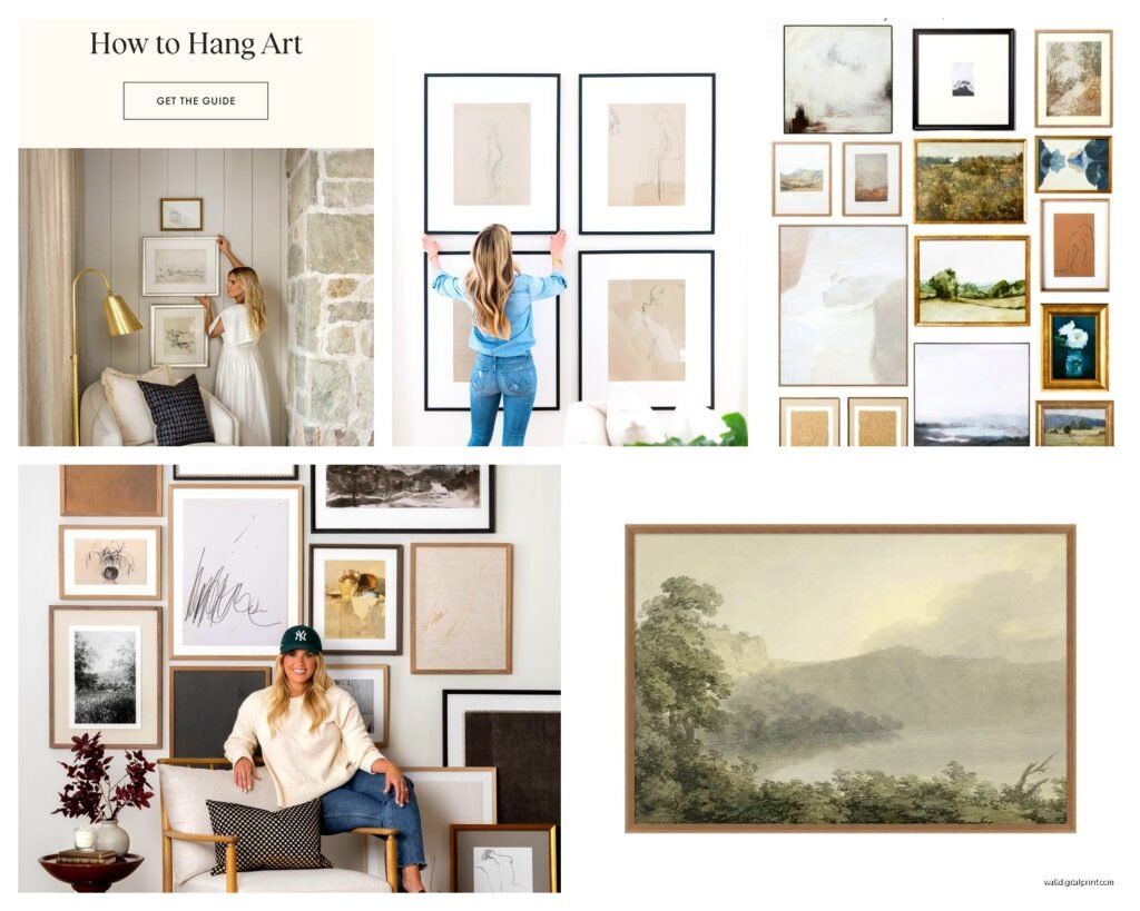
Studio McGee Wall Art: Designer Brand Collection Style
Oct
So I’ve been obsessing over Studio McGee’s wall art lately and honestly it’s kinda taken over my brain because I just redid my office and went down this massive rabbit hole trying to figure out what makes their pieces work so well in literally every space I see them in.
The thing about their collection is it’s not actually one cohesive style which threw me off at first. Like you’d think a designer brand would have this super specific aesthetic but they’ve got everything from abstract landscapes to minimalist line drawings to these really moody vintage-inspired prints. What I figured out though is they all share this one quality – they’re what I call “elevated neutral.” Nothing screams for attention but everything adds this layer of sophistication that’s hard to pin down.
The Color Theory Behind Why It All Works
Okay so this is gonna sound weird but I was watching this documentary about color theory while sorting through samples and it clicked. Studio McGee sticks to like maybe 6 core color palettes across their entire wall art line. You’ve got your warm neutrals (think terracotta, rust, cream), cool neutrals (grays, soft blues, sage), then these really specific accent moments in deep navy or charcoal or sometimes this dusty mauve that shouldn’t work but does.
The genius part is you can mix pieces from totally different “collections” because they’re all working within these same color families. I tested this in my client Sarah’s living room – we hung three completely different art styles (one abstract, one landscape, one botanical line drawing) and because they all pulled from that warm neutral palette it looked intentional instead of chaotic.
What Actually Sells Out Fast
Their abstract landscapes go first, always. Especially anything with a horizon line or that looks vaguely like a beach or desert scene. I think people connect with them because they’re abstract enough to not be cheesy but recognizable enough to not feel too “art gallery” if that makes sense.
The line drawings are hit or miss – the botanical ones do well but the figure drawings can read too minimalist for some spaces. I learned this the hard way when I bought three of the figure sketches for my bedroom and my sister was like “why is your room so empty feeling” even though the walls were literally covered.
Size Matters More Than You Think
This is where everyone messes up including me initially. Studio McGee designs their art to work at specific scales and you really gotta pay attention to the dimensions they recommend. A piece that looks perfect as a 30×40 can look totally washed out or weirdly aggressive at different sizes.
Here’s what I figured out through trial and error:
- Above a sofa you need at least 24-30 inches wide minimum, but ideally you want something closer to 2/3 the width of your sofa
- For gallery walls their smaller pieces (like 11×14 or 16×20) work better than trying to make one statement piece the focal point
- In bedrooms over nightstands I’ve had the best luck with 18×24 vertical orientations
- Dining rooms can handle way bigger than you think – I just did a 40×50 horizontal piece in a client’s breakfast nook and it’s perfect
The tricky thing is their site doesn’t always show the art in realistic room settings at accurate scale so I started using this annoying but helpful trick. I tape newspaper or craft paper to my wall in the exact dimensions before ordering anything over $150. Looks ridiculous but saves so much money and return shipping hassle.
Framing Options Breakdown
Oh and another thing – their framing can make or break the whole vibe. They offer like 4-5 frame options depending on the piece and it’s not just aesthetic it actually changes how formal or casual the art reads.
The natural wood frames are their most versatile honestly. They work in modern spaces, traditional spaces, even slightly rustic rooms. I use these probably 60% of the time. The black frames are gorgeous but they add more contrast so you gotta be careful – they can make a soft abstract feel more graphic and intentional.
White frames are tricky because they only work if you’ve got other white elements in the room. I made this mistake in my hallway where I have all warm wood tones and the white frame just looked like it was trying too hard to be coastal.
The brass or gold options they do occasionally are *chef’s kiss* for the right space but that right space is pretty specific. Think moody library vibes, emerald green walls, velvet furniture. My cat knocked one of these off the wall last month and I almost cried because the corner dented.
What I Actually Keep In My Own House
People always ask me this. Right now I’ve got five Studio McGee pieces in rotation (I swap stuff out seasonally because I have a problem). The one that’s stayed up for like two years is this abstract landscape in dusty pink and cream tones. It’s above my bed and every single person who sees it asks where it’s from.
I also have this set of three botanical line drawings in my bathroom that cost maybe $120 total for all three framed prints. Best value purchase I’ve made from them honestly. They’re small, like 11×14 each, but arranged in a vertical line they make my tiny bathroom feel taller.
The Dupe Situation
Okay so funny story – I spent an entire Saturday comparing Studio McGee art to similar pieces from like 8 other retailers because a client had a tight budget. Here’s the truth: you can find similar STYLES everywhere now because neutral abstract art is having a moment. But the actual quality difference is noticeable.
Studio McGee works with really good printmakers and the paper quality is substantial. I’ve bought dupes from certain retailers (not gonna name names but rhymes with Schmamazon) and the colors are always slightly off – either too saturated or too muddy. The matting when they include it is also thinner.
That said if you’re decorating a rental or a space you’ll redo in a year or two, the dupes are fine. I’ve used them in staging projects. But for your forever home or rooms you’re investing in properly, the real thing holds up better and honestly photographs better too which matters if you’re ever gonna post your space online.
How To Style It Without Looking Too Catalog
This is the thing that took me the longest to figure out. Studio McGee’s imagery is so polished that if you just copy it exactly your room can feel a little soulless? Like a hotel lobby or something.
What works better is using their art as the foundation but then layering in stuff that’s actually personal to you. I’ve got a Studio McGee abstract landscape next to a vintage botanical print I found at an estate sale and a small photograph from my trip to Portugal. The McGee piece elevates the whole arrangement but the other stuff makes it feel like someone actually lives there.
Also don’t be afraid to lean art instead of hanging it if you’ve got the right surface. I’ve got one of their medium landscapes leaning on my mantel propped against the wall and it’s been there for months. Looks intentional and I can swap it out easily when I get bored.
The Gallery Wall Formula That Actually Works
Wait I forgot to mention their gallery wall sets. They sell some pieces as pre-coordinated sets which seems like it would make life easier but honestly I’ve had better results mixing my own combinations.
Here’s my formula that’s worked in probably 15+ rooms now:
- Start with one larger anchor piece (24×30 or bigger) – usually an abstract or landscape
- Add 2-3 medium pieces (16×20 range) in complementary but not matching styles
- Fill in with 3-4 smaller pieces (8×10 to 11×14) – this is where you can get more experimental
- Keep your frame colors to max 2 different finishes
- Leave way more space between pieces than feels comfortable – like 3-4 inches minimum
I map these out on my floor first which my dog finds super annoying because it takes up the whole living room but it’s the only way I can visualize the spacing properly.
What’s Worth The Splurge vs What To Skip
Their original canvas pieces are beautiful but so expensive and honestly for most rooms the framed prints give you 85% of the same impact for like a third of the price. Unless you’re doing a really large scale installation or you’ve got a feature wall that needs serious presence, I’d skip the canvas options.
The textile wall hangings they’ve done are actually more unique and harder to find good dupes of. If you’re gonna splurge I’d do it there. I have one of their woven pieces in my entryway and the texture adds something that a flat print just can’t replicate.
Their smaller impulse pieces under $75 are usually worth it. I’ve bought probably a dozen of these as gifts and they always land well because they’re that perfect intersection of thoughtful and accessible.
Mixing With Other Brands
You don’t need an all-Studio McGee wall and honestly it looks better when you don’t. I mix their stuff with Minted prints, vintage finds, Etsy artists, even some Ikea frames with custom prints.
The key is paying attention to the undertones. Studio McGee stuff tends to lean slightly warm even when it’s in cool colors. So if you’re mixing with other brands make sure you’re matching that warmth level. A cool gray Studio McGee piece next to a warm gray from another brand will look off even though they’re both “gray.”
I’ve also had good luck pairing their more minimal pieces with busier patterns from other sources. Like a simple Studio McGee line drawing next to a detailed vintage botanical creates nice contrast without chaos.
Okay I think that covers most of what I’ve learned through way too much trial and error with their collection. The main thing is just to not overthink it – their stuff is designed to be pretty foolproof which is probably why it’s everywhere right now. Pick what you’re actually drawn to and commit to the right size and you’ll probably be happy with it.