
Wall Art Guide, Wall Art Tutoriels
Urban Outfitters Wall Art: Trendy Youth Retailer Collection
Sep
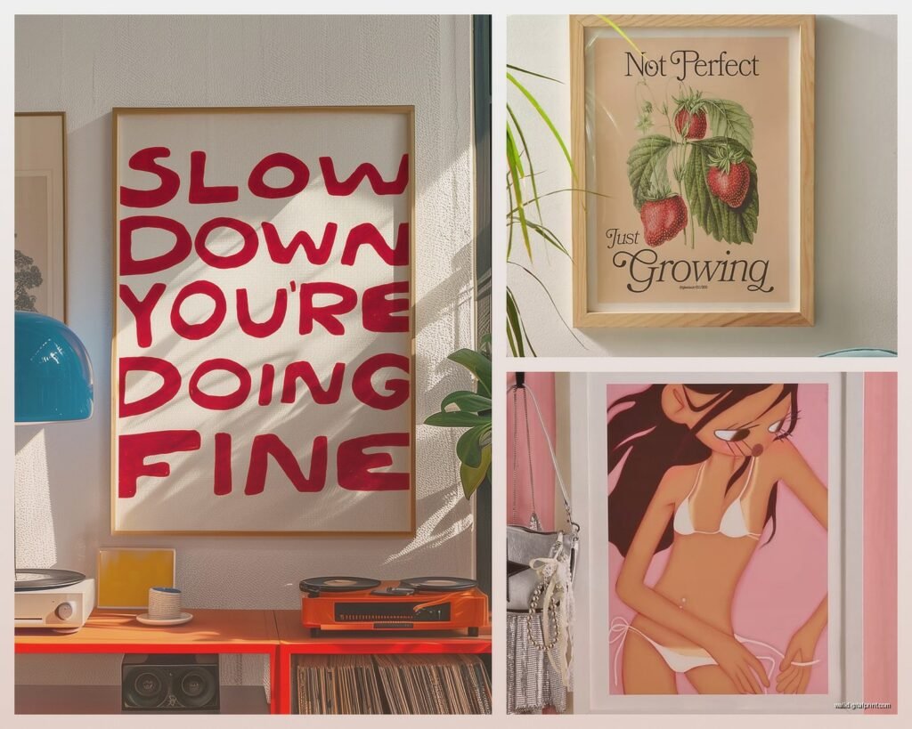
So I’ve been obsessing over Urban Outfitters wall art lately because honestly their stuff hits different when you’re trying to do that whole eclectic-but-still-pulled-together vibe, and I actually ordered like six pieces last month to test out for a client’s apartment (and maybe kept two for myself but whatever).
What Makes Their Collection Actually Worth Looking At
The thing about UO is they’re really good at riding that line between affordable and doesn’t-look-like-dorm-room-poster. Most pieces run between $19-$200, which yeah, is a range, but you can actually find gallery-quality prints in the $40-60 sweet spot. I was comparing their botanical prints to some Etsy sellers and honestly the quality was comparable but UO ships faster and their return policy doesn’t make you wanna cry.
Their aesthetic is very… how do I explain this… it’s like if a vintage store and Instagram had a baby? Lots of 70s revival stuff, abstract line art, photography that looks like it could be from the 80s, and then random maximalist pieces thrown in. Not everything works together but that’s kinda the point.
The Different Categories They Actually Stock
Abstract and Line Art Prints – This is probably their biggest section and where I find the most versatile stuff. The single-line drawings, you know the ones where it’s like a continuous line making a face or body? Those are everywhere right now but UO’s versions are actually pretty sophisticated. I got this one called something like “Resting Figure” for $38 and it’s holding up really well in direct sunlight which is more than I can say for that CB2 print I bought that faded in like three months.
Photography Prints – They source from actual photographers which is cool. Lots of desert landscapes, European architecture, vintage car shots, that moody beach photography everyone’s obsessed with. The paper quality on these varies though, gotta check the descriptions. Some are on this thick archival paper and others are… not.
Tapestries – Okay so tapestries are very college student but hear me out. UO does some really beautiful ones that work as headboard alternatives or for covering weird wall spaces. I used their celestial map tapestry in a studio apartment to hide some water damage while the landlord dragged his feet on repairs and it actually looked intentional. They’re like $30-50 and way easier than dealing with actual large-format framing.
Vintage-Style Posters – Concert posters, travel posters, retro ad reproductions. This category is hit or miss. Some look authentic and cool, others look like someone discovered Canva templates. You gotta be picky here.
How to Actually Shop Without Buying Stuff That’ll Look Dated in Six Months
My cat just knocked over my coffee so hang on… okay I’m back.
Here’s what I do when I’m browsing their site, which is probably too often but my therapist says we all need hobbies:
First, ignore the “trending” section entirely. That’s where all the super-of-the-moment stuff lives that you’ll hate in a year. I bought this neon sign thing from there in 2019 that I cringe at now.
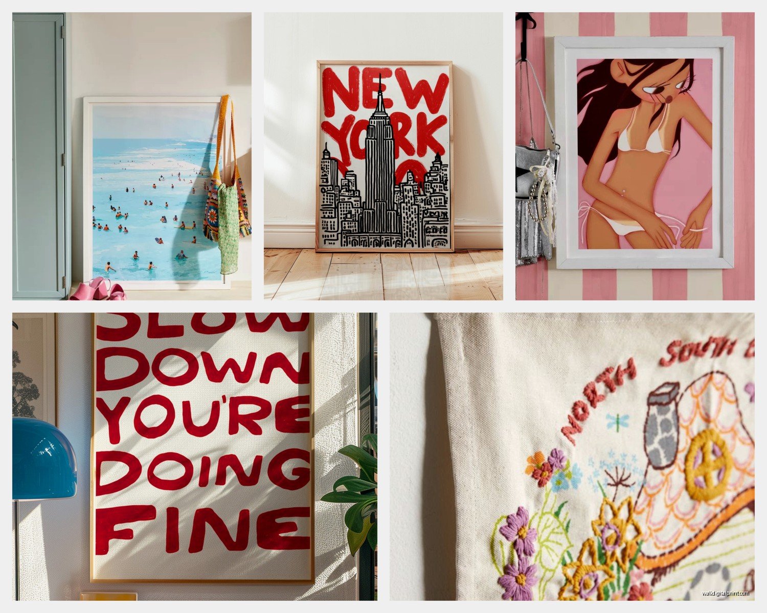
Filter by “new arrivals” but then sort by customer rating. This shows you what’s actually good from the recent drops. UO customers will roast a print in the reviews if it looks cheap in person, which is helpful because their product photos are sometimes… optimistic.
Check the dimensions obsessively. Their site lists them but it’s easy to miss. I ordered what I thought was a large botanical print and it showed up the size of a greeting card. My own fault but still annoying.
Look for pieces that say “gallery quality” or “museum quality” in the description. These are usually printed on better paper stock and the colors are more accurate. Worth the extra $10-15.
The Framing Situation
This is gonna sound weird but Urban Outfitters frames are actually decent? Like I’m an art curator by training so I’m picky about this stuff, and their wooden frames hold up. The metal ones can be flimsy. They do this thing where you can buy the print and add a frame for usually $20-40 more, and honestly it’s worth it because taking prints to a frame shop will cost you $80 minimum.
Their “Slim Metal Frame” line is surprisingly good for the price. I’ve used them for client projects and nobody’s complained. The plastic clips on the back are whatever but they work.
Oh and another thing – they sell frame-only options if you have prints from elsewhere. Their 16×20 frames are cheaper than Target’s and look better. Just saying.
What Actually Looks Good Together
So Urban Outfitters’ whole vibe is eclectic maximalism but you can’t just throw any five prints together and call it a gallery wall, I’ve seen people try and it’s chaos.
Here’s what works:
Pick a color story first. UO has a lot of warm-toned stuff (terracotta, mustard, burnt orange) and cool-toned stuff (blues, grays, sage green). Mixing these can work but you need a bridge color. I did a wall with mostly blue-toned photography and added one abstract print with both blue and warm ochre and it tied everything together.
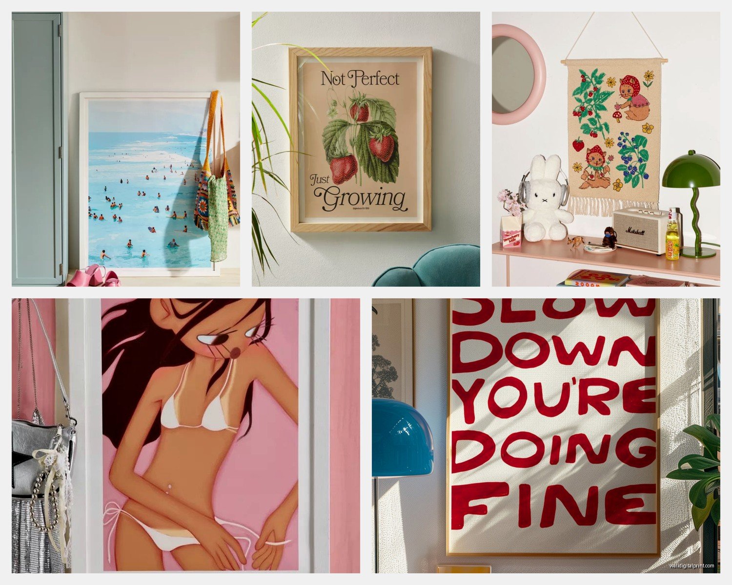
Their black and white photography mixes really well with their line art. This is like the easiest combination to pull off. Add one colorful abstract piece as an accent and you’re done.
Don’t buy all the same size. Gallery walls need variety. I usually do one large anchor piece (like 24×36), a couple medium prints (16×20), and then some smaller ones (8×10 or 11×14). UO’s website actually shows dimensions clearly which helps with planning.
Wait I forgot to mention – they have this AR feature on their app where you can see how pieces look on your wall. It’s not perfect but better than guessing. I used it to convince a client that yes, that large-scale desert photo would work in her bedroom, and she loves it now.
Specific Pieces That Are Actually Worth It
I’m gonna name some specific items I’ve bought or used because generic advice only goes so far:
Their “Matisse-inspired” cutout prints – there’s a whole series of these abstract organic shapes in various colors. The quality is solid and they’re like $30 each. I have the rust-colored one in my hallway.
Any of the Wilder California photography prints. This photographer they work with does gorgeous national park shots. The paper quality on these is consistently good.
The vintage map collection if you’re into that. They have these reproduction maps from the 1800s that are actually historically accurate (I checked, professional hazard). They look expensive but they’re like $40.
Their risograph prints when they have them in stock. These are actually printed using traditional risograph techniques and have this cool textured quality. More expensive (usually $60-80) but worth it if you want something that looks handmade.
What to Avoid
Okay so not everything at UO is a winner and I’ve made mistakes so you don’t have to:
The super trendy stuff with phrases on it. “Good vibes only” type things. Just no. Even if you think it’s ironic it’s not gonna age well.
Most of their neon signs. They’re cool in theory but the quality is inconsistent and they’re overpriced for what you get. I’ve seen better options on Amazon for half the price.
Anything described as “canvas print” under $50. The canvas quality at that price point is usually pretty rough. Either go for paper prints or invest in a better canvas piece.
The mini print sets where you get like 6 small prints for $30. These always look cheaper in person than online. The paper is thin and they’re hard to frame nicely.
How to Style Them Without Looking Like a College Dorm
This is the real question right? Because UO’s target demo is like 18-25 year olds but plenty of us older people (I’m 41, whatever) shop there too.
The key is mixing their stuff with other pieces. Don’t do an all-UO wall. I’ll put one or two UO prints with vintage finds, stuff from actual galleries, maybe something from Society6 or even Target’s threshold line. This keeps it from looking too branded.
Frame everything properly. Seriously this is like 80% of making affordable art look expensive. No pushpins, no washi tape (unless you’re actually 19), no command strips showing. Either use their frames or get proper frames elsewhere.
Group their more youthful pieces with sophisticated elements. I put one of their colorful abstract prints next to a black and white architectural photograph and suddenly the abstract piece looked more grown-up.
The Practical Stuff About Ordering
Their shipping is usually pretty fast, like 5-7 days. Sometimes prints arrive rolled in tubes, sometimes flat in cardboard. The flat packaging is obviously better but you don’t get to choose.
Check for damage immediately when stuff arrives. I had one print show up with a crease and their customer service was actually helpful about replacing it, but you gotta report it within like 48 hours.
They run sales pretty regularly – usually 25% off home stuff every few weeks. Sign up for emails if you can deal with the inbox spam because the deals are worth it. I never buy anything full price there anymore.
oh and if you’re ordering multiple pieces, sometimes it’s cheaper to hit the free shipping threshold than to pay for shipping on a small order. Their throw pillows are actually decent if you need to pad your cart.
Mixing High and Low
One thing I do a lot is mix UO pieces with higher-end art. Like I’ll put a $40 UO print next to a $300 piece from a local artist and if they’re framed similarly, people can’t tell which is which. This is honestly how you make a collected-over-time gallery wall without spending thousands.
The UO pieces work as filler while you save up for investment pieces. Nothing wrong with that. Not everything on your walls needs to be precious.
For Renters Specifically
If you’re renting and can’t make a million holes in the walls, UO’s smaller prints work great with those command strip picture hanging strips. I know I said no visible command strips but the hanging ones that go behind the frame are fine.
Their tapestries are clutch for rentals. Temporary, no damage, hide wall problems, and you can take them with you. I’ve recommended these to so many clients dealing with landlord-beige walls.
The leaning method works too – just lean larger frames against the wall on a dresser or shelf. UO’s frames are sturdy enough for this if you’re not in an earthquake zone.
Real Talk About Quality
Look, this isn’t fine art. We’re not talking about investment pieces here. But for the price point, UO’s wall art is solid. I’ve had some prints for three years now and they still look good. The colors haven’t faded (when kept out of direct sun), the frames haven’t fallen apart, and guests regularly ask where pieces are from.
Compare it to HomeGoods or TJ Maxx where quality is totally random, or fast furniture stores where everything looks cheap. UO sits in this middle zone where it’s affordable but doesn’t scream affordable.
The biggest variable is the paper quality on prints. Their premium prints (usually marked as such) use thick paper that feels substantial. The standard prints use thinner stock that’s fine but not amazing. For $20 more, go premium if you’re planning to keep something long-term.
Okay I think that covers most of what I’ve learned from way too many UO orders and probably too much time thinking about wall art but hey, it’s literally my job so whatever. The main thing is don’t overthink it – if you see something you love and it’s in your budget, just get it. You can always return it if it doesn’t work, and worst case you’re out like $40. I’ve made way more expensive decorating mistakes trust me.
