Wall Art Guide, Wall Art Tutoriels
Wall Art Deco: 1920s-1930s Vintage Style Designs

May
So I’ve been obsessing over Art Deco wall designs lately and honestly it started because a client wanted to recreate this 1920s hotel lobby vibe in her dining room and I went down this whole rabbit hole. Let me tell you what actually works versus what just looks good on Pinterest.
Getting the Proportions Right
First thing – and I cannot stress this enough – Art Deco is ALL about symmetry and geometric patterns. You can’t just slap up one piece and call it a day. I learned this the hard way when I hung this gorgeous sunburst mirror off-center in my own living room and it looked… wrong for like three weeks before I figured out why. The whole aesthetic relies on balance.
For wall art specifically, you want pieces that either go big and bold as a single statement, or you’re doing a gallery wall with mathematical precision. None of this organic, casual spacing you see with boho or eclectic styles. I usually map everything out on the floor first – yeah, I know everyone says this but I actually mean it. Take painter’s tape, mark your wall dimensions on your floor, arrange everything there first.
Color Palettes That Actually Work
Okay so the classic Art Deco colors are black, gold, cream, emerald green, and this specific shade of navy that’s almost midnight blue. But here’s what I’ve found working with real spaces – you gotta pick like two or three max. I did a bedroom last year where we went full emerald and gold with black accents and it was stunning, but when people try to use ALL the colors it turns into this weird maximalist thing that’s not quite Art Deco anymore.
Metallics are huge. Gold obviously, but also chrome, silver, brass. The 1920s-30s were obsessed with that machine age aesthetic so anything with a metallic sheen reads as period-appropriate. I found these amazing geometric metal wall sculptures on Etsy – gonna link that in my head but you know what I mean, the kind with overlapping circles and fan shapes. They catch light differently throughout the day which is such an underrated aspect of wall decor.
The Sunburst Thing
Everyone wants a sunburst mirror or wall piece and yes, they’re iconic, but placement matters SO much. These work best above mantels, behind bars (if you have a home bar situation), or as the centerpiece of a gallery wall. I’ve seen people put them in random corners and it just doesn’t make sense with the geometry of the room.
My friend actually made her own sunburst piece using wooden dowels and gold spray paint and it turned out shockingly good? Like I was skeptical but the tutorial she followed had you arrange them in this specific pattern that mimics the vintage ones. Cost her maybe forty bucks versus the $400 for an authentic vintage one.
Sourcing Actual Vintage vs Reproductions
Here’s where it gets tricky. Real 1920s-30s wall art is expensive and often fragile. I’ve worked with a few pieces from estate sales and antique shops, and while they have this incredible authenticity, the condition is always questionable. Frames are loose, prints are faded, mirrors have that cloudy thing happening.
Reproductions have gotten really good though. There are companies now doing museum-quality prints of original Art Deco posters – think Cassandre’s travel posters, Erté fashion illustrations, that whole genre. I usually recommend going reproduction for actual art prints and splurging on vintage for decorative objects like mirrors or metal work.
Estate sales are still my favorite hunting ground. Last month I found this pair of chrome wall sconces with geometric frosted glass shades for $85 total and they’re definitely from the period. The trick is going to sales in older neighborhoods where the houses haven’t been fully renovated. My dog hates when I drag him to these weekend morning sales but whatever, he gets extra treats.
The Gallery Wall Approach
If you’re doing a gallery wall with Art Deco pieces, the layout needs to be intentional. I typically do one of three arrangements:
- Symmetrical grid – everything same size, evenly spaced, usually in black frames with gold mats
- Pyramid/triangle composition – largest piece at top or center, smaller pieces arranged geometrically around it
- Horizontal line – works great in hallways or above long furniture pieces like sideboards
The frames matter as much as the art itself. Art Deco frames are either sleek and minimal (think thin black or chrome) or they’re ornate in a very specific geometric way. No baroque curls or organic shapes. I found a framing shop that does custom frames with stepped corners and linear details that are perfect for this era.
What to Actually Put in Your Frames
This is gonna sound weird but vintage sheet music from the 20s and 30s makes amazing wall art. The typography alone is so period-specific, and you can find it cheap at flea markets. I framed a bunch of jazz sheet music for a client’s music room and it cost maybe $3 per piece for the actual music.
Fashion illustrations from old magazines are another goldmine. Vogue and Harper’s Bazaar from that era had these incredible Deco-style illustrations. You can find reproductions or sometimes actual vintage magazine pages. Just make sure you’re using UV-protective glass because they’ll fade like crazy otherwise.
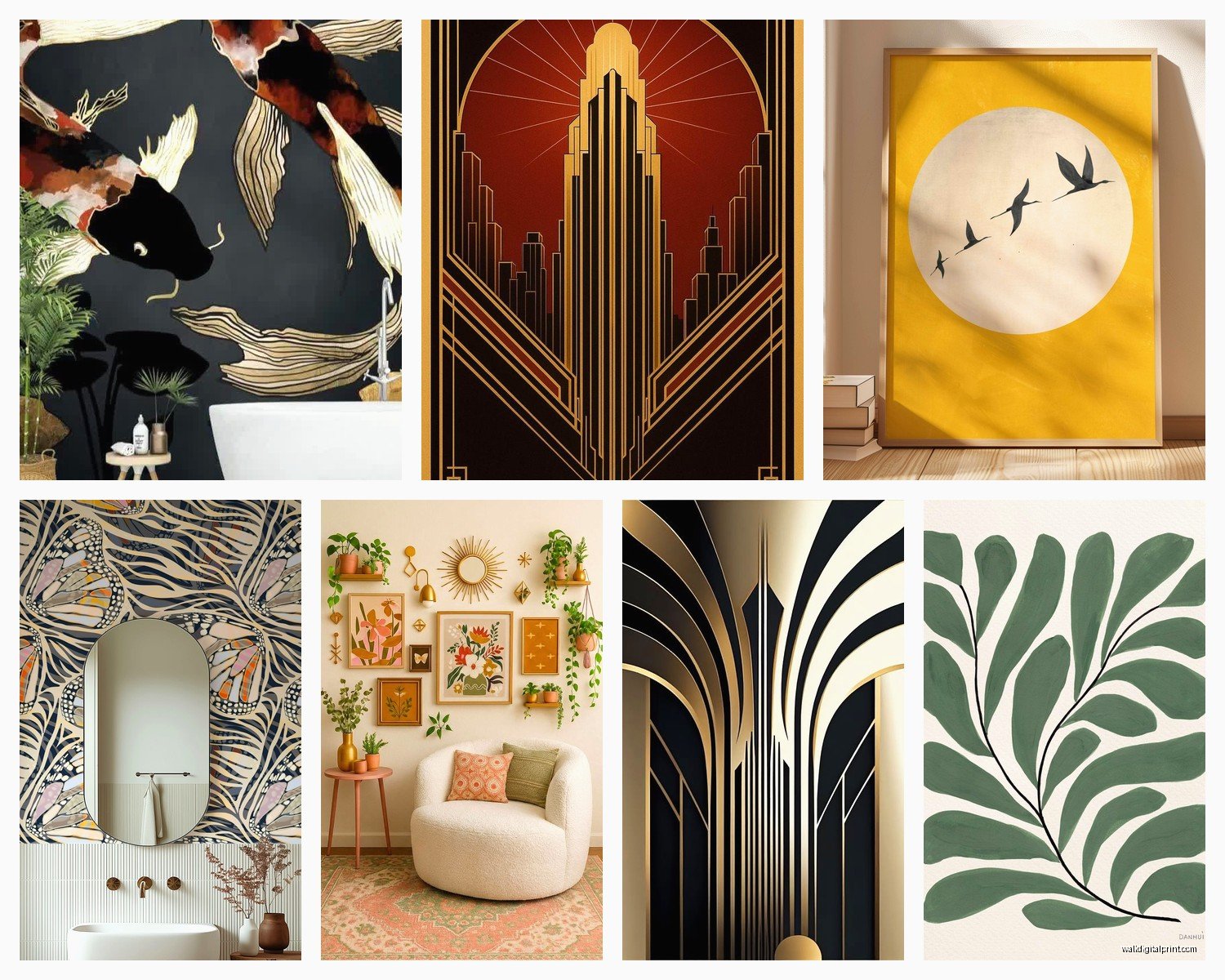
Architectural prints and blueprints also fit the aesthetic perfectly – the Chrysler Building, Rockefeller Center, anything with those ziggurat shapes and geometric details. There’s this one seller on eBay who has amazing digitally restored prints of original architectural drawings and they’re like $15-20 each.
Wallpaper and Murals
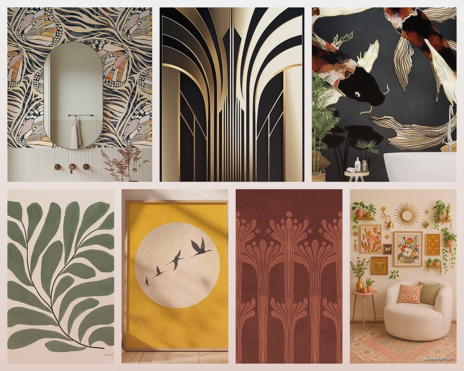
Okay so technically not wall art but it creates the same visual impact. Art Deco wallpaper has come back in a major way and some of the new designs are really well done. I used this geometric gold and navy pattern in a powder room and it completely transformed the space.
The key patterns to look for:
- Chevron and zigzag (but not the trendy 2010s chevron, the sharper Deco version)
- Fan or shell patterns (super common in the era)
- Overlapping circles and arcs
- Stepped or tiered geometric designs
- Stylized floral that’s more geometric than organic
If you’re renting or don’t wanna commit to wallpaper, there are these peel-and-stick murals now that are actually decent quality. I was skeptical but tested one in my office and it’s held up for over a year. Just make sure your walls are smooth because texture shows through.
The Accent Wall Decision
One accent wall with a bold Art Deco wallpaper or mural can anchor an entire room’s design. I usually pick the wall you see when you first enter the room, or the wall behind the bed in a bedroom. It gives you that dramatic impact without overwhelming the space.
Saw this amazing installation where someone did a half-wall treatment – Art Deco wallpaper on the bottom half, picture rail, then solid color on top with framed prints. Very period-appropriate since they actually did wainscoting and picture rails in that era.
Mixing Vintage with Modern
You don’t have to go full Gatsby to make Art Deco wall art work. I actually think it looks best when you mix it with more contemporary elements. Like, Art Deco prints in modern minimal frames, or a vintage sunburst mirror paired with modern furniture.
The geometric nature of Art Deco means it plays surprisingly well with mid-century modern and even some Scandinavian design. I did a living room where we mixed Art Deco wall art with a mid-century sofa and Scandinavian lighting and it totally worked because the common thread was clean lines and geometric shapes.
Lighting Considerations
This is something people forget – Art Deco pieces need proper lighting to show off all that metallic detail and geometric depth. I always add picture lights to important pieces or use track lighting that can be adjusted to highlight specific areas.
Wall sconces in Art Deco style can function as both lighting and wall art. Those tiered chrome ones or the frosted glass geometric shades are incredibly functional while fitting the aesthetic perfectly. Plus they create ambient lighting that makes the whole room feel more period-appropriate.
Scale and Proportion Rules
Art Deco tends to go either very large and dramatic or smaller pieces arranged in precise groupings. Medium-sized single pieces often look lost unless they’re over furniture.
For a standard 8-foot ceiling, I usually recommend:
- Single statement pieces at least 30-40 inches in one dimension
- Gallery walls that span at least 4-6 feet horizontally
- Vertical pieces that draw the eye up in rooms with good ceiling height
The Deco era loved height and verticality – think skyscrapers and upward movement. So vertical compositions often feel more authentic than horizontal ones, though both can work.
Common Mistakes to Avoid
Mixing Art Deco with the wrong styles kills the vibe. I’ve seen people try to combine it with rustic farmhouse or shabby chic and it just doesn’t work. The aesthetics are fundamentally opposite – Deco is sleek and urban and polished, while farmhouse is rough and organic.
Going too literal with the Gatsby theme is another pitfall. You don’t need everything to be champagne bottles and flapper silhouettes. The actual design elements from the period are much more sophisticated than party decorations.
Ignoring the architecture of your space is a big one too. Art Deco wall art looks amazing in rooms with good bones – high ceilings, defined molding, architectural details. In a basic apartment with standard builder-grade everything, you might need to add those architectural elements first or accept that the impact will be different.
Budget Reality Check
You can absolutely do this on a budget. Prints and reproductions are your friend. I’ve created entire Art Deco gallery walls for under $300 using a mix of affordable prints, DIY framing, and strategic thrift store finds.
The splurge items that make the biggest impact are usually the mirrors and metallic sculptural pieces. If you’re gonna spend money anywhere, spend it there. A really good sunburst mirror or geometric metal wall sculpture becomes the focal point that makes everything else look more expensive.
Installation Tips Nobody Tells You
Art Deco pieces tend to be heavier than modern art because of all the metal and glass. Use proper anchors – I’m talking heavy-duty wall anchors rated for at least double the weight of your piece. I’ve had a chrome mirror come crashing down because someone used those cheap plastic anchors and it was not pretty.
For gallery walls, I use a laser level to get everything perfectly aligned. The precision is part of the aesthetic, so eyeballing it doesn’t cut it. Yeah it takes an extra hour but it’s worth it.
My cat knocked over my template while I was mapping out a gallery wall last week and I had to start over, which was annoying but also kinda saved me because I realized my original layout was too cramped.
The thing about Art Deco is it’s unapologetically bold and geometric and there’s no room for “close enough” – either the symmetry works or it doesn’t, either the proportions are right or they’re off. But when you get it right? It’s absolutely stunning and creates this sophisticated, glamorous vibe that no other style really captures the same way.