Wall Art Guide, Wall Art Tutoriels
Wall Art for Bedroom Black and White: Monochrome Sleep Space
Apr
So I’ve been obsessing over black and white bedroom art for like the past three months because honestly, once you see how clean it looks, you can’t unsee it. My friend texted me at midnight asking where to even start with this and I basically wrote her an essay, so here we go.
Why This Actually Works Better Than You’d Think
The thing about monochrome bedroom art is it’s way more forgiving than colorful pieces. Like, you know how you buy that beautiful teal abstract and then suddenly your duvet doesn’t match and you need new throw pillows? Yeah, black and white just… doesn’t do that to you. I switched my guest bedroom to all monochrome art last year and I’ve changed the bedding four times since then without touching the walls.
Size Matters More Than You Think
Okay so here’s where everyone messes up. They buy these tiny little 8×10 prints and wonder why their room looks like a college dorm. For above your bed, you want something that takes up about two-thirds to three-quarters of your bed width. So if you have a queen bed that’s 60 inches wide, you’re looking at art that’s roughly 40-45 inches across.
I learned this the hard way when I hung three small frames above my bed and my sister walked in and was like “are those supposed to be bigger?” Ouch but also she was right.
Single Large Piece vs Gallery Wall
Single large piece is gonna be easier, not gonna lie. One nail, one frame, done. I’m currently loving oversized black and white photography prints, like 40×60 inches. Architectural shots work really well, or those abstract ink wash paintings.
Gallery walls though… they’re having a moment but they take patience. I spent an entire Saturday arranging and rearranging frames on my floor before hanging anything. Pro tip that saved my walls: tape paper templates to the wall first. Sounds tedious but way better than 47 nail holes you gotta spackle later.
What Actually Looks Good in Black and White
Photography prints are probably your safest bet. Black and white photography just has this timeless thing going on. I’ve used:
- Architectural details like staircases, doorways, old buildings
- Nature shots but make them dramatic, like stormy coastlines or foggy forests
- Urban landscapes, especially if you live in a city
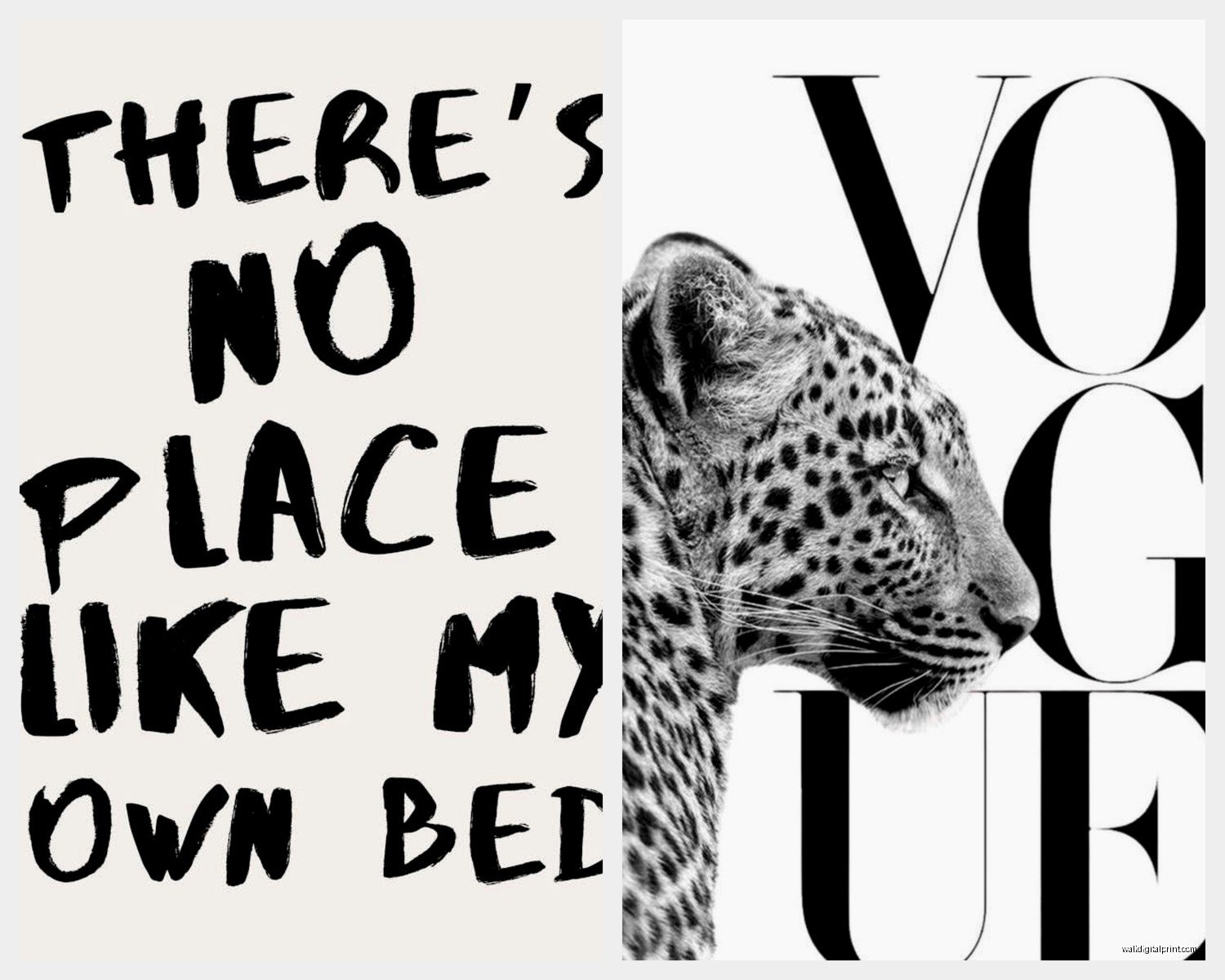
- Vintage portraits but not in a creepy way, more like fashion photography from the 60s
Abstract art is hit or miss. The good stuff looks expensive even when it’s not. The bad stuff looks like you printed a random Canva template. Look for pieces with actual texture or interesting composition, not just random black splotches on white.
Line drawings are having this huge moment right now. Those minimal one-line face drawings? I was skeptical but they actually work in bedrooms because they’re calming without being boring. Just don’t go too trendy or you’ll hate it in six months.
Typography prints can work but be careful. “Good Vibes Only” is gonna make you cringe eventually. If you do words, go classic, poetry excerpts, literary quotes, or even just interesting words in cool fonts.
Where to Actually Buy This Stuff
Oh and another thing, you don’t need to spend a fortune. I’ve mixed $15 prints with $200 pieces and nobody can tell the difference when they’re framed well.
Etsy is honestly my go-to for affordable digital downloads. You buy the file, print it at your local print shop or online through places like Printful. I’ve gotten amazing abstract ink pieces for like $8. Just make sure you’re buying high resolution files, at least 300 DPI.
Society6 and Redbubble are good for when you don’t wanna deal with printing yourself. They print and frame it for you. Quality is pretty consistent. I bought a set of three botanical prints from Society6 and they arrived ready to hang.
Local art fairs if you want something unique. I found this photographer who does black and white urban shots at a street fair and bought three prints for $120 total. They’re my favorite pieces now.
Thrift stores and estate sales for frames especially. New frames are stupidly expensive. I’ve found beautiful black frames for $5 that would cost $60 new. Just clean them really well, obviously.
Framing Without Going Broke
Okay so funny story, I almost spent $400 getting three prints custom framed until my client mentioned Framebridge. They’re not cheap exactly but way more reasonable than traditional custom framing. You send them your art and they frame and ship it back.
But honestly for standard sizes, just hit up IKEA or Target. Their black frames are perfectly fine. I use the RIBBA frames from IKEA constantly. Mix in some floating frames for variety, those glass ones where the art seems to float inside.
Matting makes cheaper prints look more expensive. White mats with black frames is classic for a reason. If you’re doing a gallery wall, keep all the mats the same color even if frame sizes vary.
Hanging Strategy That Actually Works
Center your art about 57-60 inches from the floor to the center of the piece. This is gallery standard and it actually looks right. For art above furniture, leave 6-8 inches between the furniture top and the bottom of the frame.
Wait I forgot to mention, if you’re doing art above your bed, hang it after your bed is in place. Sounds obvious but I’ve seen people hang art and then realize their bed doesn’t fit where they thought.
Gallery Wall Layout
For gallery walls, start with your largest piece and build around it. I like asymmetrical layouts better than perfect grids, they feel more collected and less corporate. Keep spacing between frames consistent though, like 2-3 inches between each piece.
My cat knocked over my entire frame arrangement while I was planning it on the floor and honestly it looked better after, so sometimes chaos helps?
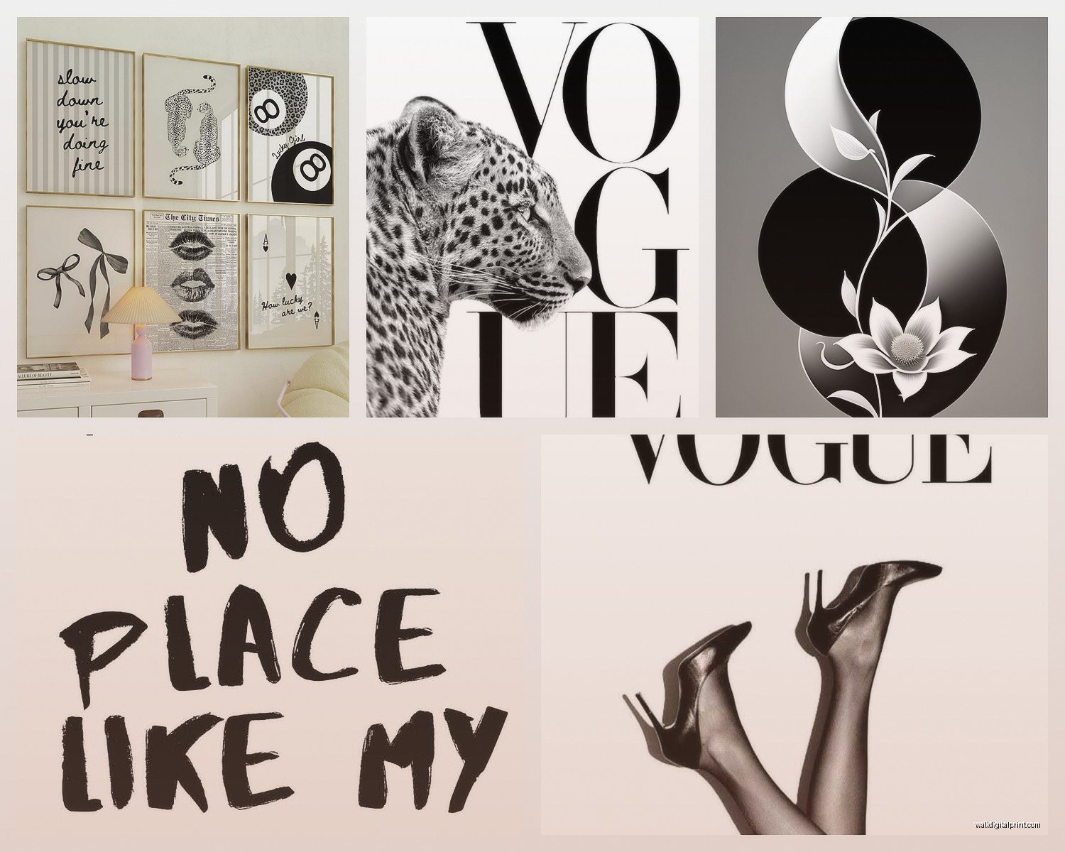
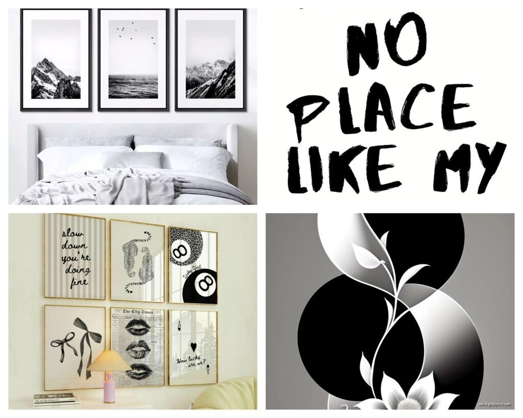
Mixing Different Types of Black and White Art
You can totally mix photography with abstract with line drawings. The black and white palette ties everything together. I have a bedroom with a large abstract above the bed, two small architectural photos on one wall, and a line drawing portrait on another wall. Works because they’re all monochrome.
What to avoid mixing: Don’t mix glossy photo prints with matte paintings, the finish difference is too obvious. Stick with all matte or all glossy in the same room.
Adding Texture Without Adding Color
This is gonna sound weird but texture matters so much in monochrome rooms. If everything is flat black and white, it can feel sterile. So I add:
- Canvas prints instead of paper for some pieces
- Black frames in different finishes like matte black, glossy black, even black wood grain
- One sculptural piece, like a black metal wall hanging
- Layering, like leaning one frame against the wall on a dresser in front of a hanging piece
Lighting Your Art Properly
Nobody talks about this enough but lighting makes or breaks black and white art. Dark pieces disappear in dim lighting. I added picture lights above my two main pieces and it completely changed how they look.
If picture lights feel too fancy, just make sure you have good ambient lighting in the room. I use warm white bulbs though, not cool white, because cool white makes black and white art feel too harsh and clinical.
Common Mistakes I See All the Time
Too many pieces. More isn’t better. I had eleven pieces in my bedroom at one point and it looked chaotic. Now I have five and it’s so much calmer.
All the same size. Boring. Vary your sizes even if you’re doing a gallery wall.
Hanging things too high. Art should relate to your eye level, not the ceiling.
Matching everything too perfectly. If all your frames are identical and evenly spaced, it looks like a hotel. Mix it up a little.
Forgetting about scale. A tiny print on a huge wall looks lost. A massive print in a tiny room is overwhelming.
Specific Pieces I’d Actually Recommend
Since you asked what to actually buy, here’s what I’d get right now:
For above the bed, one large black and white abstract photograph or an oversized ink painting. Look for something with movement and depth, not flat graphics.
For side walls, either two matching architectural prints in simple black frames, or a small collection of three line drawings in a vertical arrangement.
If you have a reading nook or chair in your bedroom, a small intimate piece nearby, like a portrait or a detailed botanical drawing.
Making It Feel Like Yours
The best black and white bedrooms I’ve done feel personal, not catalog-perfect. Include at least one piece that means something to you. A photo you took on vacation printed in black and white. A drawing from an artist you discovered. Something with a story.
I have this black and white photo of a doorway in Paris that I took on my honeymoon and even though it’s just a doorway, I love looking at it every night. That’s the piece that makes the room mine instead of just styled.
Oh and if you’re worried about the room feeling too cold or stark, you balance it with textiles. Your bedding, curtains, rug, those add warmth. The art can be stark and graphic when the rest of the room has soft textures.
Quick Shopping List to Get Started
- One large statement piece for above bed, 40×50 inches minimum
- 2-4 smaller complementary pieces for other walls
- Black frames in 2-3 sizes
- Picture hanging kit with proper hooks and level
- Paper and tape for planning layouts
Start with that and see how it feels. You can always add more later but it’s harder to edit down once you’ve put 50 nail holes in your walls, trust me on that one.
The show I was watching just ended so I should probably wrap this up but yeah, black and white bedroom art is way easier than it seems. Just start with one good piece and build from there. Don’t overthink it too much, which I know is ironic coming from someone who just wrote you basically a novel about it, but you know what I mean.