Wall Art Guide, Wall Art Tutoriels
Wall Art for Grey Walls Living Room: Neutral Main Space Styling
Sep
So I’ve been styling grey living rooms for like three years now and honestly the wall art situation is where most people completely freeze up. They pick this gorgeous grey paint thinking it’ll be easy and then they’re standing in their empty living room texting me photos like “help everything looks sad.”
First thing – what shade of grey are we talking about because that actually matters way more than people think. I had this client last month with what she called “light grey” but it was basically that blue-grey Sherwin Williams everyone uses and warm-toned art looked completely wrong. Like we tried this abstract piece with rust and terracotta and it just fought with the walls the whole time. Cool greys need either really warm art to create contrast OR you lean into the cool tones completely. Warm greys (the ones with beige undertones) are more forgiving but can look muddy if you add too much warmth.
The safest move I always tell people is black and white photography or line drawings. I know that sounds boring but hear me out – a really large black and white photograph, like 40×60 inches or bigger, looks expensive and intentional on grey walls. I found this Desenio print last year of architectural details from Paris and it was like $80 for a huge size and my client’s living room went from “meh we just moved in” to “oh you hired a designer.” The grey walls basically disappear and the art becomes the thing.
Size Matters More Than You Think
Okay so this is gonna sound obvious but people constantly get this wrong – one large piece beats a gallery wall of small stuff almost every time on grey walls. Grey is already neutral and subtle so if you add a bunch of tiny frames it just becomes visual noise. I did a whole living room redo where we took down like 15 small frames and replaced it with ONE oversized abstract and the room suddenly felt twice as big.
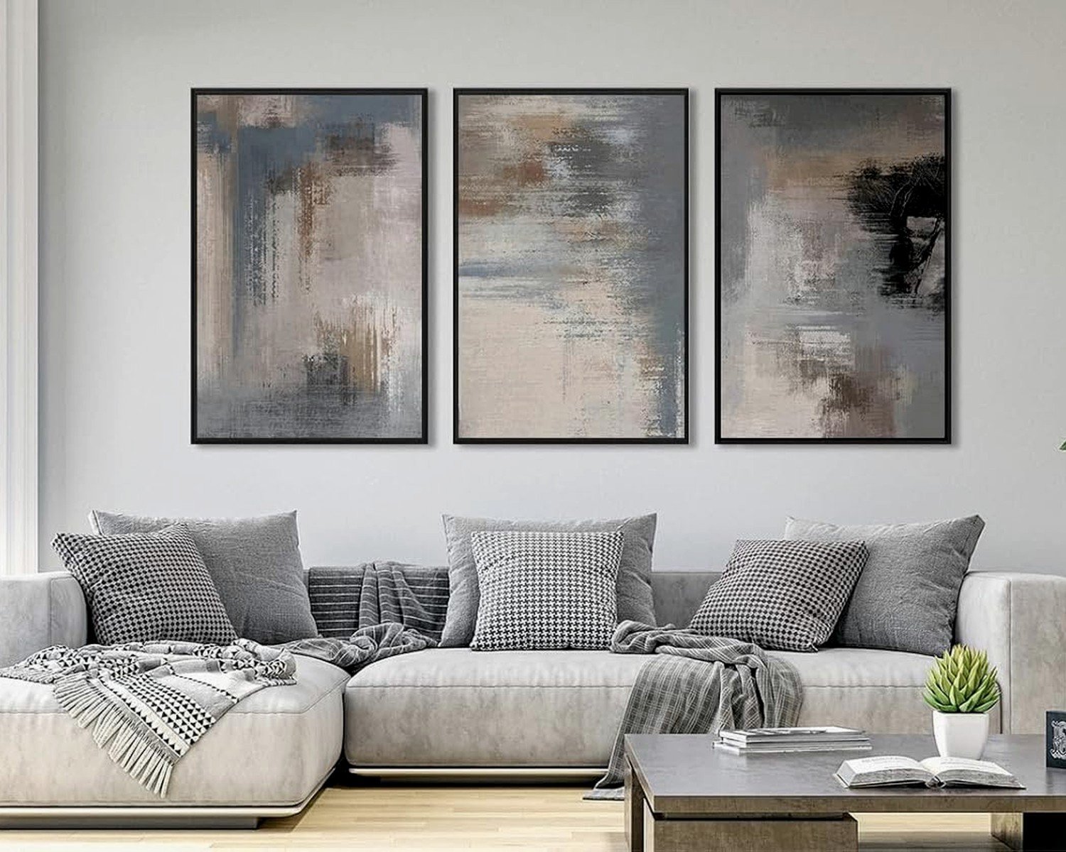
The rule I use is your art should take up about 2/3 to 3/4 of the width of your sofa. So if you have an 84 inch sofa you want art that’s roughly 56-63 inches wide. You can do a single piece or a diptych or triptych but keep them close together, like 2-3 inches apart max.
What Actually Works Color-Wise
Alright so colors that I’ve tested extensively on grey walls:
- Blush pink and grey is that combo everyone does but it genuinely works – soft and sophisticated without being too feminine if you balance it with black frames and geometric shapes
- Navy blue creates this really grounded elegant vibe, almost library-like
- Mustard yellow or gold tones add warmth without going full sunshine yellow which can look kindergarten-ish
- Sage green or eucalyptus tones – very current, very calming, makes grey feel intentional instead of default
- Rust or terracotta but ONLY if your grey is warm-toned
- Teal or deep turquoise for a jewel tone moment
I had someone try coral once and it was… a choice. Too much pop against the subtle grey, made everything feel disjointed.
Abstract vs Figurative
This depends entirely on your furniture honestly. If you’ve got a lot of pattern happening – patterned pillows, textured throws, a rug with movement – go abstract and simple. Like minimal line art or watercolor washes. But if your living room is pretty plain with solid colored furniture, you can handle more detailed figurative art like botanical prints or landscapes.
My own living room has grey walls (shocking I know) and I did this whole thing where I found vintage botanical prints from an estate sale, had them professionally framed in thin black frames, and arranged them in a grid. Six prints total, each about 11×14. The grid formation makes it feel organized and the botanical subject matter adds life without being too busy. Cost me maybe $400 total including framing and it’s the thing people always ask about.
Framing Choices That Don’t Suck
Okay so framing is where people either elevate their art or make it look like a college dorm. On grey walls specifically:
Thin black frames are your best friend. They create definition without competing with the wall color. I order most of mine from Framebridge or just get the Ikea Ribba frames which are honestly fine for most situations.
Natural wood frames work but you gotta be careful – light oak or ash can disappear against light grey walls. Walnut or darker wood creates nice contrast. I used walnut frames in a client’s living room with charcoal grey walls and it looked so rich and layered.
White frames can work but they need to be bright white not cream, and they need substantial matting otherwise they just blend into light grey walls and the art looks like it’s floating weird.
No frame at all – like canvas prints or art mounted on wood – can look really modern and gallery-like but your art needs to be large and confident. A small unframed print just looks unfinished.
Gallery Wall Strategy
If you’re set on doing a gallery wall instead of one large piece, here’s what actually works on grey walls without looking chaotic:
Keep your frames all the same color. All black or all wood, no mixing. The grey wall is already neutral so you need the frames to create a unified thread.
Vary the sizes but use odd numbers – 3, 5, 7, or 9 pieces. Even numbers can look too symmetrical and stiff.
I did this thing where I mapped out the whole gallery wall on my floor first using the actual frames and took a photo from above. Then I could see if the composition worked before putting holes in the wall. Saved me so much time and regret.
Start with the middle piece at eye level (usually around 57-60 inches from the floor to the center of the piece) and build around it.
Where to Actually Buy This Stuff
Since you’re probably wondering where I source all this:
Minted – their art prints are actually really high quality and they have tons of options that work with grey. The framing is pricey but good.
Desenio – I mentioned them already but seriously, for the price you can’t beat it. Swedish company, ships fast, looks way more expensive than it is.
Etsy – specifically for vintage prints and original paintings. I search “abstract neutral art” or “modern line drawing” and spend way too much time scrolling but I always find something unique.
Society6 – good for supporting individual artists and they do sales constantly. Quality is hit or miss depending on what you order but their framed prints are decent.
Local art fairs and student shows – this is gonna sound pretentious but original art from emerging artists is often cheaper than you think and it’s actually original. I bought a huge abstract from a local student show for $300 and it’s better than anything I could’ve gotten mass-produced.
oh and another thing – West Elm and CB2 have surprisingly good art selections when they do sales. I got a set of three abstract prints from West Elm for like 40% off and they’re still hanging in my dining room.
Textures and Materials
Something I don’t see people talk about enough is mixing textures in your wall art on grey walls. Like not everything needs to be a flat print in a frame.
Woven wall hangings or macrame add dimension and soften the grey in a way that prints can’t. I hung a large jute weaving above a client’s sofa and it completely changed the energy of the room – made it feel warmer and more tactile.
Metal wall art can be really striking against grey – especially brass or copper tones. There’s this circular metal piece I used that catches light throughout the day and creates these subtle shadows on the grey wall behind it.
Floating shelves with small art pieces and objects – technically not wall art but it serves the same purpose and you can change it up seasonally. I do this in my own space because commitment issues I guess.
Lighting Your Wall Art
This is something people forget until after everything’s hung – grey walls can make art look dull if you don’t have good lighting. I always add either:
Picture lights – those little brass lights that mount above frames. Very traditional but effective.
Track lighting aimed at the art – more modern and you can adjust where the light hits.
Even just better bulbs in your existing fixtures helps. I switched to 3000K LED bulbs in my living room and my art suddenly had way more depth and clarity.
What Doesn’t Work
Let me save you some mistakes I’ve made:
Too much white space in the art itself against light grey walls makes everything feel washed out and cold. You need some contrast and color density.
Super glossy prints create glare on grey walls because of how light reflects. Go for matte or satin finish.
Overly literal art like those “LIVE LAUGH LOVE” text prints or super obvious beach scenes – grey walls are sophisticated and deserve art that matches that energy.
Anything too small or too high – I see so many living rooms where the art is like 8 inches above the sofa floating near the ceiling. It should feel connected to your furniture, not trying to escape to the second floor.
My cat just knocked over my coffee which is perfect timing because I need a break from thinking about grey walls anyway.
Making It Feel Cohesive
The thing about grey walls is they can handle a lot of different art styles but you gotta have some thread connecting everything. That might be:
A consistent color palette across all your pieces – like all your art has touches of navy and blush even if the subjects are totally different.
Similar frames even if the art varies.
A theme like all botanical, all abstract, all black and white photography.
I did a living room where we mixed abstract paintings with architectural photography and vintage maps but they all had the same muted color palette and black frames so it felt intentional instead of random.
The Personality Factor
Here’s the real talk – grey walls can feel safe and boring if you play it too safe with the art too. This is actually your chance to show personality because the walls are neutral enough to support it.
If you love bold color, go for it in your art. If you’re into minimalism, lean into black and white and negative space. If you collect things from your travels, frame them even if they’re unconventional – I framed vintage postcards and foreign currency for a client and it looked amazing and told a story.
The grey walls are basically a blank canvas (I know that sounds cheesy but it’s true) so don’t waste that opportunity by choosing art that’s as neutral as the walls. You need some kind of contrast or interest or what’s the point.
Okay I think that covers most of what I know about this specific situation. The main thing is don’t overthink it to the point where you end up with bare walls for six months because you can’t decide. Even imperfect art is better than nothing, and you can always swap it out later once you see how you actually use the space.