Wall Art Guide, Wall Art Tutoriels
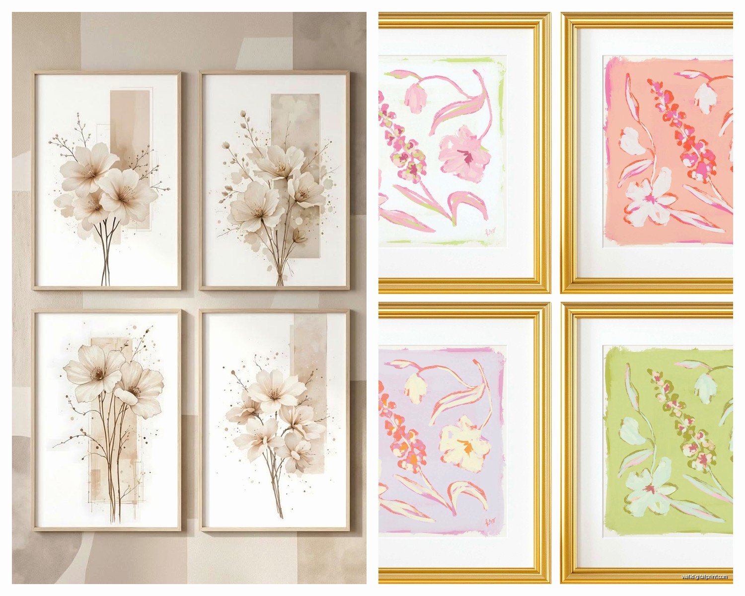
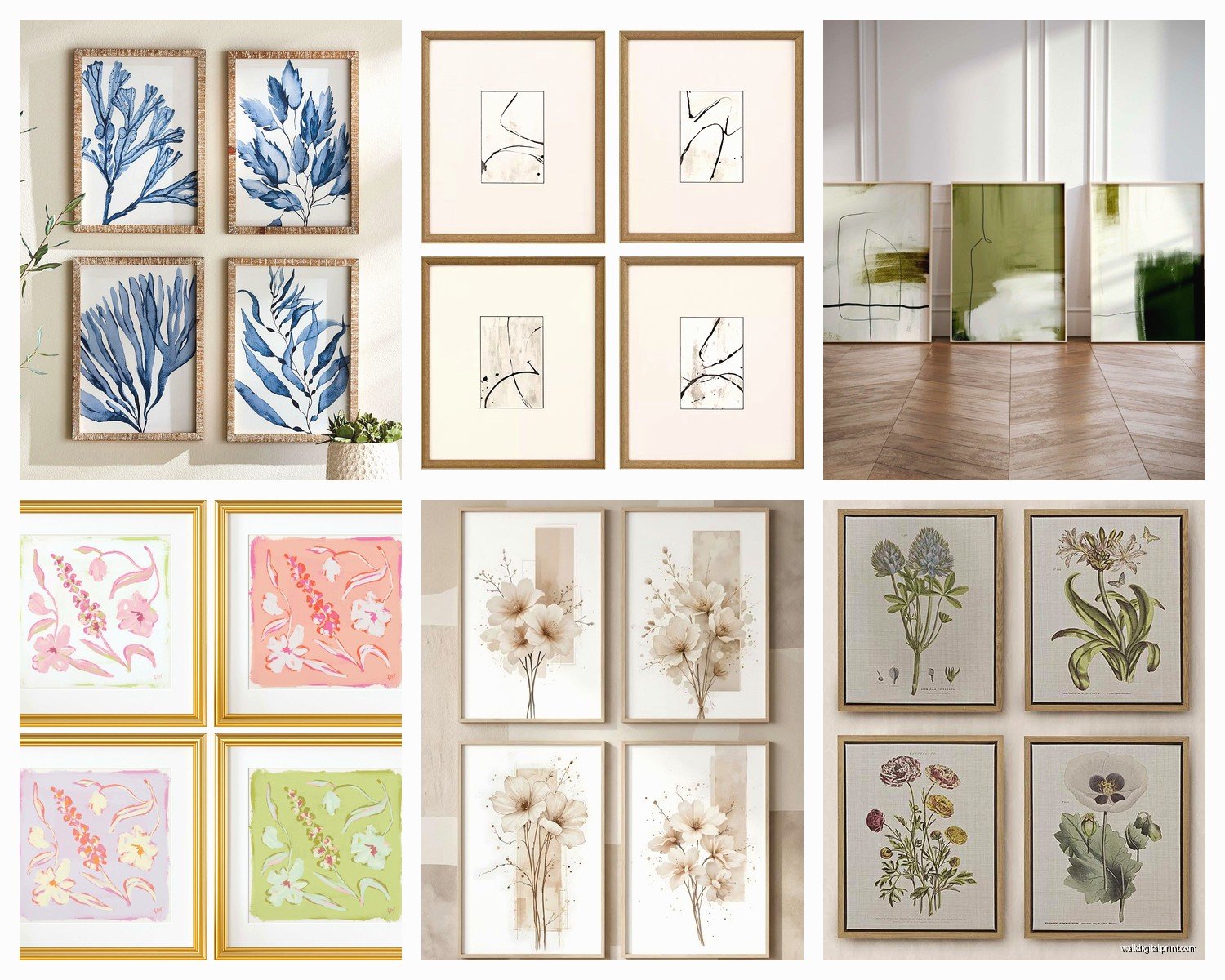
Wall Art Set of 4: Quad Coordinated Collection
Aug
So I was literally just hanging with my friend Emma last week and she was freaking out about these four blank walls in her dining room, and I realized people get SO weird about wall art sets of 4. Like they either go too matchy-matchy or they buy four random things that look like they’ve never met each other before.
Why Four Pieces Actually Makes Sense
Okay first thing, sets of 4 are kind of perfect because you can do a grid layout which is super satisfying to look at, or you can stagger them if you’re feeling less formal. I’ve been styling homes for like 15 years now and the quad setup is honestly one of my favorites because it fills space without looking too heavy. You’re not dealing with one massive piece that dominates everything or a whole gallery wall situation that takes three hours to hang.
The thing about four pieces is they create this visual rhythm thing that designers are always going on about. Your eye moves across them in a predictable way but it’s not boring? Hard to explain but you’ll see it when it’s done right.
The Coordination Sweet Spot
Here’s where people mess up and I see it constantly on my blog comments. They think coordinated means identical or they think it means completely different. It’s neither. You want like 60-70% similarity and then 30-40% variation. That’s the formula I use and it hasn’t failed me yet.
What counts as coordination:
- Same color palette but different subjects
- Same style or art movement across all four
- Same frame type and color
- Similar tones even if colors differ
- Repeated visual elements like lines, shapes, or textures
I did this whole project last month where we used four botanical prints but each was a different plant. All line drawings, all black ink on cream paper, identical black frames. Looked intentional but not boring. The client’s sister walked in and was like “where did you GET these” which is always the goal.
Color Palette Strategy
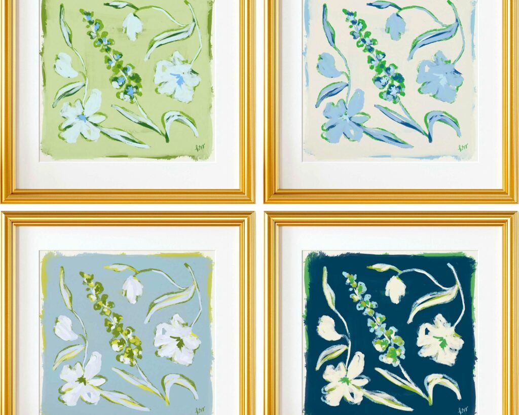
Pick three colors max for your set of four. Seriously don’t go beyond three or it starts looking like a kindergarten exploded. I usually do one dominant color, one accent, and one neutral. So like maybe navy dominant, rust as accent, cream as neutral. Then each of the four pieces uses those colors in different proportions.
Piece one might be mostly navy, piece two is balanced between all three, piece three is mostly cream with pops of navy and rust, piece four is rust-heavy. You’re creating variety within a strict limitation and that’s what makes it work.
Oh and another thing, metallics count as neutrals so gold or silver or copper can be your third “color” if you want something fancier.
Layout Options That Don’t Suck
The classic grid is two over two, and honestly it’s classic for a reason. I use this probably 60% of the time. The spacing between pieces should be 2-4 inches depending on your frame size. Smaller frames can be closer together, bigger frames need more breathing room.
But you can also do:
- Linear horizontal – all four in a row
- Linear vertical – stacked on a narrow wall
- Offset grid – where you shift the bottom two slightly off-center from the top two
- Diamond formation – one at top, two in middle, one at bottom
The linear horizontal works great above a sofa or console table. I did this in my own living room actually and my cat immediately claimed the console table as her spot so now she sits there staring at guests which is… fine I guess.
Measuring and Spacing Real Talk
Okay so this is gonna sound tedious but you gotta measure properly or you’ll be repatching nail holes forever. Take your wall width, subtract the total width of all four frames, subtract your desired spacing between frames, then divide what’s left by two. That’s your margin on each end.
Wait I forgot to mention, do the paper template thing. Trace your frames on kraft paper or newspaper, tape them to the wall with painter’s tape, live with it for a day. Move stuff around until it feels right. THEN hammer nails. I learned this the hard way after putting like 12 holes in a client’s wall in 2019 and wanting to die.
The center point of your grid should be at eye level which is roughly 57-60 inches from the floor. This is the museum standard and it actually works in homes too. Don’t hang stuff too high, that’s the number one mistake I see in DIY situations.
Where to Actually Buy Coordinated Sets
So there are places that sell pre-coordinated sets which takes the guesswork out. I’ve ordered from a bunch of online print shops and some are way better than others. Minted has good sets, Etsy has tons of options from independent artists, even Target has stepped up their game recently.
But here’s my secret, you can also buy four individual pieces from the same artist or collection and create your own set. I do this all the time when I’m curating for clients. Find an artist whose style you love, buy four different works, done. It’s automatically coordinated because it’s the same creative brain behind all of them.
Frame Matching Is Non-Negotiable
Unless you’re going for an eclectic gallery wall vibe, your four frames need to match exactly. Same style, same color, same width. I usually buy frames separately from the art because then I have more control. Framebridge is pricey but good quality, or you can go to Michael’s when they have their 50% off sales which is like constantly.
Black frames are the easiest because they work with everything and don’t compete with the artwork. Natural wood is my second choice, especially light oak or walnut. White frames can look amazing but they show dirt more and in certain lighting they can wash out lighter artworks.
Subject Matter Combinations That Work
I’ve tested this stuff in probably a hundred different spaces at this point so here’s what I know works:
Abstract shapes in complementary colors – each piece is a different composition but they’re all geometric or all organic shapes. Super modern, works in minimalist spaces.
Landscape progression – four different landscapes that show like desert, forest, coast, mountains. Or four seasons of the same location. Nature stuff always sells when I’m staging homes.
Architectural details – close-ups of different buildings or architectural elements. Very sophisticated, works in offices or formal dining rooms.
Botanical series – I mentioned this earlier but it’s worth repeating because it’s so reliable. Different plants, same style of illustration or photography.
Typography and quotes – this can go wrong fast if it’s too cutesy, but four different meaningful words or short phrases in the same font and layout can be striking. I did “gather,” “gratitude,” “grace,” “grow” for a client’s breakfast nook and she literally cried when she saw it which was awkward but sweet.
What Doesn’t Work Together
Don’t mix photography with illustration unless you really know what you’re doing. The different mediums fight each other visually. Also don’t mix black and white with color unless one is clearly dominant. Like four pieces where three are B&W and one is color can work as an accent, but two and two looks indecisive.
Random vintage stuff rarely coordinates well in sets of four. Vintage works better in larger gallery walls where the mismatched quality is part of the charm.
Size Considerations for Different Walls
Above a queen bed, I usually do four 11×14 or 12×16 pieces in a grid. Above a king bed you can go up to 16×20. The total width of your four-piece arrangement should be about two-thirds to three-quarters of your furniture width.
For a blank wall with no furniture, think about the wall proportions. A standard 8-foot wall can handle four 16×20 pieces easily. Smaller walls need smaller pieces, like 8x10s.
My general rule is to use painter’s tape to mark out the total dimensions of your planned arrangement before buying anything. Live with those taped rectangles for a few days and see if the scale feels right.
Vertical vs Horizontal Orientation
You can mix orientations within your set of four but it’s tricky. Usually it’s easier to keep all four the same orientation. If you’re doing a grid, all horizontal or all vertical is cleaner. If you’re doing a linear arrangement, match your wall direction so horizontal walls get horizontal pieces.
I did experiment with mixing orientations last year, two vertical and two horizontal in an offset grid, and it worked but it took forever to get the balance right. Not worth it unless you’re being paid to obsess over details which I guess I am.
DIY vs Buying Complete Sets
Complete sets are easier, I’ll admit it. You open the box, everything matches, you hang it, done. I recommend this route if you’re not confident in your eye for coordination or if you just wanna get it done quickly.
But DIY-ing your own set gives you something more personal and unique. Nobody else will have the exact same combination. I spent three hours last Tuesday (my client canceled so I had time) comparing different print options on Etsy for my home office and I found this amazing set from an artist in Portland who does abstract landscapes. Each piece was sold separately but I bought four that had the same color story and now they’re perfect together.
The middle ground is buying from collections where artists specifically design pieces to work together but sell them individually. Then you can pick which four you want.
Framing and Matting Decisions
Mats are optional but they do make things look more finished and expensive. I use white or cream mats probably 80% of the time, they create breathing room around the artwork and they’re neutral enough to not compete.
The mat size matters though. For smaller prints like 8×10, I’d put them in a 11×14 frame with a 2-inch mat. For 11×14 prints, use 16×20 frames with a 2.5-inch mat. Keep your mat width consistent across all four pieces obviously.
Float mounting is cool if you want a more contemporary gallery look, where the art appears to float inside the frame with space around all edges. More expensive but very striking.
Glass vs Acrylic
Regular glass is fine for most situations and it’s cheaper. Museum glass is worth it if you’re framing something expensive or if you have glare issues from windows. Acrylic is lighter which matters if you’re hanging large pieces or if you’re worried about safety around kids.
I use acrylic for anything going above a bed just in case because the idea of glass falling on someone while they sleep is not something I need in my head at 2am.
Style Matching to Your Space
Your art should feel like it belongs in your room, not like it parachuted in from a different house. If you’ve got a modern space with clean lines and minimal furniture, abstract geometric prints in a simple grid makes sense. Traditional spaces can handle more ornate frames and classic subjects like landscapes or still lifes.
I will say though, sometimes a slight contrast works really well. Like a very traditional room with one wall of modern abstract art creates this interesting tension that keeps the space from feeling stuffy.
The biggest thing is matching the formality level. Casual family room, casual art. Formal dining room, step up the sophistication.
Hanging Hardware That Won’t Fail You
Use proper wall anchors if you’re not hitting studs. I like the screw-in drywall anchors rated for at least 50 pounds even though your frames probably weigh way less. Better safe than sorry and I’ve seen too many frames crash down because someone used those cheap push-in plastic things.
For a grid of four, I usually just eyeball the spacing after I’ve measured and marked the center points. But you can use a level app on your phone which is honestly pretty accurate. I watched an entire episode of that baking show while measuring and leveling my last installation because it’s mindless work once you know what you’re doing.
Picture hanging strips are great if you’re renting or if you don’t want holes. They hold surprisingly well and they come off clean when you move.
The thing about wall art sets of four is they’re like the goldilocks of wall decor. Not too much, not too little, just enough to make a statement without overwhelming your space. And once you get the hang of coordinating them properly, you’ll start seeing possibilities everywhere. Emma ended up going with four abstract prints in navy, terracotta, and cream and her dining room went from awkward blank box to actually inviting and she texts me photos of it like every week which is cute but also girl I was there I know what it looks like.
Anyway that’s basically everything I know about quad collections after years of hanging them in every type of space imaginable.