
Wall Art Guide, Wall Art Tutoriels
White Abstract Wall Art: Pure Minimal Modern Designs
Aug
So I’ve been obsessing over white abstract wall art lately and honestly it’s kinda taken over my brain because three clients asked about it this month and now I see it everywhere. Let me just dump everything I know because you’re gonna want to hear this before you buy anything.
Why White Abstract Actually Works
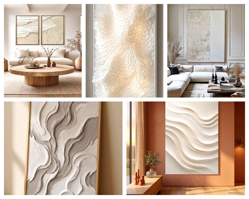
Okay so here’s the thing about white abstract pieces that nobody tells you upfront. They’re not boring. I know they sound boring on paper but they add this insane amount of texture and depth without screaming for attention. My friend Sarah has this massive white-on-white abstract in her dining room and I didn’t even notice it the first time I visited, but then I couldn’t stop staring at it once I did. That’s the whole point.
The texture is everything with these pieces. You want something with actual dimension—not just a flat print. I’m talking about pieces where the artist used thick paint, or there’s embossing, or mixed media with plaster. Without that physical texture, white abstract art just looks like you forgot to hang something.
What to Look for When You’re Actually Shopping
First thing—and I cannot stress this enough—look at it in different lighting situations if you can. White art changes SO much depending on your light. I learned this the hard way when I bought this gorgeous piece online that looked amazing in the listing photos but in my north-facing office it just disappeared into the wall. Now I always check if sellers show photos in various lighting or I straight up ask.
Here’s my checklist that I literally keep in my phone:
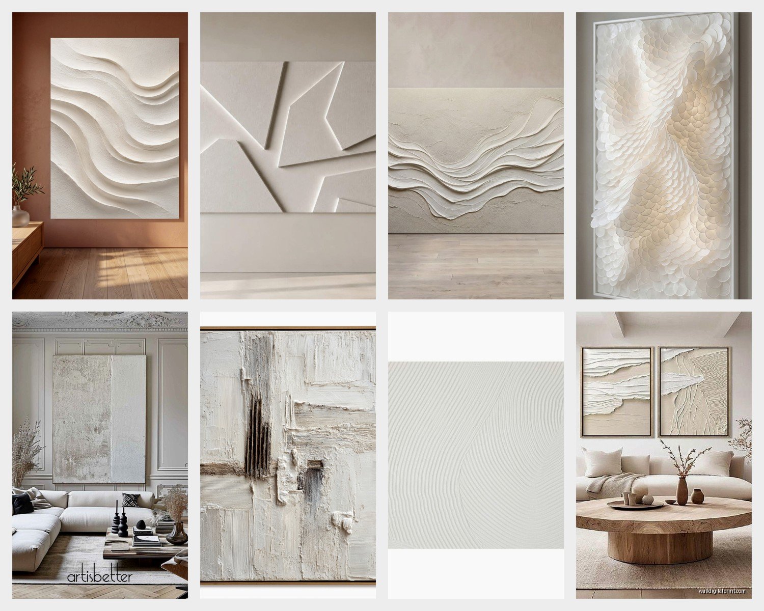
- Actual texture or just printed texture (you can usually tell by zooming way in on photos)
- What’s the base—canvas, wood panel, paper? Canvas tends to feel more casual, wood panels more architectural
- Finish—matte or glossy? Matte is safer for most spaces, glossy can look cheap unless it’s intentional
- Size relative to your wall (people always go too small, I’m telling you right now)
- Does it have warm or cool undertones in the white? This matters more than you think
The Undertone Thing That Nobody Talks About
White isn’t just white and this is gonna sound pretentious but it’s true. Some white abstract pieces lean cream or ivory, others are stark cool white, some have gray undertones. You gotta match this to your room. I have warm oak floors in my living room so I go for warmer whites in my art. My client with that ultra-modern concrete loft? Cool whites all the way.
Hold paint swatches next to your wall if you’re shopping in person. Yeah people will think you’re extra but whatever.
Size and Placement Without Overthinking It
The general rule is your art should take up about two-thirds to three-quarters of your furniture width. So if you have a 90-inch sofa, you want art that’s roughly 60-68 inches wide. But honestly I break this rule all the time.
For white abstract specifically, I actually go bigger than normal because the subtle nature means it can handle more real estate without overwhelming. I just installed a 6-foot wide white abstract piece above a 5-foot console and it’s *chef’s kiss* perfect even though technically it’s “too big.”
Placement heights:
- Center of the artwork should be 57-60 inches from the floor (this is museum standard and it actually works)
- Above furniture leave 6-8 inches of space between the furniture top and the bottom of the frame
- In a gallery wall you can fudge these numbers more
Oh and another thing—white abstract art is amazing for weird spaces. I put a vertical white piece in this narrow hallway and it made the whole space feel intentional instead of awkward.
Framing Decisions That Actually Matter
This is where people mess up constantly. The frame can completely change how a white abstract piece reads in a space.
Floating frames are having a moment and they work great with white abstracts because they create shadow and depth. The art literally floats inside the frame with space around it. Super modern, super clean. I use these probably 60% of the time now.
But also don’t sleep on no frame at all. If you have a gallery-wrapped canvas (where the art continues around the edges), you can just hang it as-is. This works best with chunkier canvases—at least 1.5 inches deep. Anything thinner looks unfinished.
For actual frames, I usually do:
- Natural wood for warmer spaces or Scandinavian vibes
- Black metal for industrial or contemporary spaces
- White or light wood when I want the art to really blend and create a cloud-like effect
- No gold or ornate frames please, it fights with the minimal vibe
Matting Yes or No
Usually no for abstract pieces. Matting creates distance and formality which kinda defeats the whole modern minimal thing. Unless you’re doing a gallery wall with multiple pieces and want visual consistency, skip it.
Where to Actually Buy This Stuff
Okay so I’ve bought from literally everywhere at this point. Here’s the honest breakdown.
Etsy is amazing for original pieces and you can message the artist directly. I found this incredible artist in Portland who does custom white abstracts with subtle metallic accents and her prices are honestly better than mass-market stuff. The search can be overwhelming though—you gotta be specific with your keywords like “textured white abstract original” or “minimal white painting.”
Minted has good quality prints and their framing options are solid. Not original art but the reproduction quality is way better than cheap Amazon prints. They have sales pretty regularly too.
Artfully Walls is where I go when clients have bigger budgets. Curated selection, actually good stuff, but you’re paying for that curation.
West Elm and CB2 have decent options but everyone has the same pieces so if you want something unique, keep looking. They’re good for trendy stuff though.
wait I forgot to mention Saatchi Art—they have a huge selection of originals from emerging artists and their filter system is actually useful. You can search by color, size, price, style. I’ve bought probably five pieces from there.
DIY If You’re Into That
Not gonna lie, I made my own white abstract piece last year when my cat knocked over a vase and ruined the art that was supposed to go in my bedroom. Turned out pretty good?
You need:
- Canvas (pre-stretched or you can stretch it yourself but that’s annoying)
- White acrylic paint in at least two shades
- Texture medium or modeling paste
- Palette knife
- Maybe some white gesso
The technique is literally just layering. Put down texture with the modeling paste using the palette knife. Let it dry. Paint over it with different whites. Add more texture. Paint again. Keep going until it looks interesting. The key is not overthinking it—abstract means there’s no wrong answer.
I watched Bridgerton the entire time I was making mine and just kinda zoned out and it worked. Sometimes the best abstract art happens when you’re not trying too hard.
Styling Around White Abstract Art
This is where it gets fun because white abstract pieces are like the perfect supporting actor. They let other stuff shine but add sophistication.
What works:
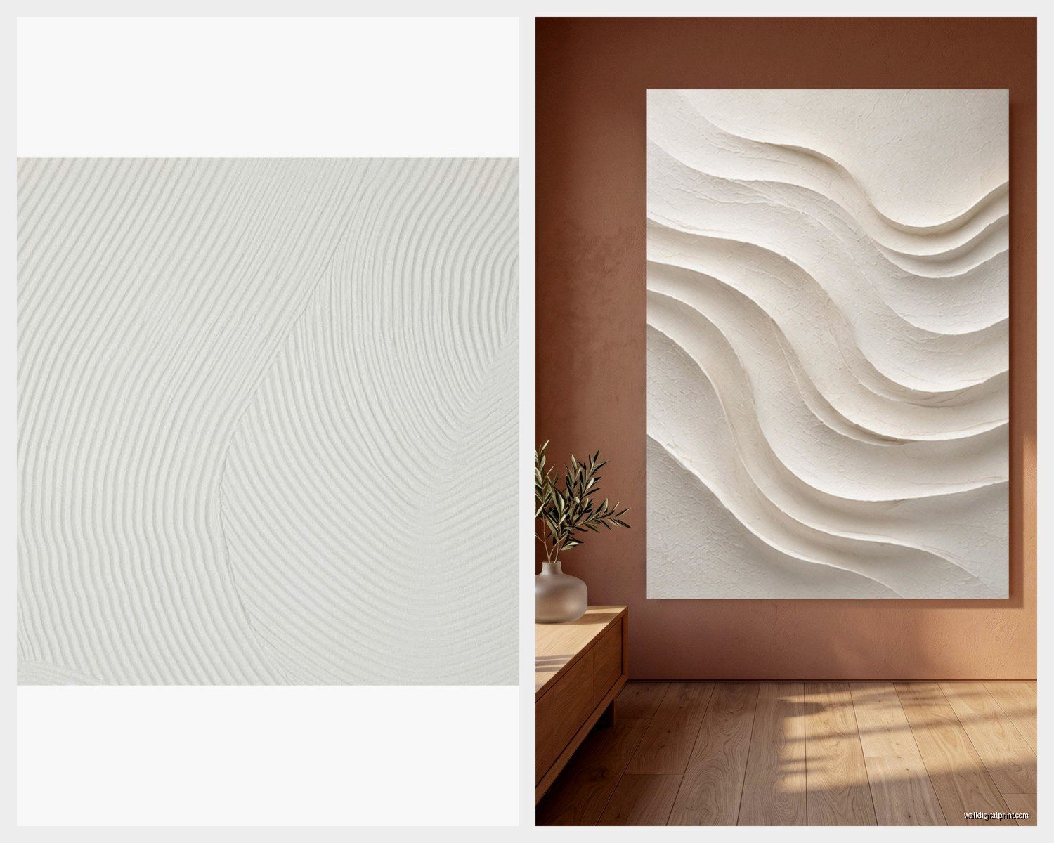
- Layering with plants—the organic shapes contrast beautifully with abstract marks
- Pairing with natural textures like linen, jute, raw wood
- Adding one or two colorful accessories in the room so the white art feels intentional not forgotten
- Mixing with black and white photography for a cohesive monochrome moment
What doesn’t work:
- Too much other white—you need contrast or everything blurs together
- Overly busy patterns nearby—the abstract needs some breathing room
- Bad lighting (I keep saying this but seriously, lighting makes or breaks it)
I have a white abstract piece above my fireplace and I styled the mantel with black ceramic vases, some greenery, and one brass candlestick. The mix of textures and the bit of black makes the white art pop instead of disappear.
Lighting These Pieces Properly
Okay so funny story—I installed this beautiful white abstract piece for a client and she texted me two days later saying she hated it. I went over and realized her overhead lighting was creating zero shadows so all the texture just flattened out. We added picture lights and suddenly it was her favorite piece in the house.
You want light that creates shadows and highlights the dimensional aspects. Picture lights are great but also expensive. I usually suggest:
- Adjustable track lighting aimed at an angle
- Wall sconces on either side (especially good for larger pieces)
- Even a well-placed floor lamp can work if it’s positioned right
Avoid direct overhead lighting if you can. It’s the worst for textured art.
Natural light is obviously gorgeous but watch out for direct sun which can fade even white paint over time. I have UV-filtering window film on my south-facing windows for this reason.
Mixing White Abstract with Other Art Styles
You don’t have to commit to all minimal all the time. I mix white abstracts with other styles constantly.
They work great with:
- Black and white line drawings
- Botanical prints
- Photography
- Even colorful abstracts if you’re careful about balance
The trick is keeping the white piece as the anchor. Let it be the calm spot that your eye rests on between busier pieces.
In my office gallery wall I have a white abstract piece in the center, flanked by black and white architectural photos and some smaller colorful pieces. The white abstract keeps the whole thing from feeling chaotic.
Caring for White Art
This is gonna sound weird but dust your white abstract art regularly. Dust shows up SO much on white surfaces and it dulls the whole piece. I use a microfiber cloth and just gently wipe it down every couple weeks.
For textured pieces with deep crevices, a soft paintbrush works to get dust out without damaging anything.
If it’s behind glass you’re lucky—just use glass cleaner. If it’s an original painting without glass, never use cleaning products directly on it. Dry dusting only unless you want to ruin a piece you just spent money on.
Keep it away from humidity if possible. Bathrooms are risky for original canvas pieces unless they’re sealed really well.
When White Abstract Doesn’t Work
Real talk—sometimes it’s just not the right choice. If your walls are already white or very light and you don’t have strong accent colors or dark furniture, white abstract art might disappear. You need some contrast in the room for it to make sense.
Also if your style is more traditional or maximalist, white minimal abstract might feel out of place. I mean you can make anything work with enough effort but sometimes it’s better to just go with art that matches your actual aesthetic.
I tried to convince a client to do white abstract in her bohemian-style living room and it looked so wrong. We ended up with a colorful abstract instead and it was way better.
Investment Pieces vs Budget Options
Look I love original art and support artists whenever possible but I’m also realistic about budgets. A good quality print in a nice frame can look just as good as an original from across the room.
Spend money on:
- Size—bigger pieces should be higher quality
- Spaces you use daily like living rooms and bedrooms
- Pieces with actual texture since that’s harder to fake
Save money on:
- Smaller pieces where you’re less likely to notice print quality
- Spaces like hallways or guest rooms
- Pieces that are more graphic than textural
I have a mix of originals and prints in my own home and honestly most people can’t tell which is which unless they get really close.
The key with budget pieces is good framing. A $30 print in a $100 frame looks way better than a $130 piece in a cheap frame. Invest in the frame if you have to choose.
Just measure your space properly before you order anything because returning large art is a pain and shipping costs will kill any deal you got. I learned that one the hard way twice before it stuck.
