Wall Art Guide, Wall Art Tutoriels
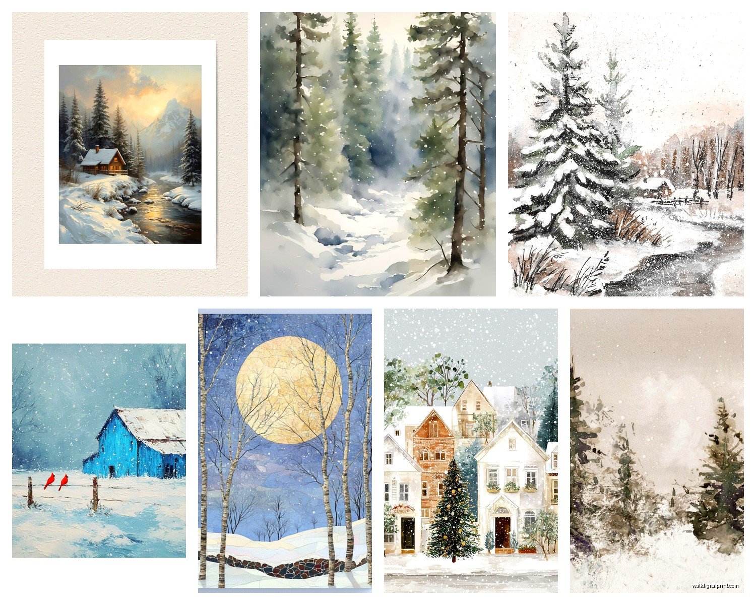
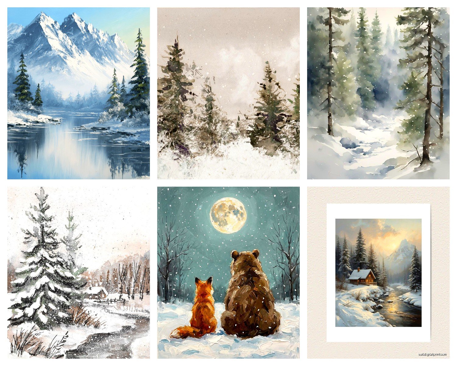
Winter Scene Wall Art: Snow Cold Season Landscape
Jul
So I’ve been obsessing over winter scene wall art lately because like three clients asked me about it in the same week and now I can’t stop seeing snow landscapes everywhere. Let me dump everything I know because I literally just finished installing a massive winter piece in someone’s living room yesterday.
Size Actually Matters More Than You Think
Okay so first thing – everyone gets this wrong. They buy these tiny 16×20 inch prints thinking it’ll make their wall look cozy and winter-y but then it just looks like… sad and lost on the wall. For winter scenes especially, you want them BIG because the whole point is that expansive snowy feeling, right?
I usually tell people to go at least 30×40 inches for a living room focal wall. If you’ve got a massive wall situation happening, don’t be scared of 48×72 or even bigger. My client yesterday went with a 60×40 inch piece and it completely transformed the space. The snow-covered mountains actually felt like you could walk into them.
But here’s where it gets tricky – if you’re doing a gallery wall with multiple winter scenes, then yeah smaller pieces work. I did this thing last month where we used like six different 12×16 inch winter landscapes in black frames and clustered them together. Looked amazing. So it’s not a hard rule, it’s more about the composition you’re going for.
Frame Colors and Why I Changed My Mind
I used to be super anti-black frames for winter art because I thought it was too harsh against all that white snow. Turns out I was completely wrong and wasted like two years avoiding them.
Black frames actually create this gorgeous contrast that makes the snow look even brighter and more crisp. It’s like the frame disappears and the winter scene just pops. White frames can work too but honestly they sometimes wash out the whole piece, especially if your walls are light colored.
Natural wood frames are my go-to though. There’s something about pairing a snowy landscape with warm oak or walnut that just… works? It brings in that cabin-y feeling without being too literal about it. I’m watching this documentary about Scandinavian design while typing this and they do this ALL the time – cold imagery with warm wood elements.
Oh and another thing – if you’re getting a winter scene with a lot of blue tones (like twilight snow or icy lakes), try a dark charcoal frame instead of pure black. It picks up those blue undertones better.
Matting Options That Don’t Suck
White mats are obvious but kinda boring for winter scenes. I’ve been experimenting with cream or off-white mats lately and they add this vintage feeling that works really well with snowy landscapes. Makes them feel less like something you bought at HomeGoods last week, you know?
For really dramatic winter scenes – like stormy skies over frozen lakes – I sometimes skip the mat entirely and do a float mount instead. It’s more expensive but the art literally floats in the frame with a shadow gap and it looks expensive even if the print itself was cheap.
Where to Actually Hang These Things
So everyone assumes winter art goes in the living room and yeah that works, but I’ve found some weird spots that are actually better.
Bedrooms are underrated for winter landscapes. There’s something calming about falling asleep looking at a quiet snowy forest. I have this client who has insomnia and she swears her winter mountain print helps her brain slow down at night. Could be placebo but who cares if it works?
Hallways – okay this is gonna sound weird but long horizontal winter scenes are PERFECT for hallways. Like a panoramic snow-covered field or a wide shot of a frozen lake. It makes the hallway feel less like a tunnel and more like a journey. I did this in my own place and my cat sits in the hallway now just staring at it which is… strange but whatever.
Bathrooms – wait hear me out. A small winter scene in a bathroom creates this spa-like feeling. Especially if you’ve got a soaking tub situation. The cold imagery actually makes the warm bath feel more luxurious by contrast. Just make sure you get something with proper sealing if there’s moisture issues.
Dining rooms get overlooked but winter scenes work great here. Something about gathering around a table with snowy landscape art makes dinner feel more intentional? Can’t explain it but I’ve done it in like five homes now and people always comment on it.
Color Schemes You Gotta Consider
This is where people mess up constantly. They see pretty snow art and buy it without thinking about their existing colors.
If your room has warm tones – like terracotta, rust, warm greys, mustard yellow – you want winter scenes that have some warmth in them too. Look for pieces with golden hour lighting on snow, or winter sunsets, or scenes with warm cabin lights in the distance. Pure cold blue-toned winter scenes will clash and make the room feel confused.
For cool-toned rooms with blues, greys, whites, you can go full arctic with your art. Those icy blue winter twilight scenes, overcast snowy days, frozen lakes with grey skies – all of that works. Actually it makes the cool tones in your room feel intentional instead of just… cold and unwelcoming.
The Neutral Room Problem
If you’ve got a completely neutral room (beige, greige, white, cream), winter scenes are actually tricky because you need to decide which direction you’re going. The art will SET the tone.
I usually push people toward winter scenes with some color interest – maybe a red barn in the distance, some evergreen trees, a blue-grey sky, birds or wildlife. Something that gives the eye a place to land besides just endless white and beige.
Types of Winter Scenes and What They Actually Do to a Space
Not all winter art creates the same vibe and this is super important.
Snowy forests with trees – these add verticality and structure. Good for rooms that feel too horizontal or wide. The tree lines draw your eye up and make ceilings feel taller.
Open snowy fields or plains – these create expansiveness. Great for smaller rooms because they trick your brain into feeling like there’s more space. But they can make large rooms feel empty so be careful.
Mountain winter scenes – these add drama and weight. Good for rooms that feel too light or floaty. They ground a space. I use these a lot in rooms with high ceilings that feel cavernous.
Frozen lakes or rivers – these add movement even though they’re still. The lines of the ice or the curve of a frozen river create flow. Perfect for awkward rectangular rooms where you need to soften the geometry.
Winter wildlife scenes – deer in snow, birds on branches, whatever – these add a focal point and narrative. Good if your room feels too minimal or stark.
Abstract winter or snow textures – close-ups of snow patterns, ice crystals, frosted windows – these work as modern art that happens to be winter themed. Less literal, more sophisticated if that’s your thing.
Lighting Makes or Breaks Winter Art
Okay so funny story – I installed this gorgeous winter scene last year and the client HATED it. Like was upset, wanted to return it, whole thing was a disaster. Turns out it was the lighting. We added a picture light and suddenly she loved it.
Winter scenes need good lighting because there’s so much white and light color. In dim lighting they just look muddy and grey and sad. You need either:
Natural light hitting them during the day – position them on walls that get indirect natural light if possible. Direct harsh sunlight can wash them out though.
Picture lights or wall sconces – these are worth the investment. A small LED picture light makes snow actually look luminous and dimensional instead of flat.
Adjustable ceiling lights – if you’ve got track lighting or adjustable recessed lights, angle one toward the art. Makes a huge difference.
The worst is when people hang winter art on a dark wall in a dim corner and then wonder why it looks depressing. It’s not the art, it’s the placement.
Seasonal Rotation Question
People always ask me if they should rotate winter art seasonally and honestly… do what you want? I have clients who swap their art every season and others who keep winter scenes up year-round.
If you live somewhere with actual winters, having winter art up in July might feel weird. But if you’re in like Southern California or Florida, winter scenes can be that aspirational thing that makes you feel fancy.
I personally think winter art works year-round if it’s more about the aesthetic than the literal season. Like an abstract snowy texture or a misty winter forest – those read more as moody art than specifically winter-only.
Budget Options Because Not Everyone Has Money to Burn
You don’t need to spend thousands on winter art. Here’s what actually works:
Large format prints from online print shops – you can get gorgeous winter photography printed large for like 50-150 dollars if you frame it yourself. I’ve used several online services and the quality is totally fine for most homes.
Frame it yourself – buying a pre-framed piece is always way more expensive. Get the print, get a frame from Amazon or a craft store, do it yourself. Takes like 10 minutes and saves hundreds.
Thrift stores and estate sales – winter landscapes are everywhere in these places. Sometimes they’re dated but you can reframe them or if the painting itself is good, it becomes vintage charm.
DIY if you’re crafty – I have a client who literally painted her own abstract winter piece using white, grey, and silver paint. Cost her maybe 30 dollars in supplies and it looks like something from West Elm.
The Thing Nobody Tells You About Winter Art
It affects the perceived temperature of your room. Like actually affects it.
I had a client complain that her bedroom felt cold after we added a big winter mountain scene. We didn’t change the thermostat or anything – it was psychological. The art made her FEEL colder. We ended up adding warmer textiles (throws, pillows) to balance it out and problem solved.
So if you’re someone who’s always cold or your room already feels chilly, maybe balance winter art with warm elements. Wood furniture, warm lighting, cozy textures. Don’t go full winter wonderland unless you want that cold crisp feeling.
On the flip side, if your room gets really hot or feels stuffy, winter art can actually make it feel cooler and more refreshing. I’ve done this in south-facing rooms that get tons of sun and it helps a lot.
Mistakes I See Constantly
Hanging winter scenes too high – they should be at eye level when you’re standing, not floating near the ceiling
Choosing scenes that are too busy – lots of winter art has like cabins and trees and mountains and deer and smoke and… it’s too much. Simpler compositions work better
Ignoring the mood – a stormy winter scene creates different energy than a peaceful snowy morning. Match the mood to your room’s purpose
Cheap frames on expensive art – if you spent money on the actual piece, don’t ruin it with a flimsy frame
Not considering the viewing distance – if you’re gonna see the art from across a large room, details don’t matter as much as overall composition and contrast
Look I gotta wrap this up because my dog needs to go out but honestly just… trust your gut with winter art. If a piece makes you feel something when you look at it, that matters more than any design rule I can give you. I’ve broken every rule I just mentioned when the right piece came along and it worked perfectly.