Wall Art Guide, Wall Art Tutoriels
3D Wall Art Painting: Textured Dimensional Designs

Jun
So I’ve been obsessed with 3D wall art painting lately and honestly it’s transformed like three rooms in my house plus two client spaces, so let me dump everything I know on you before I forget half of it.
The Texture Medium Situation
Okay first thing, you absolutely need texture medium or modeling paste. I started with Liquitex Professional and it’s still my go-to because it doesn’t crack even when you pile it on thick. The Golden brand molding paste is also solid but slightly more expensive. Here’s what I wish someone had told me: buy the bigger tub. I went through those tiny containers so fast and kept running out mid-project which is the worst because the texture won’t match if you mix a new batch later.
You can also use joint compound from the hardware store which is like a tenth of the price, but it’s trickier. It shrinks as it dries so you gotta account for that, and sometimes it gets these weird hairline cracks. But for large abstract pieces where imperfection is kinda the point? Totally works.
Tools You Actually Need
- Palette knives in different sizes – the angled ones are easier to control
- Old credit cards or gift cards for scraping
- Texture combs (you can buy these or just use actual hair combs)
- Foam brushes for base layers
- A spray bottle with water to keep things workable
I also keep these random things around: bubble wrap for pressing patterns, crumpled aluminum foil, those mesh produce bags, even my daughter’s old bath loofa thing. Anything that makes an interesting pattern when you press it into wet texture paste.
Surface Prep That Nobody Talks About
This is gonna sound boring but you gotta prep your surface properly or everything will literally fall off the wall in like six months. I learned this the hard way with a gorgeous mountain range piece that just… peeled. Canvas needs to be primed with gesso, at least two coats. For direct wall application which I’ll get to in a sec, you need to clean the wall with TSP or at least wipe it down really well.
If you’re working on wood panels, lightly sand them first. The texture needs something to grip onto. My cat knocked over my coffee while I was prepping a panel last week and honestly the caffeine-fueled panic made me do the most thorough prep job ever, so thanks Luna I guess.
Building Up Layers
Okay so here’s where it gets fun. You don’t just slap on texture and call it done. Well you can, but it looks flat even though it’s technically dimensional, if that makes sense.
Start with a base layer that’s pretty smooth. Let it dry completely, like overnight. Then add your main textured areas. I usually work in sections because the paste starts setting up after like 15-20 minutes depending on humidity. In summer it dries faster, in winter you have more working time.
For mountain scenes or geometric designs, I sketch the basic outline lightly with pencil first. For abstract stuff I just go for it. There’s something freeing about not having a plan, but also I’ve created some absolute disasters that way so maybe have a vague idea at least.
Creating Different Textures
The palette knife is your best friend here. Hold it at different angles and you get completely different effects:
- Flat against the surface creates smooth ridges
- Angled up makes sharp peaks
- Dragging it through wet paste creates valleys and dimension
- Stippling motion (little jabs) makes a stucco-like texture
For ocean waves, I do this thing where I apply paste in curved lines, then use a comb to drag through it perpendicular to the curves. Creates this really cool wavelike pattern. Oh and another thing, if you add a tiny bit of acrylic paint to your texture medium before applying it, you get color AND texture in one step. Saves time on the painting later.
The Painting Part
Wait I forgot to mention – let everything dry completely before painting. Like 24-48 hours for thick applications. I got impatient once and started painting after 12 hours and the paint just got absorbed weird and looked muddy.
I use acrylics because they’re forgiving and dry fast. Start with your darkest colors in the recessed areas. This is key for making the dimension really pop. Then gradually build up to your lightest highlights on the highest peaks. It’s basically the opposite of how you’d normally paint.
Dry brushing is your technique here. Load your brush with paint, wipe most of it off on a paper towel, then lightly drag it across the raised texture. The paint catches on the high points and leaves the valleys darker. So satisfying when you see it start to come alive.
Color Layering Tips
Don’t try to get the perfect color in one coat. Build it up with multiple thin layers. I usually do:
- Dark base color in crevices
- Medium tone over most of the surface
- Lighter variation for depth
- Bright highlights on peaks
- Sometimes a glaze over everything to unify it
For metallics, less is more. I learned this after creating what I can only describe as a disco ball situation on a client’s wall. Now I use metallic paints as accents only, catching light on specific high points.
Specific Design Ideas That Actually Work
Okay so funny story, I was watching that baking show where they do the fancy cakes and got inspired to try a geometric honeycomb pattern. Used hexagon stencils, built up texture in each cell at different heights, painted it in ombre blues to grays. Turned out amazing and now everyone wants one.
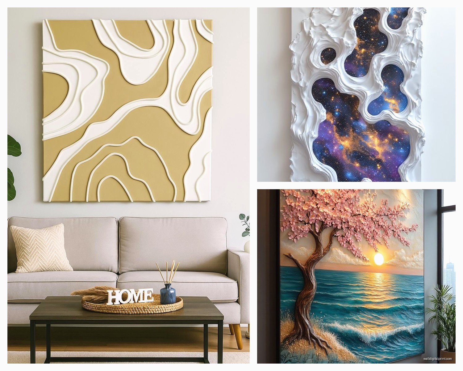
Mountain Ranges
These are easier than they look. Build up peaks with your palette knife in overlapping layers. Let each layer dry before adding the next so they actually stack. Paint the furthest mountains lightest (atmospheric perspective) and gradually darken as you come forward. Add white highlights on peaks like snow. I’ve done probably eight of these and they never get old.
Abstract Geometric
Tape off sections with painter’s tape. Build texture in alternating sections. Remove tape before it dries completely or you’ll pull up chunks. Paint each section in complementary colors. The hard edges against organic texture creates this really striking contrast.
Floral or Organic Shapes
Honestly harder than geometric but so beautiful. I use tools to carve petal shapes into wet paste, then enhance with paint. For leaves, press actual leaves into the paste to create impressions. Nature does the design work for you.
Direct Wall Application vs Canvas
So you can do this directly on your wall or on canvas that you hang later. Both have pros and cons.
Direct wall is dramatic and permanent. You’re committed. But it’s also architectural and really transforms a space. I did an accent wall in my bedroom and it’s the first thing people comment on. You’ll need more materials because you can’t really control waste the same way. Also ladders and neck pain.
Canvas or wood panels are portable, you can fix mistakes easier, and you can take them with you when you move. Much easier to work on a table than up on a ladder. But they don’t have quite the same impact as a full wall installation.
My Wall Installation Process
Clean wall thoroughly. Mark your design lightly with pencil. Apply texture medium in sections working top to bottom so drips don’t mess up finished areas. Keep a damp cloth handy to wipe up mistakes immediately. Let dry for at least 48 hours before painting. Prime with white if your texture medium is gray. Then paint as normal.
Pro tip: put drop cloths on the floor and tape them to the baseboards. This stuff gets everywhere and it’s basically concrete when it dries.
Sealing and Protecting
You gotta seal these pieces. The texture traps dust like crazy if you don’t. For canvas I use a matte varnish spray, multiple light coats. For walls I use a clear acrylic sealer. Makes it wipeable which is crucial if you have kids or pets or you know, live in your house.
The sealer also intensifies colors slightly and adds subtle sheen that catches light on the texture. Just make sure everything is completely dry first. Like wait a week after your final paint layer. I know it’s hard but moisture trapped under sealer leads to weird cloudy spots.
Common Problems I’ve Run Into
Cracking: too thick application or didn’t let layers dry between coats. Fix it by embracing it as part of the design or filling cracks with more paste and sanding smooth.
Peeling: poor surface prep or applied too thick on canvas. Prevention is the only cure here, gotta start over if it peels.
Muddy colors: painting while texture wasn’t fully dry, or overworking the paint. Let each layer dry completely.
Texture looks flat: not enough variation in height, or didn’t use dark/light contrast when painting. Add more dramatic highlights.
Advanced Techniques I’m Experimenting With
Mixing in sand or other aggregates for extra texture. Coffee grounds work too but they smell weird for a while. Glass beads catch light in cool ways. Sawdust is free if you know someone with a workshop.
Carving into dried texture paste with a dremel tool. Creates really precise details but super messy, wear a mask.
Combining 3D texture with resin pours. Haven’t perfected this yet but the depth potential is insane. The resin settles into the valleys and creates this glass-like effect.
Using stencils for repeating patterns. Apply texture through the stencil, carefully remove, repeat. Time-consuming but the precision is worth it for certain designs.
The Learning Curve Thing
Your first piece will probably look rough and that’s fine. Mine looked like a kindergarten art project. The texture was uneven, my color choices were questionable, and I used way too much metallic paint. But I learned so much from that disaster.
Start small. Don’t make your first project a whole wall. Do like a 16×20 canvas or something. Practice your techniques, figure out what tools you like, learn how the materials behave. Then scale up.
Also take progress photos because sometimes you think it looks terrible in the middle but then you look back at photos and realize it’s actually coming together. I almost painted over a piece that’s now hanging in my living room because I panicked halfway through.
Budget Breakdown
If you’re just starting, you can get going for like 50 bucks. Cheap texture medium, basic acrylics, a couple palette knives, and a canvas. It won’t be your best work but you’ll learn.
For better results budget around 150-200 for quality materials that’ll last multiple projects. The texture medium is your biggest expense but a gallon tub lasts forever if you’re doing canvas pieces.
Direct wall installations cost more in materials but you’re not buying canvas or frames so it kinda evens out.
Oh wait, lighting makes a HUGE difference with these pieces. The whole point is the dimensional texture right, so you need light to hit it at an angle. I installed picture lights above mine and it completely changed how they look. Even just repositioning existing lamps can make the shadows and highlights way more dramatic.
You know what, just try it. Grab some supplies and make a mess. That’s honestly the best way to figure out what works for your style. Every tutorial makes it seem like there’s one right way but there really isn’t, it’s all about experimenting and finding what you like.