Wall Art Guide, Wall Art Tutoriels
Calligraphy Wall Art: Hand-Lettered & Script Designs
Jun
So I’ve been obsessed with calligraphy wall art lately and honestly it’s one of those things that looks way fancier than it actually is to pull off in your space. Like, people walk into a room and they’re immediately drawn to hand-lettered pieces because there’s something about that human touch that just… works.
Okay first thing you gotta know is there’s a massive difference between actual hand-lettered pieces and prints of calligraphy. Both are totally valid but they give different vibes. I picked up this genuine hand-lettered piece from a local artist maybe six months ago and the texture is insane, you can see where the ink pooled a bit more in certain letters and it just feels alive. But those run you anywhere from $150 to like $800 depending on size and who made it. Prints though? You can find gorgeous ones for $30-80 and honestly unless someone’s inspecting it up close they won’t know the difference.
Where to Actually Put This Stuff
The bedroom is probably my favorite spot for script art. Something about waking up to words just sets a different tone than waking up to like, a generic landscape. I hung this piece that says “begin again” above my nightstand and my sister thought it was cheesy at first but then she got one for her place so whatever. The key is mounting it where you’ll actually see it when you’re in bed, not just when you walk in. Sounds obvious but I’ve seen so many people hang art that only faces the doorway.
Living rooms are trickier because you don’t want it to feel too personal or precious. I usually go for either really bold statement pieces or something more abstract-looking where the calligraphy is almost decorative rather than meant to be read from across the room. My client last month wanted this huge “gather” sign and I had to talk her into getting the 24×36 instead of the 48×60 because her living room just wasn’t big enough and it would’ve felt like a command instead of an invitation.
Oh and bathrooms, wait I forgot to mention bathrooms. This is gonna sound weird but calligraphy in bathrooms is actually perfect? Something short and kinda funny works best. I have “wash your hands” in my powder room in this gorgeous copper ink and everyone comments on it. It’s practical but make it art, you know?
Choosing Your Style
There’s basically three main categories you’re looking at:
- Modern calligraphy with those really thin upstrokes and thick downstrokes, super flowy
- Traditional copperplate which is more formal and structured
- Brush lettering that’s kind of chunky and bold
Modern calligraphy is everywhere right now and it pairs really well with minimalist spaces. Like if you’ve got a lot of white walls and simple furniture, those delicate letters won’t compete. I used a piece with super fine lettering in a client’s Scandinavian-style bedroom and it was perfect because everything else was so clean-lined.
Traditional copperplate feels fancier, almost wedding-invitation-ish. It works in spaces that already have some traditional elements, like if you’ve got crown molding or classic furniture. Don’t try to force it into a ultra-modern loft because it’ll just look confused.
Brush lettering is my go-to for casual spaces or anywhere you want energy. Playrooms, home offices, even kitchens. It’s got personality without being too serious. The strokes are thicker so it reads better from a distance too.
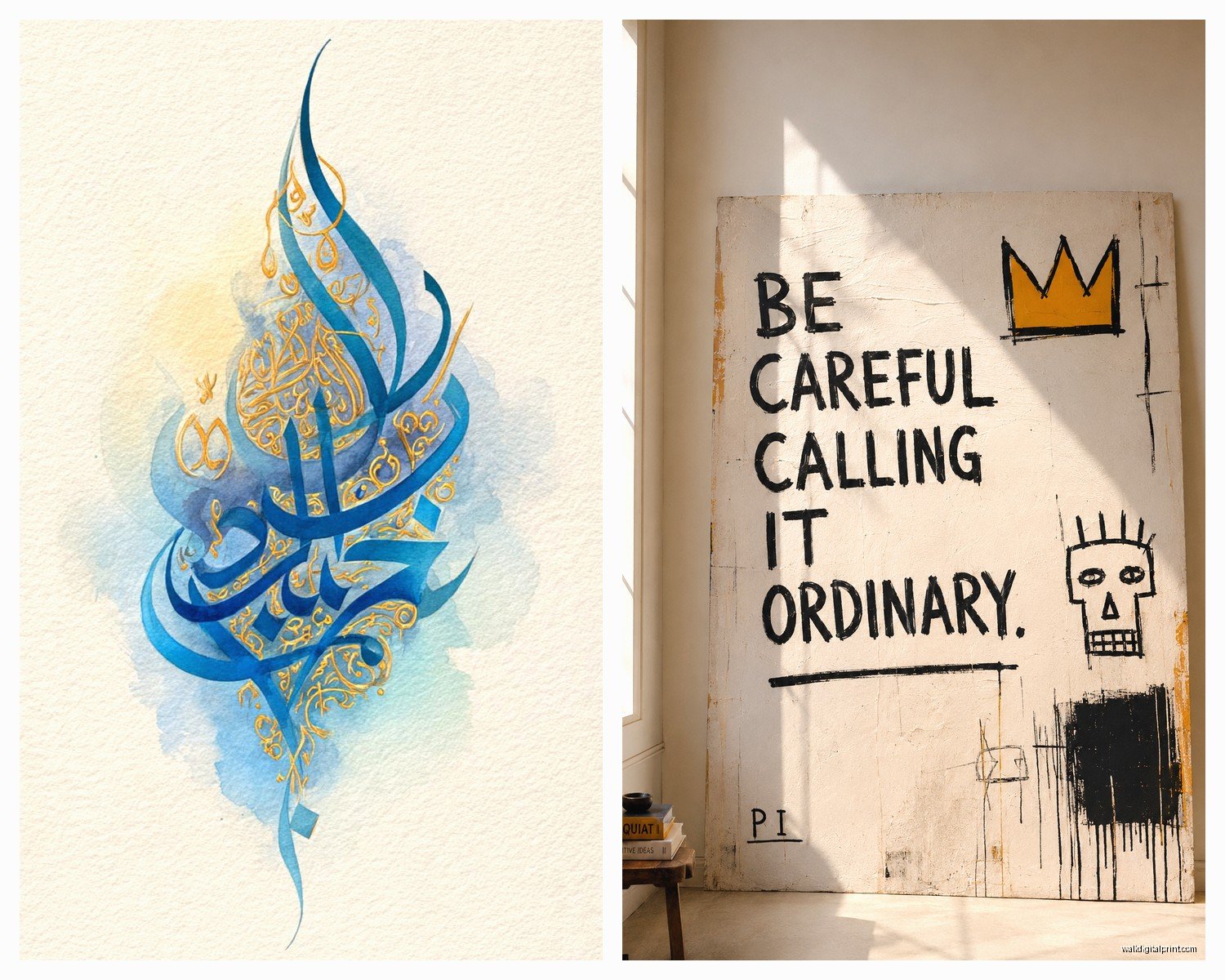
Color Choices That Actually Matter
Black ink on white is classic and you literally cannot go wrong with it. It works in every single style of room I’ve ever worked with. But if you want something more interesting, metallic inks are having a moment. Gold calligraphy on navy or deep green backgrounds looks ridiculously expensive even when it’s not. I found this print on Etsy for like $45 that looked like a $300 piece.
Colored inks are riskier. I tried a terracotta-colored script piece in my kitchen and ended up moving it to my office because it clashed with the backsplash in a way I didn’t anticipate. Stick with colors that are already in your room or go neutral.
White ink on dark backgrounds is stunning but you need good lighting. I hung a white-on-charcoal piece in a hallway that didn’t have great light and you could barely read it. Moved it to a wall with a sconce nearby and suddenly it was the focal point.
Framing Makes or Breaks It
This is where people mess up constantly. The frame matters SO much with calligraphy because the art itself is often pretty minimal. A cheap frame makes even expensive calligraphy look like a Pinterest fail.
For modern calligraphy I almost always use thin black frames or natural wood. Something about those delicate letters needs a delicate frame. Thick chunky frames overwhelm the piece. I learned this the hard way when I bought these gorgeous 2-inch wide frames thinking they’d look substantial and the calligraphy just disappeared.
Brush lettering can handle more substantial frames. I’ve done brass frames, thick black lacquer, even some distressed wood that looked amazing. The bolder the lettering the more frame it can support.
Matting is optional but it does elevate the look. White mats are safe, cream mats feel softer and more organic. I don’t usually do colored mats with calligraphy unless the room has a really specific color scheme. My cat knocked over a framed piece last week and shattered the glass so I’ve been researching acrylic glazing and honestly it might be worth it for high-traffic areas.
Actually Hanging the Thing
Eye level is usually cited as 57-60 inches to the center of the artwork but with calligraphy I go a bit lower sometimes, especially if it’s going above furniture. Like 6-8 inches above a sofa or console table feels right. You want it anchored to the furniture not floating up near the ceiling.
Gallery walls with mixed calligraphy pieces can look incredible or totally chaotic. The trick is keeping either the frame style consistent OR the ink color consistent, not both different. I did a wall with all black ink but mixed frame styles and it worked. Another wall with all matching frames but different colored inks also worked. When I mixed both it looked like a mess.
Oh and another thing, spacing matters more with words than with regular art. If the letters are too close to the frame edge it feels cramped and hard to read. You want breathing room. At least 2-3 inches of mat or background space around the text.
DIY vs Buying
Okay so funny story, I thought I could learn calligraphy and make my own pieces. Bought all the supplies, watched YouTube videos, practiced for weeks. My hand-lettering still looks like a drunk spider walked across the page. Some people are naturally good at it but I am not one of them.
If you wanna try it yourself you need:
- Brush pens (Tombow Dual Brush pens are the standard, around $3 each)
- Good paper (not printer paper, it bleeds, get marker paper or bristol)
- Practice sheets you can trace
- Patience which I apparently don’t have
Honestly unless you’re actually into calligraphy as a hobby just buy the art. Your time is worth something and there are so many talented artists selling prints for reasonable prices.
Where to Shop
Etsy is obviously the goldmine. You can find everything from $15 digital downloads you print yourself to $500 custom commissions. Filter by your country if you want faster shipping. I’ve ordered from shops in the UK and shipping took forever.
Local art markets and craft fairs usually have at least one calligrapher. The advantage here is you can see the actual work in person and sometimes they’ll do custom pieces. I got a custom piece with my favorite recipe title for my kitchen and it was only $120.
Society6 and Minted have tons of options and they’re already framed which is convenient but more expensive. The quality is consistent though which matters if you’re ordering online and can’t see it first.
Framebridge does custom framing of calligraphy and while it’s pricey they make it stupid easy. You just send them the piece and they handle everything. Used them for a client who had a calligraphy print from her wedding and it came back looking museum-quality.
What Words Actually Work
This is personal obviously but some phrases are overdone to the point of being meaningless. “Live laugh love” is the obvious one. “Blessed” is getting there. “Gather” is teetering on the edge.
I tend to go for either:
- Single words that are meaningful but not cliché (like “onward” or “enough”)
- Longer quotes from books or poems that actually mean something to you
- Funny or unexpected phrases that make people smile
The worst is when the phrase doesn’t match the room function. “Rise and grind” in a bedroom where you’re trying to relax? No thanks. “Bon appetit” in a bathroom? Please don’t.
I have a piece in my office that says “make it work” because I was watching Project Runway when I bought it and it just stuck. It’s not profound but it’s useful when I’m stressed about a deadline.
Mixing Calligraphy with Other Art
You can totally mix script art with other styles but you gotta be thoughtful. I usually pair calligraphy with:
- Black and white photography
- Line drawings
- Abstract pieces in neutral colors
- Botanical prints
What doesn’t work is mixing it with really busy colorful art. The calligraphy gets lost. I tried hanging a script piece next to a vibrant abstract painting and your eye didn’t know where to look.
Scale mixing is important too. If you have a large calligraphy piece don’t surround it with tiny little prints. Keep the sizes relatively balanced or do one large statement piece alone.
Maintaining the Look
Calligraphy art fades in direct sunlight faster than other art because the ink is often more delicate. I learned this when a piece in my sunny kitchen faded to basically gray after a year. Now I use UV-protective glass or keep calligraphy away from windows that get harsh afternoon sun.
Dusting is straightforward, just use a microfiber cloth on the frame and glass. Don’t spray cleaner directly on it because if there’s any gap it can seep behind the glass and damage the paper.
If you bought an actual hand-lettered piece on nice paper it’s worth getting it professionally framed with archival materials. The acid-free backing and proper mounting will keep it from yellowing. Regular frame shop materials can actually damage good paper over time.
Anyway that’s pretty much everything I’ve figured out through trial and error and probably too many impulse purchases. The main thing is just make sure the words actually mean something to you or at least make you feel something when you see them, otherwise what’s the point you know