Wall Art Guide, Wall Art Tutoriels
Wall Art Collections: Curated Gallery Sets & Themes
Apr
So I’ve been curating gallery walls for like seven years now and honestly the biggest mistake people make is buying random art pieces one at a time and then wondering why nothing looks cohesive. Let me just dump everything I know about wall art collections because I literally just finished installing one yesterday and I’m still thinking about what worked.
Why Gallery Sets Actually Make Sense
Okay so here’s the thing – curated sets aren’t just a marketing gimmick. When you buy a collection that’s already designed to work together, you’re basically getting someone’s expertise bundled in. I used to think this was cheating or whatever, like you weren’t being creative enough, but then I watched my neighbor spend $800 on individual prints that absolutely did not work together and I changed my tune real fast.
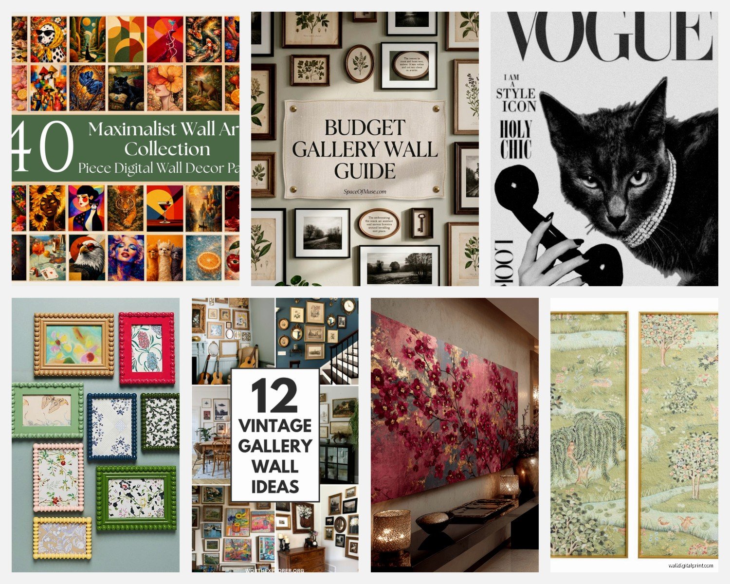
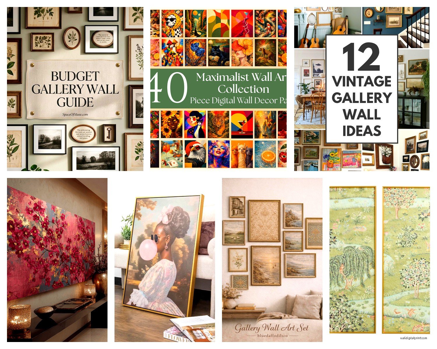
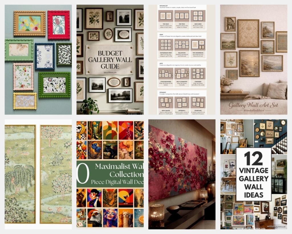
The sets typically come in 3, 5, or 7 pieces. The odd numbers thing isn’t random – your eye processes asymmetry better in these groupings. I’ve tested this SO many times and yeah, it’s true. A set of 4 can work but you gotta be more intentional about the layout.
Types of Collections That Actually Exist
Botanical Print Sets
These are everywhere right now and for good reason. A botanical collection usually has like vintage-style plant illustrations or modern leaf prints. I just installed a set of five vintage fern prints in a client’s dining room and it completely transformed the space. The key with botanical sets is making sure the background colors match – some have cream backgrounds, some are stark white, and mixing those looks messy.
What works: Sets where all prints have the same color temperature
What doesn’t: Mixing cool-toned and warm-toned botanicals unless you really know what you’re doing
Abstract Geometry Collections
These are my go-to for modern spaces. You’ll see sets with circles, lines, minimalist shapes in coordinating colors. I have a set in my own hallway that’s basically just different arrangements of rust, navy, and cream geometric shapes. My cat knocked one off the wall last month and I didn’t even notice for three days so… maybe don’t put them in high-traffic cat areas.
The thing with abstract sets is they can go really wrong if the colors are too saturated. Look for muted tones or sets that have a lot of negative space.
Black and White Photography Series
Architecture photos, landscape series, portrait collections – these are classic for a reason. I’m working with a client right now who bought a set of seven black and white city photographs and we’re doing a full staircase wall. The monochrome thing means you can’t really mess it up style-wise, but you gotta pay attention to the framing.
Themed Narrative Collections
This is like… coastal themes with multiple beach scenes, or travel collections with different city skylines, or those kitchen herb print sets. They tell a story basically. These work best in specific rooms – don’t put the kitchen herb set in your bedroom, you know?
Frame Matching vs. Frame Mixing
Okay so funny story – I once spent three hours in a framing shop trying to decide if a gallery set should have matching frames or mixed frames and the owner basically told me I was overthinking it. But here’s what I’ve learned:
Matching frames work when your art is varied in color or style. If you bought a set with lots of different colors or subjects, identical frames create unity.
Mixed frames work when your art itself is cohesive. Like if all your prints are black and white, you can do different frame styles in all black or all natural wood.
The in-between option that I actually use most: Same frame style, different sizes. This gives you flexibility in arrangement without looking chaotic.
Size Combinations That Don’t Suck
I’m gonna be real with you – this is where people mess up constantly. You can’t just buy five 8×10 prints and expect them to look interesting on a large wall. Here’s what actually works:
For a 5-piece set on a standard wall (like 8-10 feet wide):
- One large anchor piece (16×20 or 18×24)
- Two medium pieces (11×14 or 12×16)
- Two small pieces (8×10)
For a 3-piece set:
- Three same-size large prints (16×20 each) in a horizontal row
- OR one large (24×36) with two small vertical pieces (8×16) flanking it
I measured my client’s wall wrong once and ordered all 11x14s for a massive living room wall and it looked like postage stamps. Had to reorder. Learn from my expensive mistake.
Layout Strategies You Can Actually Execute
The Grid
Most foolproof option. Same-size frames, equal spacing, straight lines. I use 2-3 inches between frames usually. Measure twice, use a level, maybe have wine after because the precision required is annoying but worth it.
The Salon Wall
This is organized chaos – different sizes arranged to fill a space with smaller gaps between frames (like 1-2 inches). I always lay this out on the floor first, take a photo, then measure from that. Trying to figure it out while holding frames against the wall is a recipe for holes you’ll regret.
The Linear Arrangement
All pieces in one horizontal line with centers aligned. Works great over sofas or in hallways. The key is keeping the center line consistent even if the frames are different heights.
The Corner Build
Start with your largest piece and build outward in an asymmetrical pattern. This looks super intentional but is actually kinda forgiving because there’s no rigid structure to maintain.
Color Coordination Isn’t Optional
Wait I forgot to mention – when you’re choosing a curated set, pull colors from your existing room. I use this method: take photos of your space, put them in black and white, and see what the values are. Then pick art sets that match those light/medium/dark values. The actual colors matter less than you think if the values are right.
Also if your room has a lot of pattern already (busy rug, patterned curtains), go with simpler art sets. If your room is pretty plain, you can handle more complex or colorful art collections.
Where to Actually Buy These Sets
I’ve ordered from basically everywhere at this point:
Etsy – Great for downloadable sets you can print yourself. Cheaper but you gotta handle framing. I’ve found amazing vintage botanical sets here for like $25 that would cost $300+ framed elsewhere.
Minted – Higher quality, often artist collaborations. Their curated collections are actually thoughtfully designed. Pricier but the printing quality is noticeably better.
Society6 – Good middle ground. Lots of independent artists. Quality is decent. I ordered a set here that took forever to ship but looked great once it arrived.
West Elm / CB2 / Pottery Barn – These are safe bets if you want everything done for you. Pre-framed sets that definitely work together. You’re paying for convenience and yes, it costs more.
Target / Home Goods – Hit or miss but I’ve found surprisingly good sets here. Just check the print quality in person because sometimes it’s obviously cheap.
The DIY Collection Route
Okay so if you wanna create your own curated collection instead of buying a pre-made set, here’s the formula I use:
Pick ONE unifying element:
- Same color palette (3 colors max across all pieces)
- Same subject matter (all landscapes, all abstract, all portraits)
- Same era or style (all vintage, all modern minimalist)
- Same medium (all watercolors, all photography, all line drawings)
Then vary everything else. So if your unifying thing is “blue and cream color palette,” you can mix abstract with photography with botanical as long as those colors tie it together.
I made my own collection for my office using all warm-toned abstract prints from different artists and it looks way more expensive than it was. The secret was printing everything at the same place so the paper quality matched.
Matting Decisions
This is gonna sound weird but the mat makes a huge difference and nobody talks about it enough. White mats make everything look more formal and gallery-like. Cream or off-white mats make things feel warmer and more vintage. Black mats are dramatic but can overwhelm smaller prints.
For collections, I usually do the same mat color across all pieces. The consistency matters more than the specific color choice.
Installation Real Talk
You need:
- A level (the app on your phone works fine honestly)
- Painter’s tape or brown paper to template positions
- Appropriate wall anchors – drywall anchors for drywall, different situation for plaster
- Patience you probably don’t have but will need anyway
My process: cut paper templates of each frame size, tape them to the wall, live with it for a day, adjust, then commit to hammering. I know people say to just go for it but I’ve patched too many unnecessary holes.
The standard hanging height is 57-60 inches to the center of the artwork, which is average eye level. But in dining rooms I go slightly lower, in hallways sometimes higher depending on sight lines.
Common Problems I See Constantly
Hanging things too high – Your art is probably 6 inches too high right now, I’m sorry. It should feel connected to your furniture, not floating near the ceiling.
Frames too small for the wall – That massive blank wall needs more than three 8x10s. Scale up or add more pieces.
No relationship between pieces – Even in a curated set, you gotta arrange them thoughtfully. The pieces should feel like they’re in conversation with each other.
Ignoring the furniture below – Art above a sofa should be about 2/3 the width of the sofa. Above a console table, similar principle. There’s a proportional relationship that matters.
Themes That Work in Different Rooms
Living room: Abstract sets, landscape photography, basically anything goes as long as it’s substantial enough for the space
Bedroom: Calming themes – soft abstracts, botanicals, gentle landscapes. I did a black and white photography set in my bedroom and it’s actually too stimulating, kinda regret it
Kitchen: Botanical herbs, food illustration sets, vintage advertising prints, coffee/wine themes if you’re into that
Bathroom: Small botanical prints, vintage maps, abstract water-themed art
Home office: Geometric abstracts, inspirational typography (but not cheesy), architectural photography
Dining room: Food-related themes can work but aren’t necessary – I actually prefer interesting abstract or botanical sets here
Kids rooms: Themed sets based on their interests but maybe avoid character art that’ll feel dated in a year
Investment Levels
Budget ($50-150 for a set): Printable downloads you frame yourself, Target/HomeGoods finds, some Etsy options
Mid-range ($150-400): Society6, Minted sales, West Elm basics, pre-framed sets from mainstream retailers
Higher-end ($400+): Artist collaborations, limited editions, custom framing for vintage finds, gallery-quality prints
I mix all three levels honestly. Some walls get the investment pieces, some get the budget-friendly solutions, and nobody can tell the difference if you’re strategic about it.
The thing is you can always upgrade later. Start with printables in basic frames and if you still love them in six months, invest in better printing or framing. I’ve had some cheap prints on my walls for years because they just work and I’ve replaced expensive pieces after three months because I got tired of them.
Seasonal Switching
Oh and another thing – some people swap their gallery walls seasonally and honestly it’s not as extra as it sounds. If you use the same frame sizes, you can just swap the prints. I have a client who does warm-toned abstracts in fall/winter and switches to botanical prints in spring/summer. She stores the off-season prints in a portfolio case and it takes like 20 minutes to switch everything out.
Just make sure if you’re gonna do this that all your frames are the same sizes so you’re not re-measuring and making new holes every time.
Anyway that’s basically everything I’ve learned about gallery wall collections through way too much trial and error and probably more money spent than I should admit. The main thing is don’t overthink it to the point where you never actually hang anything – a curated set on your wall is infinitely better than perfect art still leaning against your wall six months after you bought it.