Wall Art Guide, Wall Art Tutoriels
Large Gold Wall Art: Oversized Metallic Luxury Designs
May
So I’ve been living and breathing large gold wall art for like three years now and honestly it’s one of those things where you can spend $50 or $5000 and both could look terrible if you don’t know what you’re doing. My cat literally knocked over a gold leaf piece last week and I’m still finding gold flakes everywhere but that’s beside the point.
Size Actually Matters Way More Than You Think
Okay so here’s what nobody tells you about oversized pieces. When people say “large” they’re usually thinking like 30×40 inches which is actually… not that large? For a proper statement piece you’re looking at minimum 40×60 inches, and honestly for spaces over a sofa or dining area you want 60×80 or bigger. I made this mistake in my own living room and ended up with what looked like a postage stamp floating on this massive wall.
The rule I use now is measure your wall space and aim for the art to take up about 60-75% of the width. So if you’ve got an 8-foot sofa that’s 96 inches, you want something around 60-72 inches wide. But then you gotta factor in if there’s other stuff on the wall or if it’s a gallery situation which is a whole different thing.
Types of Gold Finishes and Why They’re Not All Created Equal
This is gonna sound weird but I literally keep samples of different gold finishes in my studio because clients can never visualize the difference. You’ve got:
- Brushed gold – matte-ish, catches light softly, works in modern spaces
- Polished gold – super reflective, very traditional, can read as brassy if you’re not careful
- Gold leaf – the real stuff or imitation, has texture and variation
- Metallic paint – flat to glossy spectrum, most affordable
- Mixed metal with gold dominant – usually gold with copper or silver accents
I had this client who bought this “gold” piece online and it showed up looking like a yellow crayon melted on canvas. The photos showed warm champagne gold but the actual pigment was just… wrong. Always always check if they list the actual materials used.
Real Gold Leaf vs Imitation
Real gold leaf (or even brass leaf) gives you this depth that’s hard to describe. It catches light differently throughout the day and there’s usually slight imperfections that make it interesting. Imitation leaf can look flat and one-dimensional BUT it’s like 1/10th the price and doesn’t tarnish. For most residential spaces honestly the high-quality imitation is totally fine.
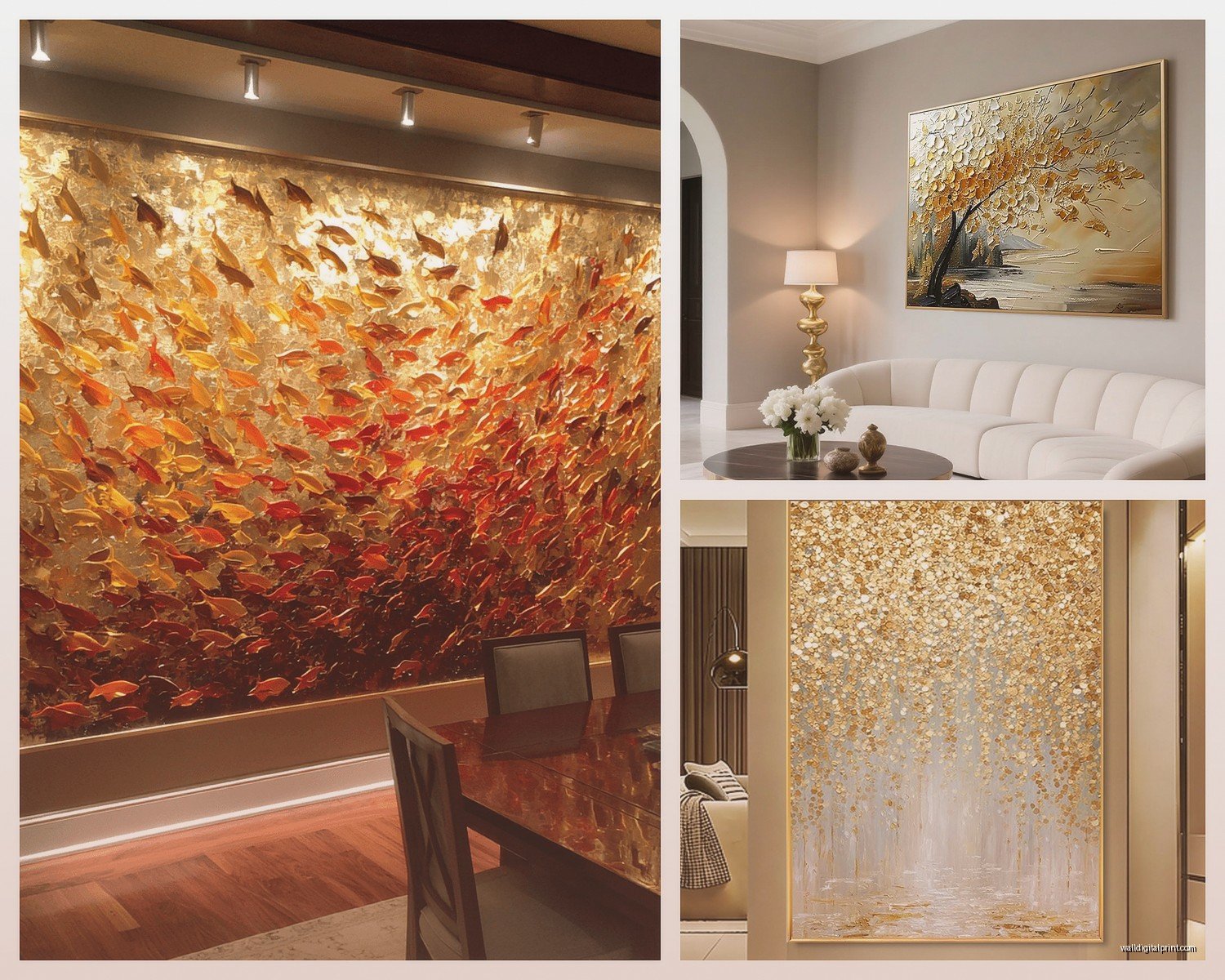
What Actually Works in Different Room Types
Living rooms are where most people want these big gold pieces and it makes sense because you’ve got the wall space. But the lighting situation matters so much. I’ve got this one piece in my dining room that looks completely different at breakfast versus dinner and I didn’t plan for that.
Living Room Placement
Above the sofa is obvious but make sure you’re leaving 6-10 inches between the sofa back and the bottom of the frame. Too high and it looks disconnected, too low and someone’s gonna bump it with their head. I learned this the hard way when my friend’s husband stood up too fast and headbutted a $800 piece.
If you’re doing it above a console table or credenza, same rules apply with spacing. The piece should feel anchored to the furniture below it not just floating randomly.
Bedroom Situations
Okay so bedrooms are tricky with gold because it can feel either really romantic and luxe or like you’re sleeping in a jewelry box. The key is balancing it with softer textures. I did a bedroom last month with this massive abstract gold piece (like 72×48) but we kept the bedding in creams and soft grays and added a chunky knit throw. The gold became the statement without overwhelming.
Behind the bed is classic but also consider the wall opposite your bed so it’s the first thing you see when you wake up. Just don’t put it where morning sun hits it directly or you’ll be blinded at 6am (speaking from experience).
Dining Rooms
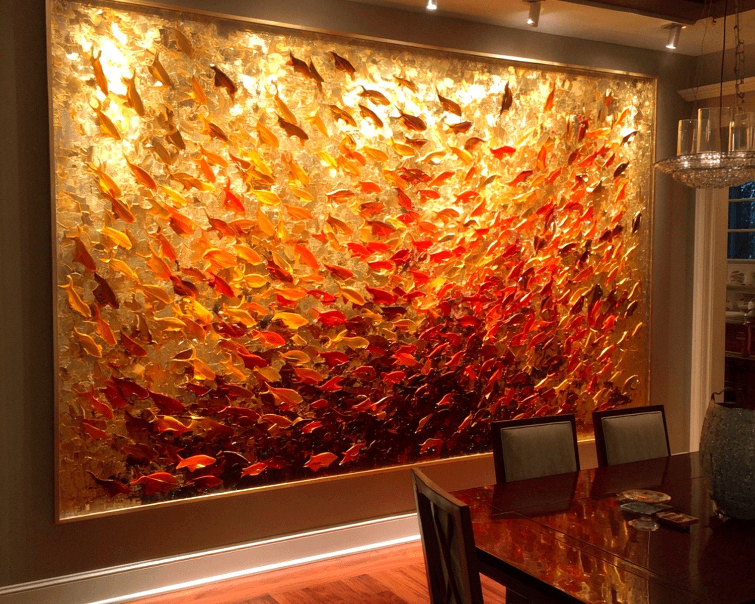
Dining rooms are actually perfect for oversized gold art because you want drama in that space anyway. The thing is most dining rooms have a chandelier or pendant light so you’re working around that. I usually go for a horizontal piece that spans wide rather than tall to avoid competing with the light fixture.
And real talk, gold in candlelight is just *chef’s kiss* for dinner parties. It reflects the warm light and makes everything feel more expensive than it is.
Styles That Don’t Look Dated in Two Years
This is the question I get most because yeah, gold can definitely skew trendy. Abstract geometric designs tend to have more longevity than specific motifs. Right now everyone’s doing these circular burst patterns and honestly they’re already feeling a bit 2022 to me.
What I’m seeing that feels more timeless:
- Large-scale abstract with gold as one element not the whole piece
- Textured gold with actual dimension (not just flat metallic paint)
- Organic shapes like leaves or branches in gold foil
- Minimalist line drawings with gold leaf accent
- Mixed media where gold interacts with navy, emerald, or charcoal
Oh and another thing – the really trendy agate slice designs with gold veining? They’re pretty but they’re very 2019-2020. Unless you really love them I’d skip.
Budget Breakdown Because This Gets Expensive Fast
So here’s the reality. A genuine oversized piece from an artist or high-end gallery is gonna run you $2000-$15000+ easily. I’ve curated pieces that cost more than my first car. But you can absolutely find gorgeous options at different price points.
Under $300: You’re looking at prints, canvas reproductions, or DIY-adjacent stuff. West Elm, CB2, Article sometimes have decent options in this range. The quality is fine but you can usually tell it’s mass-produced when you get close.
$300-$800: This is the sweet spot honestly. You can get original pieces from emerging artists on Saatchi Art or Etsy, or really well-made reproductions with actual texture and dimension. I’ve found amazing stuff in this range that looks way more expensive.
$800-$2000: You’re getting into gallery territory or established artists. Better materials, unique pieces, usually hand-finished. This is where I shop for clients who want investment pieces.
$2000+: Original art from known artists, custom commissions, or museum-quality reproductions. The gold is usually real metal leaf, the substrate is archival, and honestly it’s a different category.
Installation Tips Nobody Tells You
Okay so you bought this gorgeous 60-pound piece of art and now what. First thing – do NOT use those saw-tooth hangers that come with cheaper frames. They’re not rated for the weight and I’ve seen pieces crash at 3am and give clients heart attacks.
You need either:
- Heavy-duty D-rings (two of them) attached to the frame sides
- French cleats for anything over 40 pounds (this is what I use for almost everything oversized)
- Professional picture hanging wire rated for at least 2x the weight of your piece
And you HAVE to hit studs or use proper drywall anchors. Those little plastic ones from the hardware store? No. Get the toggle bolts or heavy-duty anchors rated for 50+ pounds. My client canceled last week so I spent like an hour comparing different anchor types at Home Depot and the employees thought I was crazy but details matter.
Hanging Height Formula
The center of your artwork should be at 57-60 inches from the floor. This is gallery standard and it works because it’s roughly eye level for most people. But if your ceilings are really high (over 9 feet) you can go slightly higher to fill the space better.
When hanging over furniture, the bottom of the frame should be 6-10 inches above the furniture top. Measure this carefully because eyeballing it never works.
Lighting Makes or Breaks Gold Art
I cannot stress this enough – the lighting in your space will completely transform how gold looks. Natural light during the day, warm artificial light at night, they create totally different effects.
If you can, add picture lights or track lighting aimed at your piece. Gold needs light to activate all that reflective goodness. I installed LED picture lights on my dining room piece and it went from nice to WOW.
Avoid fluorescent or cool-toned LED bulbs near gold art. They make it look greenish and cheap. Stick with warm white (2700-3000K) to keep that rich, luxurious vibe.
Glare Management
Glossy gold finishes can create glare issues depending on window placement. If you’ve got a big window directly across from where you want to hang your art, consider a more matte or brushed gold finish. Or use window treatments to diffuse that direct light during peak hours.
Styling Around Your Gold Piece
So you’ve got this statement gold art on your wall and now the whole room needs to work with it. The biggest mistake I see is people adding MORE gold everywhere – gold pillows, gold side tables, gold frames. It becomes too much.
Instead, let the art be the gold moment and pull in complementary colors from the piece. If your gold art has navy or emerald accents, echo those in your textiles. Keep other metals to a minimum or mix in brass and copper which play nicely with gold.
Textures are your friend here. Pair that shiny reflective gold with:
- Velvet or linen upholstery
- Natural wood furniture
- Matte ceramics or stone accessories
- Soft area rugs in neutral tones
- Plants (greenery looks amazing with gold)
Custom vs Ready-Made
I’ve done both routes probably a hundred times. Ready-made is obviously faster and you know what you’re getting. But custom lets you get exactly the size, colors, and style you want.
For custom pieces I usually work with artists through Instagram or Etsy. You can commission something specific to your space and color scheme. It takes 4-8 weeks typically and costs more but the result is truly one-of-a-kind.
Ready-made from retailers is great when you need something quickly or you’re on a tighter budget. Just make sure you’re checking the return policy because gold looks SO different in person than in photos.
Maintenance and Long-Term Care
Gold art is actually pretty low maintenance but there’s some things to know. Real gold leaf can tarnish over time especially if you’re in a humid climate. Imitation leaf or metallic paint is more stable.
Dust with a soft microfiber cloth – never use cleaning products directly on metallic surfaces. For textured pieces, a soft brush works better than a cloth.
Keep it away from direct heat sources and avoid hanging in bathrooms where humidity fluctuates a lot. I had a piece in a client’s master bath and the gold started lifting within six months.
If the piece is behind glass, clean the glass but be careful not to let moisture seep behind it. UV-protective glass is worth it if you’re investing in an expensive piece and have lots of natural light.
Where I Actually Shop
Real talk about sources because this matters. For high-end stuff I go to local galleries or online galleries like Saatchi Art and Artsy. You’re paying gallery prices but you get authenticity and often better customer service.
For mid-range I love Etsy for finding independent artists. Search for “oversized gold abstract” or “large metallic wall art” and filter by your size needs. Read reviews carefully and message sellers with questions.
For budget-friendly options West Elm, CB2, Anthropologie, and even HomeGoods sometimes have surprisingly good pieces. I found a 48×60 gold abstract at HomeGoods for $200 that looked like it should cost $800.
Oh and estate sales or consignment shops can be gold mines (pun intended) for vintage pieces. I’ve scored some incredible finds this way but you gotta be patient and check regularly.
The thing with large gold wall art is it’s an investment in your space and when you get it right it elevates everything. Just measure twice, consider your lighting, and don’t rush the decision because you’ll be living with it for years hopefully.