Wall Art Guide, Wall Art Tutoriels
Large Black Wall Art: Oversized Dark Bold Statement Pieces
May
So I’ve been working with oversized black wall art for like three years now and honestly it’s one of those things that either transforms a space completely or just sits there being awkward, and the difference comes down to placement and scale more than the actual piece.
First thing – and I cannot stress this enough – measure your wall space before you fall in love with something. I had a client who bought this gorgeous 6-foot abstract piece and then realized her wall was only 8 feet wide and it just looked… suffocating? The general rule I use is that your art should take up about 60-75% of the available wall space. So if you’ve got a 10-foot wide wall, you’re looking at something around 6-7.5 feet wide. Less than that and it floats there looking lost, more and it’s gonna feel like it’s closing in on you.
The height thing is tricky too. I usually hang the center of the piece at 57-60 inches from the floor, which is standard gallery height, but with oversized stuff sometimes you gotta adjust based on your ceiling height and furniture. Like if you have low ceilings (under 8 feet), a super tall vertical piece can make the room feel cramped.
Where Black Art Actually Works
Okay so this is gonna sound counterintuitive but black art works best in rooms that already have good natural light. I know, you’d think it would make a dark room darker, and yeah it can, but in a bright room? The contrast is just *chef’s kiss*. I put a massive black abstract piece in a client’s living room that had floor-to-ceiling windows and it became this anchor point that made all the light feel more intentional.
White walls are obviously the classic pairing – super high contrast, very gallery-like. But I’ve also done it on light gray walls (Benjamin Moore’s Classic Gray is my go-to) and even on this dusty blue wall once that was surprisingly gorgeous. The key is you need at least 3-4 shades of difference between your wall color and the black in the art.
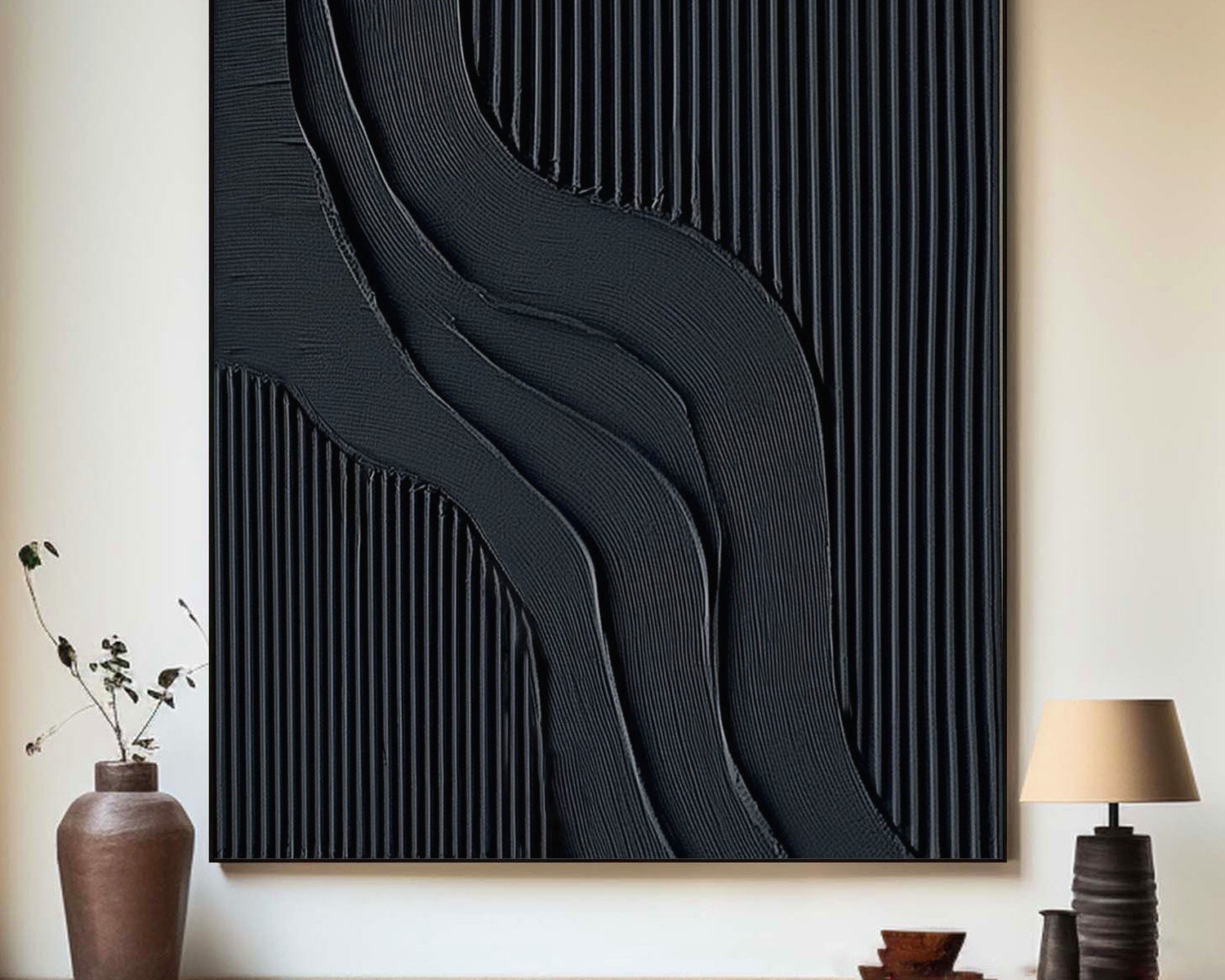
Oh and another thing – textured black art reads completely different than flat black. A piece with heavy brushstrokes or mixed media elements will catch light throughout the day and create all these subtle shadows. Flat matte black can look stunning but it’s more… severe? I guess? My cat knocked over a plant while I was installing one last month and I swear the stress of potentially getting soil on this pristine matte black canvas aged me five years.
Types That Actually Look Good Oversized
Abstract geometric stuff is probably the easiest to work with. Clean lines, bold shapes, maybe some white or metallic accents mixed in. These work in modern spaces obviously but I’ve also used them in transitional homes where you need something contemporary without going full minimalist.
Black and white photography blown up huge can be incredible – I’m talking like architectural shots, landscapes, that kind of thing. But here’s the catch: the image quality has to be flawless. You blow up a mediocre photo to 5 feet wide and suddenly every flaw is on display. I learned this the hard way with a cityscape print that looked amazing as a 2-foot preview but at actual size you could see all the grain and blur.
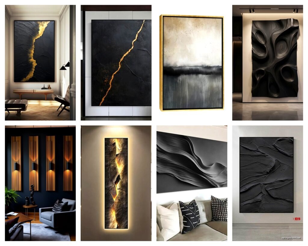
Textured pieces with raised elements or mixed media – these add dimension which keeps the black from feeling flat and heavy. I recently used this piece that had black paint with embedded metallic fragments and it caught light differently throughout the day. Made the whole room feel more dynamic.
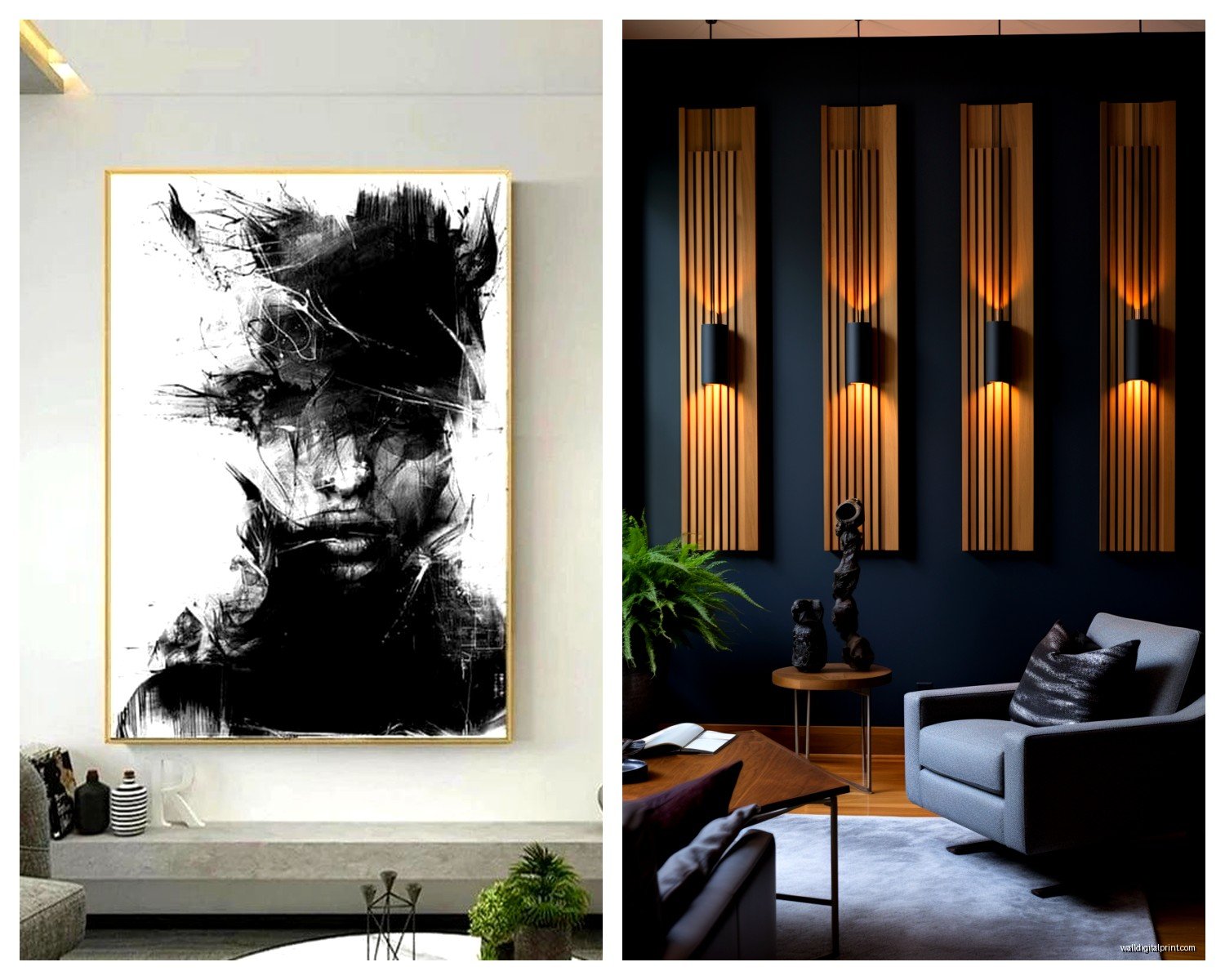
Line art or minimalist drawings on black backgrounds are having a moment right now. Like those single-line figure drawings or botanical sketches but reversed so the lines are white/metallic on black. These work really well in bedrooms because they’re dramatic but not as intense as a solid black abstract.
The Furniture Situation
This is where people mess up constantly. You cannot just slap oversized black art behind any furniture and call it a day.
Behind a sofa: your art should be about two-thirds to three-quarters the width of your sofa. So if you’ve got a 90-inch sofa, you’re looking at 60-68 inches of art width. And leave like 6-10 inches between the top of your sofa and the bottom of the frame. Any less and it looks like the art is sitting on the sofa, any more and they feel disconnected.
Above a bed: I usually do something around 50-75% of the bed width. Queen bed is 60 inches, so you want something in the 30-45 inch range. King bed gives you more room to play – 45-60 inches works. But here’s the thing with black art in bedrooms… it can either be super sophisticated and moody or it can feel oppressive. I always tell people to live with smaller black pieces in their bedroom first before committing to something huge.
Dining rooms are actually perfect for oversized black art because you want drama there anyway. The art can be wider than the table, which is different from the sofa rule, because you’re viewing it from further back usually.
Balancing the Weight
Black art is visually heavy, like really heavy. You need to balance it or the whole room tips to one side energetically. Wait I forgot to mention – I use this trick where I’ll put lighter elements on the same wall or nearby. Like floating shelves with white objects, or a light-colored credenza underneath, or even just a white lamp on a side table near the art.
I also repeat black elsewhere in the room but in smaller doses. Black picture frames on another wall, black hardware on furniture, black light fixtures. This makes the big piece feel intentional instead of random.
Metallic accents help SO much. Gold, brass, or even silver elements will catch light and prevent the black from absorbing all the visual energy in the room. I’m obsessed with brass floor lamps next to black art right now – the warm metallic glow against the matte black is just… yeah.
Practical Installation Stuff
Okay so funny story, I once tried to hang a 5-foot canvas by myself and nearly took out a window. These pieces are heavy and awkward. You absolutely need two people for anything over 3 feet in any dimension.
For really heavy pieces (over 30 pounds), forget the wire hanging system. Use D-rings mounted to the frame and hang directly on wall anchors or studs. I use heavy-duty wall anchors rated for at least twice the weight of the piece. The last thing you want is to wake up at 3am to a crash because your $800 art piece decided to become floor art.
French cleats are actually my favorite for the really massive stuff – they distribute weight evenly and the piece sits flush against the wall which looks more intentional. You can get these at any hardware store or order them online.
Level is non-negotiable. I use a laser level for big pieces because trying to eyeball a 6-foot wide frame is a recipe for disaster. Even being off by half an inch is super noticeable at that scale.
Lighting Makes or Breaks It
You gotta light this stuff properly or it just becomes a black void on your wall. Picture lights mounted above the frame work but they can look dated. I prefer track lighting or adjustable ceiling spots that highlight the piece from an angle. This creates depth and shows off any texture in the art.
If you have recessed lighting, angle the bulbs toward the art if possible. And use warm white bulbs (2700-3000K) – cool white makes black art look harsh and cold.
There’s also this thing with blackout situations where if your art is all black and your wall is dark and the lighting is dim, it literally just disappears. I’ve seen rooms where you walk in during the evening and genuinely cannot see the art that’s supposedly the focal point. Not ideal.
What to Avoid
Don’t put black art in already dark rooms with dark furniture unless you’re specifically going for a moody cave vibe. And even then, you need strategic lighting.
Don’t go oversized in small rooms just because you saw it in a magazine. A 6-foot piece in a 10×10 room is gonna overwhelm everything. Scale down or choose something with more white space incorporated.
Multiple large black pieces in one room gets tricky fast. I’ve done it successfully but you need to really know what you’re doing with spacing and balance. Usually one statement piece per room is the move.
Cheap prints that try to look like original art… they just don’t hold up at large scale. The texture and depth isn’t there. If you’re gonna go big, invest in either an actual original piece or a really high-quality print or photograph.
Budget Reality Check
Original large-scale black art from established artists starts around $1000 and goes up to like… there’s no ceiling really. I’ve specified pieces that cost more than my car.
But there are options. Oversized prints from sites like Minted or Artfully Walls run $200-600 depending on size and framing. I’ve used these for clients who want the look without the investment.
Local art fairs and student shows are goldmines for affordable original pieces. Emerging artists are creating amazing work at reasonable prices because they’re building their portfolios.
DIY is totally an option if you’re even slightly artistic. Large canvases are cheap, black paint is cheap, and abstract black art is forgiving. I’m not saying everyone should do this, but I’ve seen some impressive DIY pieces that look expensive and intentional.
Frame or No Frame
Gallery-wrapped canvas (where the image continues around the edges) looks clean and modern without a frame. This works great for abstract pieces and keeps costs down.
But frames add sophistication and can help the piece feel more finished. For black art, I usually go with either natural wood frames for warmth or thin black metal frames for a contemporary look. White frames can work too but they create a LOT of contrast – it’s a bold choice.
Float frames (where there’s a gap between the art and frame) are having a moment and they work beautifully with black art because they add dimension and make the piece feel like it’s floating off the wall.
The thing with oversized framing is it gets expensive fast. Custom framing a 5-foot piece can easily cost $500-800. Sometimes it’s worth it, sometimes the gallery wrap is the better call.
Okay I think that covers most of what you need to know? The main thing is just don’t be scared of going big and dark – it can completely transform a space when done right. Start with good measurements, make sure your lighting is solid, and balance that visual weight throughout the room. You’re gonna love how it turns out.