Wall Art Guide, Wall Art Tutoriels
Neutral Beach Wall Art: Subtle Coastal Decor
May
So I’ve been obsessing over neutral beach art lately because honestly, the whole bright turquoise and coral thing was making my eyes tired. Like don’t get me wrong, I love color, but sometimes you just want that coastal vibe without your living room screaming “BEACH!” at everyone who walks in.
Why Neutral Coastal Actually Works
The thing about neutral beach art is it gives you that breezy feeling without committing to a theme that’ll make you cringe in two years. I learned this the hard way after hanging a massive piece with bright orange starfish in my dining room back in 2019… anyway, we don’t talk about that anymore.
What you’re looking for are pieces in creams, taupes, soft grays, sandy beiges, maybe some driftwood browns. The ocean can be this gorgeous muted blue-gray instead of that aggressive Caribbean blue. And honestly? It reads more sophisticated while still giving coastal energy.
The Types That Actually Look Good
Okay so there are basically a few categories that work really well, and I’ve tested most of these in various client spaces and my own place.
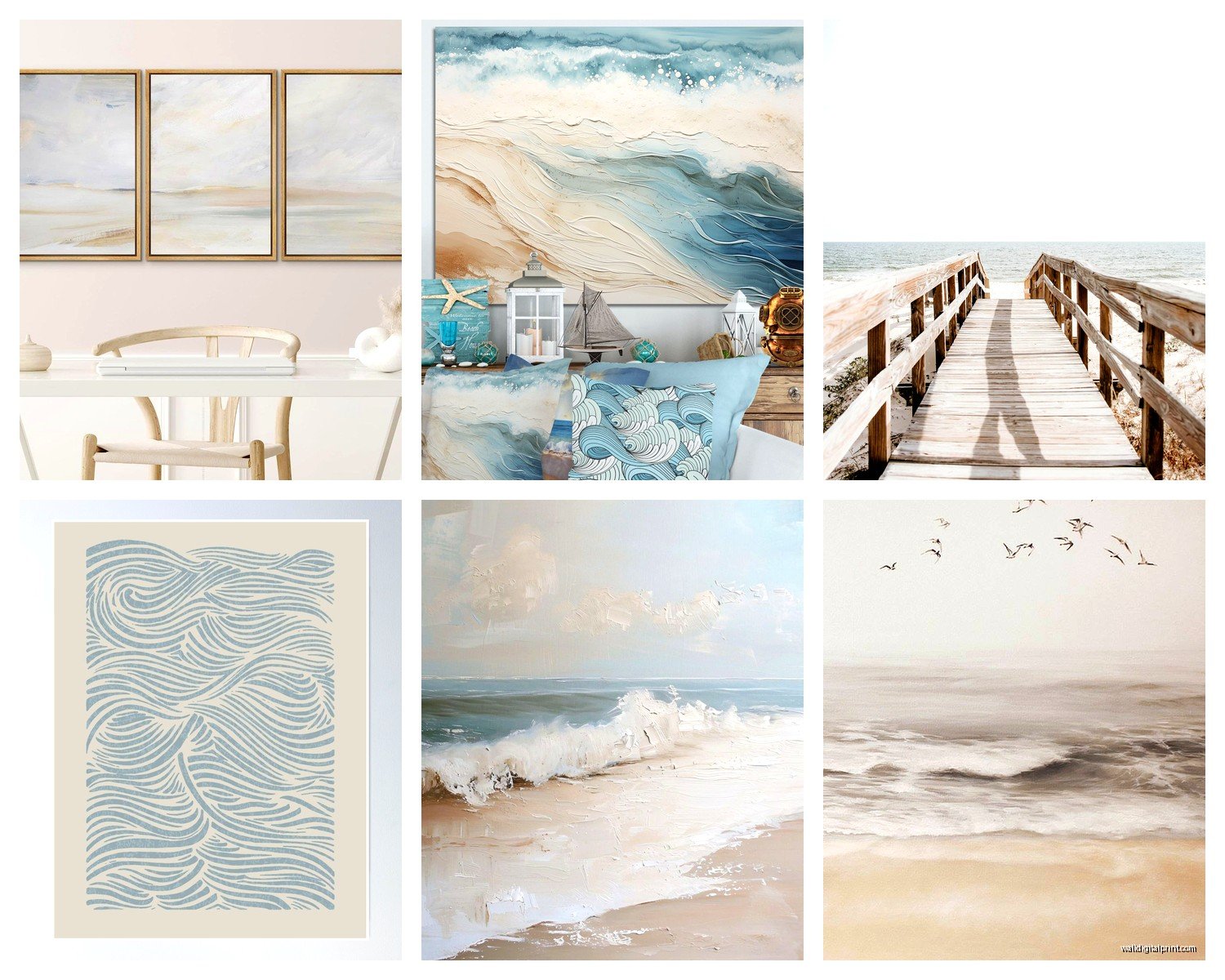
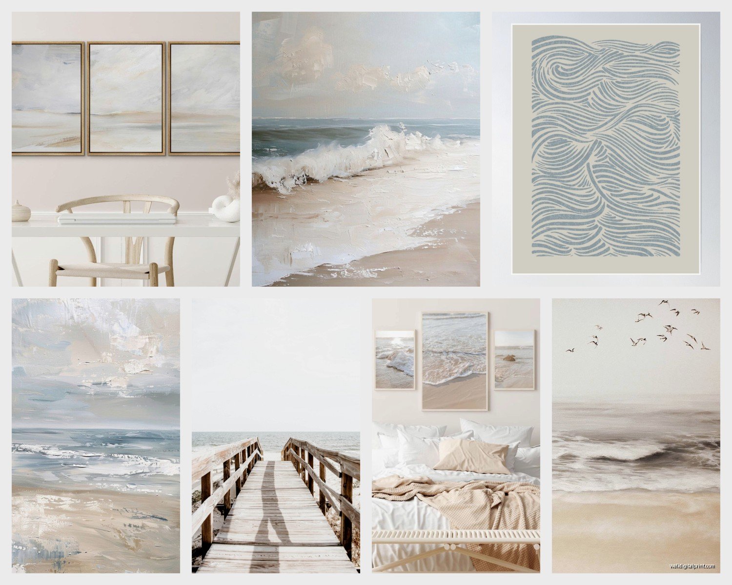
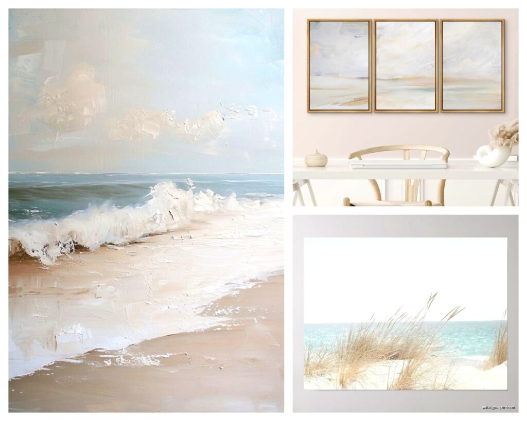
Abstract Ocean Scapes
These are my go-to recommendation like 80% of the time. You want something that suggests water and horizon lines without being literal. Think soft washes of beige blending into gray-blue, maybe some texture that looks like sand or foam. I found this one piece at this little gallery in Maine last summer… wait, that’s not helpful for you.
But seriously, look for abstract pieces where the artist used a really limited palette. Three to four colors max. When there’s too much going on, it stops reading as neutral and starts feeling busy. The best ones have this almost meditative quality, like you’re staring at the ocean on a foggy morning.
Line Drawings and Minimalist Prints
Simple line art of shells, sea grass, or coastal landscapes in black or sepia on cream backgrounds. These work insanely well in smaller spaces or when you’re clustering multiple pieces. I have three small line drawings of different shells in my hallway and people always ask where they’re from.
The key here is making sure the lines are actually well-done and not just some mass-produced thing that looks cheap up close. You can tell the difference when you see it in person, the line weight should vary naturally, there should be some character to it.
Textured Pieces
Oh and another thing – textured neutral art is having a moment and I’m here for it. We’re talking pieces with actual dimension, maybe made with plaster or heavy gel medium, in all those sandy creamy colors. They catch the light differently throughout the day which is pretty cool.
I installed one above a client’s bed last month, this big textured piece that was basically all cream and taupe with subtle wave patterns worked into it, and the way it looked at different times of day was completely different. Morning light made it almost glow, evening light brought out all these shadows in the texture.
Where to Actually Find This Stuff
So here’s where I actually shop when I need neutral coastal pieces, because this is the question everyone asks me.
Etsy is honestly goldmine territory for this. Search terms like “neutral coastal art print,” “beige ocean painting,” “minimalist beach art.” You can find digital downloads for like $8 that you print yourself at Staples or wherever, or you can buy original paintings if you’ve got the budget. I probably spend way too much time scrolling through Etsy at night when I should be sleeping, my boyfriend thinks I’m insane.
Local art fairs and coastal town galleries if you live near the coast or are visiting. The markup isn’t usually as bad as you’d think, and you’re getting something more unique. Plus you can see the actual texture and colors in person which matters so much with neutral work.
West Elm and CB2 have decent options though they can be pricey for what you’re getting. I only recommend these if you need something fast and don’t wanna deal with framing.
Minted for prints – they have a good selection and the quality is solid. You can filter by color palette which is super helpful.
Society6 has some good stuff too but you gotta dig through a lot of mediocre work to find the gems.
Size and Placement (This Actually Matters)
Okay so this is where people mess up constantly. Neutral art needs to be the right size or it just disappears into your wall.
For above a sofa, you want something that’s roughly two-thirds to three-quarters the width of the sofa. Could be one large piece or a gallery wall situation. But here’s the thing with neutral art – it tends to recede visually more than bold colorful art, so I actually recommend going slightly larger than you think you need.
I made this mistake in my own living room, hung a piece that was technically the “right” size according to all the design rules, but because it was all soft creams and grays, it just looked… insignificant? Ended up sizing up and it made such a difference.
Gallery Wall Approach
If you’re doing a gallery wall with neutral coastal pieces, keep your frames consistent. All white, all natural wood, all black – pick one. The art itself is subtle, so the frames need to create cohesion. I usually do 3-5 pieces for a gallery wall, arranged asymmetrically but balanced.
Wait I forgot to mention – when you’re arranging them on the floor first (which you should absolutely do), take a picture with your phone. It’s so much easier to see if the spacing looks right through your phone camera than just staring at it from above.
Framing Options That Don’t Break the Bank
This is gonna sound weird but I’m kinda obsessed with framing options lately. My cat knocked over a frame last week and shattered it, so I’ve been deep in framing research.
Framebridge is great if you want custom framing without the insane custom framing prices. They have good neutral frame options and will frame your art for you. Takes a few weeks though.
IKEA frames work fine for standard sizes. Their RIBBA frames in white or black are clean and simple. Just make sure your print is actually a standard size or you’ll need to get a custom mat cut.
For larger pieces, honestly sometimes going frameless with a canvas print looks better anyway. The super thick gallery-wrapped canvases in neutral tones have this organic feel that works with the coastal vibe.
Mat Colors Matter More Than You Think
If you’re matting your prints, stick with white, cream, or very light gray mats. I’ve seen people use navy or dark gray mats with neutral coastal art thinking it’ll add contrast, but it usually just looks heavy and kills the airy feeling you’re going for.
Mixing Neutral Beach Art with Your Existing Decor
So you probably have other stuff on your walls already or at least you’re not planning to make your entire house coastal themed… hopefully.
The beauty of neutral coastal art is it plays well with almost everything. I’ve mixed it with:
– Modern minimalist spaces (obviously works great)
– Traditional rooms with darker wood furniture (the lightness balances the heaviness)
– Boho spaces with lots of texture and plants
– Even contemporary spaces with some edge to them
The key is making sure your neutrals actually coordinate. If your room has warm beige tones, choose art with warm sandy beiges. If your space is cooler with grays, go for art with gray-blues and cool taupes. Sounds obvious but I’ve seen people miss this and wonder why something feels off.
Lighting Considerations
Oh and another thing that’s super important – lighting will make or break neutral art. Because the color palette is subtle, proper lighting brings out all the dimension and keeps it from looking flat and boring.
If you can swing it, picture lights or wall sconces flanking the art are ideal. But honestly, even just making sure there’s enough ambient light in the room helps. I have a client whose neutral beach art looked completely washed out and sad until we added a floor lamp near it, suddenly you could actually see all the beautiful subtle variations in tone.
Natural light is obviously amazing for this kind of art, but watch out for direct sunlight which will fade it over time. I learned this with a print that was in direct afternoon sun for like six months and… yeah, it’s noticeably lighter now on one side.
DIY Options If You’re Crafty
Okay so funny story, I tried making my own abstract neutral coastal art last winter when I was bored and had a weekend with no plans. Used some canvas boards from Michael’s, grabbed some acrylic paints in cream, taupe, and this gorgeous gray-blue, and just… played around.
It’s actually not that hard to make something decent if you keep it abstract and textural. YouTube has tons of tutorials. You’re basically layering paint, scraping some away, adding texture with palette knives or even credit cards. The “imperfect” quality actually works in your favor with coastal art.
Cost me maybe $40 in supplies and I made three pieces that honestly look pretty good in my guest room. Would I do this for a main living space? Maybe not, but for a bedroom or hallway, totally works.
Photography Prints
If you’re decent with a camera, printing your own coastal photography is another option. Black and white or very desaturated color photos of beaches, dunes, sea grass, weathered docks. Get them printed large format at a professional print shop – not your home printer, trust me on this – and frame them simply.
I did this with some photos from a trip to Cape Cod and people assume they’re professional art prints.
Common Mistakes I See People Make
Hanging stuff too high. The center of your art should be at eye level, which is usually around 57-60 inches from the floor. I know everyone says this but literally 70% of the time I walk into someone’s home, their art is hung way too high.
Choosing pieces that are too matchy-matchy. Even in a neutral palette, you want some variation in tone or texture or subject matter. Three identical beige abstracts in a row looks like a hotel.
Forgetting about scale in relation to furniture. That tiny 8×10 print above your king size bed is just gonna look lost and sad.
Not considering the undertones. Neutral doesn’t mean everything goes together. Cool grays next to warm beiges can look muddy and off.
Buying something just because it’s neutral and coastal without actually liking it. I know this sounds obvious but I’ve definitely bought things because they “should” work and then never actually liked looking at them.
Specific Pieces I’d Actually Recommend
So if you’re looking for specific recs, there’s this artist on Etsy called… okay I’m blanking on the exact shop name but search for “StudioMucci” I think? They do these gorgeous minimal coastal line drawings that are perfect for clustering.
For larger statement pieces, I’ve had good luck with abstract artists who work in neutrals. Look for terms like “wabi sabi coastal,” “organic abstract,” “neutral seascape.”
Honestly though, the best piece is gonna be the one you connect with when you see it. I know that sounds annoyingly vague but it’s true. You’ll know it when you see it because you’ll immediately picture it in your space.
The neutral coastal art I have in my bedroom is this abstract piece I found at a random art show three years ago, and I walked past it, kept looking at other stuff, and kept thinking about that one piece. Went back and bought it and it’s still my favorite thing in that room.
Just remember that neutral doesn’t have to mean boring. The best neutral beach art has depth and interest and makes you feel something even without bright colors screaming for attention. That’s actually harder to achieve than colorful art in some ways, so when you find good neutral work, grab it.