Wall Art Guide, Wall Art Tutoriels
Boho Wall Art Prints: Bohemian Eclectic Designs
May
So I’ve been deep in the boho wall art print world lately because three of my clients asked for it in the same week and honestly? It’s way more complicated than just throwing up some macramé and calling it a day.
The whole “what even is boho” thing
Okay first off, boho wall art isn’t just one thing. Like, you’ve got your desert-vibe neutral boho, your colorful maximalist boho, your witchy dark boho… and mixing them is where people usually mess up. I learned this the hard way when I put a bright Mexican folk art print next to a beige line drawing and it looked like two different Pinterest boards fighting.
The prints that actually work have this lived-in, collected-over-time feel. Not the “I bought a boho wall art set on Amazon” vibe. Which is ironic because yes, you can buy them on Amazon, but you gotta be strategic about it.
Start with your color story or you’ll hate yourself later
I’m gonna sound like every design blog ever but seriously, pick your palette first. My go-to boho combinations:
- Terracotta, burnt orange, cream, and sage green (very 2023 but still works)
- Deep teal, mustard yellow, rust, and warm white
- All neutrals with one accent color like dusty pink or ochre
- The dark moody route: deep plum, forest green, black, gold accents
I had this client who bought like fifteen prints in different color families because they all “looked boho” individually, and we ended up returning half of them. Her living room looked like a craft fair exploded. Not cute.
What prints actually read as bohemian
This is where it gets specific. You want prints that have at least one of these elements:
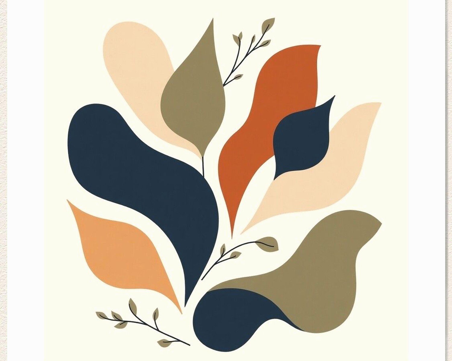
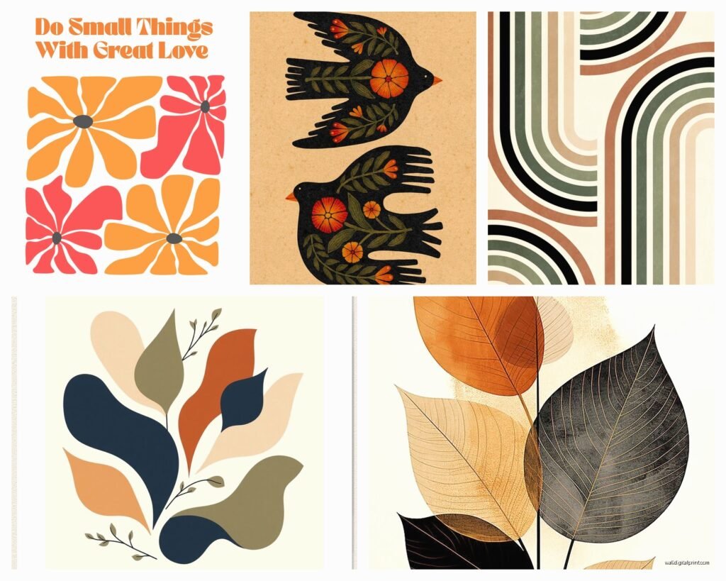
Line art botanical prints – those simple black line drawings of leaves, pampas grass, eucalyptus. They’re everywhere but they work because they’re neutral enough to anchor the weirder stuff. I usually do 2-3 of these in any boho gallery wall.
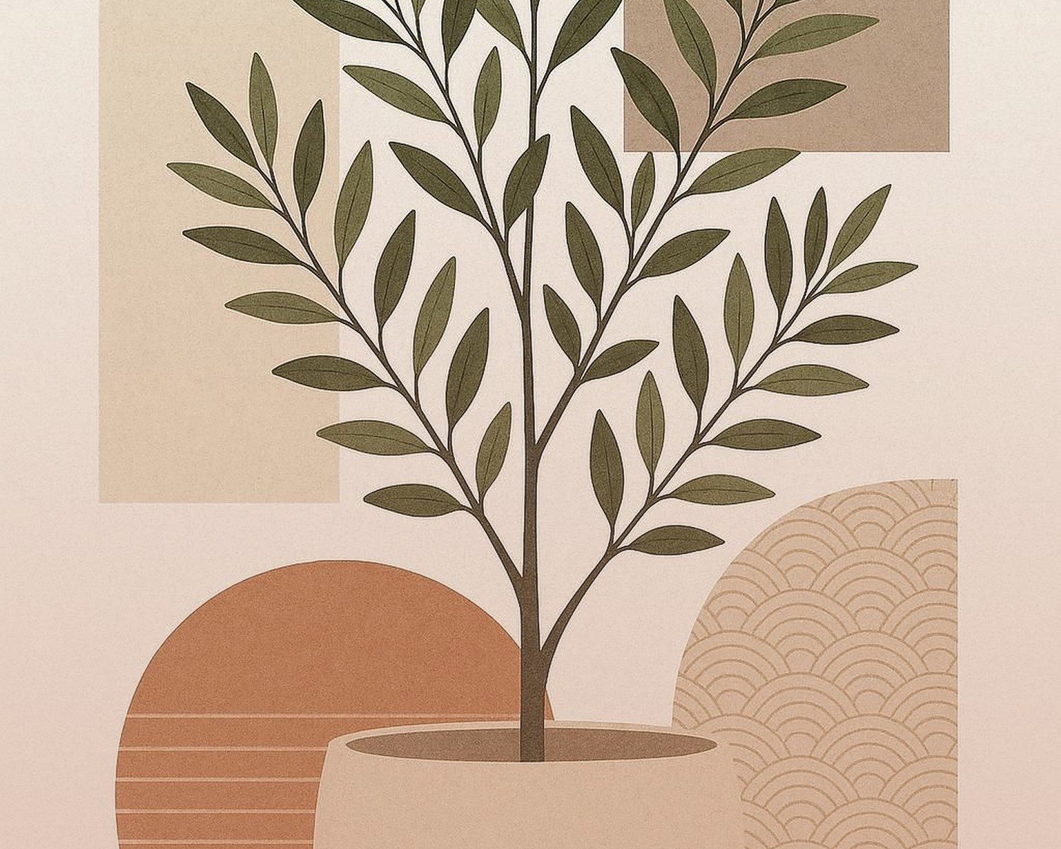
Abstract desert landscapes – the ones with those arched shapes and terracotta tones. Etsy is drowning in these right now. Some are gorgeous, some look like a high schooler’s first Procreate attempt, so really zoom in on the preview images.
Vintage-looking travel posters – Morocco, Greece, Joshua Tree, anywhere that screams “I’m well-traveled and interesting.” These add personality without being too loud. I found this amazing vintage Marrakech print at an estate sale last month and I’m still thinking about it, shoulda bought it for myself.
Geometric tribal patterns – okay this is where cultural appropriation gets tricky. I stick with abstract geometric stuff rather than anything that’s clearly copying specific indigenous designs. There are tons of artists doing original geometric work inspired by various traditions without straight-up copying.
Sun and moon illustrations – very witchy boho. Line art versions or watercolor, both work. My cat knocked one of these off my wall last week and I’m still finding glass shards, so maybe skip the glass if you have pets.
Size matters more than you think
The biggest mistake I see is buying all small prints. Boho isn’t delicate. It’s layered and bold. You need varying sizes or it looks like a doctor’s office waiting room.
My formula for a gallery wall:
- One large anchor piece (24×36 or bigger)
- Two medium pieces (16×20 or 18×24)
- Three to five smaller pieces (8×10 or 11×14)
- Maybe some tiny 5x7s if you’re doing a really big wall
The large piece is usually my most neutral choice – a big botanical line drawing or an abstract landscape. Then I get weirder with the smaller ones.
Where to actually buy these without breaking the bank
I’m gonna be real, I mix high and low constantly.
Etsy is obvious but overwhelming. Search “boho wall art digital download” and you can print them yourself at Staples or FedEx for like $3 per print. The quality is honestly fine for most situations. I do this for clients who are renting or might move soon.
Society6 has good stuff and frequent sales. Their framing is expensive though, so I usually just buy the prints.
Desenio is where I go when I need it to look expensive but don’t have the budget. Their photography prints are especially good.
Minted for when I actually have budget. Their paper quality is noticeably better.
Thrift stores and estate sales – this is gonna sound weird but I find the best boho prints at estate sales in rich neighborhoods. Old people had amazing art taste in the 70s and 80s. I found a set of three botanical prints from the 1970s for $15 total and they’re worth like $200 each online.
Oh and another thing, Facebook Marketplace has people selling their old HomeGoods and Target boho prints constantly. I furnished an entire Airbnb gallery wall for under $100 this way.
The frame situation
Frames make or break the boho vibe. You want it to look collected, not matchy-matchy.
I usually do:
- Natural wood frames in different tones (light oak, walnut, teak-looking)
- Black frames for contrast, but not too many
- Maybe one or two gold/brass frames for accent
- White frames sparingly, only if your walls are white and you want some prints to blend
IKEA frames are fine, don’t let anyone shame you. Their RIBBA frames in black and their wood frames are like 80% of what I use. Michael’s has good wood frames when they’re 50% off, which is basically always.
For a super boho look, mix frame styles – some thin, some chunky. But keep the finish quality similar or it looks cheap instead of eclectic.
Matting – yes or no?
I go back and forth on this. White mats make everything look more intentional and gallery-like, but they also make it look less boho sometimes? Like too formal.
My current approach: use mats on the smaller prints to make them feel more substantial, skip mats on the larger ones to keep it casual. Or use cream/off-white mats instead of pure white for a softer look.
Actually hanging this stuff without losing your mind
Okay so funny story, I used to meticulously plan gallery walls on paper and it never looked right when I actually hung them. Now I do it differently.
Lay everything out on the floor first. Like literally arrange all your frames on the ground in the layout you think you want. Take a picture from above. Live with that picture for a day or two. You’ll notice things that bug you.
The spacing sweet spot is 2-3 inches between frames. Closer feels cluttered, farther feels disconnected.
For the actual hanging:
- Start with your center/anchor piece at eye level (57-60 inches to the center of the frame)
- Work outward from there
- Use painter’s tape to mark the corners of each frame on the wall before you hammer anything
- Command strips work for smaller lightweight frames and save your walls if you’re renting
I use this laser level I got for $20 on Amazon and it’s honestly changed my life. No more crooked frames.
Mixing prints with other boho wall stuff
You’re probably gonna want to add other textures because that’s what makes it actually boho and not just “prints on a wall.”
Works well with prints:
- Small macramé pieces (not huge ones, those compete too much)
- Woven baskets hung as wall art
- Mirrors with natural wood or rattan frames
- Small wall shelves with plants
- Pampas grass in a wall-mounted vase
The trick is not doing too much. I usually do 70% prints, 30% other stuff. Otherwise it gets messy fast.
Wait I forgot to mention – floating shelves with prints leaning on them instead of hanging? Very boho and way easier to rearrange. I’m literally watching someone do this on an HGTV show right now and it reminded me.
The prints that don’t work together (lessons learned)
Some combinations I’ve tried that failed:
- Realistic photography + simple line drawings (too much contrast in style)
- Cool-toned prints + warm-toned prints (pick a temperature and stick with it mostly)
- Too many different art styles (abstract + line art + watercolor + photography = chaos)
- Mixing super detailed patterns with minimal designs in equal amounts (go 70/30 one direction)
Room-by-room what actually works
Living room: This is where you can go big. Large-scale botanical prints, abstract landscapes, geometric patterns. I usually do a gallery wall above the sofa or a large statement piece there with smaller prints on adjacent walls.
Bedroom: Keep it calmer. Neutrals, soft abstracts, maybe some celestial stuff if that’s your vibe. I did an all-neutral boho bedroom last month with just cream, beige, and soft terracotta prints and it’s so peaceful.
Dining room: Vintage food and drink prints with a boho vibe, travel posters, botanical herb prints. Something with personality since people actually look at the walls while eating.
Bathroom: Small botanical prints, abstract watercolors, anything that can handle humidity. Skip anything too precious. I learned this when a client’s expensive print got warped from shower steam.
Entryway: One larger statement piece or a small tight gallery wall. This isn’t the place for your whole collection.
The digital download printing thing
Since I mentioned it before – if you’re going the digital download route, here’s what you gotta know:
Print at 300 DPI minimum. Anything less looks pixelated when you print it large. Most Etsy sellers will specify this in the listing.
For printing, I’ve used:
- Staples – cheap, decent quality, fast
- FedEx Office – slightly better quality than Staples
- Local print shops – best quality but more expensive
- Printique online – good for when you want nice paper and can wait for shipping
Ask for matte cardstock or photo paper. Glossy looks cheap for art prints usually.
Keeping it from looking like a dorm room
The difference between boho and “college apartment” is intentionality and quality. Here’s how to stay on the right side:
Frame everything. Seriously. No bare posters with thumbtacks. Even cheap frames are better than no frames.
Vary your subject matter. Don’t do all plants or all abstract or all the same color palette. Mix it up while staying cohesive.
Include at least one piece with real depth or interest. Not everything can be a basic line drawing. Add something with texture or detail or color.
Quality over quantity. Five really good prints beat fifteen mediocre ones.
When to break the rules
Sometimes the most boho thing is doing something unexpected. I had a client who insisted on including this vintage taxidermy print (not my usual thing) in her otherwise soft neutral boho gallery wall and honestly? It made the whole thing more interesting.
If you find something you genuinely love that doesn’t fit the “rules,” try it anyway. The worst case is you move it somewhere else. Best case is it becomes your favorite piece.
Just don’t do this with every piece or you’re back to craft fair explosion territory.
Maintenance and switching things out
One thing I love about boho wall art is you can easily swap pieces seasonally or when you get bored. Keep your frames and just change the prints inside.
I keep a flat file folder (okay fine, it’s a big cardboard portfolio from Amazon) with extra prints I’m not currently displaying. When I want to refresh a room, I just swap some out. Way cheaper than buying all new art.
Dust your frames like once a month if you can remember. I definitely forget and then they look dingy and I wonder why the room feels off.
The best part about building a boho print collection over time is that it actually does start to feel personal and collected rather than like you bought a set. Give yourself permission to add slowly, find things you actually connect with, and not force it all at once. Unless you’re like me and have a deadline because someone’s moving in next week, then yeah, you gotta force it a bit but try to make thoughtful choices anyway.