Wall Art Guide, Wall Art Tutoriels
Black and White Mountain Wall Art: Monochrome Nature Peaks
May
So I’ve been working with black and white mountain art for like three years now and honestly it’s one of those things that seems super straightforward until you’re actually standing in someone’s living room trying to figure out why it looks wrong.
First thing – and I cannot stress this enough – size is where everyone screws up. You think you want something small and tasteful but then it just looks like you hung a postcard on the wall. For mountain art specifically, you want it to feel expansive. I usually tell people to go at least 36 inches wide for a living room, but really 48-60 inches is where it starts to have that impact. My client last month ignored this advice and got a 24×18 print for above her couch and we both just stood there like… yeah this isn’t it.
Where This Actually Works
Living rooms are the obvious choice but here’s what I’ve learned – it works best on the wall opposite your windows. The natural light hits it during the day and it doesn’t compete with your actual view. I made the mistake once of putting a massive mountain piece right next to these floor-to-ceiling windows and it just felt redundant? Like why am I looking at fake mountains when real sky is right there.
Bedrooms though, that’s where black and white mountain art really shines. Something about the monochrome palette is genuinely calming without being boring. I have this print above my bed – three layered mountain ridges getting progressively lighter – and my cat likes to sit on the headboard and stare at it which is weird but anyway. The key in bedrooms is to go horizontal format, not vertical. Vertical makes the ceiling feel lower somehow.
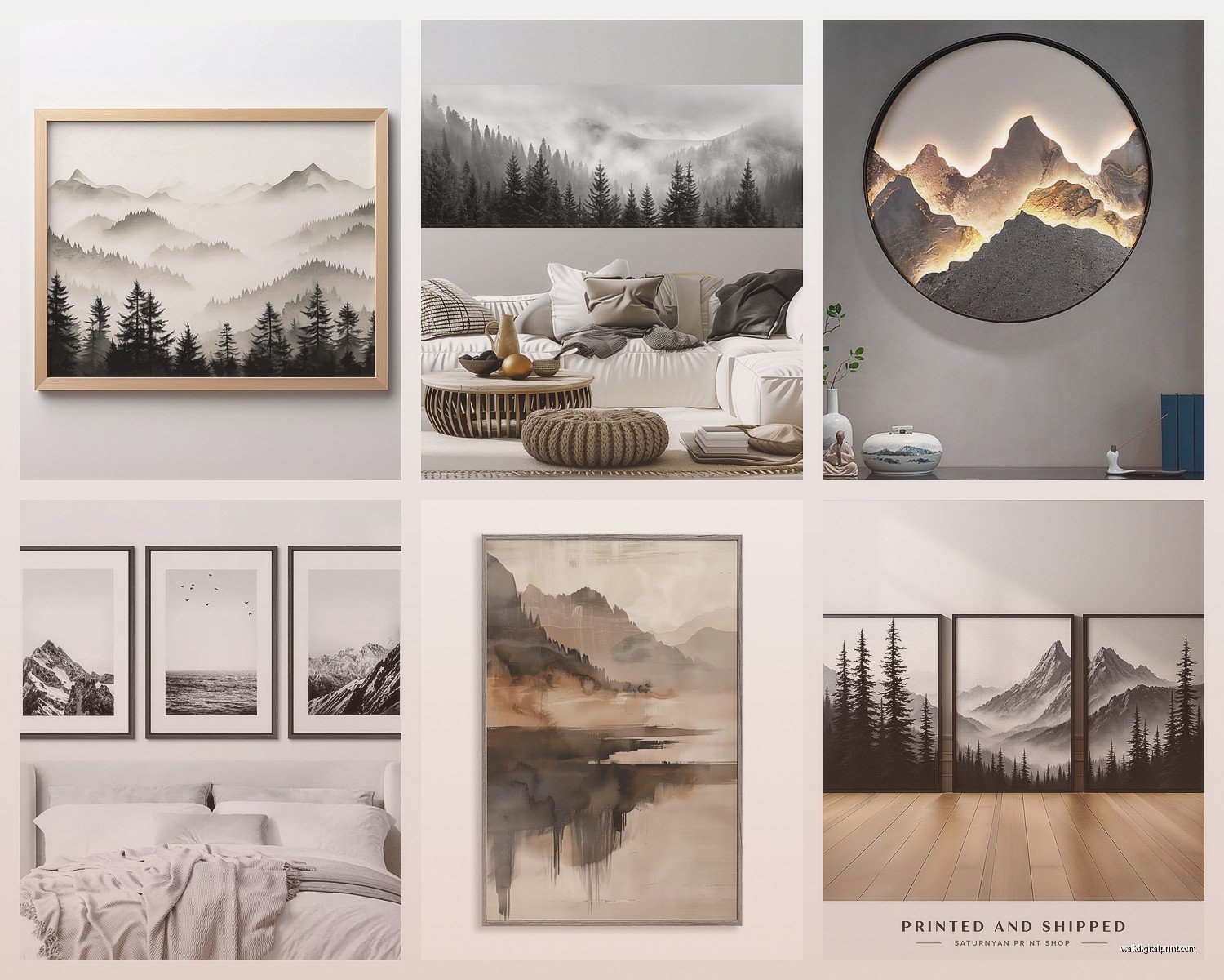
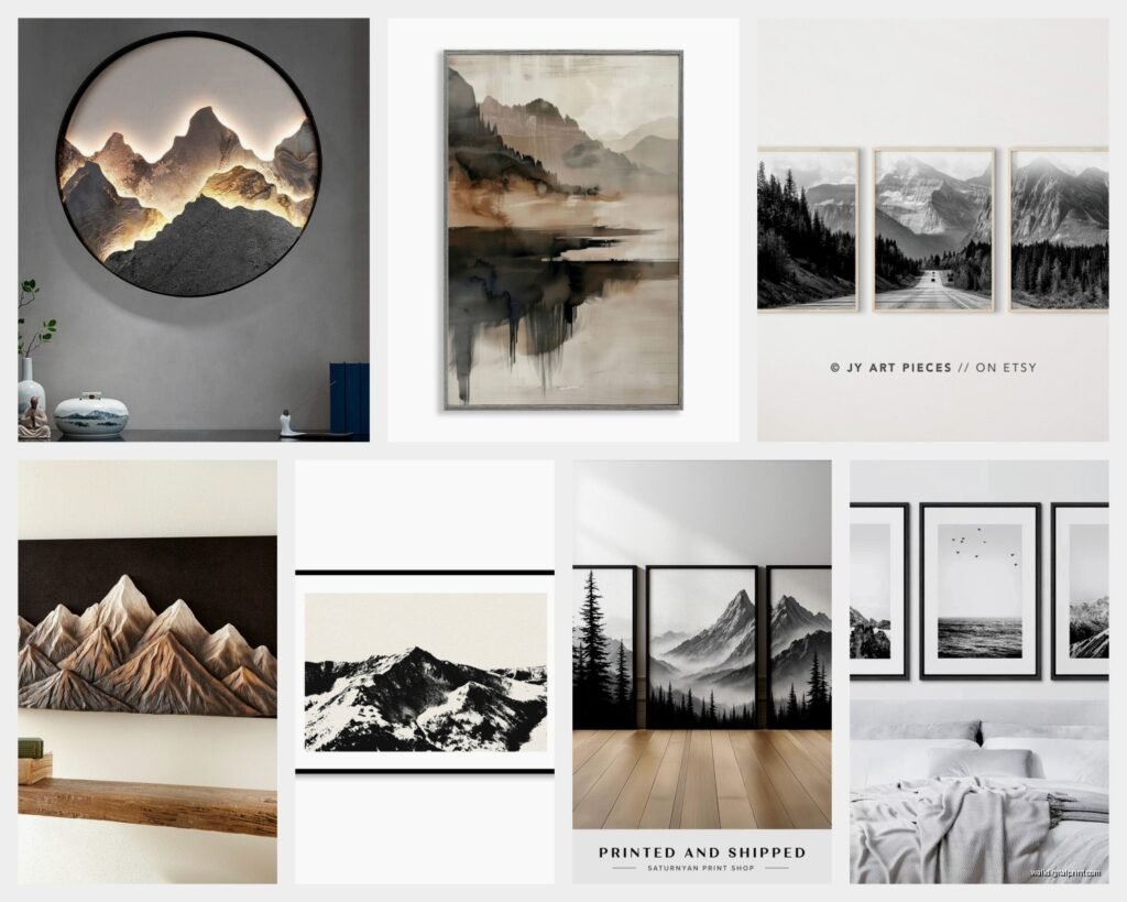
Home offices are perfect for this stuff. The black and white keeps it professional but the mountain element adds just enough personality that you’re not sitting in a corporate hellscape. I curated a whole office space last spring where we did a series of three smaller mountain prints instead of one large one and it looked so much better than I expected.
The Actual Styles You’ll See
Okay so there are basically four main styles and they do NOT all work in the same spaces.
The super minimal line drawing style – you know the ones, just black lines showing the ridge outlines. These work in modern spaces, Scandi vibes, anywhere that’s already pretty neutral. They’re safe but they can also read as generic if you’re not careful. I use these for clients who are nervous about commitment.
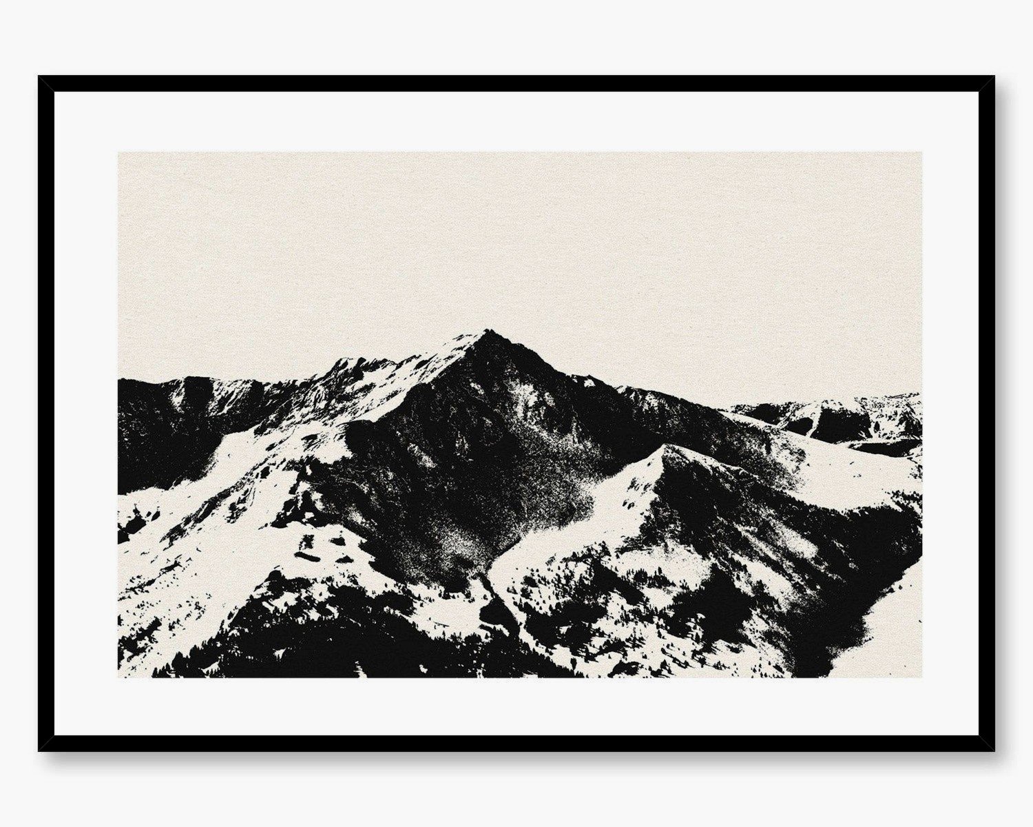
Photographic prints with high contrast – actual mountain photos edited to black and white with really punchy blacks and bright whites. These need more space to breathe. They’re dramatic and they know it. Best in rooms with high ceilings or at least 10 feet of wall space. I did a whole living room around one of these last year and we had to paint three walls this specific warm white to make it work.
Watercolor or ink wash style – where the mountains fade from black to gray to white with that organic bleeding effect. These are softer, work in more traditional spaces surprisingly well. My mom has one in her dining room and it somehow doesn’t clash with her very-not-modern furniture.
Abstract geometric mountains – angular, sharp, sometimes with gold or copper leaf accents but still primarily black and white. These are trickier. They need contemporary furniture and good lighting or they just look confused.
Framing Because Everyone Asks
This is gonna sound weird but the frame matters more with black and white art than with color. With color pieces you can get away with a basic black frame because the art provides the interest. With monochrome mountain art, the frame is part of the whole visual statement.
Thin black metal frames – super modern, clean, makes the art feel like it’s floating. Works with the minimal line drawings especially. I probably use these 60% of the time.
Thick black wood frames – more traditional but in a good way, adds weight and importance to the piece. Better for photographic prints or larger pieces.
Natural wood frames in light oak or walnut – this is my secret weapon honestly. Everyone defaults to black frames with black and white art but a light wood frame makes it feel warmer and more accessible. I did this in a nursery once and it completely changed the vibe from stark to serene.
White frames – only if your walls are a different color. White frame on white wall makes the art disappear. But white frame on gray or navy wall? Chef’s kiss.
No frame at all, just canvas – this works if you’re going for that casual modern vibe but the canvas quality has gotta be good. Cheap canvas just looks cheap without a frame to hide the edges.
Placement Specifics That Actually Matter
Above the couch is standard but here’s the thing – it should be 6-8 inches above the couch back, not higher. I see people hang art way too high all the time. The center of the artwork should be at eye level when you’re standing, which is usually around 57-60 inches from the floor. But if it’s above furniture, you measure from the furniture up.
Oh and another thing – if you’re doing a gallery wall with mountain prints, keep them all the same color temperature. Don’t mix warm-toned blacks with cool-toned blacks. Yes there’s a difference and yes people will notice even if they don’t know why it looks off.
For entryways, a tall vertical mountain print can make your ceiling look higher. I love this trick for small entry spaces. Just make sure there’s at least 4 inches of space on either side of the art – don’t cram it into a narrow wall.
Living Room Deep Dive
Okay so in living rooms you’ve got options. Single large statement piece is the move if you have a focal wall – usually the one behind or across from the sofa. You want the art to take up about 2/3 to 3/4 the width of your sofa. Smaller than that and it looks wimpy.
Diptych or triptych – this is two or three panels that form one image across multiple frames. I love these for long walls or above console tables. The spacing between panels should be 2-4 inches, not more or it starts to feel disconnected.
I did a living room last fall where we used five small mountain prints in a row – all different mountain ranges but same style and frame. It created this panoramic effect that was honestly cooler than one large piece would’ve been.
Wait I forgot to mention – consider what’s on the adjacent walls. If you have a lot going on elsewhere in the room, keep the mountain art simple. If the rest of your walls are pretty bare, you can go more dramatic with the mountain piece.
Bedroom Specific Stuff
In bedrooms the art should be the last thing you see before sleep which sounds woo-woo but actually matters for the vibe. Mountain art has this anchoring quality – it’s stable, permanent, grounding. Way better than busy patterns or bright colors.
I always go horizontal orientation in bedrooms and usually stick to the softer styles – the watercolor mountains or gradient peaks. The high-contrast photography can be too intense for a sleep space.
Size-wise, aim for about 2/3 the width of your bed. So if you have a queen (60 inches wide), you want art that’s around 40 inches wide. King bed, go bigger.
And here’s something nobody tells you – if you have bedside lamps, the top of the art should be higher than the top of the lampshades when they’re on the nightstands. Otherwise the proportions look weird.
What to Actually Buy
Canvas prints are fine for most situations. They’re affordable, they look decent, easy to hang. I order a lot of these for clients who don’t want to invest heavily. Just make sure it’s at least 1.5 inch depth canvas so it has some presence on the wall.
Framed prints behind glass or acrylic – these look more expensive and honestly last longer. The glass protects the print from fading. Go with acrylic if you have kids or if you’re hanging it somewhere it might get bumped. Regular glass works fine otherwise and it’s cheaper.
Metal prints – these are having a moment and they’re actually really cool for mountain photography. The image is infused into aluminum and the blacks are SO deep. They’re pricey though and very modern looking, so they don’t work in every space.
Original artwork if you can swing it – I mean obviously this is ideal but we’re talking $300+ usually. Worth it if you’re gonna be in your space for a while and you want something unique. I follow a few artists on Instagram who do amazing ink mountain landscapes.
The Actual Shopping Process
Measure your wall space first – I know this is obvious but people skip this step and then end up with art that doesn’t fit. Tape out the dimensions on your wall with painter’s tape to visualize the size.
Look at the art on a desktop monitor, not your phone. Colors (or in this case, the blacks and whites) look totally different on phone screens. My phone makes everything look more contrasty than it actually is.
Read the reviews specifically about print quality and whether the blacks are actually black or more grayish. This matters so much with monochrome art.
Check the return policy before buying. Most online art sellers are pretty good about returns but you gotta confirm.
Styling Around It
Your mountain art is probably gonna be the darkest element in the room so you need to balance it. I usually add at least two other black or very dark elements elsewhere – maybe black frames on the bookshelf, a dark throw pillow, black hardware on furniture.
Texture is your friend with monochrome schemes. Since you’re not getting variation from color, you need it from texture. Think chunky knit throws, linen curtains, a jute rug, maybe some ceramic vases. The mountain art provides the visual interest but texture keeps it from feeling flat.
Plants honestly look amazing with black and white mountain art. The green provides just enough color without being overwhelming. I always add at least one substantial plant near mountain artwork – it plays into that nature vibe without being too matchy.
Metallics work really well too. Brass or copper accents warm up the monochrome palette. I did a whole living room where we had black and white mountain art, brass floor lamp, copper side table, and it felt cozy instead of cold.
Lighting This Stuff Properly
This is where people mess up and then wonder why their art looks muddy. Black and white art needs good lighting to show the contrast and details.
Picture lights are the fancy option – those little lights that mount above the frame. They look great but they’re pricey and you need an electrician unless you get the battery operated ones which are fine but you gotta remember to change the batteries.
Track lighting or directional ceiling lights work well if you have them. Angle them at the art at about a 30 degree angle to avoid glare.
If you have natural light, position the art where it gets indirect light during the day. Direct sunlight will fade prints over time and also creates glare.
Wall sconces on either side of the art – this is my go-to for bedroom mountain art. Creates a nice glow and serves as ambient lighting.
Common Mistakes I See All the Time
Hanging it too high – already mentioned this but it’s the most common problem. Eye level people, eye level.
Going too small – the second most common issue. Mountain landscapes need space to feel expansive.
Mixing too many styles – if you’re doing multiple mountain pieces, keep the style consistent. Don’t mix line drawings with photography with abstract. Pick one vibe.
Ignoring the rest of the room – the art needs to relate to something else in the space. If everything is curved and soft and you add angular geometric mountain art, it’s gonna feel off.
Cheap printing that looks washed out – spend a little more for good print quality. The blacks should be rich and deep, not gray.
Okay so I think that covers most of what you’d actually need to know? The main thing is just to commit to the size – go bigger than feels comfortable and it’ll probably be right. And don’t overthink the style thing, just pick what makes you feel something when you look at it. My client yesterday spent an hour debating between two prints that were basically identical and finally I was like just pick one, you’re gonna love it either way.