Wall Art Guide, Wall Art Tutoriels
Neutral Landscape Wall Art: Subtle Earth Tone Nature
May
So I’ve been working with neutral landscape art for like three years now and honestly it’s one of those things that sounds boring until you actually see it done right in a room. Last week I was helping my friend Sarah pick pieces for her living room and she kept saying “but won’t beige landscapes look sad?” and I’m like no no no you’re thinking of it all wrong.
Why This Actually Works Better Than Colorful Art
Okay so here’s the thing about earth tone landscapes – they don’t compete with your room, they anchor it. I had this client who bought this huge vibrant abstract piece because she thought neutral was too safe, and then she couldn’t figure out why her room felt chaotic. We swapped it for a subtle desert landscape with soft browns and grays and suddenly everything just… clicked. The art became this grounding element instead of screaming for attention.
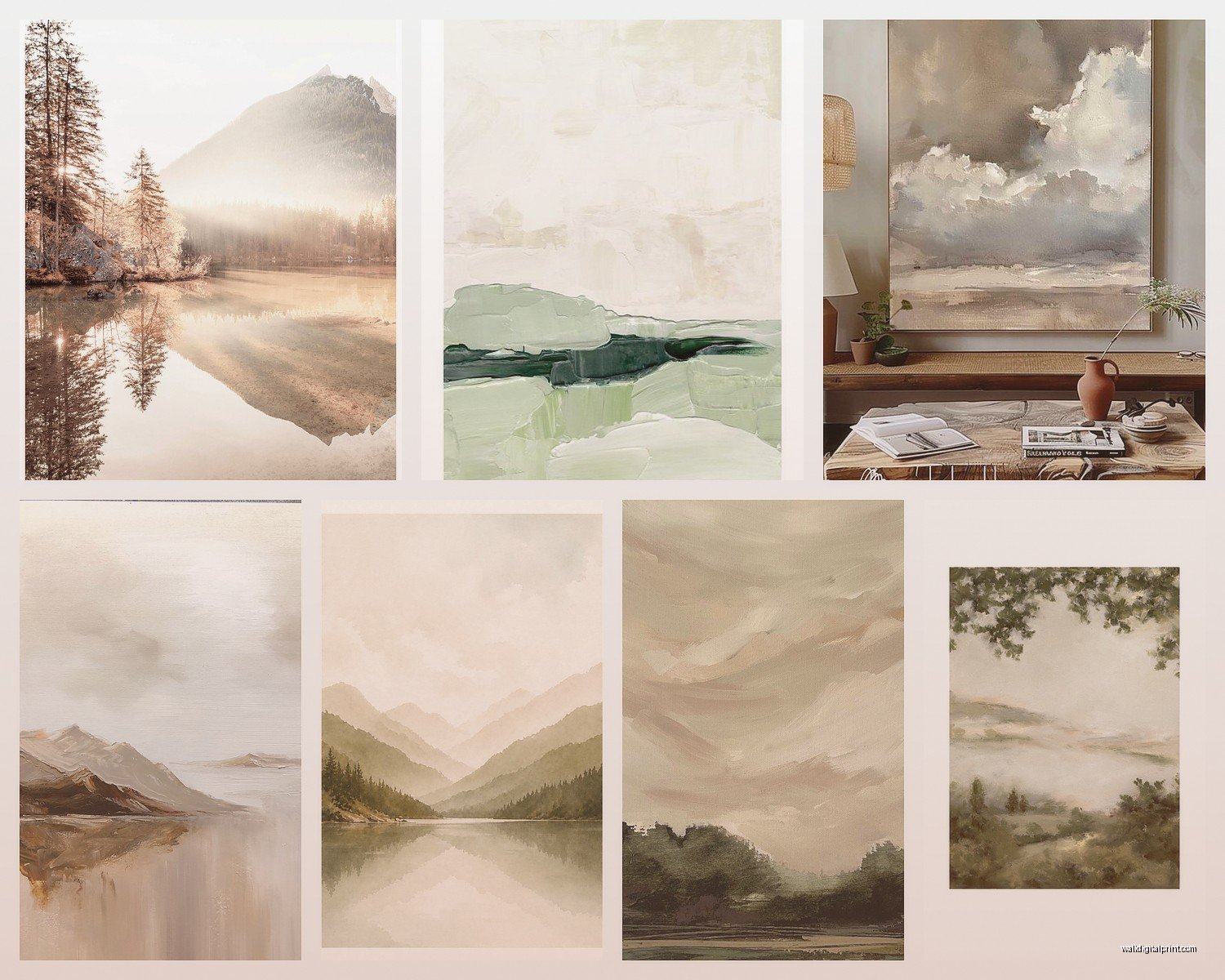
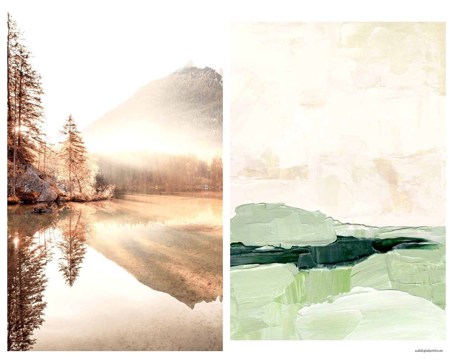
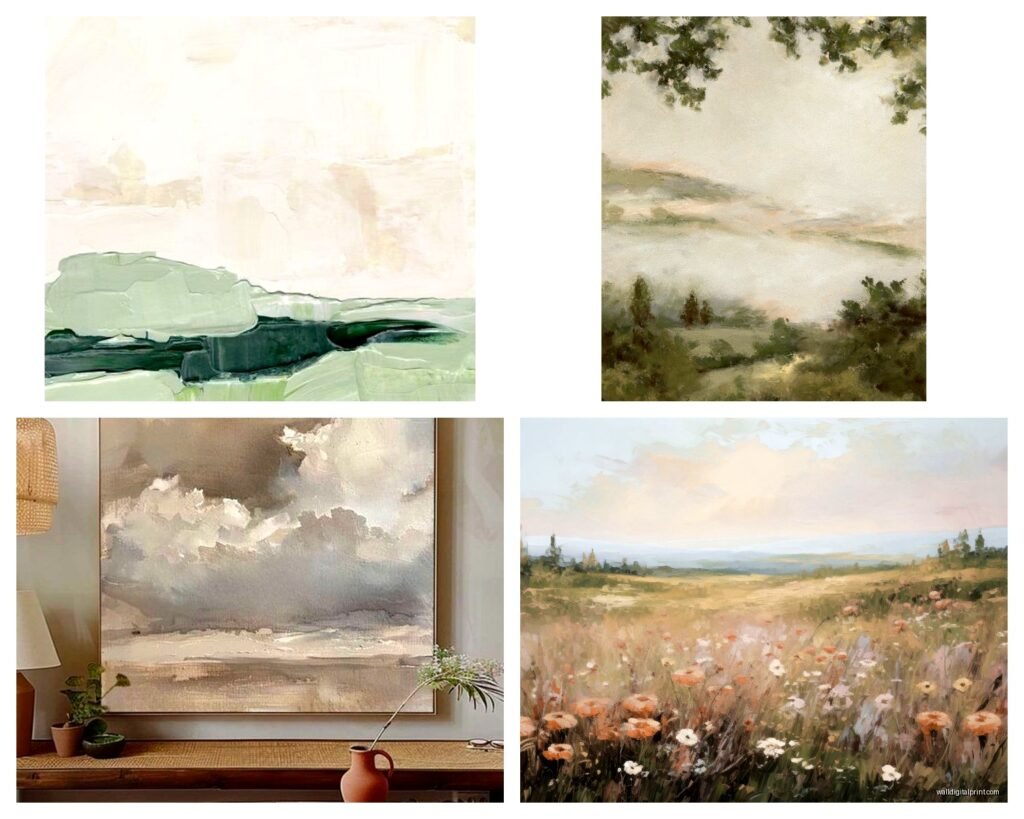
The key is that neutral doesn’t mean bland. You’re looking for pieces with texture, depth, layering. Like that misty mountain range where you can see five different shades of gray-blue fading into the distance, or a desert scene where the sand has actual dimension to it.
What Actually Counts as Earth Tone Neutral
People get confused about this constantly. Earth tones for landscapes means:
- Warm grays and taupes
- Soft browns from sand to coffee
- Muted greens like sage or olive
- Cream and ivory tones
- Dusty blues that lean gray
- Terracotta and clay colors but softened
What it does NOT mean is that sad beige aesthetic where everything looks like oatmeal. I learned this the hard way when I ordered what I thought was a “neutral beach scene” and it arrived looking like someone printed it on cardboard. Zero depth. Had to return it.
The Scenes That Work Best
Deserts are honestly my go-to recommendation. Sand dunes, Joshua trees, southwestern landscapes – they photograph beautifully in neutral tones and they have natural texture built in. Mountains too, especially when they’re shot at dawn or dusk so you get those layered ridges fading into the distance.
Forests can work but they’re trickier because green can read as loud even when it’s muted. You want foggy forest scenes or winter woods where the colors are naturally desaturated. Beaches are great if you avoid bright blue water – go for overcast skies, driftwood, sand patterns.
Oh and another thing, fields and grasslands are super underrated. Wheat fields, prairie grass, that kind of thing photographs in these gorgeous gold and tan tones that feel warm without being aggressive.
Size and Scale (This Is Where People Mess Up)
Gonna be real with you, most people buy art that’s way too small. I see it constantly. They’ll put a 16×20 print above a king bed and wonder why it looks like a postage stamp.
For over a sofa or bed, you want the art to be roughly 2/3 to 3/4 the width of the furniture. So if your couch is 84 inches wide, you’re looking at art that’s around 56-60 inches wide. You can do a single large piece or a gallery wall that adds up to that width.
I usually tell people to measure with painter’s tape on the wall before buying anything. Just tape out the dimensions you’re considering and live with it for a day or two. My cat keeps trying to scratch at the tape when I do this but it’s worth it to visualize the scale.
Single Statement Piece vs Gallery Wall
This depends on your room’s vibe honestly. Modern and minimal spaces look amazing with one large landscape – like a 48×36 desert print in a simple oak frame. Traditional or eclectic rooms can handle gallery walls better.
If you’re doing a gallery wall with landscapes, keep them all in the same tonal family. Like all warm earth tones OR all cool grays, not mixed. I did a project last month where we hung seven different neutral landscapes – all desert and mountain scenes – in matching black frames and it looked so cohesive.
Wait I forgot to mention – odd numbers work better for gallery walls. Three pieces, five pieces, seven. Something about the asymmetry just reads more natural to the eye.
Frame Selection (More Important Than You Think)
The frame can totally make or break neutral landscape art. Since the art itself is subtle, the frame becomes part of the overall statement.
Light wood frames (oak, maple, light walnut) work beautifully with warm earth tones. They add texture without adding color competition. I use these probably 60% of the time.
Black frames are classic and crisp. They work with literally any earth tone palette and they make the art feel more modern and gallery-like. Great if your room leans contemporary.
Natural wood with visible grain – this is my secret weapon for casual spaces. The texture in the frame echoes the natural texture in the landscape.
White or cream frames can work but they’re tricky. They tend to make the art feel more casual and cottage-like, which is fine if that’s your vibe but can look cheap if the art quality isn’t there.
Mat or No Mat
This is gonna sound weird but I almost always use a mat with neutral landscapes. It gives the eye a place to rest between the art and the frame, and it makes even affordable prints look more expensive. Usually I go with a cream or soft white mat, maybe 2-3 inches wide.
Exception: really large statement pieces often look better without a mat because you want that immersive feeling.
Where to Actually Find Good Pieces
Okay so I’ve tested like a ridiculous number of sources at this point. Here’s what actually works:
Minted has really solid landscape photography and you can get it in tons of sizes. Their quality is consistent which matters because I’ve ordered from places where one print is great and the next is grainy. They’re not the cheapest but the prints look professional.
Etsy is hit or miss but when you find a good landscape photographer on there, you can get downloads and print locally which saves money. Just make sure you’re looking at their reviews and example photos. I found this amazing seller who does southwest landscapes and I’ve used their work for probably four different client projects.
Society6 has decent options though I find their printing can be a bit flat sometimes. Better for smaller accent pieces than statement walls.
Local art fairs and photographer markets – this is actually where I’ve found some of my favorite pieces. You can see the quality in person and often the prices are better than you’d expect. Plus it feels good to support local artists and you can sometimes get custom sizes.
My client canceled yesterday so I spent an hour comparing print quality between different services and honestly for neutral landscapes specifically, the printing quality matters more than with colorful art because there’s less color saturation to hide imperfections.
Styling the Wall Around Your Landscape
So you’ve got your neutral landscape art, now what? The wall treatment matters.
Paint Colors That Work
White and off-white walls are the obvious choice and they work great. The art provides the subtle color interest. But you can also go bolder:
- Warm greige walls with warm-toned landscapes
- Soft sage with desert or grassland scenes
- Charcoal gray with black and white mountain photography
- Cream or almond with any earth tone landscape
I did a bedroom last year with Benjamin Moore’s “Edgecomb Gray” walls and a huge neutral sand dune photograph and it felt like a spa retreat.
Shelf Styling Below
If your landscape is above a console table or shelf, keep it simple. The art is the statement, so you want:
- Natural elements – driftwood, stones, dried grasses in simple vases
- Ceramics in coordinating earth tones
- Books with neutral spines
- Maybe one textured basket or wooden bowl
Don’t overcrowd it. Three to five objects max. The whole point of neutral landscape art is that peaceful, uncluttered feeling.
Lighting Makes or Breaks It
This is something I see people forget constantly. Neutral art needs good lighting or it just disappears into the wall.
Picture lights are ideal if you’re going for that gallery feel. They cast light directly on the art and create drama even with subtle pieces. You can get battery-operated ones now so you don’t need an electrician.
Track lighting or adjustable can lights work great too. Just make sure they’re positioned to hit the art, not create glare on glass.
Natural light is beautiful but watch for direct sun which will fade your prints over time. I usually recommend UV-protective glass if the art is in a really sunny spot.
Ambient Lighting in the Room
The overall room lighting affects how your neutral art reads too. Warm white bulbs (2700-3000K) make earth tones feel cozy and rich. Cool white bulbs can make neutral art look washed out and sad.
Common Mistakes I See All the Time
Hanging art too high – the center of the art should be at eye level, which is usually around 57-60 inches from the floor. I still use a measuring tape every single time because eyeballing it never works.
Mixing too many landscape styles – like a realistic photograph next to an impressionist painting next to a minimalist line drawing. Pick a style and commit to it in each space.
Forgetting about the room’s existing colors – your neutral landscape should echo colors that already exist in the room. If you have cool gray furniture, warm terracotta desert art might clash. Pay attention to undertones.
Choosing landscapes from places that have no meaning to you – okay this is personal preference but I think art should connect to you somehow. Whether it’s a place you’ve been or want to go, or just a landscape type you find peaceful. My living room has three different images from a trip I took to Utah and every time I look at them I remember that trip.
Oh and another thing – people buy prints that are too glossy. Matte or satin finishes look way more sophisticated with neutral landscapes. Glossy can create glare and looks cheap.
Budget Breakdown
Since you’re probably wondering about cost:
Budget option: Digital download from Etsy ($10-30) + local print at Costco or a print shop ($20-60 depending on size) + IKEA frame ($20-40) = $50-130 total
Mid-range: Print from Minted or similar ($100-250) + decent frame from Target or West Elm ($60-120) = $160-370 total
Investment piece: Original photograph or professional print ($300-800) + custom framing ($150-400) = $450-1200 total
I usually tell people to invest in one or two really good pieces for main spaces like the living room or primary bedroom, then go budget-friendly for secondary spaces.
Seasonal Swapping
This might sound extra but hear me out – because neutral landscapes are subtle, you can actually swap them seasonally without it being a huge production. I keep a few different prints and switch them out:
Summer: beach scenes, light sandy tones, airy and bright
Fall: prairie grass, warm wheat fields, golden hour landscapes
Winter: snowy mountains, foggy forests, cool gray tones
Spring: misty mornings, soft green hills, fresh and light
You don’t have to do this but it’s a way to keep your space feeling fresh without buying new furniture or repainting. The frames stay the same, just swap the print inside.
The art I have up right now is this gorgeous overcast beach scene with driftwood and I’m probably gonna swap it for a mountain landscape when it gets colder because I like that cozy feeling in winter.
Anyway, start with one piece for your main wall and see how you feel about it. Neutral landscape art is forgiving – it works with basically any decor style and you can build around it easily. Just pay attention to scale, get the right frame, and make sure the lighting shows it off properly.